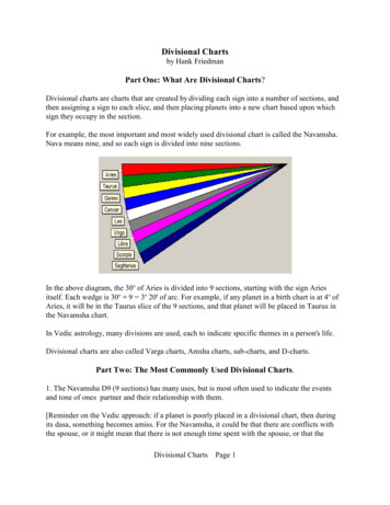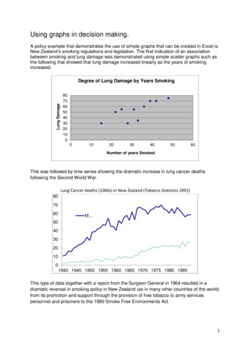
Transcription
Creating Charts and GraphsTitle:Version:First edition:First Englishedition:Creating Charts and Graphs1.0December 2004December 2004
ContentsOverview.iiCopyright and trademark ations and updates.iiInserting charts.1Using the Chart AutoPilot.2Choosing the chart type.5Editing the chart.10Moving and resizing a chart.11Graphics and color.12Applying a background to a spreadsheet.12Graphics in the background of cells.12Creating Charts and Graphsi
OverviewOverviewOpenOffice.org Calc lets you present data graphically in a chart, so that you can visuallycompare data series and view trends in the data.Copyright and trademark informationThe contents of this Documentation are subject to the Public Documentation License,Version 1.0 (the "License"); you may only use this Documentation if you comply with theterms of this License. A copy of the License is available at:http://www.openoffice.org/licenses/PDL.rtf.The Original Documentation is Creating Charts and Graphs. The Initial Writer(s) of theOriginal Documentation is/are Linda Worthington 2004. All Rights Reserved. (InitialWriter contact(s): lindaw65@earthlink.net. The Initial Writer contact(s) is to report errors inthe documentation. For questions regarding how to use the software, subscribe to the UsersMail List and post your question there: http://support.openoffice.org/index.html.)All trademarks within this guide belong to legitimate owners.FeedbackPlease direct any comments or suggestions about this document Thanks to Peter Kupfer for his review of this chapter.Modifications and updatesVersionDate1.024 December 2004Creating Charts and GraphsDescription of ChangeFirst published version.ii
Inserting chartsInserting chartsOpenOffice.org Calc offers a variety of different ways to chart or graph your Calc data. Anytime a chart is created, the chart AutoPilot is invoked.Open the spreadsheet and highlight (select) the data to be included in the chart. There aretwo ways to proceed after you have selected your data. The first method (see Figure 1) isInsert Chart:Figure 1. Selecting Insert ChartThe second method (see Figure 2) is to long-click (that is, hold down the left mouse buttonfor 1 second) on Insert Object to display the floating toolbar, then click on the Insert Chartbutton:Creating Charts and Graphs1
Inserting chartsFigure 2. Using the Insert Chart buttonUsing the Chart AutoPilotOnce Insert Chart is selected, the chart AutoPilot menu appears. (See Figure 3.) The firstdialog is used to define the data range, the labels, and the target sheet for the chart.Figure 3. Create a Chart AutoPilotData RangeThe data range selected should contain both the labels and the data. (See Figure 4.) If thedata range is selected when the AutoPilot is started, it will automatically be inserted in theRange input field. If the AutoPilot is started without a selected data range, a range can beselected by clicking on the range selection icon next to the Range input field.Creating Charts and Graphs2
Inserting chartsFigure 4. Highlighted Data RangeFirst Row/Column as LabelFirst Row as Label: Uses the entries in the top row of the selection as labels for the datarange. This setting is useful if there are several columns of data that need to be displayed inthe same chart. (See Figure 5.)1st Row as Label109876Time (s)Speed (m/s)543210Row 2Row 3Row 4Row 5Row 6Figure 5. Example using first row as labelCreating Charts and Graphs3
Inserting chartsFirst Column as Label: Uses the entries in the leftmost column of the selection as labels forthe data range. (See Figure 6.)1st Column as Label109876Column B543210Time (s)12345Figure 6. Example using first column as labelFirst Column & First Row as Label: Both checkboxes can be selected as well. Thisprovides a combination of both options. This sets the first row as the labels and the firstcolumn as the x-axis values. (See Figure 7.)1st Column & 1st Row as Label109876Speed (m/s)54321012345Figure 7. Example using first column and first row as labelsChart Results OutputThis dropdown box specifies which sheet the chart will output to. By default the currentsheet is selected, but any sheet, or a new sheet, can also be selected. However, a chart can notbe set to be its own sheet; it must be an object in a normal sheet.Once the correct options have been input, either click Create to create the chart, or clickNext to proceed to the next dialog to choose the chart type.Creating Charts and Graphs4
Inserting chartsChoosing the chart typeOn the next page of the AutoPilot (see Figure 8), the chart type can be chosen and a previewof the chart output can be seen. Click Create from here, or click Next for more options.Figure 8. Choosing a chart type (format)OpenOffice.org Calc offers several different chart types. Most chart types come in both a 2dimensional and a 3-dimensional style. Below is the list of available styles with examples.Lines (2D & 3D) – Provides a standard line graph that is useful for displaying changing dataover a period of time.Running DistancesRunning Distances600500600450550400Jenny's Distance(m)Marc's Distance(m)Sarah's Distance(m)3503002502001501005001020304050Time (s)60500Jenny's Distance (m)450Y axis titleDistance (M)550400350300250200150Sarah's Distance (m)10050Marc's Distance (m)010 20Jenny'sDistance (m)30 4050 60Z axis titleMarc's Distance(m)Sarah's Distance (m)X axis titleFigure 9. 2D Line Graph: NormalCreating Charts and GraphsFigure 10. 3D Line Graph: Deep5
Inserting chartsAreas (2D & 3D) – Creates graphs that are similar to line graphs but with the area under theline shaded in.Running DistancesSarah's Distance (m)Marc's Distance(m)Jenny's Distance (m)1020304050Distance (m)Distance (m)Running 20010006060055050045040035030025020015010050010 2030 4050 60Time (s)Jenny's Distance (m)Marc's Distance(m)Sarah's Distance (m)Marc's Distance (m)Jenny's Distance (m)Time (s)Figure 11. 2D Area: StackedFigure 12. 3D Area: DeepColumns (2D & 3D) – Creates vertical columns to represent data. The columns can benormal, stacked, or by percent. In 3D mode the data can also be represented by cylinders andcones.# of Calls# of Calls by Week200180190170140120100Week 1Week 2Week 3806040# of Calls# of Calls16015013011090705030Week 1Week 2Week 30Sunday200SundayMon Tues Wed Thurday day nes sdaydayDay of the WeekFigure 13. 2D Column: NormalCreating Charts and GraphsFridaySaturdayWeek 3TuesdayWeek 2Day ofThursdayWeek FridaySaturdayWeek 1Figure 14. 3D Columns: Cones, deep6
Inserting chartsBars (2D & 3D) – Provides the same features as columns, but they are horizontal.# of Calls# of Calls by ek 3Week 2Week 1FridaySaturdayDay of WeekDay of the 0500Week 1Week 2Week 3Wednesday50100150600# of Calls200# of CallsFigure 15. 2D Bar: StackedFigure 16. 3D Bars: NormalPies (2D & 3D) – Graphs that are useful for showing the parts of a whole. The pie chart canbe separated or keep as a solid circle.Gases in the AtmosphereGases in the AtmosphereNitrogenOxygenCarbon DioxideArgonWater VaporOther GasesFigure 17. 2D Pie: Offset 2Creating Charts and GraphsNitrogenOxygenCarbon DioxideArgonWater VaporOther GasesFigure 18. 3D Pie: Normal7
Inserting chartsXY Chart – This graph is similar to a scatter plot. It can be used to show several trials ofexperiments with two variables.Acceleration of Different Masseswith a Given Force0.400Acceleration (m/s 2)0.3500.300Acceleration of10kg mass(m/s2)Acceleration of20kg mass(m/s2)Acceleration of35kg .52.02.53.03.54.0Force (N)Figure 19. XY Chart: Lines with SymbolsNet – Provides a circular graph with a separate Y axis for each item on the X axis. Pointswithin a data series are connected with a polygon.Main TitleSunday200MondaySaturdayWeek 1Week 2Week 30TuesdayFridayWednesdayThursdayFigure 20. Net Chart: NormalCreating Charts and Graphs8
Inserting chartsStock Chart – Shows change from one data series to the next for each X value.Value (USD)My Stocks 70.00 67.50 65.00 62.50 60.00 57.50 55.00 52.50 50.00 47.50 45.00 42.50 40.00 0123478901DateFigure 21. Stock: Stock Chart 2The next page of the AutoPilot (see Figure 22) provides options for fine-tuning the chartselection. There are several variants that can be chosen for each graph type. In the examplecharts above, the variants come after the colon. Again, the chart can be created from thisscreen, or titles and labels can be added by clicking Next.Figure 22. Choosing a variantCreating Charts and Graphs9
Inserting chartsOn the last page of the AutoPilot (see Figure 23), a title and labels for the axes can be added.Figure 23. Adding textEditing the chartOnce the chart is created, further edits can be made. To edit a chart:1) Select the chart (left-click).2) Right-click and select Edit.Alternatively, the chart can be double-clicked.This will activate a new toolbar on the left side of the screen (see Figure 24) used for editingdifferent aspects of the chart.Creating Charts and Graphs10
Editing the chartFigure 24. Edit Chart toolbarMoving and resizing a chartOnce the chart has been created, it can be moved or scaled. To move the chart:1) Click on the chart to select it.2) Click and hold down the left mouse button to drag the chart across the window.To resize the chart:1) Click on the chart to select it.2) Click on one of the green handle bars (see Figure 25) and move the mouse.Creating Charts and Graphs11
Editing the chartFigure 25. Resizing chart handlesGraphics and colorApplying a background to a spreadsheet1) Select the cells.2) Choose Format Cells (or right-click on the chart and choose Format Cells from thecontext menu).3) On the Background tab page, select the background color.Graphics in the background of cells1) Choose Insert Graphics From File.2) Select the graphic and click Open.3) The graphic is inserted and anchored to the current cell.To make the inserted graphic part of the background:1) Select it.2) Right click and select Arrange To Background.Creating Charts and Graphs12
Graphics and colorNote: To remove a graphic from the background, use the Navigator. Press F5, select the graphicfrom the navigator. Double-click on the appropriate graphic, and then right-click on it andchange the arrangement.Creating Charts and Graphs13
Inserting charts First Column as Label: Uses the entries in the leftmost column of the selection as labels for the data range. (See Figure 6.) Figure 6. Example using first column as label First Column & First Row as Label: Both checkboxes can be selected as well.This