Transcription
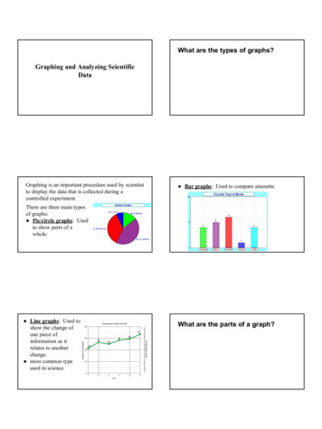
What are the types of graphs?Graphing and Analyzing ScientificDataGraphing is an important procedure used by scientistto display the data that is collected during acontrolled experiment. Bar graphs: Used to compare amounts.There are three main typesof graphs: Pie/circle graphs: Usedto show parts of awhole. Line graphs: Used toshow the change ofone piece ofinformation as itrelates to anotherchange. most common typeused in scienceWhat are the parts of a graph?
TitleTitle Title: Summarizes information beingrepresented in ANY graph. Usually includes thevariables on the graph: Ex. “The Effect of Varying Amounts ofSunlight on Respiration Rates of AquaticPlants”How to come up with a graph title:“[Dependent Variable] vs. [Independent Variable]”or “The Effect of [Independent Variable] on[Dependent Variable]”AxesX axis labelBoth bar and line graphs have an “X” axis(horizontal) and a “Y” axis (vertical).Independent Variable/X Axis Label: The variablethat is controlled by the experimenter, such as, time,dates, depth, and temperature. This is placed on the X axis and must includecorrect units.Y axis labelScaleDependent Variable/Y Axis Label: The variablethat is directly effected by the I.V. It is the result ofwhat happens as time, dates, depth, temperature, etc.are changed. This is placed on the Y axis and must includecorrect units.Scales for each Variable: one needs to knowwhere to plot the points representing the data. a scale must include all the data points must also take up a conservative amount of space
ScalesLegend/Keyscales should start with 0 and climb in intervals suchas, multiples of 2, 5, 10, 20, 25, etc the scale ofnumbers will be determined by your data valuesLegend: A short descriptive narrative concerningthe graph’s data.should be short and concise and placed under ornext to the graph.Graphs you make Must Have thesepartsHow can a graph be used to analyzedata? TitleX axis / Y axis LabelsCorrect UnitsA good scalelegend/keyAnalyzing DataAnalyzing Data Using StatisticsGraphing can be used to analyze data in 3 ways: Extrapolation: extending the graph, along thesame slope, above or below measured data. Interpolation: predicting data between twomeasured points on the graph make calculations, ex. slope, area under curve Mean: This is determined by adding all thenumbers in a set of data and then dividing by thenumber of values. (a.k.a. average) Ex: 3, 6, 8, 12, 15, 18, 26, 32 sum(total) 120; n (number of numbers) 8 mean 120/8 15
Analyzing Data Using StatisticsAnalyzing Data Using Statistics Median: This is the middle number in a set ofdata. If the there is an even set of numbers in thedata, then take the average of the two middlenumbers. Ex: 2, 3, 4, 8, 12, 16, 20 -- median 8 Ex: 3, 5, 8, 11, 17, 19, 27, 30 -- median is 11 17 28/2 14 Mode: This is the number that occurs most oftenin a set of data. Ex: 3, 4, 6, 6, 7, 9, 9, 9, 12, 12, 15 -- mode 9 To determine median and mode, put thenumbers in the set of data in numerical order.How can you determine precision?Analyzing Data Using StatisticsStandard Deviation:This is how far your datapoints deviate (differ)from the mean.mathematicallydetermines precisionHow can you determine accuracy?Analyzing Data Using StatisticsPercent Error: how far your data deviate from anaccepted value measured - accepted x 100%acceptedmathematically determines accuracy
summary of ways to analyze data graphing: extrapolate interpolate calculate statistics mean, median, mode standard deviation % error
Graphing and Analyzing Scientific Data What are the types of graphs? Graphing is an important procedure used by scientist to display the data that is collected during a controlled experiment. There are three main types of graphs: Pie/circle graphs: Used to show parts of a whole. Bar graphs: Used to compare amounts. Line graphs: Used to