Transcription
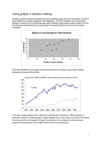
Using graphs in decision making.A policy example that demonstrates the use of simple graphs that can be created in Excel isNew Zealand’s smoking regulations and legislation. The first indication of an associationbetween smoking and lung damage was demonstrated using simple scatter graphs such asthe following that showed that lung damage increased linearly as the years of smokingincreased.Lung DamageDegree of Lung Damage by Years Smoking807060504030201000102030405060Number of years SmokedThis was followed by time series showing the dramatic increase in lung cancer deathsfollowing the Second World War.Lung Cancer deaths (1000s) in New Zealand (Tobacco Statistics 1991)807060M 504030201001940 1945 1950 1955 1960 1965 1970 1975 1980 1985This type of data together with a report from the Surgeon General in 1964 resulted in adramatic reversal in smoking policy in New Zealand (as in many other countries of the world)from its promotion and support through the provision of free tobacco to army servicespersonnel and prisoners to the 1990 Smoke Free Environments Act.1
Time series of smoking prevalence and tobacco consumption continue to be used to monitorthe effectiveness of Government’s incentives, disincentives and anti-smoking educationcampaigns.Time series are a simple but powerful graph for looking at trends, for example in thefollowing graph showing a dramatic rise in the price of New Zealand dairy products in themid 1970s. This graph was displayed on television news and used in inform discussions onthis controversial issue (see the video in the accompanying Web App on Measuring PriceChange).In New Zealand, as in many other countries, the Consumer Price Index (CPI), is used toinform Government and business decisions. The CPI is a measure of how the prices thathouseholds face change over time. Graphs that help explain how the CPI is constructed fromthe goods and services purchased by households include interactive tools such as theGerman statistics office’s Price Kaleidoscope available e.svg.2
In New Zealand the CPI is used by the media to inform the public of price (and standard ofliving) changes, by Government to adjust superannuation and other benefit payments, by theReserve Bank to help set national monetary policy and by employers and employees inwage negotiations.As it is hard to wrap your brain around big volumes of data graphs are used to summarisedata and make comparisons, to reduce information and make huge data setsunderstandable, to reveal insight that may otherwise remain hidden, to give a fast overviewand/ or to convey a memorable story by showing data visually.The type of graph used depends on the type of data to be displayed (whether it iscategorical, numeric discrete or numeric continuous) and what type of summary or feature isbeing displayed (frequency, association, change over time, etc.) Some graphs that can becreated in Excel and are in common use by decision makers are pie and bar charts,histograms and population pyramids, scatter graphs, box plots and time series line graphs. Asummary of these graphs and what they are used to show is given on the last page of thisdocument.The following gives the type of graph(s) would best suit in each given situation: Total Population in each region of a country - bar chart Monthly visitors by country of origin - bar chart Responses to the question: what will your party vote be in an election - bar or piechart Compare the number of hours boy and girls spend on computers - clustered barchart Population by age and sex in an indigenous population - population pyramid Height of children in a school - histogram or box plot Number of visitors arriving in a country every month - time series Relationship between age and how many hours spent watching TV - scatterplot The number of cigarettes smoked by degree of lung damage for individuals in ahealth study - scatterplotUsing graphs in decision making requires interpretation of their main features. These includefor graphs such as bar charts, histograms, boxplots and scatter graphs that display all thedata: where the centre of the data ishow much spread is in the dataand how many peaks (modes) there arewhether it is symmetric or skewedwhether there are observations far from the rest of the values (outliers).3
Example:CentreOne mode (unimodal)Slight skew to leftNo outliersFeatures to look for in line graphs and time series include: trends over time (increasing or decreasing)repeated patterns in the data (such as seasonal changes)points of abrupt change.The graph below shows that, in New Zealand, unemployment rates generally decrease aspeople are older, with a slight bump (increase) between ages 40-50 years.NZ Unemployment rates by Age14Unemployment rate12108642015- 1920- 2425- 2930- 3435- 3940- 4445- 4950- 54Age groupGood graphs tell a story that is based on the data without exaggerating any aspects of it.The three population pyramids below of the New Zealand population in 1945, 1960 and 1990clearly show the impact of the second war world in the loss of young men, the baby boomthat followed the war and its roll on impact in future generations.Good and bad graphs are discussed in the next section.4
Summary - types of graphs that can be created in Excel and which to use when.GraphUse to showNameDataProportionBar ChartType of carownedProportionPie Chart“X Factor”Voting patternsRelationshipbetweenvariablesScatter DiagramHeight vs FootlengthDistributionHistogramFoot lengthCompare groupsBox plotGirls’ and boys’heightsTrend over timeTime seriesPrice change fordifferent fruits5
Graphs that help explain how the CPI is constructed from the goods and services purchased by households include interactive tools such as the . created in Excel and are in common use by decision makers are pie and bar charts, histograms and population pyramids, scatter graphs, box plots and time series line graphs. .