Transcription
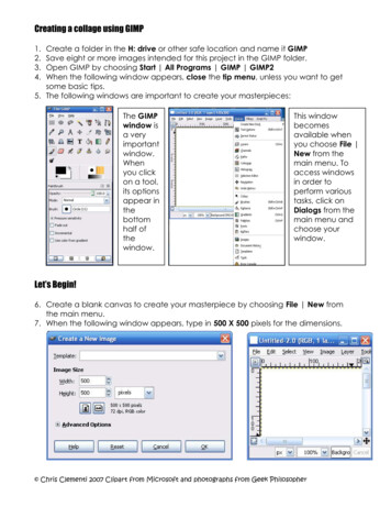
Antique-Style Maps in Gimpa tutorial by Candacis of Cartographer's Guildbased on Ascension's tutorial "Antique-Style Maps in Photoshop"This is a tutorial especially for the graphics program Gimp. The same PhotoshopTutorial was written by Ascension. I want to thank him for his fantastic guide,additional thanks goes to RobA for his pioneer work with map-making in Gimp. Withoutthose two this tutorial wouldn't have been possible. I tried to mimic all the functionsfrom Photoshop, but of course Gimp has its limit and sometimes I had to take a longway around to create the same outcome. It is not the same end result as in thePhotoshop tutorial, but hopefully close enough.Please excuse some grammatical and orthographical errors. English is not my nativelanguage. Don't hesitate to point those shortcomings out, so that I can correct them.Any other questions and comments are welcome, too.Hint: "Using Gimp to create an artistic regional map" by RobA is a useful guide to everyGimp Cartography User and it has some extra tips.Difficulty: This tutorial is for beginners, with steps in detail. However, basic knowledge,like creating a new layer, tools and layer modes, is expected. Check Beginning withGimp [Extern Link] for a starter tutorial and how to work with Gimp. Don't follow thesettings and numbers in my tutorial too closely. If you think a different setting suitsyour map better, go for it.I work with Gimp 2.6.1.Create a new Gimp document (.xcf file). I will use a 700x700px size with RGBcolor, transparent background and a 72ppi resolution (due to my weaknetbook). For a map you want to print, I recommend a larger size(2.000x2.000) and 300ppi. You may have to adjust some techniques, if youhave chosen a large size.One comment before I start: If I say I create a new layer, this layer is myactive layer (just click in the layer box on the new layer and it is active) until Icreate a new one or say so otherwise. Oh, and save often.2.Check the first four steps of RobA's tutorial "Using Gimp to create an artisticregional map", if you have a sketch of your map you want to use. I will usehis Three-Layer-Sandwich (TLS) technique for a random map.- First create a new transparent layer, fill it with the grey color #808080.- Create a new transparent layer on top of that, name it "Noise", go toFilters/Render/Clouds/Solid Noise. Set the detail to 15. I used x and y size4,0, but try different options depending on the size of your picture. Press the"new Seed" Button until you are satisfied with the result. Set the layer modeto "Overlay".- Create a new white layer on top of that, set its layer mode to "Lighten Only"and name the layer "Land 1". Open the "Levels" box (Colors/Levels), take the
white arrowhead on the right side of the output (not input) slider and drag itslowly to the left until enough land is revealed. I stopped the slider at 120,but that's just my setting and it might be different for you. If you have a nicedifference between landmass and water, click OK. Choose the Fuzzy SelectTool, check the box "Sample merged" and set the threshold to 0 and themode to "Add to the current selection". Click with the tool anywhere in thedarker area. Invert the selection (Select/Invert).- Create a new black layer, call it "Land Mask". With "Land Mask" as activelayer, fill the selection with white color. If you are at this point and at theopinion the black mass is more suitable for land than water, go toColors/Invert and white and black should switch places. But remember: whiteis your land and black your water. Go to Select/None.Hint: If you are unhappy with the look of your landmass, go back to the stepwith the noise layer and try a different noise effect. Or try to use a map draftinstead of the grey layer. Working with a white rough grunge brush to connectsome little landmasses is possible, too. Check RobA's tutorial for more advice.3."Land Mask" is your active layer. Go to Filters/Map/Displace. TheDisplacement Mode is "Cartesian", the Edge Behavior is "Smear". Chose thenoise layer as map and set 20 X and -20 Y. Click Ok. Do another DisplaceMap, but this time with -20 X and 20 Y. This gives the coastlines some niceredges. Duplicate the "Land Mask", make the duplicate invisible. This is just aprecaution in case you want to go back to this step.4."Land Mask" is your active layer. Use the Select by Color Tool and click with itanywhere in the black area. Go to Edit/Clear or just hit the delete key on your
keypad. Deselect (Select/None).- Create a new transparent layer beneath the "Land Mask". Name the newlayer "Ocean". Fill it with #808080. Choose "Land Mask" again as your activelayer. Right click the layer and choose Alpha to Selection. This should selectonly your landmass.- Create a new transparent layer on top of the "Land Mask". Name it"Coastlines". You have now two different options for creating a bettercoastline. Either go to Edit/Stroke Selection and use a black stroke line width1px or go to Select/Border, choose 1 or 2 pixel and fill the new borderselection with black color. Either way you should have a black coastline inyour new layer. Deselect. Now you can toggle the opacity until the blackcoastline is a fine line. I used the first method and 27% opacity.5."Land Mask" is the active layer, use a Alpha Selection. Create a newtransparency layer named "Rivers" beneath the Coastlines, this is your newactive layer. With the landmasses selected, you will paint the rivers only onthe land. Choose #808080 (or black) as foreground color and a circle (01) aspencil. The paintbrush works fine, too. Draw some rivers, starting at theocean and going inland. Try doing some of the majors rivers and then addingbranches. You can apply a Gaussian Blur (Filters/Blur/Gaussian Blur) of 1px ifyou want to smoothen the rivers a bit.Hint: RobA has created a script for rivers in Gimp, named "Tapered Rivers inGimp".6.Create a new transparent layer and name it "Mountains 1". I will use differentmountains than the one in the Photoshop tutorial, but they can be done quiteeasily, too. First the Ascension Mountains:- Choose black as foreground color and a big round brush. I used a Circle(09). Draw some basic lines where the mountains are supposed to be. It don'thas to be pretty, just don't draw to close to the coastlines.- Create a new transparent layer and name it "Mountains". Use a smallerbrush, check the fade out box and set it to 20px (or what length your linesshould have) zoom in and draw some hair lines around the mountains. Itshould look like a paramecium. Now hide the Mountain 1 layer. Deselect.- Alternate Mountains: I used a different approach. Choose the color #808080as foreground color and a grunge brush. I downloaded some free grungebrushes from www.deviantart.com, where you can download all sorts of usefulstuff for Gimp, because Photoshop brushes work in Gimp, too. I used thesecond brush of these. Copy the brush file in Gimp/share/gimp/2.0/brushes.You may have to refresh the brushes in order to use the new brush. Drawrough shapes in the places where you want your mountains. OpenFilters/Distorts/Emboss. Play with the three controls until you have nicemountains. Deselect.
7.Create a new white layer named "White" beneath the "Ocean" layer. Choosethe "Ocean" layer as your active layer. Set the foreground color to #BEDCE6and the background color to #F5D7D7. Use the Blend Tool to fill the Oceanlayer with a gradient, where blue is in the lower half of the picture and pink inthe upper half. Set the opacity to 50%.- Create a new white layer beneath the "Land Mask", name it "Noise 2". Applya RGB Noise Filter (Filters/Noise/RGB Noise) with Red, Green and Blue at 0,20and the independent RGB Box checked. Set the layer mode to Multiply and theopacity to 60%. But a Grain Extract at 15% or a Darken only at 70% couldresult to some nice effects, too.- Create a new layer, naming it "Aging" with #84745E as color on top of thehighest layer, set the opacity to 15%. Go to Filters/Artistic/Apply Canvas anduse a Detail of 4 and select a top-right direction. Another fine effect is to setthe layer mode to Soft Light and the opacity to 80%.8.Now for the rings around the land: Create a new transparent layer beneaththe "Noise 2" layer, name it "Rings". Activate the "Land Mask" layer and usean Alpha Selection on it. Go to Select/Grow. Expand the selection about 2 (or1) pixel. Activate the "Rings" layer. Go to Select/Border, choose a 1px border.Fill it with black. Deselect. Repeat these steps, expanding the selection about5 and 8 pixels and so on. More or less. It depends on the size of your image.Make sure that the "Rings" layer is active, when you fill the border selection.Choose a Gaussian Blur with 0,5px (Filters/Blur/Gaussian Blur). Set the layermode to Grain Merge. Copy the Rings layer, if your rings are too light.
9.Create a new layer with the color #84745E over the "Aging" layer. Name it"Aging 2". Go to Select/All, than to Select/Shrink and shrink the selectionabout 50px (or less/more, depending on the size of your image). Go toSelect/Rounded Rectangle and give it a radius of 75%. Use Edit/Clear todelete the brown color in the middle of the picture. Deselect. Set the layermode to Soft Light. Toggle with the opacity (I have it at 70%) until the colorblends nicely. Then use a grunge brush as eraser and/or smudge tool tosmooth the edges. Another method to "age" the picture is to alpha select thelandmass (in the "Land Mask" layer), then shrink the selection about 20px,feather it and delete (in the "Aging 2" layer), set it to soft light and you havea more darkish ocean.10.Time for countries! Create a new transparent layer above the mountain masklayer (or beneath mountains and rivers. Whatever suits you best). Name itafter the name of the country. Take a color you like, any pen or brush andpaint the shape of the country, then fill it with the color. Do this for everycountry. It is important that every country has its own layer! It doesn't matterif you paint in the ocean, we will delete that later. Actually it is better to makesure the coast of the country is well covered, too.- Now activate the "Land Mask" layer and make an alpha selection. Go toSelect/Invert. Activate each country layer once and hit the delete button (oruse Edit/Clear). This will erase every overlapping color part. Deselect.
- To prevent countries from overlapping you can do a similar step. Chooseyour first country, make an alpha selection and then activate a country thattouches the first country. Press Delete. Do this for every overlapping country.11.A tedious process follows to mimic outer/inner glow in Gimp. Activate yourfirst country, set the layer mode to Hard Light and roughly 20% (or more)opacity, alpha select it. Create a new transparent layer above the country,name it "[Countryname] border". Shrink the selection about 1 or 2 pixels(Select/Shrink), go to Select/Border. Make a 2px feather border, fill it with thecolor of the country. Deselect. Apply a 0,5 Gaussian Blur (or more) to theborder layer, set the layer mode to Hard Light (optional). Create a newtransparent layer beneath the border layer, name it "[Countryname] pattern".Now you need a pattern with diagonal lines. I took Ascension's pattern fromhis tutorial. You can find it here. Or create your own pattern onwww.stripegenerator.com. Open the pattern image in Gimp, go to Select/Alland Edit/Copy and Edit/Paste as. Select Paste as New Pattern. You have now anew Gimp pattern. I chose to make a second pattern with the lines in theopposite direction. Just go to Image/Transform/Flip Horizontally. Save it as anew pattern like the first one. Now activate the country layer which whomyour currently working. Make an Alpha Selection. Activate the pattern layerand use the Fill Tool to fill it with one of the two new patterns. Deselect. Setthe layer mode to Overlay (sometimes the Multiply mode with a low opacitygives better results). Repeat these steps for every country and switch to thesecond pattern, this helps to accentuate each country from another.I'm sure there are some other techniques to recreate this step in Gimp thanmy way and if you know one, don't hesitate to post your suggestion andadvice.12.Let's add cities. Create a new transparent layer above the "Mountains" layer,name it "Cities". I use a 10x10 square blur brush, I think it is one of Gimpsdefault brushes. Otherwise create an own brush (5x5px big with only a blurryblack outline) or download one. I scaled the brush to 0,70 and put a lot ofcities on the "Cities" layer. Cities are usually build at river deltas, the coast orother useful stuff for humans. Because this is a more modern kind of map, putmore cities in it than for a medieval map. You can use a bigger square brushfor larger/capital cities.- Now every city has to be named. Ascension's rule of thumb: 2 towns for 1city. Select the Text Tool, use Times New Roman, but use Times New RomanItalic for towns. Set the font size to 14px for cities and 12px for towns. Mergeall names down to a single layer, naming "City Names" (right-click on thelayers, select Merge down). Set the opacity between 70-80%. Duplicate thelayer, naming it "City Names Glow". Go to Colors/Map/Color Exchange.Change from color #000000 (black) or whatever color your city names are tocolor #F5F5F0. Apply a Gaussian Blur of 2 (or 3)px. I set it the layer mode to
Difference and the opacity to 45%, but try around with different modes. Justmoving the Glow layer beneath the city names layer works nice, too.13.Now you can give your continent (or biggest landmass) a name. Use TimesNew Roman, but all in Caps. Type the name with a font size of 40px(depending on the size of your image). See the last symbol on the fontsettings that looks a little bit like a b? This controls the space between letters,set it to 30. Switch to the path tool and create a path across the image, whereyou want the text. For this click simply somewhere in the left half of thepicture and then somewhere on the right. Now you should see a line, makesure it is as long as your text. Check the edit box of the path tool. Click in themiddle of the path and drag it slightly to the top, forming a bended path.Activate your text layer and go to Layer/Text along path. Use the path toolagain and create a selection from the new text path. Create a new transparentlayer, name it "Continent name", fill the selection with black. You should nowhave a bended text. Make the text layer with the unbended text invisible (ordelete it). Duplicate the "Continent name" layer to thicken the letters, mergeit down.Hint: Using the Rotate and Perspective Tool is another method to warp text.Repeat the Glow steps I described for the "City Names" layer. If the continentname overlaps some of the other names, go to the City Names layer, cut thename out with the Ellipse select tool and paste it in again, moving it around,then merge it with the City Names layer again. Do the same for the glow.14.Next step is naming Oceans, bays and other water bodies. Use a smaller fontsize and Times New Roman Italic. Write the Oceans in Caps and use the a b
Button to widen the space between the letters (I use a fontsize of 25px andspace 15). For smaller water bodies use a smaller font-size and upper andlower case letters. Sometimes you have to create paths again to bend the textaround the coastlines. When you're finished, merge the names down to onelayer, naming it "Ocean Names". Apply the same steps for a glow as before.Although I find it nice to leave the Glow layer mode at normal this time.15.Almost done with naming. Next in the line are countries. For this I will useArial, all in Caps and with some spacing between letters, depending on thesize of the country. For countries that are tall and skinny you will have to putthe text on two lines (make sure you hit the enter key after the first word withno space) and make sure that the text style is centered and not left aligned orright aligned. Also, change the Leading in the text tool window. It is thesymbol above the spacing symbol. This changes the amount of space betweentext lines. Once this is all done, merge the layers, name it "Country Names"and make a Glow again.- For geological features like mountains use Arial Italic with a small fontsize, inall caps, but without spacing between the letters. River names are in TimesNew Roman italic with a small fontsize, zero spacing and they have to bewarped with the path tool to fit to the rivers. This can be take a long, longtime and for this tutorial I will skip this.
16.For an easy border, go to Filters/Decor/Add Border. Set it to 8 X and 8 Y (orsmaller for a thinner border), color black. This will create a black borderaround the image. Use Select/All on the new border-layer. Go to Select/Shrinkand shrink it about 12px, then Select/Border and choose a 1px border. Fill itwith black. Now you have a simple border with two black rings. This works forme, but you can use Ascensions' method as well. If you don't want to makethe size of your picture larger (which the Add Border filter does), just workonly with the Select/All Shrink Border technique. Make sure you do it ona new transparent layer above the "Aging 2" layer, name this layer "Frame".- Nonetheless we need a transparent layer for the frame box which willcontain the name of the map and a scale bar. Use the move tool and go to thecorner of the picture where you want to put this box. I have a little space inthe left bottom corner, so I will use this. Drag the guidelines from the rulerwith the move tool in the picture. To do this just click on the ruler and draguntil you see a horizontal or vertical line (depending on the ruler). They're justfor orientation; you can switch them off with View/Show Guides. Grab therectangle select tool and drag out a selection that fills the marked area. Go toSelect/Border and make it a 4px border, fill it with black. Deselect. Drag theguidelines inside the new box. Make a new selection within these guidelines,make a 1px border, fill it with black. Deselect. If you have rings or textshowing through, then go and erase them. Put in the name of your map/worldor whatever title text you wish. Use Times New Roman Italic for any subtitleand Times New Roman, all in caps, a larger font-size and with a little spacingfor the main title.17.Time for the scale bar. Make a new transparent layer and name it "Scale Bar".Zoom in and use the square 10x10 brush to make four squares closelytogether so that you have a 10px tall and 40px weight bar. Fill it with black.Make four more squares, but this time erase the inner black lines thatseparates the squares from one another. Now you have a black and white bar.Copy (make an alpha selection and go to Edit/Copy) and paste this (you havenow a floating section, click new layer and the floating section transforms to anew layer with the pasted scale bar part), use the move tool to move this partto the right end of the scale bar. Do this as often as you like until you have afine scale bar, merge the parts down to one layer.- Now use the text tool to put the miles (or kilometer) numbers (0, 100, 200etc.) above the scale bar. Use Arial and a small font-size. Keep each numberon a different layer, that you can move them around. Using the Move tool tryto get each number centered above the color stops and make sure that eachnumber touches the scale bar. When done, link and merge these numberlayers. Move this layer up 5 pixels. I find it easier to use the arrow keys on mykeypad to move the numbers so that they are all on same height. Write"Scales In Miles" or whatever information you want to pass along beneath thescale bar (Arial, all Caps, little spacing). Position it with the move tool.Hint: Save the scale bar in a new png or xcf picture to use it for other maps.
18.If you want, you can put a compass in your map. Choose one that is not toomodern or too ancient. I used a compass that RobA posted in his Artistic Maptutorial thread here. Now, everything that is above the aging layers needs aGaussian Blur, this means the frames, the map title box and the compass.Either merge this all down to one single layer and apply a Gaussian Blur(Filters/Blur/Gaussian Blur with 0,5 - 2px) or apply the Blur to every layerindividually. Use CTRL F to reapply the Blur over and over again. Moveeverything under the "Aging" layer. Give the frames, scale, compass etc. aglow much like we did for the names (see Step 12). I set the Difference layermode to 15% opacity and used a 2px Gaussian Blur.19.Click on the Background layer, go to Image/Canvas Size and make the imagebigger (I chose 1.000px for each and an offset of 100 for X and Y). Create anew transparent layer on top of everything, name it "Grid". Go toFilters/Render/Pattern/Grid. This filter will lay latitude and longitude lines overthe image. I use Width 1, Spacing 80 and Offset 10. The width setting is forthe thickness of the lines and the spacing is important for the quantity oflines. If you have a larger image-size, you need a greater spacing, but keep inmind that the next filter will widen the grid. Go to Filters/Light andShadow/Apply Lens. Set it to 1,20. The Filters/Map/Map Object and Sphereshould work similar, but my netbook doesn't have the power for it. Now go tothe Border layer, make an Alpha Selection and go to Image/Crop to Selection.
You should now have the image-size back where it started. Deselect. Eraseany lines that go through the frame. Next, put in the numbers to indicate thedegrees of latitude and longitude (use Times New Roman in italic and a smallfont size). Apply a Gaussian Blur of 0,5px. Make a glow layer as in step 12.Move the grid layer beneath the "Aging" layer.Hint: This process works perfect, if your continent is on the equator; if yourcontinent is above or below the equator then you will have to add more linesand then move them around after the apply lens is done.20.It is almost done. Now you can tweak little things like adding a dark glowaround the landmass. This is easily done. Duplicate the "Coastline" layer,apply a Gaussian Blur of 4 or 5px and toggle with the opacity. You can use theempty space for doing inset maps of islands or cites or add clipart orwhatever. Just make sure that anything you add is genre appropriate (nospaceships). I will rework some of the country borders. I use the smear andblur tool to smoothen the edges between countries a little bit.21.To give the map a more antique look, you can lay a paper texture over it. Iused RobA's great tutorial "Creating Old Paper/Parchment in Gimp" to makethe map look old. Then I set the paper layer to multiply and played with theopacity of the other layers from his tutorial. I used grunge and splatterbrushes from deviantArt.
Gimp Cartography User and it has some extra tips. Difficulty: This tutorial is for beginners, with steps in detail. However, basic knowledge, like creating a new layer, tools and layer modes, is expected. Check Beginning with Gimp [Extern Link] for a starter tutorial and how to work with Gimp. Don't follow the
