Transcription
DATA ANALYSISUSING SPSSDr. Mark Williamson, PhD(based on PDF of Andrew Garth, Sheffield HallamUniversity)
Purpose The intent of this presentation is to teach you to explore, analyze, andunderstand data The software used is SPSS (Statistical Package for the Social Sciences)– commonly used in social sciences and health fields– as opposed to other statistical software such as SAS or R, it requireslittle to no coding background This presentation is heavily indebted to the work of Andrew Garth (SheffieldHallam University) and his full document can be found at the link /pdf/analysing data using spss.pdf All the data files used in this presentation can be found at the link below(download the ources/resourceindex.html
Outline First, we will look at the Big Picture Next, we’ll define our terms Then, we’ll get set up for working in SPSS Only then will we get into the meat of things, which willfocus on aspects of data analysis– Descriptive Statistics and Graphs (Exploring our Data)– Inferential Statistics (Analyzing our Data, andInterpreting our Results)
The Big Question. How should I analyze my data?It depends on the nature of the data andwhat questions you want to answerTo answer those questions, you need to explore your data.and select the proper analysis
Big Picture Steps in Statistical Analysis1. Explore your data1.2.3.4.Look at dataIdentify dataGraph/Describe dataFormulate Question (Hypothesis)2. Analyze your data1. Set up hypothesis2. Check normality3. Select and run appropriate test3. Interpret your results1.2.3.4.5.Find the Test Statistic, DF, and P-valueDetermine if significantState if null hypothesis rejected or notWrite resultPresent appropriate plot
Before we can start analysis, we need to getset up on the basics Defining Terms Working in SPSS
Defining Terms There are two basic data types, each with two sub-types– Numerical: expressed by numbers Discrete: numbers take on integer values only (number of children,number of siblings) Continuous: numbers can take on decimal values (height, weight)– Categorical: expressed by categories (also known asfactors/groups) Nominal: no meaningful order between categories (gender, occupation) Ordinal: categories can be put in meaningful order (agreement, level ofpain, etc.) If data is not used for analysis, it can be labeled as a nuisance orbookkeeping variable
Defining Terms 2 Data can also be paired or unpaired– Paired: categories are related to one another Often result of before and after situations(treatments/events) Since each part of the pair is related to each other, thisneeds to be considered If there are pairs of higher than 2, this is called repeatedmeasures– Unpaired: categories are not related to one another Numerical data can be parametric or non-parametric– Simply put, parametric data approximately fits a normaldistribution Data are symmetric around a central point “Bell curve” Also known as normally distributed– Data must be parametric (normally distributed) for many statisticaltests If the data are not parametric, you cannot use the test results If the data are non-parametric (does not fit a normaldistribution), there are non-parametric tests for use, but theyare weaker
Defining Terms 3RecapExamples Data can be:– Numerical, categorical, ornuisance– Paired or unpaired– Parametric or non-parametric(usually must run a test to tell) Numerical continuous: height, weight, drugconcentration Numerical discrete: number of siblings, numberof drinks in a day, flower petal number Categorical ordinal: time of day (morning, noon,night), position (assistant professor, associateprofessor, department chair, dean) Categorical nominal: flower color, college major,drug treatment (A, B, C) Nuisance: sample number, subject name, date,id number Paired: Before, during, and after treatment; preand post-disaster
Defining Terms 4 For statistical tests, we use two types of variables:– Independent Variable- variation does not depend on another variable –Dependent Variable – value depends on another variable (the independent one) Usually denoted as XTypically represents what the researcher set up (treatment, group, etc.)Usually denoted as YRepresents the variable that the researcher is interested inOutput or outcomeAlmost all statistical tests give three important pieces of information– Test statistic –Degrees of Freedom –Variable calculated from sample data and used in hypothesis testUsed to determine whether a test was significant or notNumber of values of quantities that can be assigned to a statistical distributionShould be reported with test resultsP-value Measure of significance for the test statisticTypically 0.05 is the cutoff value
Assessment 11. What types of data (categorical [nominal,ordinal], numerical [discrete, continuous] areeach of the following examplesa) Number of vaccine shots administeredb) Highest level of education attained (highschool, bachelors, masters, PhD)c) Country of origind) Tumor size2. In the boxplot graph to the right, which axis isthe independent variable plotted on? Whichaxis is the dependent variable plotted on?Sample # User IDHeightTreatmentGroup134AF001 162.31A267AF001 159.11B3. In the table to the right, label each of the3columns as numerical, categorical, or nuisance 478AF001 160.21C22AF001 165.02A513AF001 157.52B649AF001 155.02C
Assessment 1 Answers1. What types of data (categorical [nominal, ordinal],numerical [discrete, continuous] are each of the followingexamplesa) Number of vaccine shots administered (numericaldiscrete)b) Highest level of education attained (high school,bachelors, masters, PhD) (categorical ordinal)c) Country of origin (categorical nominal)d) Tumor diameter (numerical continuous)2. In the graph to the right which axis is the independentvariable plotted on? Which axis is the dependent variableplotted on? Independent on X-axis (Treatment),Dependent on Y-axis (Inflammation)3. In the table to the right, label each of the columns asnumerical, categorical, or nuisance(nuisance, nuisance, numerical, categorical, categorical)Sample#User AF001155.02C
Starting in SPSS : Access You can get access to SPSS using theCitrixWorkspaceApp for UND Some UND computers also have itdownloaded If all else fails, you can try a free ?formid urx-19774) From here on out, I will be using thefollowing formats1. White boxes with green border are instructionsin SPSS.2. These will guide you through how to do theexploration/analysis I show yourself.White boxes with purple borders are summaries1. Orange boxes with red border aregeneral step outlinesBlue boxes are reminders
Starting in SPSS: Data Format Specifics of format depends on the kind of data Principles that apply in most situations1. Each case goes in its own row2. Categorical variables are best represented bynumbers (even though they are not): can belabeled with Variable Labels option3. Variable names for the columns are limited inlength, so again can be labeled with VariableLabels option4. Multiple groups of subjects should still be setup with each case having its own row: create anew variable column and give it the grouplabel
Starting in SPSS: Entering data There are two ways to enter data intoSPSS– Manually (entering the data byhand)– Loading in a file (data is saved insome form and can be opened inSPSS) Let’s try manual first You can look at the data in two ways– Variable View– Data View 1.Start SPSS from wherever you have it2.Double click New Dataset at the top left3.In the box on the right there are 10 people’s names,type them into the first column4.You may notice a problem when you get to Peter.SPSS gives a lot of information, mostwhich you don’t need– Ignore what you don’t need1.Peter has 5 letters in his name, unfortunatelySPSS has assumed all the cases are similar tothe first one and Peter has become Pete.2.We can alter this by switching to the VariableView (click the tab at the bottom of the SPSSwindow). You should see a row of informationabout variable one (var0001), which is wherewe are storing these names.3.Change the Width from 4 to 12.4.Go back to the Data View and type in Peteragain.5.Finish typing the names.5.Go back to the Variable View and change the columnname (variable) to person rather than var00001.6.Do the same for var00002, replacing it with the name‘age’.
Starting in SPSS: Saving data Graphs and analyses will not besaved unless you save themspecially Save often It is good practice to have multiplecopies of data (especially whenworking on original data)Reminder: the data needed for thetasks to follow are ourceindex.html1.To save the names and ages from the previous slide, choose Save fromthe File menu. Call it people and put your name at the end of the word(ex. peopleAnderson).2.You can save anywhere you want by using the Look in: and selecting theappropriate location3.To save graphs or analyses, we need to do an analysis first1.Click on the Analyze menu and choose Descriptive Statistics, thenDescriptives.2.The button between the two windows let you choose the variablesto be analyzed, in our case the choice is simple, just click thecenter button to move the age variable over to the right then clickOK.3.SPSS should display the results in a separate window, you will seethis appear in front of the Data Editor and a new button willappear on the Windows task bar at the bottom of your screen. Thenew window has a title, have a look in its title bar at the top of itswindow.4.Look at the output. If you want to save results like this, you haveto save it separately.
Starting in SPSS: Looking at data Seeing what data looks like is the first step to dataanalysis It gives a broad-overview in what is going on Again, each row is a different sample, while the columnsshow the value of different variables for that sample Looking at the data tells you a lot of big-picture things–How many samples there are–How many variables there are–The types of variables and their values–If there is any missing data We will examine some data collected by an OccupationalTherapy student, looking at how age affected OTstudents’ participation in discussion in class. She counted how many times each student contributedorally in a period totaling 12 hours of classes. Thestudents were from the 1st and 2nd years of the courseand were classed as young if under 21 and mature if 21or over, making 4 groups altogether.1. Open up Studentss in SPSS1. choose the File menu and select Open- Data (will need to search for whereveryou downloaded the sample files)2. Take a look at the data and answer thefollowing questions.1. What is each column telling you?2. Which group is which?3. How many students were in each group?4. Do older students contribute morefrequently in class discussion?
Starting in SPSS: Exploring the Data When analyzing data, it is necessaryto know what variable is what1. Click on the Analyze menu- DescriptiveStatistics- Explore. Dependent variable:– depends on the factor– Is usually numerical– In our case, it is ‘speaks’2. Transfer the speaks variable to theDependent list and the group variable tothe Factor list and then click OK. Independent variable (Factor):– Is the groups that the differentsamples are grouped into– Is usually categorical– In our case, it is ‘group’3. Take a look at the results.
Descriptivesgroup StatisticStd. ErrorspeaksM1Mean 33.09 7.30395% Confidence Interval for MeanLower Bound16.82Upper Bound 49.365% Trimmed Mean 32.16Median31.00Variance586.691Std. le Range 34Skewness .677 .661Kurtosis.185 1.279M2Mean 46.91 10.96495% Confidence Interval for MeanLower Bound22.48Upper Bound 71.345% Trimmed Mean 42.84Median34.00Variance1322.291Std. rtile Range 28Skewness 2.475 .661Kurtosis6.939 1.279Y1Mean 9.67 2.10195% Confidence Interval for MeanLower Bound 5.04Upper Bound 14.295% Trimmed Mean 9.57Median8.00Variance52.970Std. e Range 13Skewness .245 .637Kurtosis-1.248 1.232Y2Mean 16.50 3.84595% Confidence Interval for MeanLower Bound 7.80Upper Bound 25.205% Trimmed Mean 15.89Median12.00Variance147.833Std. le Range 16Skewness 1.292 .687Kurtosis.542 1.334
Part A-3dUsing descriptive statistics It is hard to read out the variousdescriptive statistics from graphs Instead, we can calculate them andspit out numbers in tables: such asmedium, mean, interquartile range,and, standard deviation Measures of central tendency, or‘average:– Mean: all values are summedand divided by the number ofvalues– Median: middle value– Mode: the most common value Measures of spread:– Interquartile range– Standard Deviation1. Go back to the studdentsss file2. Got to Analyze menu, select DescriptiveStatistics, then Explore. The dependent listrefers to the quantity we are measuring, in thiscase, the number of times people speak. Inthe factor list we put the factor that we areinvestigating, in this case "agegroup".3. From the output find the Mean and Median ofeach group. The mean and median are bothforms of average, do they seem to agree?
Assessment 21. When formatting data in SPSS,should each sample be put in itsown row?2. Will SPSS automatically saveresults and graphs?3. What is the mean, median, andmode of the dataset to the right?Number ofSiblings21123510241
Assessment 2 Answers1. When formatting data in SPSS,should each sample be put in itsown row? YES2. Will SPSS automatically saveresults and graphs? NO3. What is the mean, median, andmode of the dataset to the right?3.33, 2, 2Number ofSiblings2112351024
Descriptive Statistics and Graphs(Exploring our Data) A large part of data analysis is exploring your data andunderstanding more about it, both by visually graphing itand generating statistics such as means This section will go over a variety of the basic approaches
Rules for Exploring Data Discipline––– If you discipline yourself by doing each of these things each time you look at your data, you willdevelop the skill to intelligibility see the dataThis will give you the freedom to analyze the data without struggling to comprehend even the mostbasic understanding of the dataComputers are fast but dumb, so they rely on you to supply the intelligence to make sure the resultsare usefulRules1.2.3.4.Look at data: open up the file and look at the raw data (or, if the data is too large, a subset)Identify data: for each column determine what type of data it isa) If it is numerical, is it continuous or discrete?b) If it is categorical, how many categories and is it nominal or ordinal?c) Or if it is not useful, call it a nuisance variable?d) Are their any variables that may be paired?Graph/Describe data: for each variable or set of variables (comparison), graph and run descriptivestatisticsWrite Research Question: Write out in a clear sentence what each comparison is trying to test
Rules: Example with Plant dataNuisance1. Look at theData2. Describe EachVariable3. Graph/Statseach Comparison4. Write ousNumericalDiscreteSample TreatmentGrowth RateLeaf 511Nitrogen24.6512Nitrogen30.05 Is there a difference in [plant]growth rate across nutrienttreatments? Is there a difference in [plant] leafnumber across nutrienttreatments? Is Leaf number related to growthrate?
Part A-3Mean vs. medianSummary: Mean vs. Median - both are types ofaverage. The mean is based on all the datavalues, however because of this it is prone tobeing unduly affected by outliers in the data,most noticeably when the sample is small. Themedian however is largely unaffected by one ortwo extreme outliers, even in small samples, it issimply the middle value.1.Open a new file. (File- New- Data) We are goingto type in a few figures.2.Put the following numbers in the first column(7000, 7000, 7000, 7000, 7000, 7000, 7000,7000, 7000, 100000).3.Give the column the title ‘Salaries’ (you need toclick onto the Variable View for this4.Back in Data View you may want to alter thecolumn width by dragging the vertical bar next tothe variable name.5.The numbers represent the annual salaries of the10 permanent employees of a small (mythical)private clinic. Which is the director’s?6.Run Descriptive Statistics- Explore to find themean and the median. If you were the unionnegotiator for the employees of the clinic which ofthe two average salaries would you quote to thepress? If you were the owner of the clinic whichmight you quote?7.Find the inter-quartile range and the standarddeviation. Can you sketch what the Boxplot wouldlook like? Create the Boxplot on SPSS if you like.
Part A-4Standard deviation What is the Standard Deviation (S.D.)really measuring? What can it tell us about our data? Let’s take a look at some data– The table below shows theGerman, Geography and ITresults of a group of tenstudents.1. Open the file std dev example in SPSS2. Use the Descriptive Statistics- Descriptivesto fill out the table belowGermanGeographyITMEANMAXMIN3. Which set(s) of figures has the largestrange?4. Which set(s) of figures has the largestnumber in it?5. Which set(s) of figures contains the smallestnumber?6. Which set of figures has the largestminimum?
Part A-4Standard deviation 2 Given the figures for mean, maximum and minimum it is hard to differentiate between the German andIT figures, the mean, (arithmetic mean) of the figures is the numbers all added together then divided bythe number of numbers. However it gives no indication of the distribution of the marks within the sets of figures. To do this wecould graph the three sets of figures and see if that helps us (later we will create bar charts, for now justlook at these). Look at the three graphs above. Which two do you think are most similar? Possibly Geography and IT but it is rather subjective. They do seem to have less variation in the valuesthan the German results.
Standard deviation 3 Question: How can we asses in afair, unambiguous way, which ofthree has the least widely deviatingset of numbers? Answer: Use the StandardDeviation. The standard deviation of a set of numbers is a measure of how widely values are dispersedfrom the mean value. It can be calculated manually, or SPSS can calculate it for you.
Part A-4Standard deviation 4 Let’s work out the standard deviation of thenumbers in each column from the std devexample– Higher Standard Deviation values indicate agreater spread of values– Lower Standard Deviation values indicate atighter spread of valuesSummary: Range, IQR & SD are all measures ofspread. Only the SD takes all the data values intoaccount, however this leaves it open to problemssimilar to the mean, i.e. a tendency to be swayedinordinately by extreme values. The range isextremely sensitive to outliers, since it is basedonly on the smallest and largest values. The InterQuartile Range is again based on only two values,the upper and lower quartiles, these are on eachend of the middle half of the data, therefore lesseffected by extremes.1.Use Descriptive Statistics then Frequencies fromthe Analyze menu.2.Select the three variables (get German,Geography and Information Technology (IT) fromthe left into the right pane).3.Click the “Statistics” button and select theStandard deviation as well as mean, maximumand minimum, then click “Continue”.4.Before pressing OK on the Frequencies dialogbox, uncheck the option to display frequencytables then click OK.5.Compared the standard deviations.1. Which set of figures, German, Geographyor IT, is the least spread out?2. Of the two subjects with the same mean,and the same range, which varies least?3. Which of the three sets of figures, German,Geography or IT varies most?
Assessment 31. In the data to the right, which subjecthad the highest average score?2. In the data to the right, which subjecthad the most variation in score?Which had the least?3. What are the 4 rules for exploringdata?Exam ing10705.8Math10673.5Science108412.3Social Studies10892.1Physical Education 10981.2
Assessment 3 Answers1. In the data to the right, which subjecthad the highest average score?Physical EducationExam ScoresSubjectNMeanStandardDeviation2. In the data to the right, which subjecthad the most variation in score?Which had the least?Science, Physical ce108412.33. What are the 4 rules for exploringdata?Social Studies10892.1Physical Education 10981.21. Look at the Data2. Describe Each Variable3. Graph/Stats each Comparison4. Write Research Question
Graphs Graphs serve two purposes– Quickly visualize data during data exploration– Present results of significant statistical analyses
Types of Graphs to be coveredType of GraphData TypeUsageBasic ExampleAnother ExampleHistogramSingle numerical variableData exploration(determining normality)Heights of freshmanstudentsTooth number of apexpredator dinosaursBoxplotSingle numerical variable;single numerical variable categorical variableData exploration,presenting non-parametrict-tests/ANOVAHeights of freshmanstudents; Heights ofstudents by gradeWeights of apex-predatordinosaurs; Weight of apexpredator dinosaurs bygeological periodBar ChartSingle numerical variable categorical variablePresenting Parametric Ttest/ANOVA resultsHeights of students bygradeTooth number of sharks byspeciesScatterplotTwo numerical variablesData exploration,presenting correlationresultsHeights and weights ofstudentsWeights and top swimmingspeed of sharksLine ChartsTwo numerical variables(one usually time)Data explorationHeart rate over timeOunces of coffee drank bystudents over timeMultiple Line ChartsThree or more numericalvariable (one usually time,rest on same scale)Data explorationVarious concentrations ofnutrients in bloodstreamover timeOunces of variouscaffeinated beveragedrank by students overtimePie graphSingle numerical variable(proportions) categoricalvariableData explorationPercentage of studentsacross gradesPercentage of differentcaffeinated beveragesdrank in a month
Histogram and Normal Distribution Histograms can be used to look atthe distribution of data This is important for determining ifthe data is parametric or notReminder: if data is parametric, it willapproximate a normal distribution (bellcurve) when viewed as a histogram. Manystatistical tests can only be used if thedata is parametric1.Open the file Reconstructed male heights 1883 in SPSS.2.This file contains data that is similar to that from which thetable you have seen was derived. The file contains 8585heights, measured in inches.3.We are going to create a histogram from the values in thevariable called hgtrein4.From the menus choose Graph- Chartbuilder.5.A dialog box will come up, choose OK.6.In the bottom section Choose Histogram and double click thefirst image7.Drag the hgtrein (Heights in inches - reconstructed) variableover to the box representing the horizontal (X) axis of the graph.8.Click OK and wait to see the graph in the output viewer. Youshould see a normal (bell shaped) pattern to the distribution ofthe data.9.To see a normal curve superimposed on the graph go back tothe Create Histogram dialog box (from the menus Graph,(Legacy,) Interactive, Histogram) then click on the Histogramtab and tick the "Normal curve" check box, then Click OK.10. Are these data Discrete or Continuous?
Histogram 2Radiologist example: The file Radiologist dose with and without leadcombined.sav contains data gathered to assess theeffect of a lead screen to reduce the radiation dose toRadiologists hands while carrying out procedures onpatients being irradiated.In the trials the lead screen was placed between thepatient and the radiologist, the intended effect was toreduce the radiation dose to the radiologist, howeverthere were fears that working through the screen wouldlengthen the procedure. We want to answer twoquestions with this data, one about the hand dose andthe other about the length of time the examinationtook.Summary: Histograms are for displaying continuous data,e.g. height, age etc, the bars touch, signifying thecontinuous nature of the data. The area of the barsrepresent the number in each range, the bars are usuallyof equal widths but this need not always be the case.Histograms should be clearly labelled and the units ofmeasure displayed. The use of Histograms compared toBar Charts is summarized after the section on Bar Charts.1.Open Radiologist dose with and without lead combined file inSPSS2.Look at the data, the variable called "screen" is the variablethat lets you discriminate between procedures carried out withor without the lead screen. If there is a 1 in the screen variablecolumn it means the procedure was carried out with the screenin place, if not the value is 0.3.We can use this discriminatory variable to create twohistograms at once, by using it as a panel variable.4.The variable we are interested in is the dose to the radiologists'left hand, the left-hand would be nearest the patient so we willconcentrate on the left-hand dose variable.5.Draw histogram using the left-hand dose variable (lhdose)6.Go to the Groups/Point ID tab and click the Rows panelvariable7.Drag the discriminatory variable (Lead or No Lead) as the panelvariable.8.What do the histograms show us about the data?9.If you have time draw a similar histogram using the extimminvariable. Does this back up the fears about the increase inexamination time?
Drawing boxplots Boxplots are a great way to visualizedata between varies groups Requires: numerical dependent variableand a factor with 2 or more groups For paired data, you can draw boxplotsstraight from the graph menuSummary: Boxplots are good for seeing the rangeand level of data and highlighting outliers. Thebox shows the IQR (Inter Quartile Range) and thebar in the box shows the median. Boxplots shouldbe clearly labelled with the units of measuredisplayed.1.Go back to in studentsss2.Choose Chartbuilder under Graphs3.In the bottom section Choose Boxplot and doubleclick the first image4.Drag the speaks variable to the y-axis and the yearvariable to the x-axis.5.Look at your boxplots. Can you see an asterisk orcircle beyond the whiskers? In SPSS an asteriskrepresents an extreme outlier (a value more than 3times the interquartile range from a quartile). A circleis used to mark other outliers with values between1.5 and 3 box lengths from the upper or lower edge ofthe box. The box length is the interquartile range.6.Which number on your data screen does the mostextreme outlier correspond to? (SPSS gives a bit of ahint here!) Why is it an extreme outlier?7.Look at the boxplots, which group has the highestmedian? What does this tell you about the groups?8.Look at the boxplots, which group has the highestinterquartile range (IQR)? What does this tell youabout the groups? Refer to a glossary to review IQR
Bar Charts Bar charts and histograms look similar at first1. there is however a definite difference in the type of2.data each is designed to show and this subtledifference is an important one if you are usingthem in your research. Bar charts are for non-continuous data, i.e. data incategories that are not related in any order. Histograms are for displaying continuous data the graph can be edited after it is drawn, justdouble click on the graph and then click into thelabels you wish to alterSummary: Bar charts are for non-continuous data e.g. the number ofpeople from each of five towns, the bars do not touch. Bar charts shouldbe clearly labelled and the units of measure displayed. Bar charts andHistograms look similar, however the type of data they should be used onis different. In a Histogram the bars touch each other, this denotes thecontinuous nature of the data being displayed. Bar charts should be usedfor discrete data. If you aren't sure about the difference betweencontinuous and discrete data look itopen the file shoetypes in SPSSthis file contains data about the type of shoesworn at the time the data were gathered andnumber of pairs owned by a sample of 100people. We can use SPSS to analyze the data byusing bar charts among other methods.3.Graphs- Chartbuilder- Select Bar4.Drag the footwaretxt variable to the x-axis thenclick OK. The graph above should appear.5.Try again but this time, include a Rows Panelvariable, then drag the gendertxt variable overPanel box and see what happens.
Percentages Percentages are often used in bar charts General formula for calculationpercentages100 the individual value the total ofthe values If percentages span across all values, thetotal needs to sum to 100% across allgroupsSummary: Percentages showproportions, it should be clearwhat they are percentages of.1.You can very quickly create summary percentages using the"frequencies" command, for example in the shoes file,2.What percentage of subjects were wearing each type of shoe?3.Analyze- Descriptive Statistics- Frequencies4.Add footware to the variables list5.Does the percentage of footwear types differ in the differentgender grouped?6.Lets get SPSS to do everything twice, once for males and oncefor females, we can do this using the split file command.Choose Data- Split file. Now calculate the percentages againas you did before.7.The output should now be split into two groups, one for Maleand one for Female. Tables like this are rarely in the idealformat for inclusion in a di
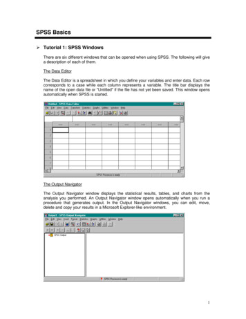
The software used is SPSS (Statistical Package for the Social Sciences) . appear on the Windows task bar at the bottom of your screen. The new window has a title, have a look in its title bar at the top of its window. 4. Look at the output. If you want t