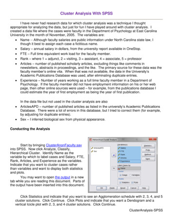
Transcription
SPSS: Displaying DataFor WindowsAugust 2012
SPSS: Displaying DataTable of ContentsSection 1: Introduction .3Section 2: Tables .3Section 3: Exporting Tables in SPSS .6Section 4: Bar Graphs .7Section 5: Scatterplots . 10Section 6: Modifying and Exporting Graphs . 18Section 7: Interactive Charts. 222The Division of Statistics Scientific Computation, The University of Texas at Austin
SPSS: Displaying DataSection 1: IntroductionThis document is the third module of a four module tutorial series. This document describes theuse of SPSS to create and modify tables which can be exported to other applications. Graphicaldisplays of data are also discussed, including bar graphs and scatterplots as well as a discussionson how to modify graphs using the SPSS Chart Editor and Interactive Graphs. If you are notfamiliar with SPSS or need more information about how to get SPSS to read your data, consultthe first module, SPSS for Windows: Getting Started, of this four part tutorial.This set of documents uses a sample dataset, Employee data.sav, that SPSS provides. It can befound in the root SPSS directory. If you installed SPSS in the default location, then this file willbe located in the following location: C:\Program Files\SPSS\Employee Data.sav.Section 2: TablesMuch of the output in SPSS is displayed in a pivot table format. While these pivot tables areprofessional quality in their appearance, you may wish to alter their appearance or export them toanother application. There are several ways in which you can modify tables. In this section, wewill discuss how you can alter text, modify a table's appearance, and export information in tablesto other applications.To edit the text in any SPSS output table, you should first double-click that table. This willoutline dashed lines, as shown in the figure below, indicating that it is ready to be edited. Someof the most commonly used editing techniques are changing the width of rows and columns,altering text, and moving text. Each of these topics are discussed below: Changing column width and altering text. To change column widths, move the mousearrow above the lines defining the columns until the arrow changes to a double-headedarrow faceing left and right. When you see this new arrow, press down on your leftmouse button, then drag the line until the column is the width you want, then release yourmouse button.Editing text. First double-click on the cell you wish to edit, then place your cursor onthat cell and modify or replace the existing text. For example, in the frequency tableshown below, the table was double-clicked to activate it, then the pivot table's title wasdouble-clicked to activate the title. The original title, "Employment Category," wasmodified by adding the additional text, "as of August 1999."Using basic editing commands, such as cut, copy, delete, and paste. When you cut andcopy rows, columns, or a combination of rows and columns by using the Edit menu'soptions, the cell structure is preserved and these values can easily be pasted into aspreadsheet or table in another application.3The Division of Statistics Scientific Computation, The University of Texas at Austin
SPSS: Displaying DataAside from changing the text in a table, you may also wish to change the appearance of the tableitself. But first, it is best to have an understanding of the SPSS TableLook concept. A TableLookis a file that contains all of the information about the formatting and appearance of a table,including fonts, the width and height of rows and columns, coloring, etc. There are severalpredefined TableLooks that can be viewed by first right-clicking on an active table, thenselecting the TableLooks menu item. Doing so will produce the following dialog box:4The Division of Statistics Scientific Computation, The University of Texas at Austin
SPSS: Displaying DataThis dialog box will allow you to modify the appearance of your table. Use the tab and cursorkeys to navigate the different table look options. When you have selected the table look youwant, type the Tab key until "Ok" is selected, then type Enter.You can browse the available TableLooks by clicking on the file names in the TableLook Filesbox, as shown above. This will show you a preview of the TableLook in the Sample box.While the TableLooks dialog box provides an easy way to change the look of your table, youmay wish to have more control of the look or create your own TableLook. To modify an existingtable, right-click on an active pivot table, then select the Table Properties menu item. This willproduce the following dialog box:The above figure shows the Table Properties dialog box with the Cell Formats tab selected.You can alternate between tabs (e.g., General, Footnotes, etc.) by clicking on the tab at the upperleft of the dialog box. While a complete description of the options available in the TableProperties dialog box is beyond the scope of this document, there are a few key concepts that areworth mentioning. Note the Area box at the upper right of the dialog box. This refers to theportion of the box that is being modified by the options on the left side of the box. For example,the color in the Background of the Data portion of the table was changed to black and the colorof the text was changed to white by first choosing Data from the Area box, then selecting blackfrom the Background drop-down menu and selecting white for the text by clicking on the colorpalette icon in the Text area on the left side of the dialog box.5The Division of Statistics Scientific Computation, The University of Texas at Austin
SPSS: Displaying DataThis dialog box will also allow you to modify the appearance of your table. Use the mouse tonavigate and select the options you want.The Printing tab also has some useful options. For example, the default option for threedimensional tables containing several layers is that only the visible layer will be printed. One ofthe options under the Printing tab allows you to request that all layers be printed as individualtables. Another useful Printing option is the Rescale wide/long tables to fit page, which willshrink a table that is larger than a page so that it will fit on a single page.Any modifications to a specific table can be saved as a TableLook. By saving a TableLook, youwill be saving all of the layout properties of that table and can thus apply that look to other tablesin the future. To save a TableLook, click on the General tab in the Table Properties dialog box.There are three buttons on the bottom right of this box. Use the Save Look button to save aTableLook. That button will produce a standard Save As dialog box with which you can save theTableLook you created.Section 3: Exporting Tables in SPSSIn addition to modifying a table's appearance, you may also wish to export that table. There arethree primary ways to export tables in SPSS. To get a menu that contains the available optionsfor exporting tables, right-click on the table you wish to export. The three options for exportingtables are: Copy, Copy object, and Export.The Copy option copies the text and preserves the rows and columns of your table but does notcopy formatting, such as colors and borders. This is a good option if you want to modify thetable in another application. When you select this option, the table will be copied into yoursystem clipboard. Then, to paste the table, select the Paste command from the Edit menu in theapplication to which you are importing the table. The Copy option is useful if you plan to formatyour table in the new application; the disadvantage of this method is that only the text and tableformatting remains and you will therefore lose much of the formatting that you observe in theOutput Viewer.The Copy object method will copy the table exactly as it appears in the SPSS Output Viewer.When you select this option, the table will be copied into your clipboard and can be importedinto another application by selecting the Paste option from the Edit menu of that application.When you paste the table using this option, it will appear exactly as it is in the Output Viewer.The disadvantage of this method is that it can be more difficult to change the appearance of thetable once it has been imported.The third method, Export, allows you to save the table as an HTML or an ASCII file. The resultis similar to the the Copy command: you will have a table that retains the text and cell layout ofthe table you exported, but it will retain little formatting. This method for exporting tables toother applications is different from the above two methods in that it creates a file containing thetable rather than placing a copy in the system clipboard. When you select this method, you willimmediately be presented with a dialog box allowing you to choose the format of the file you are6The Division of Statistics Scientific Computation, The University of Texas at Austin
SPSS: Displaying Datasaving and its location on disk. The primary advantage of this method is that you canimmediately create an HTML file that can be viewed in a Web browser.Section 4: Bar GraphsBar graphs are a common way to graphically display the data that represent the frequency ofeach level of a variable. They can be used to illustrate the relative frequency of levels of avariable by graphically displaying the number of cases at each level of the variable. For example,you could compare the distribution of employees among employment categories by plotting thefrequency of each job category next to the other job categories. If you want to develop a similardisplay for a continuous variable, examine the Histogram option on the Graphs menu. To accessthe SPSS facilities for visually displaying data, including the bar graph procedure, select the Baroption from the Graphs menu:GraphsBar.This will produce the following dialog box:In this dialog box, you must choose between the three types of bar graphs offered by SPSS. TheSimple bar graph is the most common one and is used to graph frequencies of levels within avariable. In the Simple bar graph, the category axis is the variable and each bar represents a levelof the variable.The Bar Charts dialog box allows you to choose what type of chart you would like. To open theBar Charts dialog box, while in the data editor type Alt G and B. Use the Tab and cursor keysto select the Bar Chart that you want. When you have made your selection, type Tab until the"Define" button is selected, then type Enter.7The Division of Statistics Scientific Computation, The University of Texas at Austin
SPSS: Displaying DataThe other two types of bar graphs are used in situations where you want to graph frequencies formore than one variable. For example, if you want to graph job category by gender of employee,then you would choose either the Clustered or Stacked options in the above dialog box. TheClustered option groups together bars representing levels of a category. For example, in graphinggender by job category, you could produce a bar graph in which male and female, the levels ofthe gender variable, are grouped next to each other for each of the three levels of the jobcategory variable:The other bar graph option for two variables is the Stacked option, which will have a bar for eachlevel of one of the variables, while the levels of the other variable are placed on top of each otherwithin each bar. The frequency of each level within a variable in a stacked bar graph isrepresented by a different color. For example, you could create a graph in which there was a barfor the levels of gender, male and female, and the numbers of males in females within eachemployment category are represented by a different color within a bar:8The Division of Statistics Scientific Computation, The University of Texas at Austin
SPSS: Displaying DataThis discussion will focus on the the Simple graph. The options for all three are similar, so anunderstanding of the Simple option will suffice for either the Clustered or Stacked options. Toget started with the bar graph, click on the icon representing the type of graph that you want, thenclick on the Define button to produce the following dialog box:The Define Bar Chart dialog box allows you to choose the variables represented in your simplechart. Within this dialog box, use the Tab and cursor keys to navigate. When you have selectedthe options you want, type Tab until the "Ok" button is selected, then type Enter.9The Division of Statistics Scientific Computation, The University of Texas at Austin
SPSS: Displaying DataYou may create the same Bar chart in SPSS by using the following syntax:GRAPH/BAR(SIMPLE) COUNT BY jobcat/MISSING REPORT.To open a syntax window to use the above syntax, type Alt F, N, and S.In this dialog box, theCategory Axis is the only box that you must fill in. Click on a variable name in the list ofvariables at left and move it to the Category Axis box by clicking on the arrow next to that box.You should also select the summary information that you want in the Bars Represent section ofthe box. The N of cases option is the default and is the most common way of summarizing datain a bar graph. There is little difference between using the N of cases and the % of cases options,other than the unit of measurement in the vertical axis. Using either the Cum. n of cases or theCum. % of cases options will produce a cumulative graph in which the first bar represents thelevel of a variable with the fewest number of cases, then then next bar represents the level withthe second fewest number of cases in addition to the level that has previously been graphed, andso on.In addition to these four options, you can also use the Other summary function option to specifyanother summary statistic, such as a variable's mean, sum, or variance. As in the above example,begin by selecting a Category Axis variable. Next, select the Other summary function, then placeanother variable in the box labels Variable. For example, you could select the variable salary toobtain the mean salary for each level of the variable jobcat. Doing so would produce thefollowing table:Section 5: Scatterplots10The Division of Statistics Scientific Computation, The University of Texas at Austin
SPSS: Displaying DataScatterplots give you a tool for visualizing the relationship between two or more variables.Scatterplots are especially useful when you are examining the relationship between continuousvaraibles using statistical techniques such as correlation or regression. Scatterplots are also oftenused to evaluate the bivariate relationships in regression analyses. To obtain a scatterplot inSPSS, go to the Graphs menu and select Scatter:GraphsScatter.This will produce the following dialog box:Note that there are four scatterplot options. The Simple option graphs the relationship betweentwo variables. The Matrix option is for two or more variables that you want graphed in everycombination: variable is plotted with every other variable. Every combination is plotted twice sothat each variable appears on both the X and Y axis. For example, if you specified a Matrixscatterplot with three variables, salary, salbegin, and jobtime, you would receive the followingscatterplot matrix:11The Division of Statistics Scientific Computation, The University of Texas at Austin
SPSS: Displaying DataThe third scatterplot option is the Overlay option. It allows you to plot two scatterplots on top ofeach other. The plots are distinguished by color on the overlaid plot. For example, you could ploteducation by beginning and current salaries by pairing the variables educ with salbegin and educwith salary using our example dataset. Doing so would produce the graph shown below. In thatgraph, the green points represent the educ x salbegin plot whereas the red points represent theeduc x salary plot.The fourth option for scatterplots is the 3-D scatterplot. This is used to plot three variables inthree dimensional space. Here is an example of the 3-D option, containing the variables, educ,salary, and salbegin:12The Division of Statistics Scientific Computation, The University of Texas at Austin
SPSS: Displaying DataReturning to the Simple scatterplot option, you can examine some of the options that arecommonly used with a basic scatterplot by plotting the values of two variables. When you selectthe Simple option from the initial dialog box, you will get the following dialog box:Select the two variables that you want to plot from the list on the left, placing one in the Y axisbox and the other in the X axis box. If you have multiple groups (e.g., males and females) in yourdataset, you can have SPSS draw different colored markers for each group by entering a groupvariable in the Set Markers by box.13The Division of Statistics Scientific Computation, The University of Texas at Austin
SPSS: Displaying DataYou may create the same scatterplot in SPSS by using the following syntax:GRAPH/SCATTERPLOT(BIVAR) salbegin WITH salary/MISSING LISTWISE .You can add titles to your chart by clicking on the Titles button.Clicking OK in the dialog box will produce the following scatterplot:Some of the most useful options for modifying your scatterplot are only available after you havethe initial scatterplot created. To use these options, double-click on the chart. This will open thechart in a new window, as shown below:14The Division of Statistics Scientific Computation, The University of Texas at Austin
SPSS: Displaying DataTo navigate back and forth between the main dataset window and output windows, you can usethe Window navigation keystrokes:Go to first working window (usually the data editor) Alt W and 1Go to second working window Alt W and 2Go to third working window Alt W and 3etc. (the windows will be assigned numbers in the order in which they were opened or created inthis session. Thus, if you open the data editor, then produce output, and then open a chartwindow, your windows will be assigned as follows: 1 Data Editor; 2 Output; 3 Chart. If youhave multiple chart or output windows, they will each be assigned their own number in the orderin which they were opened or created).From the chart window, you have several options for modifying your chart. We will only dealwith scatterplot-specific options here, as many of the general options will be covered in the nextsection. To get the scatterplot options, select Options from the Chart menu:ChartOptions.To get the following dialog box:15The Division of Statistics Scientific Computation, The University of Texas at Austin
SPSS: Displaying DataSome of the most useful options that will add information to your scatterplot are the Sunflowersand the Fit Line options. The Show sunflowers option draws spikes that resemble petals for eachcase where there are overlapping cases in the scatterplot. Clicking on the Sunflower Optionsbutton will then give you several options for defining how fine or coarse you want the spikes toappear and how many cases are represented by each spike in your scatterplot. See the chart at theend of this section for an example of sunflowers on a scatterplot. The Fit Line option will allowyou to plot a regression line over your scatter plot. Click on the Fit Options button to get thisdialog box:Next, click on the type of regression line you want in the Fit Method box. The Linear regressionline is the most commonly plotted regression line, and it represents the linear increase in the Yvariable as a function of increases in the X variable. The graph below illustrates a linearregression line plotted on a sunflower scatterplot. If you have a quadratic or cubic term in yourmodel, you will likely be interested in plotting one of those fit lines.16The Division of Statistics Scientific Computation, The University of Texas at Austin
SPSS: Displaying DataOne common extension of the above example is to plot separate regression lines for subgroups.For example, you could plot separate regression lines for men and women in the above exampleto visually examine whether the relationship between beginning salaries and current salaries isthe same for both men and women. To do this, you will first need to select a categorical variablein the main scatterplot dialog box (this is the dialog box that is labeled Simple Scatterplot). Placea categorical variable in the box labeled Set Markers by. After doing that, follow the rest of theabove steps until you reach the dialog box labeled Scatterplot Options. There, you can defineseparate regression lines for your groups by selecting the Subgroups option in the Fit Linesection of the Scatterplots dialog box. Doing so produces the graph shown below:17The Division of Statistics Scientific Computation, The University of Texas at Austin
SPSS: Displaying DataSection 6: Modifying and Exporting GraphsThe primary tool for modifying charts in SPSS is the Chart Editor. The Chart Editor will open ina new window, displaying a chart from your Output Viewer. The Chart Editor has several toolsfor changing the appearance of your charts or even the type of chart that you are using. To openthe Chart Editor, double-click on an existing chart and the Chart Editor window will openautomatically. The Chart Editor shown below contains a bar graph of employment categories:18The Division of Statistics Scientific Computation, The University of Texas at Austin
SPSS: Displaying DataYou may create the same Bar chart in SPSS by using the following syntax:GRAPH/BAR(SIMPLE) COUNT BY jobcat/MISSING REPORT.While there are many useful features in the Chart Editor, we will concentrate on the three ofthem: changing the type of chart, modifying text in the chart, and modifying the graphs.You can change the type of chart that you are using to display your data using the Chart Editor.For example, if you want to compare how your data would look when displayed as a bar graphand as a pie chart, you can do this from the Gallery menu:GalleryPie.Selecting this option will change the above bar graph into the following pie chart:19The Division of Statistics Scientific Computation, The University of Texas at Austin
SPSS: Displaying DataOnce you have selected your graphical look, you can start modifying the appearance of yourgraph. One aspect of the chart that you may want to alter is the text, including the titles,footnotes, and value labels. Many of these options are available from the Chart menu. Forexample, the Title option could be selected from the Chart menu to alter the charts title:ChartTitle.Selecting this menu item will produce the following dialog box:The title "Employment Categories" was entered in the box above and the default justificationwas changed from left to center in the Title Justification box. Clicking OK here would cause thistitle to appear at the top center of the above pie chart. Other text in the chart, such as footnotes,legends, and annotations, can be altered similarly. The labels for the individual slices of the pies20The Division of Statistics Scientific Computation, The University of Texas at Austin
SPSS: Displaying Datacan also be modified, although it may not be obvious from the menu items. To alter the labels forareas of the pie, choose the Options item from the Chart menu.ChartOptions.This will produce the following dialog box:In addition to providing some general options for displaying the slices, the Labels sectionenables you to alter the text labeling slices of the pie chart as well as format that text. You canclick the Edit Text button to change the text for the labels. Doing so will produce the followingdialog box:To edit individual labels, first click on the current label, which will be displayed below the Labelbox, then alter the text in the Label box. When you finish, click the Continue button to return tothe Pie Options dialog box. You can make changes to the format of your labels by clicking theFormat button here. If you do not want to to change formatting, click on OK to return to theChart Editor.In addition to altering the text in your chart, you may also want to change the appearance of thegraph with which you are working. Options for changing the appearance of graphs can beaccessed from the Format menu. Many options available from this menu are specific to aparticular type of graph. There are some general options that are worth discussing here. One suchis Fill Pattern option, which changes the pattern of the graph. It can be obtained by selecting theFill Pattern option from the Format menu:21The Division of Statistics Scientific Computation, The University of Texas at Austin
SPSS: Displaying DataFormatFill Pattern.This will produce the following dialog box:First, click on the portion of the graph where you want to change the pattern, then select thepattern you want by clicking on the pattern sample on the left side of the dialog box. Then, clickthe Apply button to change the appearance of your graph.One other formatting option that is generally useful is the the ability to change the colors of yourgraphs. To do that, select the Color option from the Format menu:FormatColor.To produce the following dialog box:This will allow you to change the color of a portion of a graph and its border. First, select theportion of the graph for which you would like to change its color, then select the Fill option ifyou want to change the color of a portion of the graph and select the Border option if you want tochange the color of the border for a portion of the graph. Next, click on the color that you wantand click Apply. Repeat this process for each area or border in the graph that you want tochange.Section 7: Interactive Charts22The Division of Statistics Scientific Computation, The University of Texas at Austin
SPSS: Displaying DataMany of the standard graphs available through SPSS are also available as interactive charts.Interactive charts offer more flexibility than standard SPSS graphics: you can add variables to anexisting chart, add features to the charts, and change the summary statistics used in the chart. Toobtain a list of the available interactive charts, select the Interactive option from the Graphsmenu:GraphsInteractiveSelecting one of the available options will produce a dialog for designing an interactive graph.For example, if you selected the Boxplot option from the menu, you would get this dialog box:Dialog boxes for interactive charts have many of the same features as other SPSS dialog boxes.For example, in the above dialog box, the variable type is represented by icons: scale variables,such as the variable bdate, are represented by the icon that resembles a ruler, while categoricalvariables, such as the variable educ, are represented by the icon that resembles a set of blocks.Variables in the variable list on the left of the dialog box can be moved into the boxes on theright side of the screen by dragging them with your mouse, in contrast to using the arrow button23The Division of Statistics Scientific Computation, The University of Texas at Austin
SPSS: Displaying Dataused in other SPSS dialog boxes. Options in interactive graphs can be accessed by clicking onthe tabs. For example, clicking on the Boxes tab produces the following dialog box:Here, you have several choices about the look of your boxplot. The choice to display the medianline is selected here, but the options to indicate outliers and extremes are not selected. The Titlesand Options tabs offer several other choices for altering the look of your table as well, although athorough discussion of these is beyond the scope of this document. When you have finished thespecifications for a graph, click the OK button to produce the graph you have specified in theOutput Viewer.Interactive graphs offer several choices for altering the look of the chart after you have a draft inthe Output Viewer. To get the menus for doing that, double-click on the interactive graph thatyou want to alter. For example, double-clicking on the boxplot obtained through the above dialogbox will produce the following menus:24The Division of Statistics Scientific Computation, The University of Texas at Austin
SPSS: Displaying DataThe icons immediately surrounding the graph provide you with several possibilities for alteringthe look of your graph. The three leftmost items in the horizontal menu are worthy of mention.The leftmost icon produces a dialog box that resembles the original Interactive Graphs dialogbox and contains many of the same options. For example, you could change the variables thatyou are graphing using this dialog box. The next icon, the small bar graph, lets you addadditional graphical information. For example. you could overlay a line that graphed the meansof the three groups in the above graph by choosing the Dot-Line option from the menu, or youcould add circles representing individuals salaries within each group by choosing the Cloudoption. The third icon provides several options for changing the look of your chart. Selecting thaticon will produce the following dialog box:25The Division of Statistics Scientific Computation, The University of Texas at Austin
SPSS: Displaying DataEach icon in this di
SPSS: Displaying Data 2 The Division of Statistics Scientific Computation, The University of Texas at Austin . SPSS for Windows: Getting Started, of this four part tutorial. This set of documents uses a sample dataset, Employee data.sav, that SPSS provides. It can be found in the root SPSS directory. If you installed SPSS in the default .