Transcription
Forecasting Hotspots - A Predictive Visual Analytics ApproachRoss Maciejewski PurdueRyan Hafen Stephen Rudolph David S. Ebert University Regional Visualization and Analytics Center (PURVAC)A BSTRACTCurrent visual analytics systems provide users with the means toexplore trends amongst their data. Linked views and interactive displays provide insight into correlations between space, time, events,people and places. Analysts search for events of interest throughstatistical tools linked to visual displays, drill down into the data,and form hypotheses based upon the available information. However, current systems stop short of predicting events. In spatiotemporal data, analysts are searching for regions of space and time withunusually high incidences of events (hotspots). In the cases thathotspots are found, analysts would like to predict how these regions may grow in order to plan decision support and preventativemeasures. Furthermore, analysts would also like to predict wherefuture hotspots may occur. To facilitate such forecasting, we havecreated a predictive visual analytics toolkit that provides analystswith linked geo-spatiotemporal and statistical analytic views. Oursystem models spatiotemporal events through the combination ofkernel density estimation for event distribution and seasonal trenddecomposition by loess smoothing for temporal predictions. Weprovide analysts with estimates of error in our temporal modeling,along with temporal alerts to indicate the occurrence of hotspots.Spatial data is distributed based on a modeling of previous event locations, thereby maintaining a temporal coherence with past events.Such tools allow analysts to perform real-time hypothesis testing,plan intervention strategies, and allocate resources to correspond toperceived threats.Keywords:surveillance.1Predictive analytics, visual analytics, syndromicM OTIVATIONVisual analytics has been defined as the science of analytical reasoning assisted by interactive visual interfaces [29]. Recently, visual analytics systems (e.g., [23, 27, 31]) have been developedthat allow users to interactively explore their data through linkedwindows, temporal histories, document aggregations and numerousother views. Such systems allow users to find correlations betweenevents and begin forming hypotheses about what events may beoccurring in the future; however, the primary use of such systemstends to be reactive, meaning that analytic systems are typicallyused in the context of alert generation. As event data is captured, algorithms and analysts search for unexpected events, and these unexpected events then trigger an alert. Analysts react by drilling downinto the data to confirm the alert, redistributing resources to control the problem, etc. Unfortunately, in a reactive situation, eventshave already occurred that are negatively affecting the populationunder analysis. In this work, we propose the addition of a suite ofpredictive analytics tools as a means of enhancing current analysis systems, thereby moving from a solely reactive paradigm to aproactive paradigm. e-mail:William S. Cleveland {rmacieje rhafen srudolph wsc ebertd}@purdue.eduOur predictive analytics system focuses on categorical geospatiotemporal event data (e.g., financial data, crime reports, emergency department logs). In such data, events consist of locationsin time and/or space, and each event fits into a hierarchical categorization structure. These categories can be filtered by linked data(e.g., demographic information), and the events may be mapped to aparticular spatial location. Data categories are typically processedas either time series aggregated over some spatial location (e.g.,county, zip code, collection station), or spatial snapshots of a smalltime aggregate (e.g., day, week). These aggregations are then analyzed for counts that exceed the expected value by some threshold.There are also systems that allow for spatiotemporal alert detection(e.g., [17]), but such systems become intractable as the data set becomes large. As previously stated, these types of alert systems forceanalysts into a reactive paradigm. As such, tools are needed thatnot only perform these alert calculations based on current events,but also perform alert calculations on predicted data.To this end, we have developed a series of novel predictive analytics tools. We base our extensions on the framework developedby Maciejewski et al. [23, 24] to move from an understanding ofspatiotemporal alerts (hotspots) to a predictive modeling of suchalerts; however, it is important to note that such methods are readily transferable to any similar data analysis systems. Novel systemfeatures include the following: The application of seasonal trend decomposition by loess fortime series prediction Scalable 3D kernel density estimation for spatiotemporal prediction to maintain temporal coherence Multiple spatial aggregation schemes for hotspot analysis andforecasting Linked spatial and temporal views for analysis and forecastingIn order to demonstrate the impact of such tools, we focus ourdiscussion on a representative categorical geo-spatiotemporal dataset, syndromic surveillance data. Syndromic surveillance is an areaof healthcare monitoring that focuses on the detection of adversehealth events using pre-diagnosis information from emergency departments. Such data has long been recognized as providing meaningful measures for disease risks in populations [18, 28], and provides a solid base for discussing the impact of our methods. In thispaper, we utilize data provided by the Indiana State Departmentof Health (ISDH) through their Public Health Emergency Surveillance System (PHESS) [13], which provides electronically transmitted patient data (in the form of Emergency Department chiefcomplaints) from 77 hospitals around the state at an average rateof 7500 records per day. These complaints are classified into ninecategories (respiratory, gastro-intestinal, hemorrhagic, rash, fever,neurological, botulinic, shock/coma, and other) [6] and used as indicators to detect public health emergencies before such an eventis confirmed by diagnosis or overt activity. Further, to demonstrateour event detection and prediction methods, we employ the synthetic disease injection tools developed by Maciejewski et al. [22].Our work focuses on advanced interactive visualization and analysis methods providing linked environments of geosaptial data and
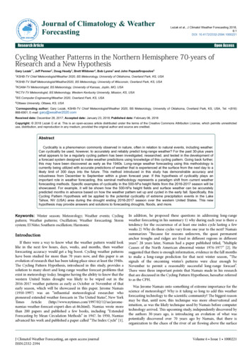
Figure 1: Our interactive predictive visual analytics environment. In this case, the interface has been customized for exploring syndromicsurveillance data. The user is analyzing respiratory syndrome counts across the state at a county level aggregation. In the time series windowyellow diamonds indicate temporal alerts, the white line represents the current day, and the transparent polygon represents the bounds of thetime series prediction. Note that predicted values are only displayed when data is not available.time series graphs. Time series events are forecasted for a range ofspatial aggregations, providing a context in which to explore potential future events. Time series alerts are generated for current andpredicted event thresholds, and analysts can explore future eventbounds for resource management and response scenarios. Alertsgenerated in the temporal realm can be quickly analyzed in the geospatiotemporal interface, helping users find patterns simultaneouslyin both the spatial and temporal domain. Event distributions aregenerated based on population density distributions with respect tothe Emergency Department (in a more generic sense, this can beviewed as any central data collection location, for example, a police department, financial institution, etc.), and these distributionsare then used in conjunction with the historical data to model theexpected population density of events in order to maintain temporal coherence amongst hotspots. Such methods can provide insightinto the ongoing impact of current events, and provide advancedwarning for future events, thereby improving interdiction and response.2R ELATED W ORKRecently, the development of visual analytics systems for data analysis and exploration has been rapidly growing (e.g., [4, 19, 27, 31]).These systems incorporate a variety of visualization techniquesfrom traditional, widely used methods, such as scatterplots or parallel coordinate plots to more recently developed tools (e.g., spiralgraphs [5], theme river [15]). Techniques common across these systems include the probing, brushing and linking of data in order tohelp analysts refine their hypotheses, and these systems emphasizethe interaction between human cognition and computation throughdynamically linked statistical graphs and geographical representations of the data. However, while these systems allow users to explore their data and form hypotheses, it has been only recently thatvisual analytics systems have begun progressing towards predictiveanalytics (e.g., [32, 33]).Analytic systems in the realm of syndromic surveillance includethe Early Aberration Reporting System (EARS) [16] and the Electronic Surveillance System for the Early Notification of Community based Epidemics ESSENCE [20]. Unfortunately, all of thesesystems offer limited data exploration tools and analytic capability is limited to reactive alerts. Furthermore, these systems tend togenerate a large amount of false positives for epidemiologists to analyze. Work in the geographical and visual analytics communitieshave attempted to improve healthcare data analysis and explorationthrough a variety of systems (e.g., [21, 23, 30]) using linked viewsand interactive plotting; however, these systems also stop short ofpredicting future events.The concept of predictive analytics is found widely across financial services (e.g. credit scoring), retail sales, and health care. Withrespect to categorical geo-spatiotemporal event data, we focus ourdiscussion solely on time series modeling and spatiotemporal modeling for forecasting events. A summary of time series analysisin biostatistics can be found in [10]. Common time series modeling techniques include the use of auto regressive moving average(ARMA) models (e.g., [1]) which describe stationary time series,and auto regressive integrated moving (ARIMA) average models(e.g., [25]). While such models are useful, we focus on the application of a non-parametric method, seasonal decomposition of timeseries by loess (STL) [7]. This method allows for flexible modelingof the differing onsets and shapes of seasonal peaks, and allows usto account for other components of variation also, see Section 3.2for details.Along with time series modeling and prediction, our work alsofocuses on spatiotemporal predictions. A summary of spatial modeling and geostatistical methods can be found in [11] and [12]. Diggle noted that typically, the temporal prediction should take precedence over the spatial. As such, we utilize temporal modeling forpredicting events, and employ the use of kernel density estimationfor creating a probability distribution of patient locations. This
probability distribution is then used to place the number of predicted patients into geospatial locations, see Section 3.3 for moredetails.preparedness (i.e., if an outbreak has occurred or is expected to occur, staff members may be informed of the predicted models andcan look for specific symptoms).33.2.1 Prediction with Cumulative SummationIn terms of outbreak detection through time series analysis, one ofthe standard epidemiological algorithms employed is the cumulative summation (CUSUM) [16]. Xt (µ0 kσxt )St max 0, St 1 (1)σxtP REDICTIVE A NALYTIC E NVIRONMENTOur current work extends the system developed by Maciejewskiet al. [23, 24]. As in many visual analytic and information visualization systems, we utilize dually linked interactive displays formulti-domain/multivariate exploration and analysis as well as interactive filter controls for variable selection. We extend both thespatial and temporal viewing windows to incorporate spatiotemporal predictions for enhanced data analysis and exploration, movingfrom a visual analytics environment to a predictive visual analyticsenvironment.Figure 1 presents a screenshot of our system. In this example, the user is exploring potential future outbreaks of respiratorysyndromes across the state of Indiana. The data displayed in thegeospatial window utilizes a color mapping based on the percentage of patients that went to an emergency department classified ashaving respiratory syndromes using a sequential color scheme [2].Users may interactively view other syndromes, or filter the data byage, gender and/or keyword in order to perform more complex analyses. Selection of counties and/or hospitals are displayed in thetime series windows on the right. The time series plots provide anupper and lower bounds of prediction through an overlaid transparent polygon. The white vertical line serves as a reference forthe geospatial date shown on the left. Note that predicted data isonly displayed when actual data is not available. The contributionsof our new system include methods for spatiotemporal predictionand methods for the interactive visualization of these predictions.We employ the use of several time series modeling techniques fordata forecasting, and use the results of these predictions in a spatialmodeling scheme to represent event distributions.Equation 1 describes the CUSUM algorithm, where St is the current CUSUM, St 1 is the previous CUSUM, Xt is the count at thecurrent time, µ0 is the expected value, σxt is the standard deviation,and k is the detectable shift from the mean (i.e., the number of standard deviations the data can be from the expected value before analert is triggered). We apply a 28 day sliding window to calculatethe mean, µ0 , and standard deviation, σxt , with a 3 day lag, meaning that the mean and standard deviation are calculated on a 28 daywindow 3 days prior to the day in question. Such a lag is used toincrease sensitivity to continued outbreaks.Given the 3 day lag, we can use the CUSUM method to extend the current time series into the future by simply calculatingthe mean of the sliding window. This method allows us to providethe analyst with both an expected value for the next 3 days (notethe 3 could be modified depending on the chosen lag) and an alertthreshold. While this prediction is limited, the CUSUM method isuseful for providing a quick look at the expected average number ofincoming patients, and thresholds can quickly be set to determinevarious alert levels. For syndromic surveillance data, we utilize thethreshold values of the EARS CUSUM2 model [16] (approximatelytwo standard deviations).3.2.23.1Time Series Power TransformationOne method we have previously applied [24] to simplify temporal analysis was the application of a power transformation to bringthe data more in line with model assumptions [8]. In time seriesanalysis, the logarithm transformation is widely applied when themean is proportional to the standard deviation [3]. In cases wherethe data consists of counts following a Poisson distribution a squareroot transformation will approximately make the mean independentof the standard deviation. In each case, the transformations are necessary to simplify the modeling procedure. We examined our dataunder both a logarithmic and square root power transformation. Theuse of log(x) failed to eliminate the skewness on the right tail of thedistribution for the numberof observations; however, experimental results show that the x stabilizes the variability and yields a skewfree distribution of the time series. As such, all time series analysesare performed on the square root scale of the original series in orderto remove the dependence of a signal’s variance on its mean.3.2Time Series PredictionIn our predictive analytics environment, time series models are usedfor forecasting the future behavior of events. Our temporal modeling is performed over a spatial aggregation of data, meaning the collection of all event records over the state, county, or data collectionagency make up the time series (in the case of syndromic surveillance the collection agency would be the Emergency Department).For multivariate data, we model each event category as a separatetime series signal. Future work will focus on more robust modelsto capture correlations between signals. We employ the use of botha cumulative summation [16] and a seasonal-trend decompositionmodel [7]. These predictions can then be used for supply management (e.g., insuring enough antibiotics are available) and outbreakPrediction with Seasonal-Trend Decomposition Basedon LoessUnfortunately, the CUSUM model fails to take into account someimportant characteristics of chief complaint count data, such as theday-of-the-week. Furthermore, using a 28 day sliding average is notideal for time series with components that evolve over the course ofa month. In order to more accurately model the data, we employ adifferent strategy in which the time series is viewed as the sum ofmultiple components of variation [14]. Seasonal-trend decomposition based on loess (locally weighted regression) [7] is used to separate the time series into its various components. STL componentsof variation arise from smoothing the data using moving weightedleast-squares polynomial fitting, in particular loess [9], with a moving window bandwidth in days. The degree of the polynomial is 0(locally constant), 1 (locally linear), or 2 (locally quadratic).For a given hospital, we decompose our daily patient count datainto a day-of-the-week component, a yearly-seasonal componentthat models seasonal fluctuations, and an inter-annual componentwhich models long term effects, such as hospital growth: Yt Tt St Dt rt(2)where for the t-th day, Yt is the original series, Tt is the inter-annualcomponent, St is the yearly-seasonal component, Dt is the day-ofthe-week effect, and rt is the remainder.The procedure begins by extracting the day-of-the-week component, Dt . First, a low-middle frequency component is fitted using locally linear fitting with a bandwidth of 39 days. ThenDt is the result of means for each day-of-the-week of the Yt minus the low-middle-frequencycomponent. Next, the current Dt is subtracted from the Yt and the low-middle-frequency componentis re-computed. This iterative process is continued until convergence. After removing the day-of-the-week component from the
data, we use loess smoothing to extract the inter-annual component, Tt , using local linear smoothing with a bandwidth of 1000days. Finally, we apply loess smoothing to the data with the dayof-week and inter-annual components removed, thereby obtainingthe yearly-seasonal component, St , using local quadratic smoothing with a bandwidth of 90 days. After removing the day-of-week,inter-annual, and yearly-seasonal components from the time series,the remainder is found to be adequately modeled as independentidentically distributed Gaussian white noise, indicating that all predictable sources of variation have been captured in the model. Allparameters were chosen after extensive data modeling, and detailsmay be found in our previous work [14]. It is important to note thatthese parameters should be modified to work best within the confines of a given data structure; however, the application of STL formodeling and prediction is not delegated only to syndromic surveillance data.For prediction using the STL method, we rely on some statisticalproperties of loess, namely that the fitted values Ŷ (Ŷ1 , . . . , Ŷn ) area linear transformation of the observed data. Y (Y1 , . . . ,Yn ). Eachstep of the STL decomposition involves a linear filter of the data.In other words, an output time series x {x1 , . . . xn } is produced byan input time series w w1 , . . . , wn through a linear combinationnxi hi j w j .(3)i 1If we let H be a matrix whose (i, j)-th element is hi j , then we havex Hw.(4)We will refer to H as the operator matrix of the filter. Now, letHD , HS , and HT denote the operator matrices of the day-of-week,yearly-seasonal, and inter-annual filters, respectively. All of thesematrices are n n. HS and HT are straightforward to calculate [9],but HD is more difficult to calculate as it is the result of an iterationof smoothing. Once all of these have been calculated, the operatormatrix for the entire procedure, H can be written asH HD HT (I HD ) HS (I HD HT (I HD )),(5)where I is the n n identity matrix. Now, the fitted values are obtained byŶ HY.(6)To make better sense of Equation 5, the day-of-the-week smoothing, HD , is applied to the raw data, while the inter-annual smoothing, HT , is applied to the raw data with the day-of-week removed,and finally, the yearly-seasonal smoothing, HS , is applied to the rawdata with the day-of-week and inter-annual removed.Now, the variance of the fitted values is easily obtainedVar(Ŷi ) σ̂ 2n Hi2j ,(7)j 1where σ̂ 2 is the variance of Y , and can be estimated from the remainder term rt .Now, if we wish to predict ahead, a days, we append the operatormatrix H with a new rows, obtained from predicting ahead withineach linear filter and use this to obtain the predicted value and variance. For example, if we wish to predict the value for day n 1, wewould obtainnŶn 1 Hn 1, jY j(8)j 1andn2Var(Ŷn 1 ) σ̂ 2 (1 Hn 1,j ),j 1(9)Figure 2: Seasonal-trend decomposition based on loess predictioncompared to actual measurements.so that a 95% prediction interval will be calculated asqŶn 1 1.96 Var(Ŷn 1 ).(10)To demonstrate our prediction model, we have utilized data fromPHESS from January 1, 2006 through December 31, 2007 for asingle emergency department. Our STL modeling and predictionmethod is applied to this data to predict January 1, 2008 throughJanuary 14, 2008. We then compare this prediction to the actualdata in Figure 2. Here we can see that the model is able to captureproperties of the signal; however, it is important to note that as thepredictions move further into the future, the accuracy decreases.Comparable results were found for all other hospitals in our system.3.3Geospatial PredictionWhile the temporal prediction provides a forecast of the number ofexpected events, we are also interested in providing analysts witha means to analyze the expected spatial distributions. As statedabove, our time series prediction can be performed over a varietyof spatial aggregations. As such, we allow users to choose betweenseveral granularities of the spatial prediction using various data aggregations in the time series prediction as a basis for our event distribution.3.3.1Geographically Aggregated DistributionThe simplest means for spatial prediction is to utilize the time series counts based on an arbitrary geographic boundary (e.g., state,county, zip code), and visualize this information in the form of acolor map. In the case of our system, a time series is associatedwith each geographically defined region (e.g., county, zip code,state). On any given day, we have either the number of events thatoccurred and the predicted number of events, or only the predictednumber. Such values allow for several different comparison methods. In Figure 3 the analyst is scrolling across time through the predictive models, comparing the STL prediction (Figure 3 (Left)) ofrespiratory illness versus total illness with the CUSUM prediction(Figure 3 (Right)). By comparing two different predictive models,the analyst can see where the models disagree and flag those counties as regions to explore in the coming days.3.3.2Spatiotemporal DistributionWhile it is useful to compare temporal predictions across an arbitrary geographical boundary (e.g., county, zip code), it is also usefulto have a model which can incorporate a finer granularity of eventdistribution. As such, we expand on our previous use of density estimation [23] and model the spatiotemporal distributions of patients
Figure 3: Spatiotemporal prediction comparing (Left) the STL prediction and (Right) the CUSUM prediction.based on their ED visits. We employ the use of a modified variablekernel method [26] which scales the parameter of the estimation byallowing the kernel width to vary based upon the distance from Xito the k-th nearest neighbor in the set comprising N 1 points.!N1x Xiˆf (x) 1 K(11)N i 1 max(h,di,k )max(h,di,k )Here, the window width of the kernel placed on the point Xi is proportional to di,k (where di,k is the distance from the i-th sample tothe k-th nearest neighbor) so that data points in regions where thedata is sparse will have flatter kernels, and h is the minimum allowed kernel width.In order to reduce the calculation time, we have utilize theEpanechnikov kernel, Equation 12:3K(u) (1 u2 )1( u 1)4(12)where the function 1( u 1) evaluates to 1 if the inequality is trueand zero for all other cases.Given the predicted number of events from the time series modeling, we want to distribute these events given the probability density function of event locations with respect to some shared geographic location (in the case of syndromic surveillance, we modelthe population distribution served by a given Emergency Department). For each Emergency Department, we know each patient’shome address. These addresses are mapped to a grid centeredaround the hospital, and we employ Equation 11 to create a distribution function representing the probability that a patient willcome to the hospital from a given (latitude, longitude) pair. Wethen randomly distribute the n predicted events according to thisdistribution. This is done for each emergency department to simulate patient distributions across the state.Once the events are distributed, we create a three-dimensionalarray, consisting of a grid of patient locations across the predictedday being visualized and the previous t days. We then perform athree-dimensional kernel density estimation to maintain the temporal coherence of previous hotspots in order to analyze if suchlocations could be persistent across time under the assumption thatpatients will visit the Emergency Department based only on its service area distribution. Finally, the estimated density of the currentdays events (with the incorporated temporal history) is plotted as aratio of the number of events under analysis versus the total numberof events (also calculated to incorporate temporal history). Examples of the use of such modeling are provided in Section 4.4H OTSPOT A NALYSISANDF ORECASTINGBy using a combination of geospatial and temporal visualizationand analytics tools, our system provides epidemiologists with toolsfor real-time hypothesis testing and event prediction. In order todemonstrate the strengths of our modeling tools, we utilize synthetic syndromic surveillance data [22] with known outbreaks. Thissection provides both a retrospective case analysis and a prospective case analysis. We utilize two years worth of synthetic syndromic surveillance data (January 1, 2006 through December 31,2007) with 33 emergency departments across the state of Indiana[22] with two known outbreaks. We utilize synthetic data as opposed to actual data in order to remove privacy concerns; however,we have found the results to be comparable across synthetic andactual data.4.1Retrospective and Reactive AnalysisIn order to illustrate our alert generation using CUSUM and spatialmodeling effects, an outbreak containing patients presenting signsof respiratory illness was introduced beginning on July 18, 2007and ending July 22, 2007. The injection of patients followed a lognormal distribution such that the number of excess patients showingrespiratory syndrome symptoms were 1 on July 18, then 18, 8, 5,3, and 2 for each subsequent day. In Figure 4 (Top-Left) the useris looking at a typical geospatial view at a county level aggregation. Note that in the disease injection area, the counties are onlyshowing a slightly higher percentage than their neighbor; however,if the analyst were to instead look at a comparative view, Figure 4(Top-Right), of the actual patient counts versus the predicted patient counts, a different story unfolds. The analyst can immediatelyidentify a cluster occurring on July 19th in the area where an outbreak was injected. Furthermore, the time series alerts from theCUSUM algorithm, yellow diamonds in Figure 4 (Bottom), furthercorroborate this outbreak.In order to obtain a more localized view of where the outbreak isoccurring, the analyst may switch over to the density estimate view,Figure 5. The analyst can scroll back in time prior to when the firstalert was generated in the hospital’s time series and begin looking
Figure 4: An outbreak has been injected beginning on July 18, 2007 and ending on July 22, 2007. The black circle represents the injection.(Top) Images show July 19, 2007. (Top-Left) A percentile view of patients with respiratory illness. Note that no outbreak is readily observablein this view. (Top-Right) A comparative view of actual patients versus the number of predicted patients. Here the analyst can quickly see whichcounties have exceeded the predicted values.(Bottom) Time series views of the nearby hospital and counties, yellow diamonds indicate alerts.We see that on July 19th, alerts were generated for the three dark red counties overlapped by the injection circle.at the estimated patient density. Notice that the estimated densityremains consistent in the circled area until the outbreak reaches itspeak on July 19th. On that day, the spatial model shows a higherconcentration of patients across a very specific geographic region,and the analysts may then focus their attention on that particularregion as opposed to a multiple county alert that may have been issued if only the views in Figure 4 (Top) had been utilized. However,such a view is only applicable in a reactive manner (the analyst iscomparing what happened on Ju
Forecasting Hotspots - A Predictive Visual Analytics Approach . We employ the use of several time series modeling techniques for data forecasting, and use the results of these predictions in a spatial modelin