Transcription
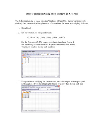
Brief Tutorial on Using Excel to Draw an X-Y PlotThe following tutorial is based on using Windows Office 2003. Earlier versions worksimilarly, but you may find the placement of controls on the menu to be slightly different.1. Open Excel2. For our tutorial, we will plot the data:(5,25), (6, 36), (7,49), (8,64), (9,81), (10,100)For the first entry (5, 25), enter x-coordinate in column A, row 1and enter the y-coordinate in B1. Repeat for the other five points.You Excel window should look like this:2. Use your cursor to highly the columns and rows of data you want to plot (andnothing else). If you have highlighted them properly, they should look like:
4. Drag down the Chart Wizard. If you have chart wizard icon on your menu bar, asshown below, just click on it. Otherwise, drag down Insert until you get to Chart andrelease.5, This will pop a window that look like this. Typically, you will want to chooseXY(Scatter) [and not Line, even though it looks similar – this is the most commonerror people make]
5. Now you Chart Wizard look like the one below. Choose the version you want, mostlike the one shown here, which shows points and connects them by smoothed lines.6. This will convert your highlighted data into a graph, like the one below. Note that itautomatically chooses the axes, the tick marks, and the proportions.
7. To change the range and format of the x-axis, double-click on any number alongthe axis. It pops up a menu with various tabs. The one here allows you to changethe font format.The most important one is called Scale. This allows you to choose the range ofthe x-axis (minimum and maximum values) and the steps between major andminor tick marks. Choose the range to lie between 5 and 10. Then click ok.After you complete this for the x-axis, repeat for the y-axis (click on any numberon the y-axis) and choose a narrow range.
8. After you click OK again, you have an Excel Chart that looks like this:8. To put the finish touches on the plot (the graph and axes label), click on the chart(the graph itself) and a menu item called Chart should appear. Drag it down andchoose Chart Options. It is self-explanatory.
9. Unfortunately, Excel is not too smart. After you have finished making all yourchoices, you might find that you get an cramped or ugly plot like this:Then you have fiddle with resizing the window, re-choosing the axes, etc. untilyou get something you like.There are other controls to play with -- for example, you might see if you canfigure out how to change the legend -- but this is enough to get make charts forthis course.10. (Slight more advanced – Using Excel to do calculations and graph the results.)We will now make a graph of Perfect Cubes. For this purpose, we will use Excelto compute the cubes of the numbers in Column A and put them in Column C.
a. Click on Box C1b. Type: A1 3This tells Excel to take the number in box A1 and cube it. Hit Enter andsee the resultWe could repeat this C2, C3, etc., but we would be repeating the sameoperation over and over. Imagine if there were 1000 numbers inColumn A1 !?c. Instead, use your cursor to highlight C1 thru C6 (where you want thecubes to be placed).
d. Drag down the Edit menu to Fill, then to Down on the submenu (andthen release). This instructs Excel to take the same rule you applied to A1and C1 and apply it successively to (A2, C2), then (A3,C3), etc., as far asyou highlighted:11. Now we want to graph Column A vs. Column C.a. Highlight all THREE columnsb. Choose the Chart wizard as in Step 4. Just hit Next until it finishes andplaces the plot on the Sheet. Notice that it plots both the squares and thecubes
Label axes as before.If you want to change the Legend (so you can mark which curve is the squaresand which is the cube), hit anyplace in the chart. Under the Chart menu, chooseSource Data. A new window pops up:Hit the Tab that reads “Series.” Hit Series1 in the window on lower left.
Under Name, but the Name you want to call the first curve (Squares).Click Ok. The window disappears and now the first curve in the legend has thelabel you chose. Now repeat the process choosing Series2 and giving it the nameyou want (Cubes). The result is:
5. Now you Chart Wizard look like the one below. Choose the version you want, most like the one shown here, which shows points and connects them by smoothed lines. 6. This will convert your highlighted data into a graph,


![Unreal Engine 4 Tutorial Blueprint Tutorial [1] Basic .](/img/5/ue4-blueprints-tutorial-2018.jpg)
