Transcription
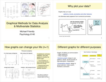
Why plot your data?Graphs help us to seepatterns, trends, anomalies and other featuresnot otherwise easily apparent from numerical summaries.Well, atleast Inoticed!Graphical Methods for Data Analysis& Multivariate StatisticsMichael FriendlyPsychology 6140Source: http://xkcd.com/523/1How graphs can change your life (n 1)2Different graphs for different purposesPersonal analytics15 yr. blood sugar, pre-diagnosisdaily average, after diagnosisA statistician contractsdiabetes, and usesgraphs to monitor hisblood sugar.ĺ Visual feedback ondiet & exercise reinforcebehavioral changeaverage hourly variationresiduals: - daily average and hourlyĺ 5HVLGXDO SORWV VKRZ unexplained events,possibly importantGraphs (& tables) as communication: What audience? What message? Analysis graphs: design to seepatterns, trends, aid the process ofdata description, interpretation Presentation graphs: design toattract attention, make a point,illustrate a conclusionRef: Wainer & Velleman,Looking at blood sugar,Chance, 2008, 21(4), 56-6135
Comparing groups: Analysis vs.Presentation graphsDifferent graphs for different purposesSix different graphs for comparinggroups in a one-way design which group means differ? equal variability? distribution shape?Ooh! what do error bars mean?Ah ha! unusual observations?Never use dynamite plotsAlways explain what error bars meanConsider tradeoff betweensummarization & exposurePresentation graphs: single image for a large audienceExploratory graphs: many images for a narrow audience (you!)67Presentation: Turning tables into graphsPresentation graph: Nightingale’s coxcombGraphs of model coefficients are oftenclearer than tablesFlorence Nightingale: Deaths in theCrimean war from battle vs. othercauses (disease, wounds)She used this to argue for betterfield hospitals (MASH units)The best presentation graphs passthe Interocular Traumatic Test:The message hits you between theeyes!8Source: tables2graphs.com9
Effective data displayRhetorical graph: Common Sense Revolution Make the data stand out Fill the data region (axes, ranges) Use visually distinct symbols (shape, color) for different groups Avoid chart junk, heavy grid lines that detract from the data Facilitate comparison Emphasize the important comparisons visuallySide-by-side easier than in separate panels“data” vs. a “standard” easier against a horizontal lineShow uncertainty where possible1011Make comparisons direct Points not barsConnect similar by linesSame panel rather than different panelsPublished in: Ian Gordon; Sue Finch; Journal of Computational and Graphical Statistics 2015, 24, 1210-1229.DOI: 10.1080/10618600.2014.989324Copyright 2015 American Statistical Association, Institute of Mathematical Statistics, and Interface Foundation of North America1213
Analysis graph: ScreeningShowing uncertainty Standard plots of observed vs. predicted lack a basis for assessment of uncertaintyConfidence envelopes indicate extent of deviationIdentify “noteworthy” observations to track them downSide-by-side boxplots of variables in the baseball data show the shapes ofdistributions --- aid to transformationExample: Normal QQ plots used to assess normality of data Each variable isstandardized to allowcomparison. Plot is produced bydatachk xploratory graphs: Transformations15Diagnostic graphs: TransformationsData often needs to betransformed to meet analysisassumptions:Diagnostic plots can be used tosuggest corrective action, often by apower transformation \ ĺ yp Symmetry ( Normality)Symmetry transformation plot: Linear relations Constructed so symmetric dataplots as horizontal line Constant variance Slope (b) of data line ĺ SRZHU S 1 – b ĺ yp y(1-b)For symmetry, a symbox plotshows a variable transformed tovarious powers.Other diagnostic plots use theVDPH LGHD VORSH E ĺ \(1-b)SAS: symbox macroR: car package: symbox()1617
3Normal Q-Qminister2contractor20Multiple regression model: prestige income educationcontractor0ResidualsministerModel diagnosis: Influence in regression140Residuals vs Fitted0Statistical software shouldmake it easy to getinformative diagnostic plotsStandardized residualsModel diagnosis: regression quartet-1Influence plots can show:-2-20In R, plotting a lm modelobject ĺ WKH ³UHJUHVVLRQ quartet” of plotsreporter model residualreporter020406080100-2-10reporter3 influence residual xleverage (Cook D statistic)minister1 contour map of influence0.501.0-2-10.5Standardized residuals1.5ministercontractorResiduals vs Leverage2Scale-Locationconductor0.0(SAS has similar, usingODS graphics) leverage (potential impact)1 model - lm(prestige income education) plot(model)2Theoretical QuantilesStandardized residualsFitted values10.5reporterCook'sdistance0204060Fitted atterplots: A basic workhorse forquantitative dataScatterplots: Scales matterComputer plots are usuallygenerated with a given aspect ratio,to conform to the page or screen. Show the relation between twoQ variables (ignoring all others!)A better idea is to scale the plot sothat slopes of lines or curvesaverage 45 degrees. More useful when enhanced toshow visual summaries Vary point color/shape to showstrata/groups Combine in multi-paneldisplays to show more Scatter plot matrix: allpairsIn the rescaled version, we can seethat, within each cycle, sunspotstend to increase more quickly thanthey decline. Conditional relations: Y vs.X stratified by Group2021
Scatterplots: Annotations enhance perceptionScatterplots: Annotations enhance perceptionDrawing a smooth curveshows a systematic decreasetoward the end of the year.Data from the US draftlottery, 1970 Birth dates were drawn atrandom to assign a “draftpriority value” (1 bad) The smooth curve is fit byloess, a form of nonparametric regression. Can you see any patternor trend?Visual explanation:Me (May 7): ĺ SULRULW\ 2223Scatterplots: Data ellipsesScatterplots: Data ellipsesGalton’s (1886) semi-graphictable, showing relation ofmid-parent’s height tochildren’s height.Galton’s data on child & mid-parent heights, shown as a sunflower plot: eachsunflower symbol shows the number of observations in the (x, y) cell.As shown:2D density estimate ofbivariate surface Contours of equal frequencyformed ellipses Regression lines of Y on Xand X on Y are the loci ofvertical and horizontaltangents Major/minor axes are theprincipal components2425
Visualizing multivariate dataScatterplots: Data ellipsesAny scatterplot can be summarized by data ellipses (assuming normality). Theseshow: means, standard deviations, and allow correlations & regression lines to bevisually estimated.Data ellipse:E(x y)D ( y ) F (1 D )22pGalton data, 40%, 68% &95% data ellipses. Sizesare: ȋ2 (0.40) 1.0 ȋ2 (0.68) 2.28 ȋ2 (0.95) 6.0Showing relations among 3 or more variables: Scatter plot matrices (enhance with visualsummaries, thin for many variables) Conditional plots: Y X (Z, Group) Seeing multivariate profiles, clusters: Star plots, face plots, parallel coordinatesE(y x) Biplots: project data into low-D view26Scatterplot matrix27Scatterplot matrix Fitness data: Occ. prestige:Oxy Age Weight Runtime Rstpulse Each panel shows rowvar vs. col var Reg line shows linearrelationPrestige %women Educ Income Box, rug plots show univar.distributions Quadratic regressions showlinear/non-linear relations(loess would be better)Questions: What is the best predictor of Oxy? Which two predictors are mosthighly correlated?Questions: How should Educ be modeled? How should Income be modeled?2829
Larger data sets: Visual thinningLarger data sets: CorrgramsBaseball data: log(Salary) performance variablesCorrelation diagram showspattern of correlations for manyvariables. Too much data to showindividual pointsVariables are re-ordered to makethe groupings most visuallyapparent. Each scatterplot issummarized by a loesssmoothed curve and a dataellipseThis graphic assumes that allrelations are linear, notnecessarily always trueQuestions: Which variables are most stronglyrelated to logSal? Which relations are stronglynonlinear? Which predictors are too highlycorrelated?Graph using SAS corrgram macro,http://datavis.ca/sasmac/corrgram.htmlR: corrgram package3031Corrgrams: Different renderingsThe value of a correlation maybe rendered in different ways,with different visual impact.Conditional plots: Y X ZBaseball data PC2/PC1 orderOften want to explore how therelation between Y and Xdepends on/ varies with someother variable(s) Z.AssisError Shading levels: help detectsimilar valuesAtbat Moderator variablesHits Pie symbols: make it easierto compare for larger/smaller InteractionsRunsWalkEmission of NOx from ethanolin relation to enginecompression ratio and richnessof air/ethanol mixture (EE)RBIPutouGraph using R corrgrampackageHomelogSaYears32Graph using R lattice package33
Conditional plots: Y X Z3D plotsOften not useful, unless donewith great care.The same data is shown in adifferent format, withThis plot shows the loesssmoothed predicted values ofNOx in relation to EE and CR.(But, raw data not shown.) loess smooth curves curves banked to 45oThe joint dependence on CRand EE is now much clearerColor is used to show thepredicted NOx, using a“heatmap” color scale.The interpretation is simple!(These are examples oflattice plots, produced usingR software.)343D plots35Seeing multivariate clusters: face plot3D plots can be enormously useful withdynamic, interactive software & perspectiveA faces plot assigns variables tofacial features, to show configuralpatterns of many variables.This plot shows a relation of occupationalprestige to income & education.Pros: Easy to see similar patternsin large data sets. points are shown in perspective,connected to the fitted surfaceCons: Hard to connect features tovariables for interpretation the fitted surface (linear, quadratic,smoothed) can be changedinteractively No good rules/ideas for assigningvariables to features. the plot can be rotated dynamicallyto see other viewsGraph using SAS faces macro,36http://datavis.ca/sasmac/faces.html37
Seeing multivariate clusters: face plotBiplots: variables and obs. in low-D ViewMeans, by make & origin Based on PCA: data is shown in 2D (3D) view that accounts for greatest varianceObservations: plotted as pointsVariables: vectors from origin ( mean)Angles between vectors correlationsProjection of point on vector scorev1Ɣo1 Ɣx11x12Ɣv2ƔƔƔv338Biplot: US crime rates39Biplot: Baseball dataDim1: Overall crime rateDim2: Property vs. personalNote: clusters of southern, NewEngland, western statesThis 2D biplot only shows 76.5%of total variance.Still, it gives a useful summary of9 variables and 50 observations.Baseball hitters’ data: Dim2: fielding, -years Dim1: batting performancePlayers identified by position,with data ellipses for each IF: more assists, errors DH: olderThis 2D biplot only shows 63.7%of total variance.4041
HE plots for MANOVA, MMRegHE plot matricesHE plots provide a way to visualize hypothesis tests in MANOVA andmultivariate multiple regression, using data ellipses for fitted (H) andresidual (E) co-variances.HE plots in a scatterplotmatrix show effects for allpairs of responses.Graphic ideas: (a) Data ellipses summarize H & E (co)variation; (b) ScaleH ellipse so it projects outside E ellipse iff effect is significant (Roy test)For the iris data, theSpecies means are highlycorrelated on all variablesexcept Sepal length.42HE plots: MMRA43HE plots: MMRA & MANCOVARohwer data: Cognitive abilityand PA tests: n 37, Low SESgroupRohwer data: Low SES & HiSES groups(SAT, PPVT, Raven) SES n s ns na ss(SAT, PPVT, Raven) n s ns na ss Only one predictor, NA, is(barely) significant Yet, overall multivariate test: H0:B 0 is highly so!4546
Dynamic, interactive graphicsDynamic, interactive graphicsInteractive graphics &data analysis provides:Interactive graphics &data analysis provides: Identifying points Identifying points Model & displaycontrols Model & displaycontrolsThese methods are muchmore highly developed in R googleVis shiny ggvis ggobi - rggobiSAS/Insight: mpg weight, linear fitSAS/Insight: mpg weight, quadratic fit4748shiny: dynamic app showing downloads of R Dynamic, interactive graphicsDynamic graphics provide multiple, linked views of a data setSelecting points, regions in one plot (“brushing”) selects the sameobservations in all other plotsImage source: Data Desk (Paul Velleman)See: lessonbook/nyheart.shtml49
Text mining: Latent distance analysis of a corpus ofresearch papers https://gallery.shinyapps.io/LDAelife/Multivariate frequency data: mosaic plotsUses MDS to find a 2D space from distances among termsA contingency table can bevisualized by tiles whose area cell frequency.Shading: Pearson residual,dij(Oij Eij ) / EijColor: blue: Oij Eij; red: Oij EijInterp: association (darkhair, dark eyes), (light hair,light eyes)52N-way tablesN-way tables3 way tables: split each tile conditional proportions of thenext variable.All models fit to the same tablehave same-sized tiles (Oijk),but different residuals.Now, there are several differentmodels that can be fit.This model of conditional independence, [HS][ES] ĺ ( independent given Sex. Mutual independence: [H][E][S]ĺ DOO YDUV XQDVVRFLDWHG Residuals: show associationsnot acct’d for by the model5354
N-way tablesSummaryThe model of joint independence,[HE][S] allows Hair, Eye colorassociation, but ĺ (@ DVVRF LV independent of Sex.This model obviously fits muchbetter, except for blue-eyedblonds, where females are moreprevalent than the model allows. Goal of statistical analysis: summarization Goals of graphical analysis: exposure! Often more useful when enhanced with visualsummaries (fitted curve, data ellipse) Different graphs for different purposes: Reconnaisance (overview) Exploration (detecting patterns, trends) Model diagnosis (assumptions, outliers)55Summary Multivariate data requires novel graphs todisplay increasing # of variables Enhanced scatterplot matrices Visual thinning: less is often more Low-D views (biplots / MDS) HE plots to visualize multivariate tests Mosaic plots to visualize n-way frequencytables.5756
Graphical Methods for Data Analysis & Multivariate Statistics Michael Friendly Psychology 6140 2 Why plot your data? Graphs help us to see . Side-by-side boxplots of variables in the baseball data show the shapes of distributions --- aid to transformation Each variable is standardized to allow comparison. Plot is produced by