Transcription
Excel Temperature GraphsLevelsOverview:In this lesson, students will download weather data from the ACMP website. UsingExcel, students will find temperature averages, make a graph of the data, and adda trend line to the graph.III-IVGrades 5-8Objective:The student will identify the formula bar, cells, rows and columns in Excel worksheets; use a formula in Excel to find averages from a set of data; use the charting capabilities in Excel to be able to make a graph of data; plot a trend line of data.GLEs Addressed:Science[5-8] SA1.1 The student demonstrates an understanding of the processes of science by askingquestions, predicting, observing, describing, measuring, classifying, making generalizations,inferring, and communicating.Math[5] S&P-2 The student demonstrates an ability to analyze data (comparing, explaining, interpreting, evaluating; drawing or justifying conclusions) by using information from a variety of displays (tables, bar graphs, line graphs, or Venn diagrams).[6] S&P-2 The student demonstrates an ability to analyze data (comparing, explaining, interpreting, evaluating; drawing or justifying conclusions) by using information from a variety of displays (tables, bar graphs, line graphs, circle graphs, or Venn diagrams).Materials: Computer with Microsoft Excel Printer (Optional) STUDENT WORKSHEET: “Is Nome, Alaska Getting Warmer?”IT BasicsMicrosoft Excel is a spreadsheet application. It is a flexible program that can be used to perform calculations on numerical data, graph data, and as a simple database.ACMP 2006-2008 UAF Geophysical InstituteC-1Excel Temperature Graphs
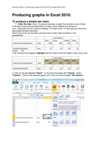
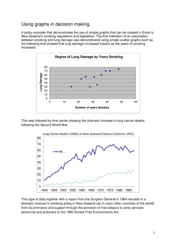
Activity Procedure1. Review the basic components of an Excel worksheet (cells, rows, columns).Formula barColumnsActive cellRows2. Direct students to the ACMP Web site and ask them to click on the file “Excel Nome Data” todownload the file.NOTE: The temperature data was obtained at the Western Regional Climate Center athttp://www.wrcc.dri.edu/index.html.If the file does not open automatically, ask students to open the file in Microsoft Excel.3. Distribute the STUDENT WORKSHEET: “Is Nome, Alaska Getting Warmer?” Guide studentsthrough the worksheet.4. At the end of the lesson, students will add a trend line to the graph. A trend line is a line of best fitthrough the data and will show the trend of the data. In this example, the trend line shows that thetemperatures are increasing.Answers:The student’s graph should resemble the one below. Students should state that Nome, Alaska is getting warmer.ACMP 2006-2008 UAF Geophysical InstituteC-2Excel Temperature Graphs
LevelsName:Is Nome, Alaska Getting Warmer?Student Worksheet (1 of 7)III-IVGrades 5-8Background InformationMicrosoft Excel is a spreadsheet application. It is a flexible program that can be used to performcalculations on numerical data, graph data and as a simple database. In this lesson the chartingcapabilities of Excel will be used to graph temperature trends in Nome, Alaska.In order to find out if Nome is getting warmer it will be necessary to find the averagetemperature for each year. Next a line graph will be made of the annual average then a trendline will be added to the graph.Formula barColumnsActive cellRowsDirections:Using a web browser, go to the ACMP Web site (www.ArcticClimateModeling.org) and downloadthe file “Excel Nome Data.” This file has monthly average temperatures taken at the NomeAirport from 1950 to 2004. The temperatures are listed in degrees Fahrenheit. If the file doesnot automatically launch Excel when it is downloaded, double click on the file to open it in Excel.Follow the steps below.Part One: Finding Average Temperatures.1.Place the cursor in cell N6.ACMP 2006-2008 UAF Geophysical InstituteC-3Excel Temperature Graphs
Name:Is Nome, Alaska Getting Warmer?Student Worksheet (2 of 7)2.To find the average temperature for the year enter the formula“ AVERAGE (B6:M6)” in the formula bar and press return. Thisformula will average the temperature data from cells B6 to M6.LevelsIII-IVGrades 5-8The number 27.96 will be entered in cell N6.3.The formula could be entered for each row, however there is an easier way. With thecursor in cell N6 carefully move the mouse to the lower right corner until the cursor is abox with triangles at two corners.NOTE: In newer versions of Excel there will be a sign which will change to a box with triangleswhen the mouse is moved.)ACMP 2006-2008 UAF Geophysical InstituteC-4Excel Temperature Graphs
LevelsName:Is Nome, Alaska Getting Warmer?Student Worksheet (3 of 7)4.Drag from cell N6 to N60.5.Release the mouse button at cellN60. All the cells should fill withthe average for each row.III-IVGrades 5-8Drag toN60Part Two: Graphing Average Temperatures.6.Highlight column N from N5 to N607.From the menu select Insert Chart or choose the chart icon from the toolbar. This willbring up the Chart Wizard. There are 4 steps in the Chart Wizard.NOTE: In some versions of Excel the Chart Wizard has a line graph for the icon.Chart Wizard iconACMP 2006-2008 UAF Geophysical InstituteC-5Excel Temperature Graphs
Name:Is Nome, Alaska Getting Warmer?Student Worksheet (4 of 7)LevelsIII-IVGrades 5-8Screen 1 of 4 - Chart Type:8.Select a line chart. Click the upper left linegraph in the chart sub-type part of thescreen.9.Click Next to continue.Screen 2 of 4 - Chart Source Data:10.There are several steps to thisscreen.a) Click on Series at the top.b) Click the arrow next toCategory (X) axis labels.The screen will pull up toshow more of the Excelworksheet.ACMP 2006-2008 UAF Geophysical InstituteC-6Excel Temperature Graphs
Name:Is Nome, Alaska Getting Warmer?Student Worksheet (5 of 7)c) Click and drag to highlight cells A6 through A60.The cells will have a dashed line around them.The dashed line is often called “marching ants.”LevelsIII-IVGrades 5-8d) Press Return.e) Click Next when finished.Screen 3 of 4 - Chart Options:11.Add labels to the chart by entering thefollowing:a) On the chart title:“Temperature Trend in Nome,Alaska.“b) For the x axis type “Year.”c) For the y axis type “Temp. (F).”d) Click Next.ACMP 2006-2008 UAF Geophysical InstituteC-7Excel Temperature Graphs
Name:Is Nome, Alaska Getting Warmer?Student Worksheet (6 of 7)III-IVGrades 5-8Screen 4 of 4 - Chart Location:12.LevelsThis screen will ask if the chart should be anew worksheet or as an object on thecurrent worksheet.Click Finish.Part Three: Changing the Legend13.Note that the label for the line on the graph says AVERAGE. It would be more descriptiveif it said Average Temp.Go back to the Excel worksheet and in cell N5 change the word AVERAGE to “AverageTemp.,” and then press return. Notice that the chart automatically updates with the newlegend.Your graph should look like this:ACMP 2006-2008 UAF Geophysical InstituteC-8Excel Temperature Graphs
Name:Is Nome, Alaska Getting Warmer?Student Worksheet (7 of 7)III-IVGrades 5-8Part Four: Adding a Trend Line14.LevelsThe graph represents the averageyearly temperature from the years1950 to 2004, but it is difficult to seeif there is a trend in the data. InExcel, a trend line can be added to agraph.Select the graph by clicking on it. Itwill have black boxes along theborder when it is selected.15.Go the menu and choose Chart Add Trend Line.16.Select the Linear type of trend lineand click OK.The graph will show a new line that represents a “line of best fit” through your data.17.Answer the following question: Based on the data and the graph is Nome getting warmer,cooler or remaining the same? Explain.ACMP 2006-2008 UAF Geophysical InstituteC-9Excel Temperature Graphs
ACMP 2006-2008 UAF Geophysical Institute C-2 Excel Temperature Graphs Activity Procedure 1. Review the basic components of an Excel worksheet (cells, rows, columns). Formula bar Active cell Rows Columns 2. Direct students to the ACMP Web site and ask them to click on the file "Excel Nome Data" to download the file.