Transcription
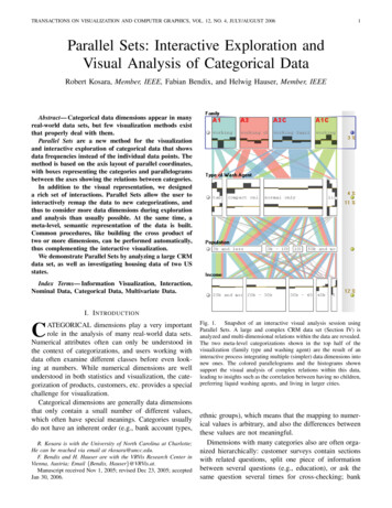
TRANSACTIONS ON VISUALIZATION AND COMPUTER GRAPHICS, VOL. 12, NO. 4, JULY/AUGUST 20061Parallel Sets: Interactive Exploration andVisual Analysis of Categorical DataRobert Kosara, Member, IEEE, Fabian Bendix, and Helwig Hauser, Member, IEEEAbstract— Categorical data dimensions appear in manyreal-world data sets, but few visualization methods existthat properly deal with them.Parallel Sets are a new method for the visualizationand interactive exploration of categorical data that showsdata frequencies instead of the individual data points. Themethod is based on the axis layout of parallel coordinates,with boxes representing the categories and parallelogramsbetween the axes showing the relations between categories.In addition to the visual representation, we designeda rich set of interactions. Parallel Sets allow the user tointeractively remap the data to new categorizations, andthus to consider more data dimensions during explorationand analysis than usually possible. At the same time, ameta-level, semantic representation of the data is built.Common procedures, like building the cross product oftwo or more dimensions, can be performed automatically,thus complementing the interactive visualization.We demonstrate Parallel Sets by analyzing a large CRMdata set, as well as investigating housing data of two USstates.Index Terms— Information Visualization, Interaction,Nominal Data, Categorical Data, Multivariate Data.I. I NTRODUCTIONATEGORICAL dimensions play a very importantrole in the analysis of many real-world data sets.Numerical attributes often can only be understood inthe context of categorizations, and users working withdata often examine different classes before even looking at numbers. While numerical dimensions are wellunderstood in both statistics and visualization, the categorization of products, customers, etc. provides a specialchallenge for visualization.Categorical dimensions are generally data dimensionsthat only contain a small number of different values,which often have special meanings. Categories usuallydo not have an inherent order (e.g., bank account types,CR. Kosara is with the University of North Carolina at Charlotte;He can be reached via email at rkosara@uncc.edu.F. Bendix and H. Hauser are with the VRVis Research Center inVienna, Austria; Email {Bendix, Hauser}@VRVis.at.Manuscript received Nov 1, 2005; revised Dec 23, 2005; acceptedJan 30, 2006.Fig. 1. Snapshot of an interactive visual analysis session usingParallel Sets. A large and complex CRM data set (Section IV) isanalyzed and multi-dimensional relations within the data are revealed.The two meta-level categorizations shown in the top half of thevisualization (family type and washing agent) are the result of aninteractive process integrating multiple (simpler) data dimensions intonew ones. The colored parallelograms and the histograms shownsupport the visual analysis of complex relations within this data,leading to insights such as the correlation between having no children,preferring liquid washing agents, and living in larger cities.ethnic groups), which means that the mapping to numerical values is arbitrary, and also the differences betweenthese values are not meaningful.Dimensions with many categories also are often organized hierarchically: customer surveys contain sectionswith related questions, split one piece of informationbetween several questions (e.g., education), or ask thesame question several times for cross-checking; bank
TRANSACTIONS ON VISUALIZATION AND COMPUTER GRAPHICS, VOL. 12, NO. 4, JULY/AUGUST 2006accounts are classified in several ways that will ofteninvolve hierarchical categorizations, etc. Using thesehierarchies for visualization is extremely helpful for theuser, because they provide a natural way of aggregatingand abstracting data. The visualization application hasto know about those hierarchies in order to make use ofthem, of course, requiring additional data about the dataset, or meta data. Interaction is also required, becausethe user will want to switch back and forth between adetailed investigation and a more general overview bymeans of these hierarchies.Most existing work has focused on the visualizationof numerical data, treating categories as a special casewith only a few values. The approach presented inthis paper had to be radically different in order toaccomodate the special properties of categorical data andlarge categorical data sets in practice.An implicit assumption in many visualization systemsis also that the user will perform a whole analysis in one,uninterrupted session, and will never return to the samekind of analysis or the same data set. Our experiencehas shown that this is not the case, however. Usersoften deal with similar data sets and similar tasks, whichconsequently require them to go through the same orsimilar sets of actions for each new data set. Also, theanalysis of a typical real-world data set requires manysessions, potentially spread out over a long time period.The user needs to be able to save results to continuewhere he or she left off as seamlessly as possible.We present a new approach to information visualization, called Parallel Sets [1] (Figure 1), whichwas developed specifically for categorical data. Thispaper presents additional features as well as a newcase study to demonstrate the method. Parallel Setssupport interactive visual exploration and analysis [2]by combining a new visual metaphor with an advancedinteraction scheme and automated procedures. ParallelSets adopt the advantages of two older and well-provenvisualization techniques: the flexible layout of ParallelCoordinates [3] (Figure 2b), treating all dimensions asvisually independent – in contrast to recursive spacesubdivision approaches like Mosaic Displays –, and displaying frequencies as representatives for the categories(Figure 2c) – as opposed to the usual one-by-one itemsbased visualization of data.The following sections present the related work andthe idea of Parallel Sets in terms of the visual metaphorand interaction scheme. The workflow is explained,which is essential to performing interactive visual analysis of heterogeneous and high-dimensional data. It isimportant to stress the fact that the interaction scheme is2(a)A(b)BDDACBC(c)(d)Fig. 2.Visualizing categorical data with traditional techniquessuch as a scatterplot (a) and parallel coordinates (b) do not yielduseful visual representations, because usually only a small number ofdifferent values are given per categorical dimension. Traditional Venndiagrams (c, d) are based on the concept of showing data frequenciesand therefore work well for categorical data. Lining categories up nextto each other leads to the basic idea of Parallel Sets.an integral part of Parallel Sets, and necessary to exploitthe full potential of the approach. We demonstrate theuse of Parallel Sets to reveal interesting information ina large customer relationship management (CRM) dataset, as well as housing data of two US states.II. R ELATED W ORKParallel Coordinates [3] (Figure 3a) are a popularvisualization technique, in which the graphical axes arenot arranged orthogonally, but they are placed side byside. An n-dimensional data point is represented bya polyline, which intersects the parallel axes at pointswhich represent the values of the individual data dimensions along the respective axes. This view is capable ofdisplaying high-dimensional data (up to about 10-15 axesin practice), because the axes are visually independentof each other.Initially, parallel coordinates were designed to displaycontinuous variables [3], but recent approaches have triedto integrate categorical variables into this visualization aswell. Rosario et al. [4] suggest transforming categoriesto numbers by techniques similar to Multiple Correspondence Analysis (MCA). By this, the space on each axisis used more efficiently, because the spacing becomesmeaningful (similar categories are positioned close toeach other). A simpler approach is proposed by Teohand Ma [5]: for each category, an interval is constructedon the continuous axes to make more polylines visible.By this, the space is used to give the user an impressionof how many data items are visualized. Using alpha
TRANSACTIONS ON VISUALIZATION AND COMPUTER GRAPHICS, VOL. 12, NO. 4, JULY/AUGUST 2006(a)(b)3(c)Fig. 3. Three different visualization techniques displaying the samedata: (a) the categories are represented by points on continuousaxes in parallel coordinates, (b) Parallel Sets show the frequenciesof categories and relations, and (c) a Mosaic Display provides acompressed view of the data (the hatched parts represent the samesubset).blending, the Information Mural [6] also gives an impression of the number of values per category, but isstill hard to read and imprecise for truly categoricaldata. One problem remains for all parallel coordinatestechniques: the visualization implements a continuousdesign model, which does not match the discrete usermodel of the data. This discrepancy between the user’smental model and the presented image is eliminated bythe use of frequency-based techniques: categories arerepresented by visual entities that are scaled accordingto their corresponding frequency.There are several techniques that follow this approach:the Mosaic Display [7], [8] (Figure 3c) is a recursive space-subdivision technique (similar to DimensionalStacking [9]), in which the frequency values of categories are represented by particular areas (“tiles”) onthe screen – interactive mosaic plots [10], [11] provide an even better approach for visual exploration,because they make use of the user’s domain knowledge;Bargrams [12] and InfoZoom [13] are techniques thatdisplay the dimensions row by row and the categoriesare mapped to boxes whose widths are scaled accordingto their frequencies. The drawbacks of these frequencybased techniques are: (1) space-subdivision methodsintroduce a ranking of the displayed dimensions and arealso limited in the number of dimensions that can bedisplayed, and (2) for the latter kind of visualizations,the relationships between dimensions are not shownexplicitly, but the vertical alignment encodes the relationof different dimensions’ categories, which can make theview difficult to understand when investigating multidimensional relations within the data.A technique that is related in terms of interactionand application area are parallel coordinate trees [14].By adding a tree-based navigation system, the data(customer surveys, similar to the data presented in thefirst part of the case study in this paper) can be analyzedFig. 4. The Parallel Sets prototype (showing the Titanic data set [15])consists of four panels (clockwise from top left): the user panel(showing user-defined dimensions), the main visualization panel, thedata panel (showing the source data), and the exclusion panel (forfiltering).in meaningful terms.The Parallel Sets technique combines the advantagesof frequency-based techniques (implementing a discretedesign model and displaying the frequencies of categories) and parallel coordinates (treating dimensionsindependently).III. PARALLEL S ETSParallel Sets are not only a new visualization technique, but also an interaction framework. The visualmetaphor serves as a natural way of mapping categorical variables to visual entities, which makes effectiveinteractive exploration and analysis possible.A. Basic IdeaClassical approaches (Section II) do not optimally dealwith categorical data: either the frequency information isnot visible or a ranking is imposed on the visual mappingtransformation [16], influencing perception of the data(Figure 3).Parallel Sets share the layout with parallel coordinates,but the point intersections are replaced with sets of boxesthat represent the categories (Figure 3b). These boxes arescaled according to the frequencies of the corresponding categories (Section III-C) and are initially orderedaccording to meta information (Sections III-D and IIIE). Using the frequency information means utilizing anaggregation [17] of a large categorical data set, reducingthe amount of data to be displayed, and providing animage of the data that more closely resembles the wayusers think of large, categorical data sets.This reduction also means that update rates of thevisual representation only depend on the number ofcategories in the data, but not on the overall numberof data points. Not only is the number of categories in
TRANSACTIONS ON VISUALIZATION AND COMPUTER GRAPHICS, VOL. 12, NO. 4, JULY/AUGUST 4%4.9%1.1%49.8%39.1%173121.4%Fig. 5.-------male145470-32514.8%28512.9%4fij is the number of all data points which are categorized according to the ith row and the jth column(145 females travelled first class on the Titanic).rij fij /fi is the individual row frequency of thePmsame data subset, with fi j 1 fij being themarginal row count for the ith row (almost 45% ofall first class passengers on the Titanic were female).70632.1%88540.2%cij fij /f j is the individual column frequency,Pmwhereas f j i 1 fij is the marginal columncount for the j-th column (e.g., 30.8% of the femalepassengers travelled first class).220178.6%100%pij fij /f is the a priori probability of this dataPPsubset, with f fij being the number ofall data points (less than 7% of all passengers on theTitanic were females in the first class).The crosstabulation of the Titanic data set shows the absolute, relative, and marginal frequencies for dimensions Class and Sex.a data set significantly smaller than the number of datapoints; categories are generally defined by the user, andtherefore grow slowly – if at all – with data set size. Asa consequence, Parallel Sets scale very well with dataset size.Because the sets of categories are placed independently side by side, the connections between categories(representing the relative number of attribute combinations) are also scaled according to their frequency values.Parallel Sets are not restricted to categorical data,however. By means of binning, a continuous variablecan be easily transformed into this kind of visualization(Section III-F).A categorical dimension is a meaningful classificationof the data, but rarely the only one. Hence, it is useful togive the user the possibility to create new classificationsby combining existing dimensions. This process is userdriven: the user utilizes his or her domain knowledgeto enrich the meta information about the data, andcan consequently use this new information for furtherexploration and analysis.Our prototype (Figure 4) shows the user not only thedata itself, but also all the dimensions and categories,including hierarchies on both levels. A separate panel isused for creating new dimensions from existing ones, bysimply clicking on categories or brushing value rangesin the visualization. The user can remove data valuesfrom the display (e.g., unknown values) by dragging thecorresponding category to the data exclusion panel.B. Statistical BasicsThe information that is provided by the visualizationis obtained by a crosstabulation [18]. Statistical examinations deal with categorical data quite frequently andusually analysts look at frequency (contingency) tablesto get a first overview. Figure 5 shows an example of atwo-way table: what is displayed by Parallel Sets is theinformation obtained by multi-way tables.In each cell of the crosstabulation, the top left values show the occurrences fij (absolute numbers), thebottom right numbers show the absolute frequenciesPP(probabilities) pij fij /f (where f fij ),and the remaining two values show the individual rowfrequencies rij fij /fi and column frequencies cij fij /f j (where fi and f j are the marginal row andcolumn frequencies, respectively). The crosstabulation,which is calculated for each attribute combination ofthe displayed dimensions, builds the basis for the visualmetaphor: each category is scaled according to the corresponding marginal frequency fi and f j respectively,and the connection between each pair of categories isscaled according to the absolute frequency fij . Thevisualization of actual data records is replaced by thatof frequency information, which gives the user insightinto the distribution of the data records.C. Visual MetaphorThe basic building block of Parallel Sets is a box thatrepresents the size of a category on one axis relative toall the data samples. Parallelograms connect categories
TRANSACTIONS ON VISUALIZATION AND COMPUTER GRAPHICS, VOL. 12, NO. 4, JULY/AUGUST 2006to show how many data points are in any of the combinations between two or more categories. Color is used todifferentiate the categories and to make the connectionsbetween them easier to see.At any point in time, there is one selected dimension –the active dimension. This dimension defines the colorcoding of the connections: each category of the activedimension gets one color from a predefined set ofequally-spaced, iso-luminant colors which differentiatethe connections well [19], and all connections obtainthe color of the respective active category. Then avisual ordering of the displayed dimension is introduced:starting at the active dimension, neighboring dimensionssplit the connections into sub-connections according totheir number of categories. This is analogous to imagining a subset with a particular attribute (e.g., first-classpassengers) and subdividing it according to a secondfeature (e.g., gender), then a third feature, and so on.In this flexible display only the absolute frequencies are visualized, but there is room to offer moreinformation: the user can vertically resize the boxes(representing the categories) and inside this additionalspace histograms can provide a more detailed view of thedata. Aside from the absolute frequencies, the individualrow and column frequencies of the contingency table(Figure 5) can be integrated into the visualization bythe use of histograms [20] for the selected dimensions.In statistical terms, these relative frequencies are conditional probabilities. Because comparing conditionalprobabilities can be misleading (similar to Simpson’sparadox [21]), the relative frequencies have to be standardized. One way is displaying the deviations of conditional probabilities from the a-posteriori probabilities( Pi P (Ai Bj ) P (Ai )). If the deviation is zero,then the particular category (with associated probabilityBj ) is independent of all categories of the neighboringdimension.Figure 6 shows an example of dependent relations: onecan see the absolute distribution of the upper dimensionand additionally, how the particular frequencies changeif only data records of the lower left categorical attributeare considered. For instance, the positive difference (9%)means that data records of the associated category (crewmembers) are more frequent in the considered category(male passengers, 49% of all males were crew members)than in the absolute distribution (40% of all passengerswere crew).D. Interaction and WorkflowParallel Sets implement several common interactionschemes: selection and highlighting, interactive query-5Fig. 6. The level of dependence between the class and the sexof passengers on the Titanic, shown for male passengers. The crewwas overrepresented in the male population on the ship, with all thepassenger classes being underrepresented.ing, filtering, and reordering of dimensions and categories – thus also heeding Shneiderman’s visual information seeking mantra: overview first, zoom and filter,then details-on-demand [22] (Figure 7).The interactive data exploration starts with an undirected investigation of the available data variables. Theuser chooses interesting data variables, adds them tothe visualization panel, and explores their relationships.The visualization can easily become very complex ifthe number of displayed categories increases to morethan just a few, so the user is able to create newviews by defining new dimensions. These dimensions aretypically more meaningful to the user or more suitablefor the analysis task at hand, and compress the relevantinformation into one or just a few dimensions, whileleaving out unwanted detail. Later, the user may needmore detailed information about the relation between twoor more dimensions, and can then go back to the originalones.This high-level view of interactive visual analysis isimplemented by Parallel Sets. The investigation startswith choosing interesting data variables: the data paneloffers the data dimensions and the user panel shows theuser-defined dimensions. The user can drag dimensionsfrom both panels, drop them in the visualization panel,and create his or her own view of the data. The dynamic layout permits the reordering of dimensions withimmediate visual feedback which is useful to look at therelationship of different dimensions more closely. Also,the categories can be reordered along their respectiveaxis, as there may not be a natural ordering amongcategorical values (Figure 7a,b). A function that wefound very useful is to let the program arrange thecategories by absolute or relative frequencies, since oftenthe first question is which category is the largest, andhow does it relate to the categories on another dimension.Having added interesting dimensions to the visualization (overview), the user can group selected categories(zoom and filter: Figure 7c,d), by which he or she canorganize categories hierarchically. The user can also draguninteresting categories into the exclusion panel to filterthe data (Figure 7e,f), thus using the available screen
TRANSACTIONS ON VISUALIZATION AND COMPUTER GRAPHICS, VOL. 12, NO. 4, JULY/AUGUST Fig. 7.Basic interaction elements in Parallel Sets: reorderingcategories (a, b) helps to generate a more meaningful layout; groupingcategories (c, d) enables a hierarchical analysis/exploration; excludingcategories from the visualization (e, f) allows for interactive filtering;and category highlighting (g, h) enables the selective investigation ofhigh-dimensional relations.Ca1 Cb1Cb2Ca2 Cb1.remainingFig. 8. An example of dimension composition: the user is interestedin a classification into the following four categories: Ca1 Cb1 , Ca2 Cb1 , Ca3 Cb1 , and remaining. The displayed interaction path in (a)illustrates the sequence of selections (the dotted lines indicate thatthe user finishes the current brush and starts a new category); theresulting user-defined classification is displayed in (b).space more effectively. Moving the mouse over a category highlights it and its connections to other dimensions(Figure 7g,h), supporting the user in understanding highdimensional relationships.One fundamental interaction technique in the designof Parallel Sets is dimension composition. The useof this feature is to reduce the dimensionality of thevisualization – both screen space and human perceptionlimit the maximal dimensionality of the visual mapping –and to build more practical and meaningful categorizations (Figure 8a). In contrast to data-driven approaches(like PCA [23] or VHDR [24]), interactive dimensioncomposition enables the integration of the user’s domainknowledge. A categorical dimension is a classification ofall data records according to a particular data attribute(e.g., regarding the attribute age, a binning could classifythe data into ten years intervals). In general, the datacan be classified according to multiple aspects of thedata. Hence, during the exploration process, it is usefulto allow the user to build his or her own classifications ofthe data and to also reuse this information during furtherexploration and analysis. Figure 8 gives an example ofthe process: a new classification is created by selectionactivities. The path illustrates the sequence of selections;firstly, the category Ca1 is selected, then the categoryCb1 , and so on. These selections are recorded by theuser panel: for the first selection, a new dimension, anactive category (equal to the selected category), anda default category (which contains all the remainingdata items) are created. All successive selections areadded to the current active category (by default, allselected categories are combined by a conjunction). Inthe example, after every two successive selections, theuser indicates to start a new category (not visible). Theresult of the process is a new categorical dimension withfour categories that represents a new classification of
TRANSACTIONS ON VISUALIZATION AND COMPUTER GRAPHICS, VOL. 12, NO. 4, JULY/AUGUST 2006the data. This dimension (representing part of the user’sdomain knowledge) can be dragged into the visualizationagain and the user can continue working with just thisone dimension, because it contains all the informationthe user considers to be relevant. Generally, two conceptsare utilized: the new categorization can either containall possible attribute combinations (specialization), orcontain a subset of these combinations (generalization).The effect is that more data axes are combined into fewerdisplay axes, thus showing the relevant data, but keepingthe visual complexity low.The final step is to have a closer look at interestingrelationships and to get detailed information. Details arein fact filtered data records that are the output of thevisual analysis. Usually, once the user has found outsome interesting relations within the data, he or shewants to get back to the original data items and to seeall the details, e.g., in a standard table view. Concerningthe investigation of relationships, Parallel Sets offerstwo schemes: histograms and highlighting. Histogramsshow statistical parameters to analyze relations in detail,highlighting is realized as a mouse-over effect: all connections that pass through the box under the cursor (i.e.,relations that include the corresponding data attribute)are emphasized by drawing them with higher saturationand in front of all other connections. This way, multidimensional relationships become visible as a startingpoint for further exploration.Zooming into a particular category is also possible,which means for its axis, only this one category isdisplayed, and thus a lot more room is available for itsconnections to other axes. This is similar to the wayzooming/drill-down is handled in InfoZoom [13].E. Hierarchical Meta DataMeta data provides the program with informationabout the data set. The most basic information are thenames of the different data dimensions, as well as labelsfor each of the values.The meta information is organized hierarchically,which allows the definition of groups of dimensionsas well as categories that belong together (rightmostpart of Figure 4). This is useful in many applications,e.g., customer surveys (questions that are related oreven redundant to check for validity), bank account data(account types and groups of types), etc., or in caseswhere the data model is such that one kind of informationis spread over several dimensions. In these applications,it is often necessary to use dimension composition toproduce the data that is then used for the actual analysis.The hierarchy also provides a means of storing knowledge, especially in the case of hierarchical categories.7This information is not shown in the visualization, butthe user can read it from the tree. It is also possibleto expand and collapse subtrees containing categories,thereby automatically combining all the categories intoone. Thus, the amount of detail can be changed quickly,and in terms the user is already working with.Using dimension composition, the user can createcustom dimensions either to support a particular analysisquestion, or to encode information that has been found.Knowledge is accumulated this way, and stored directlyin the meta data.F. Continuous DimensionsMany data sets do not contain only nominal or onlycontinuous axes, but a mix of both. Parallel Sets can dealwith continuous axes and show them in a meaningfulway (Figure 9). In order to do this though, the noncategorical axis is divided into bins, and thus transformed into a categorical dimension. This is necessaryto maintain a consistent visual metaphor, and also forperformance reasons.The user can select the number of categories thenumerical axis gets split into. Such a dimension is thenvisualized as an axis with triangular shapes pointing atthe bins, instead of parallelograms (because all bins havethe same width). A histogram is of course available tosee the distribution of values on the axis.In most cases, the user will be interested in certainvalue intervals, which make up interesting groups ofdata items (e.g., certain ranges in household income).By selecting value ranges in terms of whole bins, a newdimension can be created quickly that specifies thesegroups. This new dimension then acts like any othercategorical dimension within the program.Showing continuous axes as true parallel coordinatedimensions would of course be the most useful displayof this data, and this will be included in a futureversion of the program. Doing this, however, meanslosing the elegant independence from the data set size,and therefore requires some additional engineering tomaintain interactivity for large data sets.G. Reducing Visual ClutterWhen dimensions with many categories are visualized,the many intersections between ribbons connecting categories can make the display very busy (Figure 11). Asecond (“bundled”) mode can be used to alleviate this:the connections for each category (except the active one)are drawn in parallel (Figure 10), yielding a much tidierdisplay, but also making it harder to track connectionsover more dimensions.
TRANSACTIONS ON VISUALIZATION AND COMPUTER GRAPHICS, VOL. 12, NO. 4, JULY/AUGUST 2006(a)(b)8(c)Fig. 9. Categorization of numerical dimensions. Initially, the user
involve hierarchical categorizations, etc. Using these hierarchies for visualization is extremely helpful for the user, because they provide a natural way of aggregating and abstracting data. The visualization application has to know about those hierarchies in order to make use of them, of course, requiring additional data about the data set .