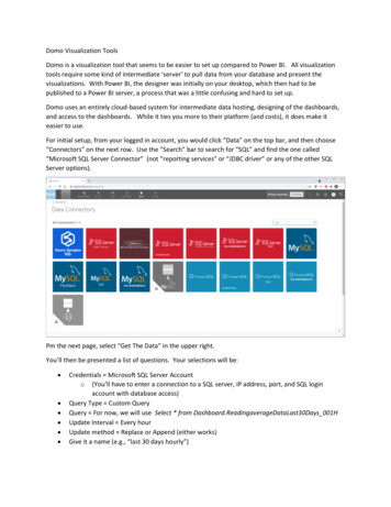
Transcription
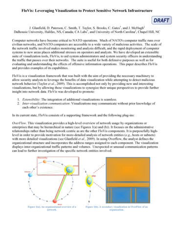
FloVis: Leveraging Visualization to Protect Sensitive Network InfrastructureJ. Glanfield, D. Paterson, C. Smith, T. Taylor, S. Brooks, C. Gates†, and J. McHugh‡Dalhousie University, Halifax, NS, Canada; CA Labs†, and University of North Carolina‡, Chapel Hill, NCComputer networks have become critical to NATO operations. Much of NATO's computer traffic runs overcivilian networks, and NATO computers are accessible to a wide variety of malicious activities. The scale ofthe network traffic involved makes monitoring and analysis difficult, and the rapid deployment of computersystems to new areas places additional stresses on operators and analysts. We have developed an extensiblesuite of visualization tools, FloVis, to aid system administrators and system security officers in understandingthe traffic that passes over their networks. The suite is useful for both defensive purposes as well as forevaluating and understanding the effects of offensive information operations. This paper describes FloVisand provides examples of its capabilities.FloVis is a visualization framework that was built with the aim of providing the necessary machinery toallow security analysts to leverage the benefits of data visualization while attempting to detect maliciousnetwork behavior (Taylor et al., 2009). This is accomplished not only by providing new and interestingvisualizations, but by allowing these visualizations to synergize their unique perspectives to provide furtherinsight into network data. FloVis was developed to promote:1. Extensibility: The integration of additional visualizations is seamless.2. Inter-visualization communication: Visualizations may communicate without prior knowledge ofeach other’s existence.In its current state, FloVis consists of a supporting framework and the following plug-ins:OverFlow. This visualization provides a high-level overview of network usage by organizations orenterprises that may be hierarchical in nature (see Figures 1(a) and (b)). It focuses on the administrativerelationships rather than being network centric as are the other FloVis components. It is purposefully highlevel in order to provide motivation for more-detailed analysis of network entities (e.g., hosts or subnets)with more detailed visualizations (see Glanfield et al., 2009). In using Overflow, the analyst defines theorganizational structure and incorporates the address ranges assigned to each component. The visualizationdisplays inter-organizational traffic patterns and volumes. Unexpected or unusual communication patternscan lead to further investigation of the specific network entities involved.Figure 1(a). An organizational overview of anetwork.Figure 1(b). A secondary visualization in OverFlow of anorganization.
FlowBundle. Displays communications between network entities and reduces occlusion by using hierarchicaledge-bundling (Holten, 2006). The display arranges 512 entities around a circle that is divided into twosections by the border across which communication was observed (see Figure 2). Typically, the entities aresubnet or host addresses with 256 points allocated to each side of the border, but other relationships includinghost port usage can be displayed. The limitation to 512 points allows unambiguous identification ofindividual connections, however a sliding window allows any consecutive 8 bits of the entity ID (e.g., IPaddress) to be selected. For example, if the inside network is a single /24, it is possible to view connectionsbetween outside /8s and inside hosts. By sliding the outside window, connections from /16s within a given /8or the /24s within a given /16, etc., can be displayed. Connection line transparency is a rough indicator oftraffic volume. Given that the OverFlow plug-in has identified questionable inter-organizational traffic,FlowBundle could be used to identify the subnets or hosts involved.Figure 2. Our host-of-interest communicating with twosubnets.NetBytes Viewer. This plug-in allows detailed analysis of host behaviors over time. It displays an impulseplot in three dimensions that describes port or protocol volumes over time (Taylor et al., 2008). To avoid theocclusion problems that often accompany static 3D plots, the NetBytes Viewer plot can be rotated andrescaled by the user. 2D finder lines allow precise identification of specific impulses in the time / volume andport, protocol / volume planes (see Figures 3 and 6). The viewer is particularly useful in examining thebehavior of a compromised machine since the behavior of the machine prior to and after compromise caneasily be compared. In addition, unexpected behavior changes associated with a compromise can be detected.These might include bot behaviors or other malicious activity.Activity Viewer. This visualization shows categorical entity activity as a function of time, using distinctcolors to describe a limited number of categories (Taylor et al., 2009). The choice of categories is arbitrary.Any small set of behaviors that can be derived from the available data is suitable. One example uses client /server behavior, another shows hosts’ responses to scans. The categories of individual entities are plottedagainst time in a simple two-dimensional grid, with the entities listed along the vertical axis and time alongthe horizontal axis (see Figure 4). If a given entity exhibits one or more of the categorical activities during agiven hour, the corresponding square is given the color of the activity that causes the most concern. In anoperational setting, the categories might correspond to the roles assigned to individual hosts. Hosts behavingin manners consistent with their assigned role would be given colors that identify the role and indicate
normal activity. Hosts that appear to deviate from the role would be given colors that indicate the nature andextent of the deviation. This could be compressed into the common three category "stoplight chart" withgreen indicating normal, yellow questionable, and red clearly bad. Since some role shifting and deviationfrom expectation is often observed, the time series of colors allows quick identification of hosts that aredeviating from past behavior. The entities need not be hosts. Subnets or organizational units could be used, aswell.Figure 3. Port 22 traffic occurring over a few hours. The top right of the display shows hundreds of thousands of bytesover a short time period.The following two plug-ins are experimental and we are in the process of refining them and evaluating theirutility for network monitoring and analysis:FlowBurst. This visualization displays large amounts of hierarchical, numeric network data in a radial spacefilling diagram and it allows analysts to quickly obtain an overview of network traffic, visualizing andcomparing up to three traffic attributes concurrently. The data can be explored interactively using hyperbolicdistortion to shift the center of the hierarchy.FlowCal. A calendaring visualization (inspired by van Wijk and van Selow, 1999) that displays multiple timeseries of a quantitative network property, e.g., daily series of port 80 volumes measured hourly. We knowthat traffic patterns exhibit diurnal patterns, and the basic display allows us to superimpose a large numbersof days of data on a single display, linking each day's line to an accompanying calendar. Clusteringalgorithms can then be applied to the lines to group them by a variety of similarity measures. When the linesare grouped, each group is assigned a color and the calendar entries for each group are colored accordingly.Once the obvious groupings are accounted for, e.g., weekdays vs. weekend days, smaller groups and singularcases should arise. Among these we hope to find subtle indications of abnormal activities. Since mostnetwork activity exhibits fairly strong daily patterns, we suspect that it will be necessary to remove dailypatterns before clustering on other time scales is effective.In our system, the plug-ins are designed to interact through a number of data properties, enabling both drilldown to examine smaller groupings of entities in greater detail as well as pivoting that allows data values ofinterest in one view to be used as the targets of investigation in others. This interaction is illustrated in thefollowing two case studies.
Case #1This example shows how three of the plug-ins offer unique perspectives of the same data. We drill furtherinto the data via each plug-in and discover undesirable traffic.Using OverFlow to provide a visual breakdown of important subnets, we found unexpected traffic betweentwo organizations (“Security” and “wlan,” see Figure 1(a)) belonging to a conference network.OverFlow displays a tree-map (Johnson and Shneiderman, 1991) in order to show volume quantities withinlevels of a hierarchy. Based on this secondary view of an organization (see Figure 1(b)), it was decided tofurther investigate the host represented by the large orange block in the tree-map since that block correspondsto the largest portion of traffic. Further drill down with the FlowBundle plug-in reveals a single hostcommunicating with two subnets, which belong to the Security organization (see Figure 2), is responsible forall of the suspicious traffic. The network administrators knew beforehand that there was to be nocommunication between Security and the public network (“wlan”) organizations. Hence, the nature of thistraffic is of interest.The specific nature of the traffic can be determined by using the NetBytes plug-in, as it provides specific portand volume information. With NetBytes, we were able to discover that communication occurred over port 22and that the volume was large enough to suggest that significant data transfer had occurred (see Figure 3).In spite of the fact that we drill into the data across multiple visualizations, context is retained throughFloVis’ multi-tabbed and multi-window displays, which allow the multiple views to be open simultaneously.Case #2In this example we show how the use of the Activity Viewer allows us to find anomalous behavior byalerting our attention to a change in a host’s pattern of behavior. In Figure 4, we see that a host exhibitssuspicious server and client activity on the same port. This behavior is of concern because it is unusual forthe given host based on the previously observed behavior.Figure 4. Discovering a change in the pattern of behavior.Since we are interested in understanding the specific nature of the traffic occurring on our host of interest, wedrill down by using the FlowBundle plug-in. Figures 5(a) and 5(b) show us that the host is scanning multiplenetworks and that it is scanning across a large range of ports, respectively.
Figure 5(a). Scanning across networks.Figure 5(b). Scanning across ports.The NetBytes plug-in provides yet another perspective by displaying port patterns over time. Thus, we candetermine precisely when the scanning activity commenced (see Figure 6).Figure 6. Port-traffic patterns over time.CommentsWe have described how the various components of the FloVis framework work in tandem to allow an analystto visually drill into network data and explore anomalous network behavior. Should this extended abstract beaccepted, our final paper will contain further detailed descriptions of each plug-in and will include additionalcases to demonstrate further utility.This material is based upon work supported by the Department of Homeland Security under Contract No.
N66001-08-C-2032. We also wish to acknowledge the support of Ron McLeod of TARA, CA Labs, andNSERC in this research initiative. Any opinions, findings and conclusions or recommendations expressed inthis material are those of the author(s) and do not necessarily reflect the views of the Department ofHomeland Security.ReferencesJ. Glanfield, S. Brooks, T. Taylor, D. Paterson, C Smith, C. Gates, J. McHugh. OverFlow: An OverviewVisualization for Network Analysis. Accepted to the 6th International Workshop on Visualization for CyberSecurity. Atlantic City, NJ. October 11, 2009.D. Holten. Hierarchical Edge Bundles: Visualization of Adjacency Relations in Hierarchical Data. IEEETransactions on Visualization and Computer Graphics, 12(5):741–748, 2006.B. Johnson and B. Shneiderman. Tree-Maps: A Space-Filling Approach to the Visualization of HierarchicalInformation Structures. In VIS ’91: Proceedings of the 2nd conference on Visualization,pp. 284–291, Los Alamitos, CA, USA, 1991. IEEE Computer Society Press.T. Taylor, S. Brooks and J. McHugh. NetBytes Viewer: An Entity‐based NetFlow Visualization Utility forIdentifying Intrusive Behavior. In Goodall et al. (eds.), Mathematics and Visualization (Proceedings ofVizSEC), Springer‐Verlag, August, 2008.T. Taylor, D. Paterson, J. Glanfield, C. Gates, S. Brooks, J. McHugh. FloVis: Flow Visualization System. InProceedings of the Cybersecurity Applications and Technologies Conference for Homeland Security(CATCH). Washington, DC. March 3-4, 2009.J. J. van Wijk and E. R. van Selow, E. R. Cluster and Calendar Based Visualization of TimeSeries Data. In InfoVis '99: Proceedings of the 1999 IEEE Symposium on InformationVisualization, pp. 4-9, San Francisco, CA, USA, 1999. IEEE Computer Society Press.
D. Holten. Hierarchical Edge Bundles: Visualization of Adjacency Relations in Hierarchical Data. IEEE Transactions on Visualization and Computer Graphics, 12(5):741-748, 2006. B. Johnson and B. Shneiderman. Tree-Maps: A Space-Filling Approach to the Visualization of Hierarchical Information Structures. In VIS '91: Proceedings of the 2nd .