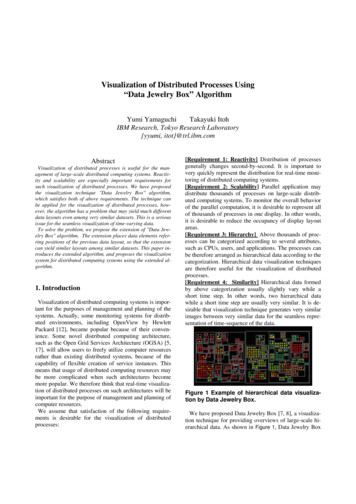
Transcription
Arab Institute for Training and Research in StatisticsData VisualizationLecture # 12 Aug. 2021www.aitrs.orginfo@aitrs.orge-learning Workshop2-4 August 2021Dr. Abbas Maaroofaimaaroof@gmail.com
Course Outline1.Introduction to Data Visualization -Day #12.Data Visualization using Tableau SoftwareDay#23.Open Source Data Visualization ToolsHighChart-Day#3
Day #1Data Visualization Introduction:Definition, Examples, LearningResources, and Tools
Data Visualization Introduction Outline What is data visualization? The advantages and benefits of good datavisualization Why data visualization is important? Examples of data visualization in action Tools used to build data visualization Free courses and paid training programs online References and blogs
What is Data visualization?Data visualization is the act of taking information (data)and placing it into a visual context, such as a map or graph.Data visualizations make big and small data easier for thehuman brain to understand, and visualization also makes iteasier to detect patterns, trends, and outliers in groups ofdata.Good data visualizations should place meaning intocomplicated datasets so that their message is clear andconcise.
Data VisualizationTo convey information through visual representations eInspire
The advantages and benefits of good data visualizationChallenging the viewer to think about the substancerather than about the methodology, graphic design, orthe technology used to make the visualization.Encourage the eye to compare, reveal the data atseveral levels of detail, from a broad overview tominute statistics.Storytelling: Data analysis are the stories we desire totell. Storytelling with data visualization creates animpactful response from the user with numbers toback it up.
Why data visualization is important?1. Interactive images speak louder than words.2. Data visualization is especially important when it comesto big data3. The results from complex algorithms are much easier tounderstand in a visual format4. Data visualization can be use in any field such as infinance, marketing, tech, design, or anything else, youneed to visualize data5. Visualized data gives stakeholders, business owners, anddecision-makers a better predictionGoogle, Facebook, Amazon, Apple, Twitter and Netflix all askbetter questions of their data –and make better business decisions –by using data visualization.
Examples of data visualization in actionOf course, one of the best ways to understand data visualization is to see it!1. 3#!/https://public.tableau.com/en-gb/gallery/?tab viz-of-the-day&type viz-of-the-day
2. High ://www.yr.no/place/United Kingdom/England/London/forecast hourby hour.xml
Global warming is a lie? One thing I can tell you: Data never lies. Here's a coolvisualization showing how the distribution over Earth's surface of annual averagetemperature anomalies has been shifting due to global warming since 1850. TLDR? Earthis heating up! mingSource:https://lnkd.in/efswdQp
General steps to create your first data visualizationStep 1: Connect to your data and drag and dropto take a first lookStep 2: Focus your results and explore yourdata. Drill down into the detailsStep 3: Build a dashboard to show your insightsand build a story to presentStep 4: Share your findings
Tools used to Build Data Visualization(Top Open-Source Data Visualizations Tools )
1. D3.jsD3.js is a JavaScript library for manipulating documents based ondata. D3 helps you bring data to life using HTML, SVG, and CSS. D3’semphasis on web standards gives you the full capabilities of modernbrowsers without tying yourself to a proprietary framework, combiningpowerful visualization components and a data-driven approach toDOM manipulation.https://d3js.org/2. TableauTableau can help anyone see and understand their data.https://www.tableau.com3. Google ChartsIt is an interactive Web service that creates graphical charts rtHighcharts is an open source tool with 10.2K GitHubstars and 2.8K GitHub forks. Here’s a linkto Highcharts's open source repository on m/highcharts/highcharts?ref stackshare
4. Plotly.jsIt is a standalone Javascript data visualization libraryhttps://plotly.com/javascript/5. EChartsApache ECharts is a free, powerful charting and visualization library offeringan easy way of adding intuitive, interactive, and highly customizable charts toyour commercial products. It is written in pure JavaScript and basedon zrender, which is a whole new lightweight canvas ex.html6. AnyChartAnyChart is a JavaScript library for cross-platform data visualization in theform of interactive charts and dashboards.https://www.anychart.com/JavaScript / HTML5 charts and maps data-viz libraries for web sites andapplications. Fast and responsive. WordPress plugin availablehttps://www.amcharts.com/
Free courses and paid training programs online,References and BlogsLearn more about data visualizations (and how to create your own)See list of great Data visualization blogs full of examples, inspiration, and educationalresources at this ta-visualization-blogsFree Data Visualization Online Courses for BeginnersThere are plenty of great paid and free courses and resources on data visualizationout there, including right here on the Tableau website. There are videos, articles, s/https://www.datasciencecentral.com/eBooks
Tableau SoftwareTableau can help anyone see and understand their data. Connect to almost anydatabase, drag and drop to create visualizations, and share with a clickhttps://www.tableau.com/
What is Tableau ?Tableau is a powerful and fastest growing datavisualization tool used in the BusinessIntelligence Industry. It helps in simplifying rawdata into the very easily understandable format.Data analysis is very fast with Tableau and thevisualizations created are in the form ofdashboards and worksheets.
So Why use Tableau? SpeedUser-friendlyCompelling and Interactive DashboardDirect ConnectionEasy publishing and sharingGrowing Market
Tableau Product Types1. Tableau Desktop2. Tableau Online3. Tableau Server4. Tableau Reader5. Tableau Public
Type of Data sources by TableauTableau can connect to all the popular data sources whichare widely used. Tableau’s native connectors can connect tothe following types of data sources. File Systems such as CSV, Excel, etc. Relational Systems such as Oracle, Sql Server, DB2, etc. Cloud Systems such as Windows Azure, GoogleBigQuery, etc. Other Sources using Open Database Connectivity(ODBC)The following picture shows most of the data sourcesavailable through Tableau’s native data connectors.Places to publish the results Desktop Tablet Phone
Charts in Tableau Bar ChartStacked Bar ChartPie ChartLine ChartPacked Bubble ChartWord MapTree MapsWaterFall ChartIt takes 30 secondsto create any typeof chart you needto practice andwatching differenttype of videos toteach yourselfHow Tableau Considers Database Dimensions Measures
Tableau Public: Free Data Visualization Software1.Sign up to download Tableau Publicat your Desktop follow this link (Copyand paste the link)https://public.tableau.com/s/2. Tutorial: Get Started with TableauPublic follow this link (Copy and pastethe tarted-tutorial/en-us/get-startedtutorial-home.htm
Sign up
Step#1: Tableau Public Overview Connecting to data Creating Worksheets ,Dashboards,and Storytelling Publishing to the web
Step 1: Connect to your data and drag and drop to take a first look1. Tableau icon. Click in theupper left corner of any pageto toggle between the startpage and the authoringworkspace.2. Connect pane. Under Connect,you can: Connect to data that is stored ina file, such as Microsoft Excel,PDF, Spatial files, and more. Connect to data that is stored onTableau Server, Microsoft SQLServer, Google Analytics, oranother server. Connect to a data source thatyou’ve connected to before.4. Under Open, you can openworkbooks that you've alreadycreated.5. Under Discover, find additionalresources like video tutorials, forums, orthe “Viz of the week” to get ideas aboutwhat you can build. Under Discover, find additional resources like video tutorials, forums, orthe “Viz of the week” to get ideas about what you can build.3. Under Sample Workbooks,view sample dashboards andworksheets that come withTableau Desktop.The first thing you see after you open Tableau Public is the start page. Here, you select theconnector (how you will connect to your data) that you want to use.
Explore Tableau Main pageNewWorksheetNewDashboardNewStory
Step 2: Creating your first worksheet
Step 3: Creating your first Dashboard
Step 4: Creating your first StorytellingStorytelling contains many dashboards
Case Study: Data from theworld Bank-CO2 Emissions byCountry Since 1960Example of questions:1. Who is the largest polluters in the world2. What are the trends in CO2 emissions over time?Attached to the lecture data files with name:World Bank CO2.xlsx
You can download the workook at this rkbook/DeviceSpecificDashboard
Step#2: Connect to Data: Selectthe type of data we want to use-Inour case study Excel and Text Files
Step#3: Creating Worksheet
1: Drag and drop the desire worksheet
2. Check the data columns of your worksheetStep#5: Click on Sheet1
3. Different way creating charts in TableauDrag and drop thesheet on the lefthand side
Map with each dot for each country
4. Add more information to the map by dragging CO2 per Capita to the map
5. Add color by dragging CO2 per Capita to the color
6. Chose the Edit color chose for example blank and red
7. Rename the sheet
Let us create a second chartand look at the evolution ofCO2 emissions over time
1. Open a new worksheet
1. Drag CO2 per Capita
2. See how it changes over time by clicking on yearIn the world CO2 emissionhave been increasing overtime
2. Let us add country to the view as well
Add country
2. FormattingAdd CO2 per capita onto color
Change alsothe name ofthe worksheetCO2 EmissionChange overTime
Step#4: Creating Dashboard
NewDashboard
Already CreatedWorksheets
Drag and drop the first and second worksheet Worksheets
Change the dimension of the dashboard
Formatting the Dashboard
Publishing the dashboard on the Web
Use the username and the password which you already created (You have 10GBsize of visualization to publish)-give the visualization a good name.You can share the visualization in the social media or send it by email etc.
2.Data Visualization using Tableau Software-Day#2 3.Open Source Data Visualization Tools-HighChart-Day#3 Course Outline . Data Visualization Introduction: Definition, Examples, Learning . PDF, Spatial files, and more. Connect to data that is stored on Tableau Server, Microsoft SQL