Transcription
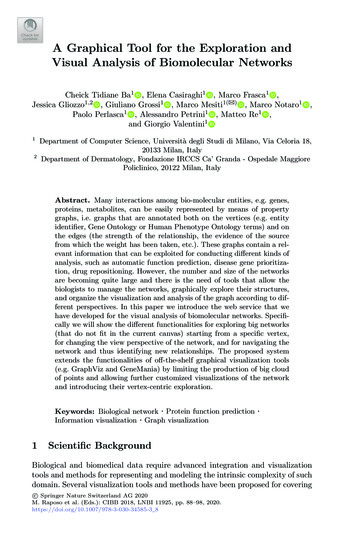
A Graphical Tool for the Exploration andVisual Analysis of Biomolecular NetworksCheick Tidiane Ba1 , Elena Casiraghi1 , Marco Frasca1 ,Jessica Gliozzo1,2 , Giuliano Grossi1 , Marco Mesiti1(B) , Marco Notaro1 ,Paolo Perlasca1 , Alessandro Petrini1 , Matteo Re1 ,and Giorgio Valentini112Department of Computer Science, Università degli Studi di Milano, Via Celoria 18,20133 Milan, ItalyDepartment of Dermatology, Fondazione IRCCS Ca’ Granda - Ospedale MaggiorePoliclinico, 20122 Milan, ItalyAbstract. Many interactions among bio-molecular entities, e.g. genes,proteins, metabolites, can be easily represented by means of propertygraphs, i.e. graphs that are annotated both on the vertices (e.g. entityidentifier, Gene Ontology or Human Phenotype Ontology terms) and onthe edges (the strength of the relationship, the evidence of the sourcefrom which the weight has been taken, etc.). These graphs contain a relevant information that can be exploited for conducting different kinds ofanalysis, such as automatic function prediction, disease gene prioritization, drug repositioning. However, the number and size of the networksare becoming quite large and there is the need of tools that allow thebiologists to manage the networks, graphically explore their structures,and organize the visualization and analysis of the graph according to different perspectives. In this paper we introduce the web service that wehave developed for the visual analysis of biomolecular networks. Specifically we will show the different functionalities for exploring big networks(that do not fit in the current canvas) starting from a specific vertex,for changing the view perspective of the network, and for navigating thenetwork and thus identifying new relationships. The proposed systemextends the functionalities of off-the-shelf graphical visualization tools(e.g. GraphViz and GeneMania) by limiting the production of big cloudof points and allowing further customized visualizations of the networkand introducing their vertex-centric exploration.Keywords: Biological network · Protein function predictionInformation visualization · Graph visualization1·Scientific BackgroundBiological and biomedical data require advanced integration and visualizationtools and methods for representing and modeling the intrinsic complexity of suchdomain. Several visualization tools and methods have been proposed for coveringc Springer Nature Switzerland AG 2020 M. Raposo et al. (Eds.): CIBB 2018, LNBI 11925, pp. 88–98, 2020.https://doi.org/10.1007/978-3-030-34585-3 8
Exploration and Visual Analysis of Biomolecular Networks89a range of different features (Kuznetsova et al. 2018, Pavlopoulos et al. 2008)(Napolitano et al. 2008). Following the approach adopted by the cited systems,we have adopted the JavaScript library Cytoscape.js for the development ofthe interactive network visualization part of the application. This library indeedoffers the flexibility required for developing a web application that need to handlegraphs of big dimensions and provide a professional visualization. Different webtools for protein function prediction are available, such as N-Browse (Kao andGunsalus 2002), SIFTER (Sahraeian et al. 2015), MouseNet v2 (Kim et al. 2016),the IMP tool (Wong et al. 2015), and the GeneMANIA server (Warde-Farley etal. 2010). N-Browse provides a graphical user interface (GUI), leveraging interaction in the network display on node and edge information, allowing the user toselect the networks involved in the analysis; however, solely three organisms aresupported, and N-Browse runs as a Java web start, which might be not immediate for a generic user. SIFTER is a sequence-based web interface exploring aprotein family’s phylogenetic tree as a statistical graphical model of function evolution. The search is limited to one protein at a time, or must include the wholeproteome, and the user cannot specify a subset of query proteins. MouseNet v2extends MouseNET (Guan et al. 2008), a previous prediction server for laboratory mouse, by including new microarray data derived from diverse biologicalcontexts and embedding other 8 model vertebrates to exploit the orthologybased projection of their genes on MouseNet. However the search is limited toone organism. The IMP system provides an easy to use interface to query oneor more proteins at the same time, even from different organism, by exploitinggene homology information. SIFTER, MouseNet and IMP hide the data integration phase to the user, which consequently cannot evaluate the impact ofspecific connection types on the final integrated network. Moreover, they do notprovide the user with the possibility to interact with the resulting integratedprotein network. Finally, the GeneMANIA prediction server allows the user tospecify customized queries and to interact in the visualization process, depicting even a graphical view of the obtained consensus network. Nevertheless, itassigns weights using a Gaussian random field framework that cannot cope withlabel-imbalance characterizing the GO terms.All these systems provide features for graphically representing the networks,but they are not usually able to represent and highlight specific local characteristics of the biomolecular graph under study. Moreover, when the networks arelarge, a dark cloud of points is shown from which it is quite hard to understandthe structure of the network and the visual analysis of the graph becomes unfeasible. For this reason, we developed a web tool that supports a “vertex centric”visualization of the subgraph connected to the node under study. In this way theuser can focus on a specific biomolecular entity (e.g. a specific gene or protein),and explore the topologically close subnetwork that include its neighborohoodnodes and their annotations. Moreover the user can interactively include newvertices and navigate on the network structure in order to identify useful patterns. The presence of different perspectives, i.e. mode of visualization of the
90C. T. Ba et al.subnetwork, gives the user the possibility to directly obtain biological insightsand infer novel characteristics of the biomolecular entities under study.2Materials and MethodsThe web service we have developed (available at http://unipred.di.unimi.it) isflexible and extensible enough to take into account new constraints and requirements. The internal representation of information is separated from its renderingto the end-users according to the model-view-control paradigm. For this purposewe have used Angular.js for maintaining the interaction with the database andCytoscape.js for the graphical representation of networks. Biological networksare stored into a mysql database and we are able to compute at run time newintegrated networks and to extract the sub networks to be displayed accordingto the user requests. Angular.js data-binding and suitable mechanisms to handleasyncronous data access have been exploited to manage the server-side computation required for preparing the network and for extracting the sub network tobe displayed, while Cytoscape.js has been used for the graph visualization andanalysis. In order to test the functionalities of the application, we have considered biological networks downloaded from STRING (Szklarczyk et al. 2015) andfrom the GeneMANIA website.3ResultsA Web Application has been realized for the integration and visualization ofbiomolecular networks that have been collected in a web server. Once the preferred network is loaded in the server, different functionalities for the vertexcentric exploration of the network, for the customized visualization from differentperspective, and for the navigation can be selected. As an example, Figs. 1 and 2show how an initial visualization of a loaded biomolecular network (representedas a point cloud) can be improved by applying a sequence of customized rendering options specifically developed in the Web application: by increasing the noderepulsion layout option of the graph displayed in Fig. 1(a) a new positioning ofthe nodes is obtained, as shown in Fig. 1(b); hiding labels the graph becomesuncluttered (see Fig. 2(a)); filtering the weights allows to show only edges ofinterest (see Fig. 2(b)). Beside the specification of the graph to be visualized, theinterface allows to identify the vertex from which the graph exploration shouldbe started. This vertex represents a biomolecule that the user wishes to analyzeand the “radius” of the subgraph to be displayed (where the radius correspondsto the number of hops from the center). As an example, Fig. 3 shows the interfacefor preparing the rendering of the network view that is centered on the proteinFbgn0267347 of the Drosophila melanogaster organism with GO:0000001 classwith depth 2. The user can drag each vertex of the subnetwork and obtain a
Exploration and Visual Analysis of Biomolecular Networks(a) Initial point cloud(b) Point cloud after increasing node repulsionFig. 1. Options for visualization optimization of a biomolecular network91
92C. T. Ba et al.(a) Point cloud after hiding labels(b) Point cloud after weights filteringFig. 2. Optimized visualization of the biomolecular network in Fig. 1
Exploration and Visual Analysis of Biomolecular Networks93Fig. 3. Web interface for preparing the rendering of the network viewpersonalized visualization; by clicking on a node or an edge, he/she can obtainthe corresponding information as shown in Fig. 4(a).The web tool is also equipped with different visualization options for makingthe visual analysis of the generated network more user-friendly (note that eachlayout might be customized to obtain an optimized visualization, as previouslyshown in Figs. 1 and 2). Cose, grid, concentric, circle and breadthfirst are theavailable visualization layouts provided also by Cytoscape.js. Figures 4 and 5show the application of different layouts to the experiment described above. Thecose (Dogrusoz et al. 2009) visualization option uses a physics simulation to layout graphs and is based on the traditional force-directed layout algorithm withextensions to handle multi-level nesting (compound nodes), edges between nodesof arbitrary nesting levels and varying node sizes (see Fig. 4(a)). With the gridvisualization option, the proteins in the subnetwork are placed in a grid and theirconnections are shown in the canvas. With the concentric visualization option,the target protein is positioned at the center of the canvas and vertices at distance one, two or three, according to the chosen experiment depth, are drawn indifferent concentric circles. This rendering allows one to better understand theconnectivity of the target with its neighborhood as shown in Fig. 4(b). With thecircle visualization option, all vertices are posed in a circle and shown their connections with the other vertices. Vertices with an higher in-out-edge-degree arepositioned closer in the circle. This visualization allows one to better appreciatethe nodes for which there is a high interconnection strength from those whoseconnections are minimal. This feature helps to graphically detect hub proteins,
94C. T. Ba et al.(a) Cose visualization layout(b) Concentric visualization layoutFig. 4. Different layout visualizationsi.e. those possessing higher centrality indexes, such as node betweeness, andglobal clustering coefficient, as shown in Fig. 5(a). Finally, the breadthfirst visualization option puts nodes in a hierarchy, based on a breadthfirst traversal ofthe graph (see Fig. 5(b)).By opening a panel in the right-top corner of the web interface, the network visualization can be personalized from different perspectives (beside thevisualization option described above). The user can decide to prune connections
Exploration and Visual Analysis of Biomolecular Networks95(a) Circle visualization layout(b) Breadthfirst visualization layoutFig. 5. Different layout visualizationsin the visualized network relying on their weights. This feature is quite usefulfor keeping in the canvas only the edges with the higher connectivity relevance.Moreover, the user can change the color of the network nodes depending of thebiological functions of the networks used for the integration. This is an important feature in order to make the user immediately aware of a specific property
96C. T. Ba et al.(a) Nodes belonging to a specific network are yellowcolored(b) Personalization optionsFig. 6. Layout personalization example (Color figure online)such as belonging to a specific network as shown in the Fig. 6(a). In the samespirit, it is possible to change the shape of the network nodes. Figure 6(b) showsthe different options so far discussed.Figure 7 shows an important feature, named one-step navigation, of our application. By clicking on a node of the subnetwork currently visualized in the canvas,further nodes can be included that stay a step-forward from the clicked one. Inthis way the user can enrich the subgraph with the neighbor nodes that the userconsiders to be interesting.
Exploration and Visual Analysis of Biomolecular Networks97Fig. 7. One step navigation4ConclusionIn this paper we have presented the features of a Web application for the visualization, analysis and navigation of biological networks of large size. By adoptinga vertex-centric rendering of a subnetwork, the system offers different customizedvisualizations that can be exploited for identifying useful patterns in the analyzednetwork. Moreover, we have discussed the characteristics for extending the visualized subnetwork by clicking on the nodes of the network and provide a largervisualization of the subnetwork. As future work we are planning to introducemachine learning algorithms for suggesting to the user the best visualization byconsidering user feedbacks in the proposed visualizations. Moreover, we wish toconsider visualizations at different granularities in order to reduce the amountof vertices to be included in the current canvas.ReferencesKuznetsova, I., Lugmayr, A., Holzinger, A.: Visualisation methods of hierarchical biological data: a survey and review. Int. Ser. Inf. Syst. Manag. Creative eMedia (CreMedia) (2017/2), 32–39 (2018)Pavlopoulos, G.A., Wegener, A.-L., Schneider, R.: A survey of visualization tools forbiological network analysis. BioData Min. 1(1), 12 (2008)Napolitano, F., Raiconi, G., Tagliaferri, R., Ciaramella, A., Staiano, A., Miele, G.:Clustering and visualization approaches for human cell cycle gene expression dataanalysis. Int. J. Approx. Reasoning 47(1), 70–84 (2008)
98C. T. Ba et al.Kao, H.-L., Gunsalus, K.C.: Browsing Multidimensional Molecular Networks with theGeneric Network Browser (N-Browse). Wiley, Hoboken (2002)Sahraeian, S.M., Luo, K.R., Brenner, S.E.: Sifter search: a web server for accuratephylogeny-based protein function prediction. Nucleic Acids Res. 43(W1), W141–W147 (2015)Kim, E., et al.: MouseNet v2: a database of gene networks for studying the laboratorymouse and eight other model vertebrates. Nucleic Acids Res. 44(D1), D848–D854(2016)Wong, A.K., Krishnan, A., Yao, V., Tadych, A., Troyanskaya, O.G.: Imp 2.0: a multispecies functional genomics portal for integration, visualization and prediction ofprotein functions and networks. Nucleic Acids Res. 43(W1), W128–W133 (2015)Warde-Farley, D., et al.: The genemania prediction server: biological network integration for gene prioritization and predicting gene function. Nucleic Acids Res. 38(suppl2), W214–W220 (2010)Guan, Y., Myers, C.L., Lu, R., Lemischka, I.R., Bult, C.J., Troyanskaya, O.G.: Agenomewide functional network for the laboratory mouse. PLoS Comput. Biol. 4(9),1–15 (2008)Szklarczyk, D., et al.: String v10: protein-protein interaction networks, integrated overthe tree of life. Nucleic Acids Res. 43(D1), D447–D452 (2015)Dogrusoz, U., Giral, E., Cetintas, A., Civril, A., Demir, E.: A layout algorithm forundirected compound graphs. Inf. Sci. 179(7), 980–994 (2009)
Improved Predictor-Corrector AlgorithmHassan Pazira(B)Johann Bernoulli Institute, University of Groningen, Groningen, The Netherlandsh.pazira@amsterdamumc.nlAbstract. The differential geometric least angle regression method consists essentially in computing the solution path. In Augugliaro et al. [4],this problem is satisfactorily solved by using a predictor-corrector (PC)algorithm, that however has the drawback of becoming intractable whenworking with thousands of predictors. Using the PC algorithm leads toan increase in the run times needed for computing the solution curve. Inthis paper we explain an improved version of the PC algorithm (IPC),proposed in Pazira et al. [9], to decrease the effects stemming from thisproblem for computing the solution curve. The IPC algorithm allows thedgLARS method to be implemented by using less number of arithmeticoperations that leads to potential computational saving.Keywords: Differential geometry · dgLARS · Predictor-correctoralgorithm · Sparsity · High-dimensional inference1IntroductionModern statistical methods developed to study high-dimensional data sets areusually based on the idea to use a penalty function to estimate a solution curveembedded in the parameter space and then to find the point that represents thebest compromise between sparsity and predictive behaviour of the model. Recentstatistical literature has a great number of contributions devoted to this problem,such as the 1 -penalty function [11] and the Smoothly Clipped Absolute Deviation method (SCAD) [7]. Differently from the methods cited here, Augugliaroet al. [4] proposed a new approach based on the differential geometrical representation of a Generalized Linear Model (GLM). The derived method, that doesnot require an explicit penalty function, has been called differential geometricLARS (dgLARS) method because it is defined generalizing the geometrical ideason which the least angle regression (LARS), proposed in [6], is based. Moreover,Pazira et al. [9] extended the dgLARS method to the high-dimensional GLMsbased on the exponential dispersion models with arbitrary link functions. In thesame paper the authors proposed a new estimation method of the dispersionparameter based on high-dimensional feature space showed that is more accurate than the classic estimator. Furthermore, the authors, in [12], proposed anextension of the dgLARS method for sparse inference in relative risk regressionmodels.c Springer Nature Switzerland AG 2020 M. Raposo et al. (Eds.): CIBB 2018, LNBI 11925, pp. 99–106, 2020.https://doi.org/10.1007/978-3-030-34585-3 9
Information visualization · Graph visualization 1 Scientific Background Biological and biomedical data require advanced integration and visualization tools and methods for representing and modeling the intrinsic complexity of such domain. Several visualization tools and methods have been proposed for covering c Springer Nature Switzerland AG 2020