Transcription
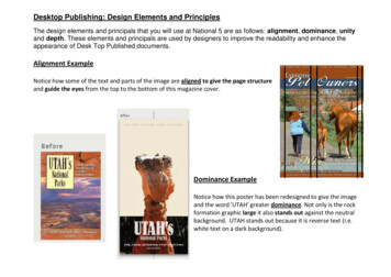
Desktop Publishing: Design Elements and PrinciplesThe design elements and principals that you will use at National 5 are as follows: alignment, dominance, unityand depth. These elements and principals are used by designers to improve the readability and enhance theappearance of Desk Top Published documents.Alignment ExampleNotice how some of the text and parts of the image are aligned to give the page structureand guide the eyes from the top to the bottom of this magazine cover.Dominance ExampleNotice how this poster has been redesigned to give the imageand the word 'UTAH' greater dominance. Not only is the rockformation graphic large it also stands out against the neutralbackground. UTAH stands out because it is reverse text (i.e.white text on a dark background).
Unity ExampleVisual unity has been achieved in this companies publication by the using thesame colours in the image as in the words (white, blue and orange). By usingcontrasting colours (orange and blue) an otherwise dull information documenthas been given some interest. The use of the blue background links with thewoman’s eye colour providing a focal point in the document. Unity is alsoachieved by using the same font (or typeface) for all the textDepthExampleDepth is created by selecting an image with aforeground and background, in this case thesand/ grass in the foreground and the rockislands in the background. Using transparencyin the area around the text also createsanother layer in the image without obscuringthe picture. Depth can also be created by usingdrop shadows (refer to the palm tree poster on the next page)
Examples of techniques used in promotional graphicsExample 1Example 1A harmonising colour scheme has been used which gives a relaxed feelto the poster. The dominant colour green ties in with theenvironmental project being advertised giving the message and posterdesign some unity. The way the text has been used; putting all thewords together, creates some interest in the design and gives theposter a modern feel, which might appeal to the youth targetaudience. The clever use of the trees shadow gives a double message:the tree gives a strong symbol of the environment and the aeroplaneshadow indicates the travel aspect of the project it also gives a 3Dimpression giving the poster some depth.Landscape outlineExample 2LogoIn this example contrasting colours of white and black are used togive a sophisticated and elegant feel to the poster. The yellow flashbar and the yellow moon provide some brightness to the design, aswell as attracting people’s attention. The use of yellow and the use ofthe landscape outline also give the poster unity by tying features inthe clock to features in the background. Alignment has been used togive structure to the page, for example the edge of the logo lines upwith the edge of the clock and the edge of the letter C of ‘Cityscapelines up with the edge of the building. Depth is created by the shadowon parts of the clock and having the image and ‘Cityscape’ layeredabove the flash bar. The image bleeds used for the clock logo and thecity outline help to give the poster a more modern, dynamic feel.
Homework 5 Illustration,Colour, Layout and Desk TopLightGreenBrownBrownPublishingQuestion 1LightGreenLook at the 2 CDs produced by a American National Park.List 3 ways in which the designer has created unity between the 2 designs1.2.3.Question 2Look at the 'Campsite Rules' poster shown oppositeName the Desk Top Publishing features shown at A, B and CA.B.C.State the name of the page orientation used in the 'Campsite Rules' document shownABC
Question 3Look at the Nokia phone advertisement shown opposite. Notice how the designerhas used the 'principal of 1/3rds' i.e. the important parts of the poster aredistributed 1/3 and 2/3rds of the way across the pagea) What type of colour scheme has the designer used?b) What is the name given to the techniques shown of using white text on a coloured backgroundQuestion 4Look at the magazine page shown oppositeWhat are the names of the desk top publishing features shown at A, B, C, D, E andFA.B.C.D.E.F.Give 2 examples of how contrast has been used in this magazine page1.2.
Question 5Look at the advertisement for perfume shown oppositea) Give 2 examples of how depth has been created in this advertisement1.2.b) Orange has been used for the colour fill behind the product name.State whether orange is an advancing or a receding colour?c) What is the name given to the effect of making text follow the wavy curvein the advertisement?d) What effect does this have on the message of the posterQuestion 6Look at the advertising poster for a camera shown oppositea) Annotate the following poster with these desk top publishing features main feature,backdropheading/titleflash-bardrop shadow
Question 6 (continued)b) Explain how harmony, dominance and unity have been achieved in the camera posterHarmonyDominanceUnity
Desktop Publishing: Design Elements and Principles The design elements and principals that you will use at National 5 are as follows: alignment, dominance, unity and depth. These elements and principals are used by designers to improve the readability and enhance the appe