Transcription
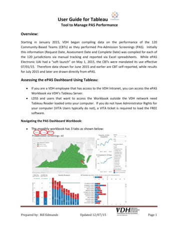
User Guide for TableauTool to Manage PAS PerformanceOverview:Starting in January 2015, VDH began compiling data on the performance of the 120Community‐Based Teams (CBTs) as they performed Pre‐Admission Screenings (PAS). Initiallythis information (Request Date, Assessment Date and Complete Date) was compiled for each ofthe 120 jurisdictions via manual tracking and reported via Excel spreadsheets. While ePASElectronic UAI had a “soft launch” on May 1, 2015, the CBTs were mandated its use effective07/01/15. Therefore data shown for June 2015 and earlier are CBT self‐reported, while resultsfor July 2015 and later are drawn directly from ePAS.Assessing the ePAS Dashboard Using Tableau: If you are a VDH employee that has access to the VDH Intranet, you can access the ePASWorkbook via VDH’s Tableau Server.LDSS and users that want to access the Workbook outside the VDH network needTableau Reader loaded onto your computer. If you do not have Administrator Rights foryour computer (VITA Users typically do not), a VITA ticket is required to load the FREEsoftware.Navigating the PAS Dashboard Workbook: The monthly workbook has 3 tabs as shown below:Prepared by: Bill EdmundsUpdated 12/07/15Page 1
User Guide for TableauTool to Manage PAS PerformanceEach of the tabs will be described individuallyDistrict Dash This is the view that should be familiar as it has been the standard since January 2015Here is a complete view & each section of the view will be explained:Prepared by: Bill EdmundsUpdated 12/07/15Page 2
User Guide for TableauTool to Manage PAS PerformanceSelection Criteria:By District (VDH Health District)The default is set to “All”, so to be able to view datafor a single Health District, check the box like shownon the left. In this instance Central Virginia HD hasbeen selected. Once selected the Dashboard shouldchange for the Red/Green Map, FIPS Comparison, %PAS Completed 30 Days to reflect info only for thisHealth District.Title will remain “All”.This view is especially helpful to compareoperational performance by locality within aHealth District. This concept is shown for theCentral Virginia HD.Prepared by: Bill EdmundsUpdated 12/07/15Page 3
User Guide for TableauTool to Manage PAS PerformanceBy FIPSHere the FIPS for Appomattox County was selected. As shown below, once selected theDashboard Title should change as well as the Total No. of PAS Completed and % PAS Completed 30 Days to reflect info only for this FIPS. The Red/Green map, as well as the MonthlyBreakout will show only the locality selected.Prepared by: Bill EdmundsUpdated 12/07/15Page 4
User Guide for TableauTool to Manage PAS PerformanceBy Submission MonthHere a single month (October 2015) is selected. Please remember when gauging compliancevia the Red/Green Map (3 month weighted/rolling average) to select the last 3 monthsavailable, otherwise the map will only show compliance for the month selected.Graphs on the District DashThere are 6 different graphs that make up this tab. Each will be discussed individually.165234Prepared by: Bill EdmundsUpdated 12/07/15Page 5
User Guide for TableauTool to Manage PAS Performance1 – Red/Green Map For each of the 120 FIPS, any jurisdiction that has an average Request to Completiontime of 30.0 Days is colored Green. An average of 30.1 Days shows as Red.The map will display different results based on the time period selected. The map usedon the previous page has only October 2015 selected, so those results (Green/Red) arefor that month ONLY.Compliance with the 30 Day standard is measured by the 3 most recent months (for theOctober Dashboard – August, September & October). The weighted/rolling aspectmeans that if the jurisdiction selected did 3 PAS in August, 2 in September and 1 inOctober, the average time for August (3 PAS) will count 3 times as much as the averagetime for the 1 PAS completed during October. The weighted/rolling component meansthat each monthly Dashboard the oldest month “rolls” off (for November, August isreplaced by November), with the newest month taking its place in the map’s calculation.Another great function of Tableau is that by simply “hovering” the mouse over any fieldthe data underling the area (in this instance the Piedmont Health District’s AmeliaCounty average days) displays. This feature works throughout the Workbook.Any jurisdiction that did not perform any PAS during the time period selected, will showup as “white”.Prepared by: Bill EdmundsUpdated 12/07/15Page 6
User Guide for TableauTool to Manage PAS Performance2 – State Average/Locality AverageThe Blue Bar shows the time periodfrom Request to Assessment (HomeVisit). The Red Bar shows the timefrom Assessment to Complete.Also, notice that every time that theDashboardshowsperformance(Blue/Red Bars) there is a Green orRed line that marks the 30 Daythreshold.The State Average/Locality Average compares the selected FIPS or Health District’sperformance for the time period selected. Again, when measuring compliance via theRed/Green map, always use the 3 most recent months as it will calculate the 3 monthweighted/rolling average.Prepared by: Bill EdmundsUpdated 12/07/15Page 7
User Guide for TableauTool to Manage PAS Performance3 – Monthly BreakoutRegardless of the time periodselected, this vertical bar chart willalways show the PAS performancefor the previous 12 months for“All”, the District or FIPS selected.This view is especially helpful tolook for trends in performance.Measure Names & a horizontal 30Day line are again used.4 – All CountiesThis horizontal bar chart shows all ofthe FIPS selected for “All”, the HealthDistrict or a single jurisdiction (FIPS).Regardless of the selection, the resultswill always be compared to the State‐wide average (All Counties) for thetime period selected.The 30 Day threshold is displayed witha Red vertical line.Measure Names are used consistentlyas with (3) Monthly Breakout.Prepared by: Bill EdmundsUpdated 12/07/15Page 8
User Guide for TableauTool to Manage PAS Performance5 – % Completed in 30 DaysRegardless of the time period selected,this graph will always show the % of PAScompleted each month within the 30 Daythreshold (0.1 Days to 30.0 Days) fromSeptember 2014 to the most recentmonth. This graph will show different datadepending upon the selection of District,FIPS or All selected.Hopefully, like the example to the left the% Completed will be increasing over time.This is another graph to analyze trendingresults over time.6 – Total No. PAS CompletedRegardless of the time period selected,this graph will always show the TotalNumber of PAS completed each monthfrom September 2014 to the most recentmonth. This graph will show differentdata depending upon the selection ofDistrict, FIPS or All selected.Since PAS is such a manpower intensiveeffort, this chart will show how many PASare being completed each month. In thisexample, the FIPS is now completingabout twice the ePAS that it performed 6months ago. Increasing #’s of PAS maymean a need for additional staffing tomaintain results.Prepared by: Bill EdmundsUpdated 12/07/15Page 9
User Guide for TableauTool to Manage PAS PerformanceWebThis is the “static” view that DMAS posts to its website on a monthly basis. There are noselection criteria.Prepared by: Bill EdmundsUpdated 12/07/15Page 10
User Guide for TableauTool to Manage PAS PerformanceSummaryThis view allows selection on both FIPS and time period, but not Health District. By selecting“All” you can compare results for all 127 jurisdictions. The view shown below is for September2015 – November 2015, but any combination of time periods is available. The Blue/Redhorizontal bars, the 30 day line, the # of PAS Completed (Purple bar) and the % Completed 30Days (Green bar) are all shown as part of this view.Please contact me at William.edmunds@vdh.virginia.gov or (804) 864‐7942 with questions orcomments.Prepared by: Bill EdmundsUpdated 12/07/15Page 11
User Guide for Tableau Tool to Manage PAS Performance Prepared by: Bill Edmunds Updated 12/07/15 Page 3 Selection Criteria: By District (VDH Health District