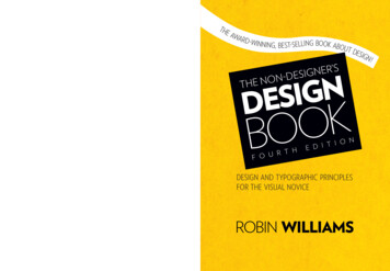
Transcription
NGISEDTHROBIN WILLIAMSKOBOR T HF O UNT I OE D IDESIGN AND TYPOGRAPHIC PRINCIPLESFOR THE VISUAL NOVICELEARN THE BASICS OF DESIGN AND TYPEFROM THE AUTHOR OF THE NON-DESIGNER’SBOOK SERIES (OVER 800,000 COPIES IN PRINT)Whether you’re a Mac user or a Windows user,a type novice, or an aspiring graphic designer,you will find the instruction and inspiration toapproach any design project with confidence.ROBIN WILLIAMS is the authorof dozens of best-selling andaward-winning books, includingThe Non-Designer’s PresentationBook, The Non-Designer’s InDesignBook, and Robin Williams DesignWorkshop. Through her writing, teaching, andseminars, Robin has educated and influenced anentire generation of computer users in the areas ofdesign, typography, desktop publishing, the Mac,and the web.FOURTH EDITIONTHE AWARD-WINNING, BEST-SELLING BOOKABOUT DESIGN!For nearly 20 years, designers and non-designersalike have been introduced to the fundamentalprinciples of great design by author Robin Williams.Through her straightforward and light-heartedstyle, Robin has taught hundreds of thousands ofpeople how to make their designs look professionalusing four surprisingly simple principles. Now in itsfourth edition, The Non-Designer’s Design Bookoffers even more practical design advice, includinga new chapter on the fundamentals of typography,more quizzes and exercises to train your DesignerEye, updated projects for you to try, and new visualand typographic examples to inspire your creativity.THIS ESSENTIAL GUIDE TO DESIGNWILL TEACH YOU The four principles of design that underlieevery design project How to design with color How to design with type How to combine typefaces for maximum effect How to see and think like a professional designer Specific tips on designing newsletters,brochures, flyers, and other projectsTHE NON-DESIGNER’S DESIGN BOOKIGNER’S-DESE NONTHEAWARD-WINNING, BEST-SELLING BOOK ABOUT DESIGN!S’RENG-DESINGISEDNTHE NOKOOBT HRUF ONOITE D IDESIGN AND TYPOGRAPHIC PRINCIPLESFOR THE VISUAL NOVICEfacebook.com/PeachpitCreativeLearningUS 34.99Canada 39.99ISBN-13: 978-0-13-396615-2ISBN-10:0-13-396615-1Peachpit Presswww.peachpit.comLevel: Beginning / IntermediateCategory: Graphic DesignCover Design: John Tollett9780133 9661525 3 4 9 9WILLIAMS@peachpitROBIN WILLIAMS
JTHE NON-DESIGNER’SDESIGNBOOKfourth editiondesignandtypographicprinciplesfor thevisualnoviceRobin WilliamsPeachpit PressSan FranciscoCalifornia
Non-Designer’s Design Book Thefourth editionrobin williams 2015 by Robin WilliamsFirst edition published 1993.Peachpit Presswww.peachpit.comPeachpit is a division of Pearson Education.To report errors, please send a note to errata@peachpit.com.Editor:Interior designand production:Cover designand production:Nikki McDonaldProofreader:Prepress:Jan SeymourDavid Van NessRobin WilliamsJohn TollettThe quote by Jan White on page 209 is from the out-of-print book How to Spec Type,by Alex White. Reprinted courtesy of Roundtable Press, Inc. Copyright 1987 byRoundtable Press, Inc.The portions of “Ladle Rat Rotten Hut” and other stories, such as “Guilty Looks EnterTree Beers,” “Center A lley,” and “Violate Huskings” are from a long out-of-print book byHoward L. Chace called Anguish Languish. It is our understanding that these delightfulstories are now in the public domain. They are easily found on the Internet.Notice of RightsAll rights reserved. No part of this book may be reproduced or transmittedin any form or by any means, electronic, mechanical, photocopying, recording,or otherwise, without the prior written permission of the publisher.For information on obtaining permission for reprints and excerpts,please contact permissions@peachpit.com.Notice of LiabilityThe information in this book is distributed on an “as is” basis, without warranty.While every precaution has been taken in the preparation of this book, neither the authornor Peachpit shall have any liability to any person or entity with respect to any loss ordamage caused or alleged to be caused directly or indirectly by the instructions containedin this book or by the computer software and hardware products described herein.TrademarksMany of the designations used by manufacturers and sellers to distinguish their productsare claimed as trademarks. Where those designations appear in this book, and Peachpitwas aware of a trademark claim, the designations appear as requested by the owner ofthe trademark. All other product names and services identified throughout this book areused in editorial fashion only and for the benefit of such companies with no intention ofinfringement of the trademark. No such use, or the use of any trade name, is intended toconvey endorsement or other affiliation with this book.isbn 13: 978-0-13-396615-2isbn 10:0-13-396615-110 9 8 7 6 5 4 3 2 1Printed and bound in the United States of America
To Carmen Sheldon,my comrade in Design,my friend in Life.with great love,R.
More matter is being printed and publishedtoday than ever before, and every publisherof an advertisement, pamphlet, or bookexpects his material to be read. Publishersand, even more so, readers want what isimportant to be clearly laid out. They willnot read anything that is troublesome toread, but are pleased with what looks clearand well arranged, for it will make their taskof understanding easier. For this reason,the important part must stand out andthe unimportant must be subdued . . . .The technique of modern typography mustalso adapt itself to the speed of our times.Today, we cannot spend as much time ona letter heading or other piece of jobbingas was possible even in the nineties.Jan Tschichold 1935typefacesModernica Light and Black
CONTENTSIs this book for you?. . . . . . . . . . . . . . . . . . . . . . . . . . . . . . . . 10Desi gn rast11The Joshua tree epiphany. . . . . . . . . . . . . . . . . . . . . . . . . . . . 11The four basic principles. . . . . . . . . . . . . . . . . . . . . . . . . . . . . 13Proximity15Summary of proximity. . . . . . . . . . . . . . . . . . . . . . . . . . . . . . . 32The basic purpose. . . . . . . . . . . . . . . . . . . . . . . . . . . . 32How to get it. . . . . . . . . . . . . . . . . . . . . . . . . . . . . . . . 32What to avoid. . . . . . . . . . . . . . . . . . . . . . . . . . . . . . . 3233Summary of alignment . . . . . . . . . . . . . . . . . . . . . . . . . . . . . . 54The basic purpose. . . . . . . . . . . . . . . . . . . . . . . . . . . . 54How to get it. . . . . . . . . . . . . . . . . . . . . . . . . . . . . . . . 54What to avoid. . . . . . . . . . . . . . . . . . . . . . . . . . . . . . . 5455Summary of repetition . . . . . . . . . . . . . . . . . . . . . . . . . . . . . . 68The basic purpose. . . . . . . . . . . . . . . . . . . . . . . . . . . . 68How to get it. . . . . . . . . . . . . . . . . . . . . . . . . . . . . . . . 68What to avoid. . . . . . . . . . . . . . . . . . . . . . . . . . . . . . . 6869Summary of contrast. . . . . . . . . . . . . . . . . . . . . . . . . . . . . . . 84The basic purpose. . . . . . . . . . . . . . . . . . . . . . . . . . . . 84How to get it. . . . . . . . . . . . . . . . . . . . . . . . . . . . . . . . 84What to avoid. . . . . . . . . . . . . . . . . . . . . . . . . . . . . . . 84
contents678Review of the Four Design Principles85Proximity. . . . . . . . . . . . . . . . . . . . . . . . . . . . . . . . . . . . . . . . 86Alignment. . . . . . . . . . . . . . . . . . . . . . . . . . . . . . . . . . . . . . . 87Repetition . . . . . . . . . . . . . . . . . . . . . . . . . . . . . . . . . . . . . . . 88Contrast. . . . . . . . . . . . . . . . . . . . . . . . . . . . . . . . . . . . . . . . 89Little Quiz #1: Design principles. . . . . . . . . . . . . . . . . . . . . . 90Little Quiz #2: Redesign this ad. . . . . . . . . . . . . . . . . . . . . . 91Summary. . . . . . . . . . . . . . . . . . . . . . . . . . . . . . . . . . . . . . . . 94Design with Color95The amazing color wheel . . . . . . . . . . . . . . . . . . . . . . . . . . . . 96Color relationships. . . . . . . . . . . . . . . . . . . . . . . . . . . . . . . . . 97Complementary. . . . . . . . . . . . . . . . . . . . . . . . . . . . . 98Triads. . . . . . . . . . . . . . . . . . . . . . . . . . . . . . . . . . . . . 99Split complement triads . . . . . . . . . . . . . . . . . . . . . . . 100Analogous colors. . . . . . . . . . . . . . . . . . . . . . . . . . . . 101Shades and tints . . . . . . . . . . . . . . . . . . . . . . . . . . . . . . . . . 102Make your own shades and tints . . . . . . . . . . . . . . . . . 103Monochromatic colors. . . . . . . . . . . . . . . . . . . . . . . . 104Shades and tints in combination . . . . . . . . . . . . . . . . . 105Watch the tones . . . . . . . . . . . . . . . . . . . . . . . . . . . . . . . . . 106Warm colors vs. cool colors. . . . . . . . . . . . . . . . . . . . . . . . . . 107How to begin to choose?. . . . . . . . . . . . . . . . . . . . . . . . . . . 108cmyk vs. rgb: print vs. web . . . . . . . . . . . . . . . . . . . . . . . . . 110Print vs. web color models . . . . . . . . . . . . . . . . . . . . . . . . . . 112Little Quiz #3: Color. . . . . . . . . . . . . . . . . . . . . . . . . . . . . 112Extra Tips & Tricks113Creating a package or brand. . . . . . . . . . . . . . . . . . . . . . . . . 114Business cards. . . . . . . . . . . . . . . . . . . . . . . . . . . . . . . . . . . 117Tips on designing business cards. . . . . . . . . . . . . . . . . . . . 120Format. . . . . . . . . . . . . . . . . . . . . . . . . . . . . . . . . . . 120Type size . . . . . . . . . . . . . . . . . . . . . . . . . . . . . . . . . 120Create a consistent image on all pieces . . . . . . . . . . . . 120Letterhead and envelopes. . . . . . . . . . . . . . . . . . . . . . . . . . . 121Tips on letterhead and envelope design . . . . . . . . . . . . . . . 124Envelope size. . . . . . . . . . . . . . . . . . . . . . . . . . . . . . 124Create a focal point . . . . . . . . . . . . . . . . . . . . . . . . . 124Alignment. . . . . . . . . . . . . . . . . . . . . . . . . . . . . . . . . 124Second page. . . . . . . . . . . . . . . . . . . . . . . . . . . . . . . 124Faxing and copying . . . . . . . . . . . . . . . . . . . . . . . . . . 1246
contentsFlyers. . . . . . . . . . . . . . . . . . . . . . . . . . . . . . . . . . . . . . . . . 125Tips on designing flyers . . . . . . . . . . . . . . . . . . . . . . . . . . 128Create a focal point. . . . . . . . . . . . . . . . . . . . . . . . . . 128Use subheads that contrast . . . . . . . . . . . . . . . . . . . . 128Repetition . . . . . . . . . . . . . . . . . . . . . . . . . . . . . . . . 128Alignment . . . . . . . . . . . . . . . . . . . . . . . . . . . . . . . . 128Newsletters. . . . . . . . . . . . . . . . . . . . . . . . . . . . . . . . . . . . . 129Tips on designing newsletters . . . . . . . . . . . . . . . . . . . . . . 132Alignment . . . . . . . . . . . . . . . . . . . . . . . . . . . . . . . . 132Paragraph indents . . . . . . . . . . . . . . . . . . . . . . . . . . . 132Not Helvetica/Arial!. . . . . . . . . . . . . . . . . . . . . . . . . . 132Readable body copy. . . . . . . . . . . . . . . . . . . . . . . . . . 132Brochures . . . . . . . . . . . . . . . . . . . . . . . . . . . . . . . . . . . . . . 133Tips on designing brochures . . . . . . . . . . . . . . . . . . . . . . . 136Contrast . . . . . . . . . . . . . . . . . . . . . . . . . . . . . . . . . 136Repetition . . . . . . . . . . . . . . . . . . . . . . . . . . . . . . . . 136Alignment . . . . . . . . . . . . . . . . . . . . . . . . . . . . . . . . 136Proximity . . . . . . . . . . . . . . . . . . . . . . . . . . . . . . . . . 136Postcards . . . . . . . . . . . . . . . . . . . . . . . . . . . . . . . . . . . . . . 137Tips on designing postcards. . . . . . . . . . . . . . . . . . . . . . . 140What’s your point? . . . . . . . . . . . . . . . . . . . . . . . . . . 140Grab their attention. . . . . . . . . . . . . . . . . . . . . . . . . . 140Contrast . . . . . . . . . . . . . . . . . . . . . . . . . . . . . . . . . 140In general. . . . . . . . . . . . . . . . . . . . . . . . . . . . . . . . . 140Advertising . . . . . . . . . . . . . . . . . . . . . . . . . . . . . . . . . . . . . 141Tips on designing ads. . . . . . . . . . . . . . . . . . . . . . . . . . . . 144Contrast . . . . . . . . . . . . . . . . . . . . . . . . . . . . . . . . . 144Type choices. . . . . . . . . . . . . . . . . . . . . . . . . . . . . . . 144Reverse type. . . . . . . . . . . . . . . . . . . . . . . . . . . . . . . 144Résumés . . . . . . . . . . . . . . . . . . . . . . . . . . . . . . . . . . . . . . . 145Tips on designing résumés . . . . . . . . . . . . . . . . . . . . . . . . 148Contrast . . . . . . . . . . . . . . . . . . . . . . . . . . . . . . . . . 148Repetition . . . . . . . . . . . . . . . . . . . . . . . . . . . . . . . . 148Alignment . . . . . . . . . . . . . . . . . . . . . . . . . . . . . . . . 148Match the design to the medium. . . . . . . . . . . . . . . . . 1487
contentsDesigning with Type91011The Essentials of Typography151One space after punctuation . . . . . . . . . . . . . . . . . . . . . . . . 152Quotation marks . . . . . . . . . . . . . . . . . . . . . . . . . . . . . . . . . 153Apostrophes . . . . . . . . . . . . . . . . . . . . . . . . . . . . . . . . . . . . 153Little Quiz #4: Apostrophes . . . . . . . . . . . . . . . . . . . . . . . 155Dashes . . . . . . . . . . . . . . . . . . . . . . . . . . . . . . . . . . . . . . . . 156Special characters . . . . . . . . . . . . . . . . . . . . . . . . . . . . . . . . 158Accent marks . . . . . . . . . . . . . . . . . . . . . . . . . . . . . . . . . . . . 160Capitals. . . . . . . . . . . . . . . . . . . . . . . . . . . . . . . . . . . . . . . . 161Underlining. . . . . . . . . . . . . . . . . . . . . . . . . . . . . . . . . . . . . 162Kerning. . . . . . . . . . . . . . . . . . . . . . . . . . . . . . . . . . . . . . . . 163Widows and orphans . . . . . . . . . . . . . . . . . . . . . . . . . . . . . . 164Miscellaneous . . . . . . . . . . . . . . . . . . . . . . . . . . . . . . . . . . . 165Type (& Life)167Concord . . . . . . . . . . . . . . . . . . . . . . . . . . . . . . . . . . . . . . . 168Conflict. . . . . . . . . . . . . . . . . . . . . . . . . . . . . . . . . . . . . . . . 170Contrast . . . . . . . . . . . . . . . . . . . . . . . . . . . . . . . . . . . . . . . 172Summary. . . . . . . . . . . . . . . . . . . . . . . . . . . . . . . . . . . . . . . 174Categories of Type175Oldstyle. . . . . . . . . . . . . . . . . . . . . . . . . . . . . . . . . . . . . . . . 176Modern. . . . . . . . . . . . . . . . . . . . . . . . . . . . . . . . . . . . . . . . 177Slab serif. . . . . . . . . . . . . . . . . . . . . . . . . . . . . . . . . . . . . . . 178Sans serif. . . . . . . . . . . . . . . . . . . . . . . . . . . . . . . . . . . . . . 179Script. . . . . . . . . . . . . . . . . . . . . . . . . . . . . . . . . . . . . . . . . 181Decorative. . . . . . . . . . . . . . . . . . . . . . . . . . . . . . . . . . . . . . 182Be conscious. . . . . . . . . . . . . . . . . . . . . . . . . . . . . . . . . . . . 183Little Quiz #5: Categories of type. . . . . . . . . . . . . . . . . . . . . 183Little Quiz #6: Thick/thin transitions . . . . . . . . . . . . . . . . . 184Little Quiz #7: Serifs. . . . . . . . . . . . . . . . . . . . . . . . . . . . . 185Summary. . . . . . . . . . . . . . . . . . . . . . . . . . . . . . . . . . . . . . . 1868
contents12Type Contrasts187Size . . . . . . . . . . . . . . . . . . . . . . . . . . . . . . . . . . . . . . . . . . 188Weight . . . . . . . . . . . . . . . . . . . . . . . . . . . . . . . . . . . . . . . . 192Structure . . . . . . . . . . . . . . . . . . . . . . . . . . . . . . . . . . . . . . 196Form . . . . . . . . . . . . . . . . . . . . . . . . . . . . . . . . . . . . . . . . . . 200Direction . . . . . . . . . . . . . . . . . . . . . . . . . . . . . . . . . . . . . . . 204Color . . . . . . . . . . . . . . . . . . . . . . . . . . . . . . . . . . . . . . . . . 208Combine the contrasts. . . . . . . . . . . . . . . . . . . . . . . . . . . . . 214Summary. . . . . . . . . . . . . . . . . . . . . . . . . . . . . . . . . . . . . . . 215Little Quiz #8: Contrast or conflict. . . . . . . . . . . . . . . . . . . 216Little Quiz #9: Dos and don’ts. . . . . . . . . . . . . . . . . . . . . . 217An exercise in combining contrasts. . . . . . . . . . . . . . . . . . . . 218A Few Extras13Does it Make Sense?14Answers & Suggestions15Typefaces in this Book219The process. . . . . . . . . . . . . . . . . . . . . . . . . . . . . . . . . . . . . 220An exercise . . . . . . . . . . . . . . . . . . . . . . . . . . . . . . . . . . . . . 221Okay—redesign this! . . . . . . . . . . . . . . . . . . . . . . . . . . . . . . 222223Quiz answers . . . . . . . . . . . . . . . . . . . . . . . . . . . . . . . . . . . 223Designer Eye suggestions . . . . . . . . . . . . . . . . . . . . . . . . . . 225229Primary faces. . . . . . . . . . . . . . . . . . . . . . . . . . . . . . . . . . . . 229Modern. . . . . . . . . . . . . . . . . . . . . . . . . . . . . . . . . . . . . . . . 229Oldstyle . . . . . . . . . . . . . . . . . . . . . . . . . . . . . . . . . . . . . . . 230Slab serif. . . . . . . . . . . . . . . . . . . . . . . . . . . . . . . . . . . . . . . 230Sans serif . . . . . . . . . . . . . . . . . . . . . . . . . . . . . . . . . . . . . . 231Script. . . . . . . . . . . . . . . . . . . . . . . . . . . . . . . . . . . . . . . . . 232Ornaments. . . . . . . . . . . . . . . . . . . . . . . . . . . . . . . . . . . . . 232Decorative. . . . . . . . . . . . . . . . . . . . . . . . . . . . . . . . . . . . . . 233Back matter234Mini-glossary. . . . . . . . . . . . . . . . . . . . . . . . . . . . . . . . . . . . 234Resources . . . . . . . . . . . . . . . . . . . . . . . . . . . . . . . . . . . . . . 234OpenType . . . . . . . . . . . . . . . . . . . . . . . . . . . . . . . . . . . . . . 2359
the non-de signer’ s de sign bo okIs this book for you?This book is written for all the people who need to design things, but haveno background or formal training in design. I don’t mean just those who aredesigning fancy packaging or lengthy brochures—I mean the assistants whosebosses now tell them to design the newslet ters, church volunteers who areproviding information to their congregations, small business owners who arecreating their own advertising, students who understand that a better-lookingpaper often means a better grade, professionals who realize that an at tractivepresentation garners greater respect, teachers who have learned that studentsrespond more positively to information that is well laid out, statisticianswho see that numbers and stats can be arranged in a way that invites readingrather than snoring, and on and on.This book assumes you don’t have the time or interest to study design andtypography, but would like to know how to make your pages look better. Well,the premise of this book is age-old: Knowledge is power. Most people canlook at a poorly designed page and state that they don’t like it, but they don’tknow what to do to fix it. In this book I will point out four basic conceptsthat are used in virtually every well-designed job. These concepts are clearand concrete. Once you recognize the concepts, you will notice whether ornot they have been applied to your pages. If you don’t know what’s wrongwith it, how can you fix it? Once you can name the problem, you can findthe solution.This book is not intended to take the place of four years of design school. Ido not pretend you will automatically become a brilliant designer after youread this little book. But I do guarantee you will never again look at a pagein the same way. I guarantee that if you follow these basic principles, yourwork will look more professional, organized, unified, and interesting. Andyou will feel empowered.With a smile,10
cha pter 4RepetitionThe Principle of Repetition states: Repeat some aspect of the designthroughout the entire piece. The repetitive element may be a bold font,a thick rule (line), a certain bullet, design element, color, format, spatialrelationships, etc. It can be anything that a reader will visually recognize.You already use repetition in your work. When you make headlines all thesame size and weight, or add a rule a half-inch from the bottom of eachpage, or use the same bullet in each list throughout the project, you arecreating repetition. What new designers often need to do is push this ideafurther—turn that inconspicuous repetition into a visual key that ties thepublication together.Repetition can be thought of as consistency. As you look through a sixteenpage brochure, it is the repetition of certain elements, their consistency, thatmakes each of those sixteen pages appear to belong to the same brochure.If page 13 has no repetitive elements carried over from page 4, the brochureloses its cohesive look and feel.But repetition goes beyond just being naturally consistent—it is a consciouseffort to unify all parts of a design.It often happens in Life that we needrepetitive elements to clarify andunify. A certain number of the guysabove are on the same team, but wecan’t tell.The repetition of their clothes makesit immediately clear that these guysare some kind of organized entity.We do this sort of thing all the time.55
the non-de signer’s de sign bo okHere is the same business card we worked with earlier. In the second examplebelow, I have added a repetitive element: a repetition of the strong, boldtypeface. Take a look at it, and notice where your eye moves. When youget to the phone number, where do you look next? Do you find that yougo back to the other bold type? Designers have always used visual trickslike this to control a reader’s eye, to keep your attention on the page as longas possible. The bold repetition also helps unify the entire design. This isa very easy way to tie pieces of a design package together.Sock and BuskinAmbrosia Sidney109 Friday StreetPenshurst, NM505.555.1212When you get to the end of the information,does your eye just wander off the card?Sock and BuskinAmbrosia Sidney109 Friday StreetPenshurst, NM505.555.1212Now when you get to the end of the information,where does your eye go? Do you find that it bouncesback and forth between the bold type elements?It probably does, and that’s the point of repetition—it ties a piece together; it provides unity.typefacesMikado Bold and Regular56
4 : r epetitionTake advantage of those elements you’re already using to make a projectconsistent and turn those elements into repetitive graphic symbols. Are allthe headlines in your newsletter 14-point Times Bold? How about investingin a very bold sans serif font and making all your heads something like16-point Mikado Ultra? You’re taking the repetition you have already builtinto the project and pushing it so it is stronger and more dynamic. Notonly is your page more visually interesting, but you also increase the visualorganization and the consistency by making it more obvious.THE ELIZABETHANHUMOURSIn ancient and medievalphysiology and medicine, thehumours are the four fluidsof the body (blood, phlegm,choler, and black bile) believedto determine, by their relativeproportions and conditions, thestate of health and the temperament of a person or animal.Eyes have PowerWhen two people fall in love,their hearts physically becameone. Invisible vapors emanatefrom one’s eyes and penetratethe other’s. These vapors changethe other’s internal organsso both people’s inner partsbecome similar to each other,which is why they fall in love—their two hearts merge into one.You must be careful of eyes.Music has powerSongs of war accelerate theanimal spirits and increasethe secretion of blood inphlegmatics. Songs of lovereduce the secretion of choler,slow down the pulse, andreduce melancholic anxiety.Lemnius (1505–1568) wrotethat music affects “not onlythe ears, but the very arteries,the vital and animal spirits, iterects the mind, and makesit nimble.” Marsilius Ficino(1433–1499) wrote in hisletters: “Sound and song easilyarouse the fantasy, affect theheart, and reach the inmostrecesses of the mind; they still[quiet], and also set in motion,the humours and the limbs ofthe body.”Wine!Ken Albala states: ‘Wine isthe most potent correctivefor disordered passions of thesoul. In moderation it reversesall malicious inclinations,making the impious pious, theavaricious liberal, the proudhumble, the lazy prompt,the timid audacious, and theTHE ELIZABETHAN HUMOURSIn ancient and medievalphysiology and medicine, thehumours are the four fluidsof the body (blood, phlegm,choler, and black bile) believedto determine, by their relativeproportions and conditions, thestate of health and the temperament of a person or animal.Eyes have PowerWhen two people fall in love,their hearts physically becameone. Invisible vapors emanatefrom one’s eyes and penetratethe other’s. These vapors changethe other’s internal organsso both people’s inner partsbecome similar to each other,which is why they fall in love—their two hearts merge into one.You must be careful of eyes.Music has PowerSongs of war accelerate theanimal spirits and increasethe secretion of blood inHeadlines and subheadsare a good place to startwhen you need to createrepetitive elements, sinceyou are probably consistentwith them anyway.phlegmatics. Songs of lovereduce the secretion of choler,slow down the pulse, and reducemelancholic anxiety. Lemnius(1505–1568) wrote that musicaffects “not only the ears, butthe very arteries, the vital andanimal spirits, it erects themind, and ma
approach any design project with confidence. ROBIN WILLIAMS is the author of dozens of best-selling and award-winning books, including The Non-Designer’s Presentation Book, The Non-Designer’s InDesign Book, and Robin Williams Design Workshop. Through her writing, tea
