Transcription
Unit 4Working with SPSS Graphsand Output for WindowsOutlineLesson 16B: Creating an SPSS Chart Creating a Simple Chart Different SPSS ChartsLesson 18A: Using the Viewer and Pivot Tables Saving Viewer Output To Selectively Show and Hide Results Printing the Contents of the Viewer Window Printing a Selection from the Viewer Window Deleting Output Moving Output An Introduction to Pivot Tables Changing Table AppearancePLELesson 16A: Creating an SPSS Graph Creating a Simple Graph Different SPSS GraphsSAMLesson 17A: Enhancing SPSS Graphs Modifying a Chart Setting Chart Preferences A Few More Things Using a Chart Template and Creating anAPA-Style GraphLesson 17B: Enhancing SPSS Charts Modifying a ChartLesson 18B: Using the Viewer Saving Viewer Output To Selectively Show and Hide Results Printing the Contents of the Viewer Window Deleting Output Moving OutputLearning ObjectivesLesson 16A: Explain how to create and save line,bar, scatter/dot, and pie graphLesson 17B: Understand how to enhance SPSScharts by modifying their parametersLesson 16B: Explain how to create, save, andprint different types of chartLesson 18A: Identify the use of output viewerand pivot tablesLesson 17A: Understand how to enhance SPSSgraphs by modifying them and setting chartpreferencesLesson 18B: Explain how to use viewer outputby manipulating the dataA picture surely is worth a thousand words, and nowhereis this more true than with numbers. You could look at aset of data all day long and not really see what the natureof the relationship is between variables until a graph or atable is created. In this unit, we will go through the steps ofcreating a graph and modifying one, plus some tips on using the Output Viewer window. Note that there are manydifferent tools available to create graphs in SPSS, and wewill only be concentrating on the tools contained in theLegacy Dialogs option on the Graphs menu.Lesson 16A deals with creating graphs and outputfor the Windows version (23) of SPSS. Lesson 16B coverscreating graphs and output for the Macintosh version ofSPSS (23).59M04 GREE9889 08 SE C04.indd 5931/05/16 3:35 pm
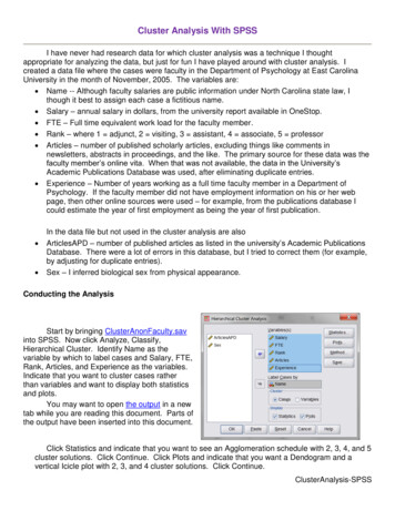
60 Unit 4Lesson 16A: Creatingan SPSS Graphsee here to create a line graph of test scores by grade.These data are available in the file named Lesson 16 DataFile 1.Lesson 16A Explain how to create and save line, bar,scatter/dot, and pie graph.Tip145256349457567672Creating a Line Graph The steps for creating anygraph are basically the same. You first enter the data youwant to use in the graph, select the type of graph you wantfrom the Graph menu, define how the graph should appear, and then click OK. Here are the steps we followed tocreate the graph you see in Figure 16A.1.Although the main menu for creating a graph in SPSS islabeled Graphs, you may also notice that the word chart isused in dialog boxes. No matter, they both mean the samething—the visual presentation of data.ScorePLESPSS offers you just the features to create graphs thatbring the results of your analyses to life. In this lesson, wewill go through the steps to create several different typesof graphs and provide examples of different graphs. InLesson 17A, we’ll show you how to modify a graph by adding a graph title; adding labels to axes; modifying scales;and working with patterns, fonts, and more. Throughoutthis unit of Using SPSS, we’ll use the words graph and chartinterchangeably.Grade16A.1: Creating a Simple GraphSAMThe one thing that all graphs have in common is thatthey are based on data. Although you may import datato create a graph, in this example we’ll use the data you1. Enter the data you want to use to create the graph.2. Click Graphs S Legacy Dialogs S Line. When youdo this, you will see the Line Charts dialog box, asshown in Figure 16A.2 (on page 61).3. Click Simple, and then click Define. You will see theDefine Simple Line dialog box.4. Click Grade, click Category Axis: area.to move the variable to the5. Click the Other Statistic button.Figure 16A.1. A simple line graph.M04 GREE9889 08 SE C04.indd 6031/05/16 3:35 pm
Working with SPSS Graphs and Output for Windows61the Define dialog box and entering what titles, subtitles, and footnotes you want.7. Click OK, and you see the graph in the Output Viewer,as shown in Figure 16A.3.This is the default graph with no additions, changes,or edits.Saving a Graph A graph is only one possible component of the Output Viewer window. The graph is nota separate entity that stands by itself, but part of all theoutput generated and displayed in the Viewer. To save agraph, you have to save the entire contents of the Viewerwindow. To do so, follow these steps:1. In the Viewer window, click File S Save.2. Provide a name for the file.Printing a Graph There are several ways to print agraph. The first way is to print from the Viewer window byselecting the graph and then selecting Print.SAMFigure 16A.2. The Line Charts dialog box.PLE3. Click OK. The contents of the Output Viewer issaved under the name that you provide with an .spvextension (attached to all Viewer files), as shown inFigure 16A.4 (on page 62). If you want to open thisfile later, you have to select this extension from theFiles of type drop-down menu.6. Click Score, and then clickto move the variable tothe Variable: area. Now is the time to enter a title orsubtitle in any graph by clicking the Titles button in1. Be sure that the graph you want to print is in the activeViewer window.2. Click on the graph so that it is selected.3. Click on the Print icon on the toolbar or click File SPrint and then OK. The graph will be printed.Figure 16A.3. A simple line chart as seen in the Viewer window.M04 GREE9889 08 SE C04.indd 6131/05/16 3:35 pm
PLE62 Unit 4Figure 16A.4. Output is always saved with an .spv extension.TipYou can print only one or more elements in the Viewer byfirst selecting the element by clicking on it once and thenselecting File S Print, clicking Selection, and then clickingyou click.SAMOK. To select more than one, hold down the Ctrl key as16A.2: Different SPSS GraphsSPSS offers 11 different types of graphs all of which youcan see at Graphs S Legacy Dialogs.Although some types of graph may be used in lieu ofothers, each has its own purpose. The purpose depends onthe type of data being graphed as well as the research question being asked. It’s beyond the scope of this book to detaileach graph and all the possible combinations (for help, justclick on any icon in the Graphs Builder help area), but thefollowing are examples of some of the more simple graphs.Keep in mind that there is an almost infinite numberof variations of the graphs you can create by using SPSS.You’ll learn about modifying graphs in Lesson 17A. Allsample graphs that follow appear as they were first created, with no modification.The Bar Graph A bar graph represents values as separate bars with each bar corresponding to the value in theData Editor. Bar graphs are often used because they are visually direct and easy to understand. In Figure 16A.5, youcan see an example of a bar graph of the number of malesand females.M04 GREE9889 08 SE C04.indd 62Figure 16A.5. A simple bar graph.Scatter/Dot The Scatter/Dot option provides a visualimage of at least two data points for each case, as shown inFigure 16A.6 (on page 63). It is most often used to illustratethe relationship between two variables and is often called ascattergram.The Pie Graph The pie graph is a circle divided intowedges, with each wedge representing a proportion of thewhole. Pie graphs provide a clear picture of the relative contribution that a data point makes to the overall body of information. In Figure 16A.7 (on page 63), you can see a simplepie graph for expenses (rent, insurance, and miscellaneous).Keep in mind that when you first create a graph, allthe SPSS defaults are used. You can easily change typesize and font and many other characteristics. You willlearn how to do that in the next lesson.31/05/16 3:35 pm
Working with SPSS Graphs and Output for Windows6316B.1: Creating a Simple ChartThe one thing that all charts have in common is that theyare based on data. Although you may import data to create a chart, in this example we’ll use the data you see hereto create a line chart of test scores by grade. These dataare available in the file named Lesson 16 Data File 1.GradeScore145256349457567672Figure 16A.6. A simple scatter/dot graph.PLENeighborhood 2Neighborhood 126.09%SAM73.91%Creating a Line Chart The steps for creating anychart are basically the same. You first enter the data youwant to use in the chart, select the type of chart you wantfrom the Graph menu, define how the chart should appear,and then click OK. Here are the steps we followed to createthe chart you see in Figure 16B.1.Figure 16A.7. A simple pie chart.Lesson 16B: Creating anSPSS ChartLesson 16B Explain how to create, save, and print different types of chart.SPSS offers you just the features to create charts thatbring the results of your analyses to life. In this lesson,we will go through the steps to create several differenttypes of charts and provide examples of different charts.In Lesson 17B, we’ll show you how to modify a chart odifyingby adding a chart title; adding labels to axes; mscales; and working with patterns, fonts, and more. Onenote of caution: Throughout this unit of Using SPSS, we’lluse the words graph and chart interchangeably.M04 GREE9889 08 SE C04.indd 63Figure 16B.1. A simple line chart.1. Enter the data you want to use to create the chart.2. Click Graphs S Legacy Dialogs S Line. When youdo this, you will see the Line Charts dialog box, asshown in Figure 16B.2 (on page 64).3. Click Simple and Summaries for groups of cases,then click Define and you will see the Define SimpleLine dialog box.4. Click grade, clickCategory Axis: area.to move the variable to the5. Click the Other Statistic button.31/05/16 3:35 pm
64 Unit 46. Click score, and then clickthe Variable: area.to move the variable to7. Click OK, and you see the chart in the Output Navigator, as shown in Figure 16B.3.This is the default chart with no additions, changes,or edits.Saving a Chart A chart is only one possible component of the Output Navigator window. The chart is nota separate entity that stands by itself, but part of all theoutput generated and displayed in the Viewer. To save achart, you have to save the entire contents of the OutputNavigator. To do so, follow these steps:1. In the Output Navigator window, click File S Save.2. Provide a name for the Output Navigator window.PLE3. Click OK. The Output Navigator is saved under thename that you provide with an .spv extension (attached to all Viewer files) (see Figure 16B.4 on page 65).If you want to open this file later, you have to selectthis extension from the Files of type drop-down menu.TipFigure 16B.2. The Line Charts dialog box.In the Macintosh version, to delete a chart in the ViewerSAMwindow, right-click and select Cut.Figure 16B.3. A simple line graph in the Viewer window.M04 GREE9889 08 SE C04.indd 6431/05/16 3:35 pm
65PLEWorking with SPSS Graphs and Output for WindowsSAMFigure 16B.4. Output is saved in the Viewer window with an .spv extension.Printing a Chart There are several ways to print achart. The first way is to print from the Output Navigatorby selecting the chart and then selecting Print.1. Be sure that the chart you want to print is in the activeViewer window.2. Click on the chart so that it is selected.3. Click on the Print icon on the toolbar or click File SPrint and then OK. The chart will be printed.16B.2: Different SPSS ChartsSPSS for the Macintosh offers many different types ofcharts. Although some types of chart may be used in lieuof others, each has its own purpose. The purpose dependson the type of data being charted as well as the researchquestion being asked. It’s beyond the scope of this bookto detail each chart and all the possible combinations, butthe following are examples of some of the simple charts.Keep in mind that there is an almost infinite number ofvariations of the charts you can create with SPSS. You’lllearn about modifying charts in Lesson 17B. All samplecharts that follow appear as they were first created, withno modifications.Data Editor. Bar charts are often used because they areeasy to understand and require little attention to detail.In Figure 16B.5, you can see an example of a bar chart ofthe number of s urvey participants above and below theage of 50.The Bar Chart A bar chart represents values as separate bars with each bar corresponding to the value in theThe Scatter/Dot Graph A scatter/dot chartis used to visually represent the relationship betweenM04 GREE9889 08 SE C04.indd 65Figure 16B.5. A simple bar chart.31/05/16 3:35 pm
66 Unit 4Lesson 17A: EnhancingSPSS GraphsLesson 17A Understand how to enhance SPSS graphsby modifying them and setting chartpreferences.A picture might be worth a thousand words, but if yourpictures or graphs don’t say what you want, what goodare they? Once you create a chart, as we showed you in thelast lesson, you can finish the job by editing the chart to reflect exactly your meaning. Color, shapes, scales, fonts, text,and more can be altered, and that is what you’ll do in thislesson. We’ll be working with the line graph that was firstshown to you in Figure 16A.1.Figure 16B.6. A simple scatter/dot chart.17A.1: Modifying a ChartThe first in the modification of any chart is to double-clickanywhere inside of the chart to access the SPSS ChartEditor. As you can see in Figure 17A.1 (on page 67), thereis a Chart toolbar containing a set of buttons across the topof the chart. In Figure 17A.2 (on page 67), you can see eachbutton better and what each represents.PLEtwo variables such as you see in Figure 16B.6, wherescores for both Test 1 and Test 2 are plotted for each individual. This type of graph is regularly used to illustrate the distribution of scores underlying a correlationcoefficient.SAMThe Pie Chart The pie chart is a circle divided intowedges, with each wedge representing a proportion ofthe whole. Pie charts provide a clear picture of the relativecontribution that a data point makes to the overall bodyof information. In Figure 16B.7, you can see a simple piechart for sales at three different store locations.GenderMaleFemaleFigure 16B.7. A simple pie chart.Keep in mind that when you first create a chart, all theSPSS defaults are used. You can easily change type size andfont and many other characteristics. You will learn how todo that in the next lesson.M04 GREE9889 08 SE C04.indd 66TipGraphs can be easily copied (use the Edit menu) andpasted into other Windows applications.One cautionary note before we begin. The most basicreason for modifying a chart should be to increase thechart’s ability to communicate your message. If you getcaught up in Chart Junk (a close cousin to Font Junk),you’ll have a mess on your hands. Modify to make better,not to show your reader that you know how to use SPSS.Some instructional notes before we begin.The general strategy for changing any elementin a chart is to select the chart element and then makethe change. You select a chart element much as you select any element in an application window, by clickingon it. If you single-click, you then must select the Menu command for the item you want to change. If you double-click, in some cases, you will go immediately to thedialog box in which you can make the change. And, thereare usually several different ways to change a chart element. You can usually double-click on the element (suchas the Y-axis) and make appropriate changes or use acorresponding tool on the toolbar. And, most parts ofa graph have a Properties dialog box associated with itwhere you can fine-tune graph edits.31/05/16 3:35 pm
edeCuploalExrmNoeowLinShonlatiinerpoit LntepFdIAdrougubdSneAdt Lil del MoLabeDataM04 GREE9889 08 SE C04.indd 67SAMInseence (Y)eferencInsee (Xrt R)e(Equat ferencion)eInsert TitleInsert AnnotationInsert Text BoxInsert FootnoteBinElementShowGridlinesShow AxisShow LegendTransposeScale to100%rt ReCasrt isRescale CharSctaletoDataowShRedoUndoPLEWorking with SPSS Graphs and Output for Windows67Figure 17A.1. The Chart Editor.Figure 17A.2. The Chart Editor tools and what they do.31/05/16 3:35 pm
68 Unit 4box opens up where you can also make adjustmentsto the title.TipThe first step in changing any graph element is to clickon that element in the Chart Editor. The second step is tomake the changes in the Properties box associated withthat element. The final step is to click the Apply button.Working with Titles and Subtitles Our firsttask is to modify the title and subtitle for the chart you seein Figure 17A.3.3. Once you are done, click anywhere else in the ChartEditor outside of the title area. We chose to enter thetitle Score by Grade.TipWhile you cannot directly save the chart modification fromthe Chart editor, you can save the format of the chart asa chart template which you can open and use again withanother set of data.SAMPLE1. With the Chart Editor open, click Options S Title.When you do this, the Title area is highlighted, as yousee in Figure 17A.3. You can also see how a Properties2. Edit the title (or subtitle or footnote) as you would anyother text and make whatever edits as necessary.Figure 17A.3. Highlighting a title.M04 GREE9889 08 SE C04.indd 6831/05/16 3:35 pm
Working with SPSS Graphs and Output for WindowsWorking with Fonts Now it’s time to work withthe font used for text in the chart. You can do this one oftwo ways, with each way yielding the same dialog boxused to change fonts:1. Select the area of the chart containing the text you wantto change. When you select text, it appears with a solidline around it. In this example, we selected the title ofthe chart (now Score by Grade).2. To change a font’s properties, double-click on the title and you will see the Properties box, as shown inFigure 17A.4.69TipNone of the changes that you make on a chart will besaved until you exit the Chart Editor and save the [filename].spv file.You can highlight more than one text area at a time byholding down the Ctrl key as you click with the mouse.Working with Axes The X- and Y-axes provide thecalibration for the independent (usually the X-axis) variableand the dependent (usually the Y-axis) variable. SPSS namesthe Y-axis the Scale Axis and the X-axis the Category Axis.Each of these axes can be modified in a variety of ways. Tomodify either axis, double-click on the title of the axis andyou will see the Properties dialog box for that axis.PLEHow to Modify the Scale (Y ) Axis For example,to modify the Y-axis, follow these steps:SAM1. Double-click on the line representing the Y-axis (theaxis will be highlighted), and you will see the Properties dialog box as shown in Figure 17A.5.Figure 17A.4. The Properties dialog box.3. Make the changes that you want. In this example, wechanged it to 14-point Arial Italic.4. Click the Apply button, and the font will change inthe chart. The Properties dialog box will remain on thescreen until you close it. That way you can change thechart size and other characteristics of the chart withouthaving to reselect the Properties dialog box.M04 GREE9889 08 SE C04.indd 69Figure 17A.5. The Properties dialog box for the Y-axis.31/05/16 3:35 pm
70 Unit 42. Select the options you want from the dialog box. Weclicked the Number Format tab and made sure thatthere were no decimal places.How to Modify the Category (X) Axis Work ing with the X-axis is exactly the same as working withthe Y-axis. Here’s how the X-axis is modified:1. Double-click on the label of the X-axis. The Propertiesdialog box opens as shown in Figure 17A.6.PLE2. Select the options you want from the Properties dialog box.Figure 17A.7. The modified line chart showing theSAMProperties dialog box for changing the pattern used for the line.Figure 17A.6. The Properties dialog box for the X-axis.Figure 17A.8. A simple bar chart.Our finished and modified line chart (with a few morechanges such as a dotted rather than a solid line which weaccomplished by clicking on the line in the line chart andmodifying the pattern) is shown in Figure 17A.7, and although none of these changes are dramatic, they do showhow easy these enhancement tools are to use.We got back to the output window by closing the ChartEditor when we were done modifying the chart.different elements in a chart. We’ll use two tools, one towork with patterns and one to work with colors. We’lluse a simple bar chart, as shown in Figure 17A.8, as anexample.Working with Patterns and Colors Timeto have some fun (and be practical besides). When SPSScreates a chart, it assigns different colors or symbols to2. Double-click on the chart element you want to select(in this case, either of the three bars) to open the Properties dialog box shown in Figure 17A.9 (on page 71).M04 GREE9889 08 SE C04.indd 70To change the patterns of any element in a chart, follow these steps:Changing Patterns1. Double-click inside the area of the chart to open theChart Editor.31/05/16 3:35 pm
Working with SPSS Graphs and Output for Windows712. Click the color you want to use. In this example, weclicked the white square and then clicked the Applybutton and the newly formatted chart appears as shownin Figure 17A.10.The final chart with modifications is shown inFigure 17A.10 after the Chart Editor is closed.17A.2: Setting Chart PreferencesNow that you know something about creating and modifying graphs, you should know there are certain default settings that you can set before you create a chart under Edit - Options - Charts menu (in the Output Viewer pane on theleft of the output window and not the Chart Editor). Usingthis tool, you can choose a particular format for viewingyour graphs. These settings, shown in Figure 17A.11, allowyou to set the following visual elements:PLE The font used in the chart, The nature of how items are filled with patterns or colors, The height-to-width ratio of the chart,Figure 17A.9. The Properties dialog box.3. Click the Fill & Border tab.4. Click the Pattern drop-down menu and select the pattern you want.SAM5. Click Apply, and the pattern used in the bars willchange. In the bar chart you see in Figure 17A.10, thedotted pattern was used for the Club variables.Figure 17A.10. Changing the color of the chart element.To change the color of any element ina chart, follow these steps (we are in the same Propertiesdialog box as was used for changing the pattern of the chartelement):Changing Colors1. Click the Fill button under Color, and you will see theProperties dialog box where you can manipulate color.M04 GREE9889 08 SE C04.indd 71Figure 17A.11. The Options dialog box.31/05/16 3:35 pm
72 Unit 4 The presence of a frame (inside or outside), and The presence of grid lines.For example, if you want the initial chart to use TimesNew Roman as a font, specify it in the SPSS Options dialog box you access through the Edit menu in the ChartEditor.If you intend to create graphs according to APAguidelines, you should create a chart template. That way,when you create a new chart, all you need to do is applythe chart template, and the formatting (such as centeredaxes titles) will be automatic. To create a chart template,follow these steps:1. Once you complete a chart that fits your style needsand you are still in the Chart Editor window, clickFile S Save Chart Template in the Chart Editor window. You will see the Save Chart Template dialog box,as shown in Figure 17A.13.17A.3: A Few More ThingsPLEBefore we finish with this bar chart and with your introduction to SPSS graphs, let’s add just a few more thingsto jazz up the bar chart. If the Chart Editor is not open,open it now so you have the chart (or some form of it)that you saw in Figure 17A.10. You can see our finishedbar chart in Figure 17A.12 and a brief description of whatwe did ure 17A.12. Making additional edits in the bar chart.Figure 17A.13. Creating a template.First, click on the Data Label Mode icon on the ChartEditor toolbar and once it appears inside of the bar, youcan double-click it and work with the data labels properties. You see the final chart in Figure 17A.12—a bit moreinformative.Second, we’ll add a title using the Title option on theOptions menu in the Chart Editor.There is, of course, an endless number of changes youmake to a chart. Just remember that simple is best.17A.4: Using a Chart Templateand Creating an APA-Style GraphIf you are preparing a chart or graph for publication, youwill want it to conform to the style detailed in the fifth edition of the Publication Manual of the American PsychologicalAssociation.M04 GREE9889 08 SE C04.indd 722. Select the options you want to save based on thisgraph, and click Continue.3. Enter a name for the template and select the templatefile extension from the Files of type: area. The templatewill automatically have an .sgt extension.4. Click Save. The chart template will be saved.To use a chart template once it has been created, followthese steps:1. After clicking the Define button when creatinga chart, click the Use chart specifications from:checkbox.2. Locate the template that you want to use.3. Click Open and the style will be applied to the graphyou are developing.31/05/16 3:35 pm
Working with SPSS Graphs and Output for Windows73Exercises: Lesson 17A1. Create a simple bar chart, save the file, and send itto a colleague and have that colleague send you theone that he or she created.2. Perform the following edits on the bar chart.b. Add a title to the chart and edit the titles of theX- and Y-axes.c. Add a footnote.d. Save the chart design as a chart template.a. Change the color of all bars.Lesson 17B: EnhancingSPSS Charts17B.1: Modifying a ChartThe first step in the modification of any chart is to double-click on the chart in the right pane of the OutputNavigator to access the SPSS Chart Editor and thenclick the maximize button on the Application title bar.As you can see in Figure 17B.1, there is a Chart toolbarcontaining a set of buttons across the top of the chart.Place the mouse cursor over a button to learn whatit does.PLELesson 17B Understand how to enhance SPSS chartsby modifying their parameters.this lesson. We’ll be working with the line chart that wasfirst shown to you in Figure 16B.1.SAMA picture might be worth a thousand words, but if yourpictures or charts don’t say what you want, what good arethey? Once you create a chart, as we showed you in thelast lesson, you can finish the job by editing the chart toreflect exactly your meaning. Color, shapes, scales, fonts,text, and more can be altered, and that is what you’ll do inFigure 17B.1. The Chart Editor.M04 GREE9889 08 SE C04.indd 7331/05/16 3:35 pm
74 Unit 4PLEOne cautionary note before we begin. The most basicreason for modifying a chart should be to increase thechart’s ability to communicate your message. If you getcaught up in Chart Junk (a close cousin to Font Junk),you’ll have a mess on your hands. Modify to make better,not to show your reader that you know how to use SPSS.One instructional note before we begin: The generalstrategy for changing any element in a chart is to select thechart element and in the Properties dialog box (don’t worry,SPSS knows what element you are clicking on) make thechange. You select a chart element much as you select anyMacintosh element, by clicking on it. If you single-click,you then must select the menu command for the item youwant to change. If you double-click, in some cases you willgo immediately to the dialog box in which you can makethe change. One other note about properties boxes in theprocess of editing a chart: They may have an arrow to theleft or right of the title bar indicating that there are more options available when that arrow is clicked.WorkingwithTitlesandCreatingSubtitles Our first task is to enter the title and subtitlefor the chart you see in Figure 17B.3.Figure 17B.2. The Properties dialog box.SAM1. With the Chart Editor open, click the Insert a Title button on the toolbar and you will see the Properties boxas shown in Figure 17B.2, and in Figure 17B.3, throughFigure 17B.3. Working with titles.M04 GREE9889 08 SE C04.indd 7431/05/16 3:35 pm
Working with SPSS Graphs and Output for Windowswhich you can add a title and make the followingchanges: The size of the chart, The font, style, and other text alterations, Select from various border and fill options, and Work with the variables in the chart.Once you have clicked on the Title option on the SPSSOptions menu (while in the Chart Editor), edit the Titletext as you would any other text—click on it and makethe necessary changes. If you want to add a subtitle, justadd another title using the same button. And using theProperties dialog box you saw in Figure 17B.2, you canchange any element you see fit.Working with Axes The X- and Y-axes provide thecalibration for the independent (usually the X-axis) variable and the dependent (usually the Y-axis) variable. Eachof these axes can be modified in a variety of ways. To modify either axis, double-click on the title of the axis and youwill see one of the Properties dialog boxes, as shown inFigure 17B.4. In this example, you can see how the Labels& Ticks tab is visible and changes in whether labels andticks are displayed and where ticks appear can be easilymade and applied.In Figure 17B.5, you can see how the lines associatedwith a chart can be modified.Once again, the element that you want modified isdouble-clicked, producing the Properties dialog box yousee in Figure 17B.5. Here, the weight, style, and end capsof the line can be easily modified. The color of the line canbe seen as well.Another tab, shown in Figure 17B.6 (on page 7
Working with SpSS Graphs and Output for Windows 61 the Define dialog box and entering what titles, subti-tles, and footnotes you want. 7. Click OK, and you see