Transcription
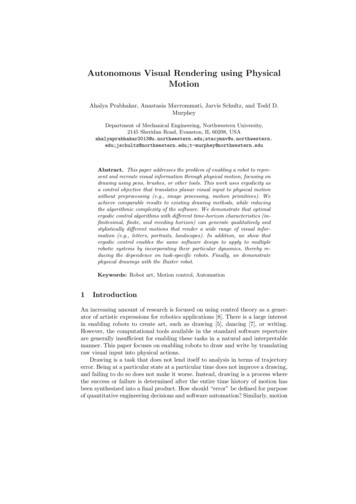
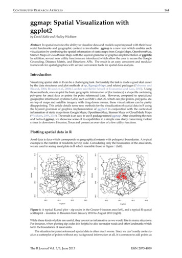
C ONTRIBUTED R ESEARCH A RTICLES144ggmap: Spatial Visualization withggplot2by David Kahle and Hadley WickhamAbstract In spatial statistics the ability to visualize data and models superimposed with their basicsocial landmarks and geographic context is invaluable. ggmap is a new tool which enables suchvisualization by combining the spatial information of static maps from Google Maps, OpenStreetMap,Stamen Maps or CloudMade Maps with the layered grammar of graphics implementation of ggplot2.In addition, several new utility functions are introduced which allow the user to access the GoogleGeocoding, Distance Matrix, and Directions APIs. The result is an easy, consistent and modularframework for spatial graphics with several convenient tools for spatial data analysis.IntroductionVisualizing spatial data in R can be a challenging task. Fortunately the task is made a good deal easierby the data structures and plot methods of sp, RgoogleMaps, and related packages (Pebesma andBivand, 2006; Bivand et al., 2008; Loecher and Berlin School of Economics and Law, 2013). Usingthose methods, one can plot the basic geographic information of (for instance) a shape file containingpolygons for areal data or points for point referenced data. However, compared to specializedgeographic information systems (GISs) such as ESRI’s ArcGIS, which can plot points, polygons, etc.on top of maps and satellite imagery with drag-down menus, these visualizations can be prettydisappointing. This article details some new methods for the visualization of spatial data in R usingthe layered grammar of graphics implementation of ggplot2 in conjunction with the contextualinformation of static maps from Google Maps, OpenStreetMap, Stamen Maps or CloudMade Maps(Wickham, 2009, 2010). The result is an easy to use R package named ggmap. After describing the nutsand bolts of ggmap, we showcase some of its capabilities in a simple case study concerning violentcrimes in downtown Houston, Texas and present an overview of a few utility functions.Plotting spatial data in real data is data which corresponds to geographical extents with polygonal boundaries. A typicalexample is the number of residents per zip code. Considering only the boundaries of the areal units,we are used to seeing areal plots in R which resemble those in Figure 1 0-94.5longitudeFigure 1: A typical R areal plot – zip codes in the Greater Houston area (left), and a typical R spatialscatterplot – murders in Houston from January 2010 to August 2010 (right).While these kinds of plots are useful, they are not as informative as we would like in many situations.For instance, when plotting zip codes it is helpful to also see major roads and other landmarks whichform the boundaries of areal units.The situation for point referenced spatial data is often much worse. Since we can’t easily contextualize a scatterplot of points without any background information at all, it is common to add points asThe R Journal Vol. 5/1, June 2013ISSN 2073-4859
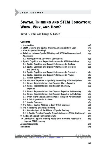
C ONTRIBUTED R ESEARCH A RTICLES145an overlay of some areal data—whatever areal data is available. The resulting plot looks like Figure 1(right).In most cases the plot is understandable to the researcher who has worked on the problem forsome time but is of hardly any use to his audience, who must work to associate the data of interestwith their location. Moreover, it leaves out many practical details—are most of the events to the eastor west of landmark x? Are they clustered around more well-to-do parts of town, or do they tendto occur in disadvantaged areas? Questions like these can’t really be answered using these kinds ofgraphics because we don’t think in terms of small scale areal boundaries (e.g. zip codes or censustracts).With a little effort better plots can be made, and tools such as maps, maptools, sp, or RgoogleMapsmake the process much easier; in fact, RgoogleMaps was the inspiration for ggmap (Becker et al.,2013; Bivand and Lewin-Koh, 2013).Moreover, there has recently been a deluge of interest in the subject of mapmaking in R—IanFellows’ excellent interactive GUI-driven DeducerSpatial package based on Bing Maps comes tomind (Fellows et al., 2013). ggmap takes another step in this direction by situating the contextualinformation of various kinds of static maps in the ggplot2 plotting framework. The result is an easy,consistent way of specifying plots which are readily interpretable by both expert and audience andsafeguarded from graphical inconsistencies by the layered grammar of graphics framework. The resultis a spatial plot resembling Figure 2. Note that map images and information in this work may appearslightly different due to map provider changes over time.murder - subset(crime, offense "murder")qmplot(lon, lat, data murder, colour I('red'), size I(3), darken .3) Figure 2: A spatial scatterplot based on Stamen Maps’ terrain tile set made with the qmplot function,an experimental amalgamation of the functions presented in this article.The layered grammar of graphicsOne advantage of making the plots with ggplot2 is the layered grammar of graphics on which ggplot2is based (Wickham, 2010; Wilkinson, 2005). By definition, the layered grammar demands that everyplot consist of five components : a default dataset with aesthetic mappings, one or more layers, each with a geometric object (“geom”), a statistical transformation (“stat”),and a dataset with aesthetic mappings (possibly defaulted), a scale for each aesthetic mapping (which can be automatically generated), a coordinate system, and a facet specification.The R Journal Vol. 5/1, June 2013ISSN 2073-4859
C ONTRIBUTED R ESEARCH A RTICLES146Since ggplot2 is an implementation of the layered grammar of graphics, every plot made with ggplot2has each of the above elements. Consequently, ggmap plots also have these elements, but certainelements are fixed to map components : the x aesthetic is fixed to longitude, the y aesthetic is fixed tolatitude, and the coordinate system is fixed to the Mercator projection.1The major theoretical advantage of using the layered grammar in plotting maps is that aestheticscales are kept consistent. In the typical situation where the map covers the extent of the data, inggmap the latitude and longitude scales key off the map (by default) and one scale is used for thoseaxes. The same is true of colors, fills, alpha blendings, and other aesthetics which are built on top ofthe map when other layers are presented—each is allotted one scale which is kept consistent acrosseach layer of the plot. This aspect of the grammar is particularly important for faceted plots in orderto make a proper comparison across several plots. Of course, the scales can still be tricked if the userimproperly specifies the spatial data, e.g. using more than one projection in the same map, but fixingsuch errors is beyond any framework.The practical advantage of using the grammar is even better. Since the graphics are done in ggplot2the user can draw from the full range of ggplot2’s capabilities to layer elegant visual content—geoms,stats, scales, etc.—using the usual ggplot2 coding conventions. This was already seen briefly in Figure2 where the arguments of qmplot are identical to that of ggplot2’s qplot; much more will be seenshortly.How ggmap worksThe basic idea driving ggmap is to take a downloaded map image, plot it as a context layer usingggplot2, and then plot additional content layers of data, statistics, or models on top of the map. Inggmap this process is broken into two pieces – (1) downloading the images and formatting themfor plotting, done with get map, and (2) making the plot, done with ggmap. qmap marries these twofunctions for quick map plotting (c.f. ggplot2’s ggplot), and qmplot attempts to wrap up the entireplotting process into one simple command (c.f. ggplot2’s qplot).The get map functionIn ggmap, downloading a map as an image and formatting the image for plotting is done with theget map function. More specifically, get map is a wrapper function for the underlying functionsget googlemap, get openstreetmap, get stamenmap, and get cloudmademap which accepts a widearray of arguments and returns a classed raster object for plotting with ggmap.As the most important characteristic of any map is location, the most important argument ofget map is the location argument. Ideally, location is a longitude/latitude pair specifying the centerof the map and accompanied by a zoom argument, an integer from 3 to 20 specifying how large thespatial extent should be around the center, with 3 being the continent level and 20 being roughly thesingle building level. location is defaulted to downtown Houston, Texas, and zoom to 10, roughly acity-scale.While longitude/latitude pairs are ideal for specifying a location, they are somewhat inconvenienton a practical level. For this reason, location also accepts a character string. The string, whethercontaining an address, zip code, or proper name, is then passed to the geocode function which thendetermines the appropriate longitude/latitude coordinate for the center. In other words, there isno need to know the exact longitude/latitude coordinates of the center of the map—get map candetermine them from more colloquial (“lazy”) specifications so that they can be specified very loosely.For example, since geocode("the white house")lonlat-77.03676 38.89784works, "the white house" is a viable location argument. More details on geocode and other utilityfunctions are discussed at the end of this article.In lieu of a center/zoom specification, some users find a bounding box specification more convenient. To accommodate this form of specification, location also accepts numeric vectors of length fourfollowing the left/bottom/right/top convention. This option is not currently available for GoogleMaps.While each map source has its own web application programming interface (API), specificationof location/zoom in get map works for each by computing the appropriate parameters (if necessary)1 Note that because of the Mercator projection limitations in mapproject, anything above/below 80 cannot beplotted currently.The R Journal Vol. 5/1, June 2013ISSN 2073-4859
C ONTRIBUTED R ESEARCH A RTICLES147and passing them to each of the API specific get * functions. To ensure that the resulting maps arethe same across the various sources for the same location/zoom specification, get map first grabs theappropriate Google Map, determines its bounding box, and then downloads the other map as needed.In the case of Stamen Maps and CloudMade Maps, this involves a stitching process of combiningseveral tiles (small map images) and then cropping the result to the appropriate bounding box. Theresult is a single, consistent specification syntax across the four map sources as seen for Google Mapsand OpenStreetMap in Figure 3.baylor - "baylor university"qmap(baylor, zoom 14)qmap(baylor, zoom 14, source "osm")Figure 3: get map provides the same spatial extent for Google Maps (top) and OpenStreetMaps(bottom) with a single simple syntax, even though their APIs are quite different.Before moving into the source and maptype arguments, it is important to note that the underlyingAPI specific get * functions for which get map is a wrapper provide more extensive mechanisms fordownloading from their respective sources. For example, get googlemap can access almost the fullrange of the Google Static Maps API as seen in Figure 4.Tile style – the source and maptype arguments of get mapThe most attractive aspect of using different map sources (Google Maps, OpenStreetMap, StamenMaps, and CloudMade Maps) is the different map styles provided by the producer. These are specifiedThe R Journal Vol. 5/1, June 2013ISSN 2073-4859
C ONTRIBUTED R ESEARCH A RTICLES148set.seed(500)df - round(data.frame(x jitter(rep(-95.36, 50), amount .3),y jitter(rep( 29.76, 50), amount .3)), digits 2)map - get googlemap('houston', markers df, path df, scale 2)ggmap(map, extent 'device')Figure 4: Accessing Google Maps API features with get googlemap.The R Journal Vol. 5/1, June 2013ISSN 2073-4859
C ONTRIBUTED R ESEARCH A RTICLES149with the maptype argument of get map and must agree with the source argument. Some stylesemphasize large roadways, others bodies of water, and still others political boundaries. Some arebetter for plotting in a black-and-white medium; others are simply nice to look at. This section gives arun down of the various map styles available in ggmap.Google provides four different familiar types—terrain (default), satellite (e.g. Figure 13), roadmap,and hybrid (e.g. Figure 12). OpenStreetMap, on the other hand, only provides the default style shownin Figure 3.Style is where Stamen Maps and CloudMade Maps really shine. Stamen Maps has three availabletile sets—terrain (e.g. Figures 2 or 13), watercolor, and toner (for the latter two see Figure 5).qmap(baylor, zoom 14, source "stamen", maptype "watercolor")qmap(baylor, zoom 14, source "stamen", maptype "toner")Figure 5: Stamen tile sets maptype "watercolor" and maptype "toner".Stamen’s terrain tile set is quite similar to Google’s, but obviously the watercolor and toner tilesets are substantially different than any of the four Google tile sets. The latter, for example, is ideal forblack-and-white plotting.CloudMade Maps takes the tile styling even further by allowing the user to either (1) select amongthousands of user-made sets or (2) create an entirely new style with a simple online editor where theuser can specify colors, lines, and so forth for various types of roads, waterways, landmarks, etc.,all of which are generated by CloudMade and accessible in ggmap. ggmap, through get map (orget cloudmademap) allows for both options. This is a unique feature of CloudMade Maps which reallyboosts their applicability and expands the possibilities with ggmap. The one minor drawback to usingCloudMade Maps is that the user must register with CloudMade to obtain an API key and then passthe API key into get map with the api key argument. API keys are free of charge and can be obtainedin a matter of minutes. Two low-light CloudMade map styles are seen in Figure 6. Note that mapstyles are only available to the user that owns them.Both Stamen Maps and CloudMade Maps are built using OpenStreetMap data. These data arecontributed by an open community of online users in much the same way Wikipedia is—both are free,both are user-contributed, and both are easily edited. Moreover, OpenStreetMap has data not only onroadways and bodies of water but also individual buildings, fountains, stop signs and other apparentminutiae. The drawback is that (like Google Maps) not all locations are mapped with the same degreeof precision, and imperfections may be observed in small-scale out of the way features.2The ggmap functionOnce get map has grabbed the map of interest, ggmap is ready to plot it. The result of get map is aspecially classed raster object (a matrix of colors as hexadecimal character strings) – paris - get map(location "paris") str(paris)2 As an example, the reader is referred to look at Google Maps satellite images of northwest tributaries to LakeWaco and search for them in the Stamen watercolor tile set.The R Journal Vol. 5/1, June 2013ISSN 2073-4859
C ONTRIBUTED R ESEARCH A RTICLES150qmap(baylor, zoom 14, maptype 53428, api key api key,source "cloudmade")qmap("houston", zoom 10, maptype 58916, api key api key,source "cloudmade")Figure 6: Two out of thousands of user made CloudMade Maps styles. The left is comparable toFigures 3 and 5, and the right contains the bodies of water in Figure 4.chr [1:1280, 1:1280] "#C6DAB6" "#C2D6B3" "#C2D6B3" .- attr(*, "class") chr [1:2] "ggmap" "raster"- attr(*, "bb") 'data.frame':1 obs. of 4 variables:. ll.lat: num 48.6. ll.lon: num 1.91. ur.lat: num 49.1. ur.lon: num 2.79The purpose of ggmap is to take the map from the raster object to the screen, and it fulfills this purposeby creating a ggplot object which, when printed, draws the desired map in the graphics device. This isillustrated in Figure 7.While ggmap requires a ggmap object, it accepts a handful of other arguments as well—extent,base layer, maprange, legend, padding, and darken. With none of these additional arguments, ggmapeffectively returns the following ggplot objectggplot(aes(x lon, y lat), data fourCorners) geom blank() coord map("mercator") annotation raster(ggmap, xmin, xmax, ymin, ymax)where fourCorners is the data frame resulting from applying expand.grid to the longitude andlatitude ranges specified in the bb attribute of the ggmap object. Thus, the default base layer of theggplot2 object created by ggmap is ggplot(aes(x lon,y lat),data fourCorners), and thedefault x and y aesthetic scales are calculated based on the longitude and latitude ranges of the map.The extent argument dictates how much of the graphics device is covered by the map. Itaccepts three possible strings: "normal" shown in Figure 7, "panel" shown in Figures 10 and12, and "device" shown in every other figure. "normal" situates the map with the usual axispadding provided by ggplot2 and, consequently, one can see the panel behind it. "panel" eliminates this, setting the limits of the plot panel to be the longitude and latitude extents of the map withscale [x,y] continuous(expand c(0,0)). "device" takes this to the extreme by eliminating theaxes themselves with the new exported theme nothing.base layer is a call which substitutes the default base layer to the user’s specification. Thus,in the above code the user can change ggplot(aes(x lon,y lat),data fourCorners) to adifferent call. This is essential for faceting plots since the referent of ggplot2 functions facet wrap andfacet grid is the base layer. Since changing the base layer changes the base scales and therefore limitsof the plot, it is possible that when the base layer is changed only part of the map is visible. Settingthe maprange argument to TRUE (it defaults to FALSE) ensures that the map determines the x and y axisThe R Journal Vol. 5/1, June 2013ISSN 2073-4859
C ONTRIBUTED R ESEARCH A RTICLES151ggmap(paris, extent "normal")Figure 7: Setting extent "normal" in ggmap illustrates how maps in ggmap are simply ggplot2graphics.limits (longitude and latitude) via the bb attribute of the ggmap object itself, and not the base layerargument.The legend-related arguments of ggmap are legend and padding, and they are only applicablewhen extent "device". The legend argument determines where a legend should be drawn on themap if one should be drawn. Its options are "left", "right" (default), "bottom", "top", "topleft","bottomleft", "topright", "bottomright" and "none". The first four draw the legend according toggplot2’s normal specifications (without any axes); the next four draw the legend on top of the mapitself similar to ArcGIS; and the last eliminates the legend altogether. padding governs how far fromthe corner the legend should be drawn.The darken argument, a suggestion by Jean-Olivier Irisson, tints the map image. The default,c(0,"black"), indicates a fully translucent black layer, i.e. no tint at all. Generally, the first argumentcorresponds to an alpha blending (0 invisible, 1 opaque) and the second argument the color of thetint. If only a number is supplied to the darken argument ggmap assumes a black tint. The tint itself ismade by adding a geom rect layer on top of the map. An example is provided by Figure 2, where ablack tint was added to the map to enhance the visibility of the points.Since ggmap returns a ggplot object, the product of ggmap can itself act as a base layer in the ggplot2framework. This is an incredibly important realization which allows for the full range of ggplot2capabilities. We now illustrate many of the ways in which this can be done effectively through a casestudy of violent crime in downtown Houston, Texas.ggmap in actionDataCrime data were compiled from the Houston Police Department’s website over the period of January2010–August 2010. The data were lightly cleaned and aggregated using plyr (Wickham, 2011) andgeocoded using Google Maps (to the center of the block, e.g., 6150 Main St.); the full data set isavailable in ggmap as the data set crime. str(crime)'data.frame':86314 obs. of 17 variables: time: POSIXt, format: "2010-01-01 0. date: chr "1/1/2010" "1/1/2010" "1.The R Journal Vol. 5/1, June 2013ISSN 2073-4859
C ONTRIBUTED R ESEARCH A RTICLES hour:premise :offense :beat:block :street :type:suffix :number :month :day:location:address :lon:lat:152int 0 0 0 0 0 0 0 0 0 0 .chr "18A" "13R" "20R" "20R" .chr "murder" "robbery" "aggr.chr "15E30" "13D10" "16E20" .chr "9600-9699" "4700-4799" .chr "marlive" "telephone" "w.chr "ln" "rd" "ln" "st" .chr "-" "-" "-" "-" .int 1 1 1 1 1 1 1 1 1 1 .Factor w/ 12 levels "january".Factor w/ 7 levels "monday" .chr "apartment parking lot" .chr "9650 marlive ln" "4750 .num -95.4 -95.3 -95.5 -95.4 .num 29.7 29.7 29.6 29.8 29.7.Since we are only interested in violent crimes which take place downtown, we restrict the dataset to those qualifiers. To determine a bounding box, we first use gglocator, a ggplot2 analogueof base’s locator function exported from ggmap. gglocator works not only for ggmap plots, butggplot2 graphics in general. # find a reasonable spatial extentqmap('houston', zoom 13)gglocator(2)lonlat1 -95.39681 29.784002 -95.34188 29.73631# only violent crimesviolent crimes - subset(crime,offense ! "auto theft" & offense ! "theft" & offense ! "burglary")# order violent crimesviolent crimes offense - factor(violent crimes offense,levels c("robbery", "aggravated assault", "rape", "murder"))# restrict to downtownviolent crimes - subset(violent crimes,-95.39681 lon & lon -95.34188 &29.73631 lat & lat 29.78400)The analysis performed only concerns data on the violent crimes of aggravated assault, robbery,rape and murder. Note that while some effort was made to ensure the quality of the data, the datawere only leisurely cleaned and the data set may still contain errors.AnalysisThe first step we might want to take is to look at where the individual crimes took place. Modulo somesimple ggplot2 styling changes (primarily in the fonts and key-styles of the legends via ggplot2’sguide function), Figure 8 contains the code to produce the spatial bubble chart shown on the left.One of the problems with the bubble chart is overplotting and point size—we can’t really get a feelfor what crimes are taking place and where. One way around this is to bin the points and drop thebins which don’t have any samples in them. The result (Figure 8 right) shows us where the crimes arehappening at the expense of knowing their frequency.The binned plot is the first time we really begin to see the power of having the maps in the ggplot2framework. While it is actually not a very good plot, it illustrates the practical advantage of theggplot2 framework with the contextual information of the map—the process of splitting the dataframe violent crimes into chunks based on the offense variable, binning the points of each, andaggregating back into one data set to plot is all done entirely behind the scenes by ggplot2.What about violent crimes in general? If we neglect the type of offense, we can get a good idea ofthe spatial distribution of violent crimes by using a contour plot. Since the map image itself is basedon ggplot2’s annotation raster, which doesn’t have a fill aesthetic, we can access the fill aesthetic tomake a filled contour plot. This is seen in Figure 9 (left).The R Journal Vol. 5/1, June 2013ISSN 2073-4859
C ONTRIBUTED R ESEARCH A RTICLES153theme set(theme bw(16))HoustonMap - qmap("houston", zoom 14, color "bw", legend "topleft")HoustonMap geom point(aes(x lon, y lat, colour offense, size offense),data violent crimes)HoustonMap stat bin2d(aes(x lon, y lat, colour offense, fill offense),size .5, bins 30, alpha 1/2,data violent crimes)Figure 8: Violent crime bubble chart of downtown Houston (left) and the same binned (right).The R Journal Vol. 5/1, June 2013ISSN 2073-4859
C ONTRIBUTED R ESEARCH A RTICLES154houston - get map("houston", zoom 14)HoustonMap - ggmap("houston", extent "device", legend "topleft")HoustonMap stat density2d(aes(x lon, y lat, fill .level., alpha .level.),size 2, bins 4, data violent crimes,geom "polygon")overlay - stat density2d(aes(x lon, y lat, fill .level., alpha .level.),bins 4, geom "polygon",data violent crimes)HoustonMap overlay inset(grob ggplotGrob(ggplot() overlay theme inset()),xmin -95.35836, xmax Inf, ymin -Inf, ymax 29.75062)Figure 9: Filled contour plot of violent crimes (left), and the same with an inset (right).The R Journal Vol. 5/1, June 2013ISSN 2073-4859
C ONTRIBUTED R ESEARCH A RTICLES155These kinds of overlays can be incredibly effective; however, their ability to communicate information can be hindered by the fact that the map overlay can be visually confused with the map itself.This is particularly common when using colored maps. To get around this problem the inset functioncan be used to insert map insets containing the overlay on a white background with major and minoraxes lines for visual guides made possible by the exported function theme inset; this is seen in Figure9 (right).The image indicates that there are three main hotspots of activity. Each of these three correspondsto locations commonly held by Houstonians to be particularly dangerous locations. From east to west,the hotspots are caused by (1) a county jail which releases its inmates twice daily, who tend to loiter inthe area indicated, (2) a commercial bus station in an area of substantial homelessness and destitution,and (3) a prostitution hotspot in a very diverse and pedestrian part of town.In addition to single plots, the base layer argument to ggmap or qmap allows for faceted plots (seeFigure 10). This is particularly useful for spatiotemporal data with discrete temporal components (day,month, season, year, etc.).This last plot displays one of the known issues with contour plots in ggplot2—a “clipping” or“tearing” of the contours. Aside from that fact (which will likely be fixed in subsequent ggplot2versions), we can see that in fact most violent crimes happen on Monday, with a distant second beingFriday. Friday’s pattern is easily recognizable—a small elevated dot in the downtown bar district andan expanded region to the southwest in the district known as midtown, which has an active nightlife.Monday’s pattern is not as easily explainable.houston - get map(location "houston", zoom 14, color "bw",source "osm")HoustonMap - ggmap(houston, base layer ggplot(aes(x lon, y lat),data violent crimes))HoustonMap stat density2d(aes(x lon, y lat, fill .level., alpha .level.),bins 5, geom "polygon",data violent crimes) scale fill gradient(low "black", high "red") facet wrap( day)Figure 10: Faceted filled contour plot by day.ggmap’s utility functionsggmap has several utility functions which aid in spatial exploratory data analysis.The R Journal Vol. 5/1, June 2013ISSN 2073-4859
C ONTRIBUTED R ESEARCH A RTICLES156The geocode functionThe ability to move from an address to a longitude/latitude coordinate is virtually a must for visualizing spatial data. Unfortunately however, the process is almost always done outside R by usinga proper geographic information system (GIS), saving the results, and importing them into R. Thegeocode function simplifies this process to a single line in R.geocode is a vectorized function which accepts character strings and returns a data frame ofgeographic information. In the default case of output "simple", only longitudes and latitudes arereturned. These are actually Mercator projections of the ubiquitous unprojected 1984 world geodeticsystem (WGS84), a spheroidal earth model used by Google Maps. When output is set to "more", alarger data frame is returned which provides much more Google Geocoding information on the query: geocode("baylor university", output "more")lonlattypeloctypeaddressnorthsoutheast1 -97.11441 31.54872 university approximate [long address] 31.55823 31.53921 -97.0984west postal codecountry administrative area level 21 -97.1304276706 united statesmclennanadministrative area level 1 locality street streetNo point of interest1texaswaco s 5th st1311 NA In particular, administrative bodies at various levels are reported. Going further, setting output "all" returns the entire JavaScript Object Notation (JSON) object given by the Google Geocoding APIparsed by rjson (Couture-Beil, 2013).The Geocoding API has a number of request limitations in place to prevent abuse. An unspecifiedshort-term rate limit is in place (see mapdist below) as well as a 24-hour limit of 2,500 requests. Theseare monitored to some extent by the hidden global variable .GoogleGeocodeQueryCount and exportedfunction geocodeQueryCheck. geocode uses these to monitor its own progress and will either (1) slowits rate depending on usage or (2) throw an error if the query limit is exceeded. Note that revgeocodeshares the same request pool and is monitored by the same variable and function. To learn more aboutthe Google Geocoding, Distance Matrix, and Directions API usage regulations, see the websites listedin the bibliography.The revgeocode functionIn some instances it is useful to convert longitude/latitude coordinates into a physical address. This ismade possible
Plotting spatial data in R Areal data is data which corresponds to geographical extents with polygonal boundaries. A typical example is the number of residents per zip code. Considering only the boundaries of the areal units, we are used to seeing areal plots in R which resemble those in Figu