Transcription
Form Builder as a ServiceAdministrator’s Guide to the Form BuilderApril 2022
Legal NoticeFor information about NetIQ legal notices, disclaimers, warranties, export and other use restrictions, U.S. Governmentrestricted rights, patent policy, and FIPS compliance, see https://www.netiq.com/company/legal/.Copyright (C) 2022 NetIQ Corporation. All rights reserved.2
ContentsAbout this Book51 Introduction7About Form Builder. . . . . . . . . . . . . . . . . . . . . . . . . . . . . . . . . . . . . . . . . . . . . . . . . . . . . . . . . . . . . . . . . . . . . . . . 7How does the Form Builder Work? . . . . . . . . . . . . . . . . . . . . . . . . . . . . . . . . . . . . . . . . . . . . . . . . . . . . . . . . . . . 8Launching the Form Builder . . . . . . . . . . . . . . . . . . . . . . . . . . . . . . . . . . . . . . . . . . . . . . . . . . . . . . . . . . . . . . . . . 82 Exploring the Form Builder User Interface9Toolbar . . . . . . . . . . . . . . . . . . . . . . . . . . . . . . . . . . . . . . . . . . . . . . . . . . . . . . . . . . . . . . . . . . . . . . . . . . . . . . . . . . 9Form Components . . . . . . . . . . . . . . . . . . . . . . . . . . . . . . . . . . . . . . . . . . . . . . . . . . . . . . . . . . . . . . . . . . . . . . . 10Basic Components . . . . . . . . . . . . . . . . . . . . . . . . . . . . . . . . . . . . . . . . . . . . . . . . . . . . . . . . . . . . . . . . . . 10Advanced . . . . . . . . . . . . . . . . . . . . . . . . . . . . . . . . . . . . . . . . . . . . . . . . . . . . . . . . . . . . . . . . . . . . . . . . . 11Custom . . . . . . . . . . . . . . . . . . . . . . . . . . . . . . . . . . . . . . . . . . . . . . . . . . . . . . . . . . . . . . . . . . . . . . . . . . . 11Layout . . . . . . . . . . . . . . . . . . . . . . . . . . . . . . . . . . . . . . . . . . . . . . . . . . . . . . . . . . . . . . . . . . . . . . . . . . . . 11Data. . . . . . . . . . . . . . . . . . . . . . . . . . . . . . . . . . . . . . . . . . . . . . . . . . . . . . . . . . . . . . . . . . . . . . . . . . . . . . 12Workspace . . . . . . . . . . . . . . . . . . . . . . . . . . . . . . . . . . . . . . . . . . . . . . . . . . . . . . . . . . . . . . . . . . . . . . . . . . . . . . 12General Settings for Selected Component . . . . . . . . . . . . . . . . . . . . . . . . . . . . . . . . . . . . . . . . . . . . . . . . . . . . 12Display Tab . . . . . . . . . . . . . . . . . . . . . . . . . . . . . . . . . . . . . . . . . . . . . . . . . . . . . . . . . . . . . . . . . . . . . . . . 12Data Tab . . . . . . . . . . . . . . . . . . . . . . . . . . . . . . . . . . . . . . . . . . . . . . . . . . . . . . . . . . . . . . . . . . . . . . . . . . 13Validation Tab. . . . . . . . . . . . . . . . . . . . . . . . . . . . . . . . . . . . . . . . . . . . . . . . . . . . . . . . . . . . . . . . . . . . . . 13API Tab . . . . . . . . . . . . . . . . . . . . . . . . . . . . . . . . . . . . . . . . . . . . . . . . . . . . . . . . . . . . . . . . . . . . . . . . . . . 14Conditional Tab . . . . . . . . . . . . . . . . . . . . . . . . . . . . . . . . . . . . . . . . . . . . . . . . . . . . . . . . . . . . . . . . . . . . 14Logic Tab . . . . . . . . . . . . . . . . . . . . . . . . . . . . . . . . . . . . . . . . . . . . . . . . . . . . . . . . . . . . . . . . . . . . . . . . . . 14Layout Tab . . . . . . . . . . . . . . . . . . . . . . . . . . . . . . . . . . . . . . . . . . . . . . . . . . . . . . . . . . . . . . . . . . . . . . . . 143 Creating and Editing Forms15Creating Custom Request and Approval Forms . . . . . . . . . . . . . . . . . . . . . . . . . . . . . . . . . . . . . . . . . . . . . . . . 15Creating a Custom Request Form . . . . . . . . . . . . . . . . . . . . . . . . . . . . . . . . . . . . . . . . . . . . . . . . . . . . . . 15Creating a Custom Approval Form . . . . . . . . . . . . . . . . . . . . . . . . . . . . . . . . . . . . . . . . . . . . . . . . . . . . . 16Customizing the Default Request and Approval Forms . . . . . . . . . . . . . . . . . . . . . . . . . . . . . . . . . . . . . . . . . . 17Editing a Form . . . . . . . . . . . . . . . . . . . . . . . . . . . . . . . . . . . . . . . . . . . . . . . . . . . . . . . . . . . . . . . . . . . . . . . . . . . 18Editing a Form Using the Form Builder User Interface . . . . . . . . . . . . . . . . . . . . . . . . . . . . . . . . . . . . . 18Editing a Form in the JSON Editor. . . . . . . . . . . . . . . . . . . . . . . . . . . . . . . . . . . . . . . . . . . . . . . . . . . . . . 18Editing a Form in the JS Editor . . . . . . . . . . . . . . . . . . . . . . . . . . . . . . . . . . . . . . . . . . . . . . . . . . . . . . . . 194 Rendering the Forms235 Localization of a Form25Providing Translations of Form Field Labels . . . . . . . . . . . . . . . . . . . . . . . . . . . . . . . . . . . . . . . . . . . . . . . . . . . 256 Troubleshooting27Using setFieldValue function in Logic is Not Supported on Radio Component . . . . . . . . . . . . . . . . . . . . . . . 27Contents3
JavaScript Code Defined in Custom Default Value Not Executed When the Component is Redrawn . . . . . 27Unable to Overwrite the Calculated Value on Date/Time Component . . . . . . . . . . . . . . . . . . . . . . . . . . . . . 28A Appendix29Example of Creating a Form . . . . . . . . . . . . . . . . . . . . . . . . . . . . . . . . . . . . . . . . . . . . . . . . . . . . . . . . . . . . . . . . 294
About this BookThe Administrator’s Guide provides conceptual information about the Form Builder product. Thisbook describes how to work with the Form Builder product. It also provides step-by-step guidancefor creating forms using simple examples.Intended AudienceThis book provides information for individuals responsible for understanding the form buildingconcepts and using the Form Builder to create forms for their application.Contact InformationOur goal is to provide documentation that meets your needs. If you have suggestions forimprovements, please email Documentation-Feedback@netiq.com. We value your input and lookforward to hearing from you.For detailed contact information, see the Support Contact Information website.For general corporate and product information, see the NetIQ Corporate website.For interactive conversations with your peers and NetIQ experts, become an active member of ourcommunity. The Net IQ online community provides product information, useful links to helpfulresources, blogs, and social media channels.About this Book5
6About this Book
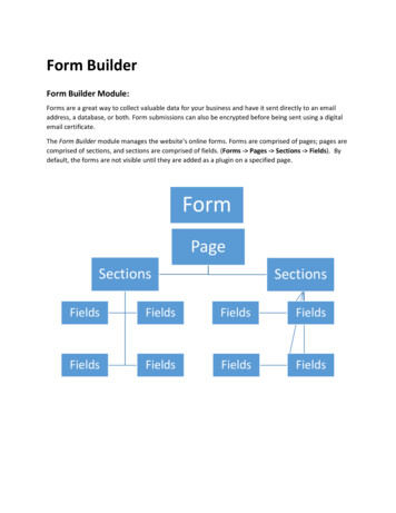
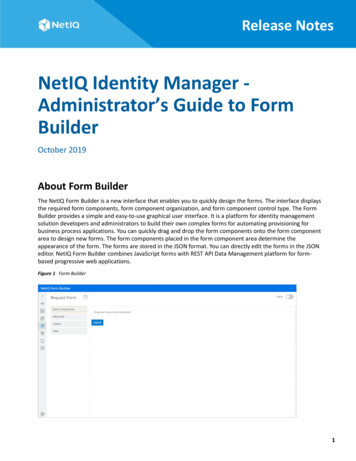
1Introduction1Forms are an integral part of any application that involves workflow process and data management.Forms can range from simple surveys to complex resource management forms. Typically, forms areembedded in workflows and connect to an API platform at the back end of an application, which canmake the overall form creation process complex and difficult. Moreover, integrating forms withthird-party servers and legacy systems increases the complexity. Form Builder simplifies the processby making it a hassle-free experience for the application administrators.The Form Builder allows you to design responsive forms that can be accessed by any application. Itprovides all the basic and modern form building features, including the drag-and-drop interface, andsupports a rich set of user interface elements. Using the Form Builder, you can build, customize, test,and deploy forms to an application. The application uses the Form Renderer component to renderthese forms and generate corresponding APIs.The application use forms at different stages of workflow process to collect the required informationand to execute relevant action for the fulfillment of the process. For example, roles and permissionsworkflows often need a formal approval before they are provisioned to the users. The user requeststhe role or permission by providing the required information through a request form. Once therequest is submitted, the approvers can approve or deny the request by providing the requiredinformation through approval forms.About Form BuilderThe Form Builder is a web-based service used for designing forms. It provides a platform forapplication developers and administrators to build their own complex forms. It combines JavaScriptforms with REST API Data Management platforms to set up form-based progressive webapplications.Form Builder provides the following features and benefits: Drag and drop feature that enables you to quickly create modern and responsive forms. Multiple components (widgets) with modern look and feel. Simplify connections between the forms and the REST APIs. Integrated with the JavaScript Editor to provide a consolidated view of all the JavaScriptmethods in the form. Integrated with the JSON Editor to edit JSON forms directly. Support for inbuilt localization for forms. Allows you to search and read the REST API description and invoke the REST API in JS methodswith a single click. Automatically populates the code in JavaScript Editor to call the API. Uses One SSO Provider service (OSP) to provide single sign-on (SSO) across the application andthe Form Builder.Introduction7
How does the Form Builder Work?Form Builder works as a service that provides form building capabilities to your application. Forexample, the Form Builder service integrates with the Identity Governance to provide an ability tocustomize the default forms or to create custom forms. You must be an authorized administrator tobuild and design forms in Form Builder.When the form is saved in Form Builder, a JSON schema is generated and stored on the IdentityGovernance database server. The Form Renderer uses this JSON schema to render the formdynamically within the application. The schema automatically generates the corresponding APIs topass the user and approver submissions to Identity Governance request and fulfillment workflows.Launching the Form BuilderPerform the following steps to launch Form Builder:1 Log in to Identity Governance as a Customer, Global, or Request Administrator, or as ApplicationOwner.2 (Conditional) Perform the following actions to launch the default request or approval form onForm Builder:2a Select Policy Access Request Polices.2b Select Application Default Forms or Permission Default Forms.2c Choose an application or permission as required.2d Click the default request or default approval form to launch the Form Builder in a newbrowser tab.3 (Conditional) Perform the following actions to launch the custom request or approval form onForm Builder:3a Select Catalog Applications Application Name, or select Catalog Permissions Permission Name.3b Select Actions Add form set.3c Click Create Form Set.3d Click the request or approval form to launch the Form Builder in a new browser tab.8Introduction
2Exploring the Form Builder User Interface2The Form Builder interface is simple, intuitive, and easy to use. The interface displays the requiredform components, form component organization, and form component control type. You can simplydrag and drop the required form components into the workspace to design new forms. Everycomponent includes validation checks that are executed on both the front end and back end tocreate a seamless user experience.Form Builder user interface consists of the following elements: Toolbar Form Components WorkspaceToolbarYou can locate the toolbar on the left pane of the Form Builder user interface. For a better view, clickthe button to expand the toolbar and display the available options along with their labels.The following options are available in the toolbar:Table 2-1 Toolbar: Tools and its descriptionToolForm BuilderJS EditorDescriptionClick to return to the Home screen. It is the defaultview when the Form Builder is launched.Click to edit the form in the JS editor. The editorenables you to write your logic to change the customdefault value and to calculate the value. For moreinformation, see “Editing a Form in the JS Editor” onpage 19.Form JSONClick to edit the form in the JSON editor. The editorprovides a JSON representation describing a fullyfeatured form. You can also use the editor toduplicate and edit an existing form. For moreinformation, see “Editing a Form in the JSON Editor”on page 18.PreviewClick to preview the designed form.LocalizationSelect the language in which you want the fields inthe form to appear in the form renderer. For moreinformation, see Chapter 5, “Localization of a Form,”on page 25.Exploring the Form Builder User Interface9
ToolDescriptionSaveClick to save the form.SettingsSelect from the following options: Preview Settings: By default, Preview Settings isdisabled. Set the toggle button to ON to enablethe buttons in Preview mode. This will allow youto test the buttons such as Add To Request andSubmit in the form. It is recommended toperform this action (Add To Request or Submit)only through the application. About: Displays the version details of the FormBuilder.Form ComponentsForm components are used as building blocks to create forms. A form component collects user dataand serves as the display or user interface within the system. Form components help you to definethe type of widget that is required to enter data and automatically adds a property to the resourceendpoint to interact with the form component. Each component includes functionality that enablesyou to design form fields according to your requirements.Form Builder provides a wide range of components for creating forms. You can use thesecomponents to create a variety of forms, ranging from simple survey forms with basic form fields tocomplex resource management forms with dynamic form fields, where scripts can be executed forvalidation checks, and actions can be triggered when a form is submitted.Form components are grouped into the following five broad categories: Basic: Includes a set of common components that can be used to design simple widgets in aform. Advanced: Includes a set of components that can be used to design widgets with advancedfields in a form. Custom: Includes a set of components that allows you to design labels and titles in a form. Layout: Includes a set of components that can be used to change the general layout of a form. Data: Includes a set of components that allows you to customize the data layout in a form.Basic ComponentsWhen you select Basic, the Form Builder displays the following components: Text Field Text Area Number Password Checkbox10Exploring the Form Builder User Interface
Select Boxes Select Radio ButtonAdvancedWhen you select Advanced, the Form Builder displays the following components: Email URL Phone Number Tags Date/Time Day Time Currency Survey SignatureCustomWhen you select Custom, the Form Builder displays the following components: Label Element Title ElementLayoutWhen you select Layout, the Form Builder displays the following components: HTML Element Content Columns Field Set Panel Table Tabs WellExploring the Form Builder User Interface11
DataWhen you select Data, the Form Builder displays the following components: Hidden Container Data Map Data Grid Edit GridWorkspaceWorkspace is the part of the Form Builder user interface where you drag and drop the componentsto add new fields into the form. When Form Builder is launched, the default view shows a set ofpredefined fields in the request or approval form in the workspace area.General Settings for Selected ComponentWhen you drag and drop a component on the Form Builder interface, a window appears in whichyou can configure the settings of that component. You can provide a description, select the inputformat, and enter the required values (which can be predefined as well). These settings, barringcertain exceptions, are common for most of the components. For more information about settings,clickin the Form Builder.The following section describes the settings that are common for most of the components.Display TabThe settings available on the Display tab define how a given component appears on the form uponrendering.The following elements are listed on the Display tab for a Text Field component: Label Label Position Label Width Label Margin Placeholder Description Tooltip Prefix Suffix Widget Input Mask12Exploring the Form Builder User Interface
Allow Multiple Masks Custom CSS Class Tab Index Hidden Hide Label Show Word Counter Show Character Counter Hide Input Initial Focus Allow Spellcheck Disabled Table View Modal EditData TabThe settings available on the Data tab allow you to define the default value and how the componentappears on the form.The following elements are listed on the Data tab for the Number component: Multiple Values Default Value Use Thousands Separator Decimal Places Require Decimal Input Format Redraw On Clear Value when Hidden Custom Default Value Calculated Value Allow the calculated value to be overridden manuallyValidation TabThe settings available on the Validation tab allow you to add validation checks on the component.You can set the component as mandatory to ensure that the user fills it before submitting the form.The following elements are listed on the Validation tab for the Select component: Validate On Required Error LabelExploring the Form Builder User Interface13
Custom Error Message Custom Validation JSONLogic ValidationAPI TabThe settings available on the API tab allow you to define the property name and configure anycustom properties for the selected component.The following elements are listed on the API tab for the Phone Number component: Property Name Field Tags Custom PropertiesNOTE: Each component must have a unique Property Name.Conditional TabThe settings available on the Conditional tab allow you to determine the conditions for displaying orhiding the selected component in a form. You can define a simple conditional logic based on thefollowing rules to determine when to hide or display the component: Select True to display the component or False to hide the component. The visibility depends on another component within the same form. The logic is activated when the dependent component contains the defined plain text value.In addition to simple conditional logic, you can also use advanced conditional logic, which allows youto enter custom JavaScript code or custom JSON logic for any combination of conditions.Advanced conditional logic will override the results of the simple conditional logic.Logic TabThe settings available on the Logic tab allow you to define and configure multiple logic and actionsfor the selected component, which helps you design a form that can perform certain defined actionsfor the defined logic.Layout TabThe settings available on the Layout tab allow you to define the HTML attributes for the componentand map those attributes with the component’s input element. You cannot edit the component typefrom the values you specify in this tab. For example, if you select a Text Field component, you cannotchange the component type to a different value such as a Checkbox.14Exploring the Form Builder User Interface
3Creating and Editing Forms3Using Form Builder, you can either create custom request and approval forms, or customize thedefault forms that comes with the application. Let us understand how to perform both theseoperations in the Form Builder through the Identity Governance application.Creating Custom Request and Approval FormsBy default, the Identity Governance provides a default form set. This form set consists of request andapproval forms with a set of predefined fields. You can use the default forms for requesting access toapplications and permissions. However, when more complex forms are required, you can create anew form set and add custom fields in the request and approval forms using the Form Builder. Formore information on how to create a new form set, see the Creating Custom Forms for One or MorePermissions and Applications in the Identity Governance User and Administration Guide.Creating a Custom Request Form1. From Identity Governance, launch the request form associated with a permission or application.2. In Form Builder, drag and drop the required component into the workspace to add new fields onthe form. For more information, see “Form Components” on page 10.3. Define the properties of the component, then click Save.4. Clickon the Home screen.The following example provides step-by-step instructions for creating a request form that allows theuser to request for a laptop. The options on the form include the laptop type, color, and the reasonfor placing the request.1. From Basic Components, drag and drop the Select component into the workspace.2. On the Display tab, type Laptop Type in the Label field.3. On the Data tab, verify that the selected Data Source Type is Values.4. In the Data Source Values, enter the following values in the Label field: Dell Lenovo HP MacTIP: Click Add Another button to add new label and value fields.5. (Optional) Verify the Laptop Type drop-down list functions correctly in the Preview area.6. Click Save.7. To add choices for laptop color, drag and drop the Select Boxes component into the workspace.Creating and Editing Forms15
8. On the Display tab, type Choice of Color in the Label field.9. On the Data tab, enter the following labels in the Values field: Grey White Black10. Click Save.11. (Optional) To modify the Reason component (present in request form by default), clickconfigure the settings as required.12. Clickto preview the form.13. Clickon the Home screen.andCreating a Custom Approval FormWhen you customize a request form, you may also need to add the corresponding controls to theapproval form to facilitate data flow. For example, if you have added Laptop Type and Choice of Colorfields to the “Request for Laptop” request form, it requires that you add these fields in the approvalform and configure the flowdata. Adding flowdata allows you to pass the user input from therequest form to the approval form.To add flowdata to the approval form:1 Launch the approval form associated with the “Request for Laptop” permission in Form Builder.2 To pass the user input for laptop type from the request form to the approval form, perform thefollowing actions:2a From Basic Components, drag and drop the Select component into the workspace.2b On the Display tab, type Laptop Type in the Label field and select the Disabled check boxto disable the user input in this field.2c Click Save.2d Open the JS Editor and look for the following function:function laptopType CustomDefaultValue () {}function laptopType CalculateValue () {}2e Configure the custom default value as:function laptopType CustomDefaultValue () {value context.flowdata.laptopType;}function laptopType CalculateValue () {}TIP: You can use the IG Request option to add the context.flowdata.laptopType;flowdata. Click IG Request Flowdata, and select Laptop Type.2f Click16.Creating and Editing Forms
3 To pass the user input for choice of color from the request form to the approval form, performthe following actions:3a From Basic Components, drag and drop the Select Boxes component into the workspace.3b On the Display tab, type Choice of Color in the Label field and select the Disabledcheck box to disable the user input in this field.3c On the Data tab, add the following labels in the Values field: Grey White Black3d Click Save.3e Open the JS Editor and look for the following function:function choiceOfColor CustomDefaultValue () {}function choiceOfColor CalculateValue () {}3f Configure the custom default value as:function choiceOfColor CustomDefaultValue () {value context.flowdata.choiceOfColor;}function choiceOfColor CalculateValue () {}TIP: You can use the IG Request option to add thecontext.flowdata.choiceOfColor; flowdata. Click IG Request Flowdata and selectChoice of Color.3g Click.4 Clickto preview the form.5 Clickon the Home screen.NOTE: You can use the Simulate Request Workflow option to review the form fields by simulatingthe requester and approver action. In the Form Builder, you can create inline scripts that can be used as helper functions. Be aware,however, that since these inline scripts are published to the global javascript context,unexpected results may occur. One example of this is in the compare to draft to published area,where one has two forms up at the same time. In this case, both forms will end up sharing thesame inline function, even if the definition of the function was different between the draft andpublished form.Customizing the Default Request and Approval FormsIdentity Governance uses default request and approval forms for applications and permissionsaccess. These forms are provided under the Application Default Forms and Permission Default Formstabs in the Access Request Policies page. You can choose to customize the default forms using theCreating and Editing Forms17
Form Builder. For more information on how to launch the default application or permission form inForm Builder, see Customizing Default Application or Permission Forms in the Identity GovernanceUser and Administration Guide.After the default request or approval form is launched in the Form Builder, you can either modify theexisting fields, or you can add new fields to the form. Drag and drop the required component intothe workspace, define the properties of the component, then click Save. Refer to the “FormComponents” on page 10 for more information about available components. After saving the formin Form Builder, you need to publish the form on Identity Governance to set it as the default requestor approval form for applications or permissions.Editing a FormYou can edit a form as follows: “Editing a Form Using the Form Builder User Interface” on page 18 “Editing a Form in the JSON Editor” on page 18 “Editing a Form in the JS Editor” on page 19Editing a Form Using the Form Builder User InterfaceEach component in Form Builder includes edit, copy, move, paste, and remove functionality. Thesupporting icons appear when the cursor is positioned over the selected component.Perform the following actions to edit a component in the form:1 Clicknext to the component that you want to edit.2 Make the necessary edits in the modal window. You can preview the changes in the Previewarea on the right side of the window.3 Click Save.4 Clickon the Home screen.NOTE: You can move the components across the workspace in a form. Selectcomponent you want to move, drag and drop it to the desired location.next to theEditing a Form in the JSON EditorAll forms rendered within Form Builder use a JSON schema. When you add new components to aform, you are defining a JSON schema in the background. Form Builder uses this schema to invokethe REST APIs needed to support the form. This section provides an explanation of the structure ofthe JSON schema and the components that can be rendered within a form.TIP: Do not directly edit the form in the JSON editor unless you are very comfortable using the editor.You must make a backup of the form before editing it.The example form described in the “Example of Creating a Form” on page 29 can be designed usingthe JSON editor as well.18Creating and Editing Forms
Figure 3-1 JSON Editor - Sample formYou can use the same JSON schema to duplicate the form. You can make edits to the form using theJSON editor directly.Editing a Form in the JS EditorForm Builder provides a global JS Editor which enables you to add or modify the JavaScript methodsfor all the form fields in one place. From this page, you can add or modify (invoke the API) therequired HTTP method (GET or POST) and apply the value to the required field.The JS Editor automatically populates the method to set Custom Default Value and Calculated Valuesfor all the configured fields in the form. You must use this editor to write your own JavaScript logicfor these methods.For example, while setting the value for a field, the value variable is used by default. However, ifyou use asynchronous JavaScript, you must use the instance.setFieldValue(data) value. Theinstance.setFieldValue(value)function and its parameters are described as rty,labelProperty,defaultValueToSet), where: response {Array}: is an array of objects or strings to be set. valueProperty {String}: is the value for each option to be set. It is expected that each objectin the response array has this property. labelProperty {String}: displays label for the options. It is expected that each object inresponse array has this property. defaultValueToSet {String}: when set as string, it selects the corresponding item in theresponse array that has same valueProperty as the string . This parameter is optional.The following example shows how to set options or values dynamically for Select component:Creating and Editing Forms19
function selectForApi CustomDefaultValue () {utils.get('','/api/dcs/schema/GROUP', '', '',function(response) onse.attributes,'attributeKey','displayName');}, function(err) {console.log(err);});}Using IG Request AttributesThe JS Editor provides an option to include Identity Governance attributes in the form. Theseattributes are passed as RequestItems between Form Builder and Identity Governance. Click theIG Request option to display the list of supported Identity Governance attributes. You can select therequired attribute to design the form accordingly.A snippet of the supported attributes is shown in the following figure:Figure 3-2 IG Request AttributesThe following section discusses different ways to use the IG Request attributes: “Using Flowdata Attribute to Pass Data from Request to Approval Form” on page 20 “Requesting Resource from Identity Governance REST API” on page 21 “Requesting a Resource From an External API” on page 22Using Flowdata Attribute to Pass Data from Request to Approval FormThe flowdata attribute is u
Form Builder works as a service that provides form building capabilities to your application. For example, the Form Builder service integrates with the Identity Governance to provide an ability to customize the default forms or to create custom forms. You must be an authorized administrator to build and design forms in Form Builder.