Transcription
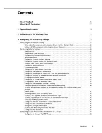
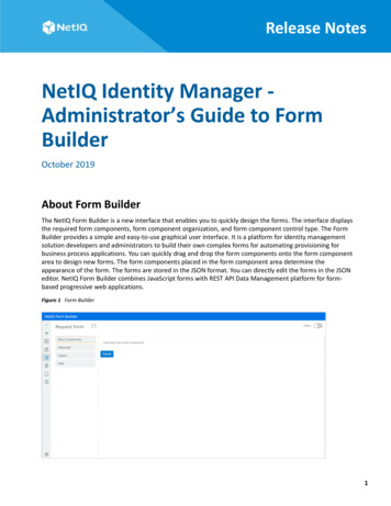
Release NotesNetIQ Identity Manager Administrator’s Guide to FormBuilderOctober 2019About Form BuilderThe NetIQ Form Builder is a new interface that enables you to quickly design the forms. The interface displaysthe required form components, form component organization, and form component control type. The FormBuilder provides a simple and easy-to-use graphical user interface. It is a platform for identity managementsolution developers and administrators to build their own complex forms for automating provisioning forbusiness process applications. You can quickly drag and drop the form components onto the form componentarea to design new forms. The form components placed in the form component area determine theappearance of the form. The forms are stored in the JSON format. You can directly edit the forms in the JSONeditor. NetIQ Form Builder combines JavaScript forms with REST API Data Management platform for formbased progressive web applications.Figure 1 Form Builder1
This release of Identity Manager supports form creation through both the legacy method and the Form Builder.NetIQ recommends you to use the Form Builder.The Form Builder provides the following advantages: Allows the forms to be used by multiple provisioning request definition (PRDs). Provides drag and drop features to enable you to quickly create modern and responsive forms. Simplifies the connections between forms and REST APIs. Provides multiple components (widgets). Supports all widgets available in the legacy forms.Currently, Designer does not support migration of legacy forms to JSON forms. You must migrate the formsmanually. To migrate a legacy form to a JSON form, perform the following actions:1. Back up the workflows that use the legacy form.2. Create a JSON form in the Form Builder.3. Add the existing data item mappings to the newly created JSON form.4. Deploy the JSON form to the Identity Vault by using Designer.How does the Form Builder Work?The Form Builder uses the JSON schema to render the form dynamically within Identity Applications. Theschema automatically generates the corresponding APIs to receive the data when the form is submitted. Youcan preview the saved forms before deploying them and make the necessary changes. Identity Manager storesthe forms in the JSON format on your file system.Figure 2 Form Creation FlowLaunching Form BuilderPerform the following actions in Designer to launch the Form Builder.1 From the Provisioning view, right-click the Provisioning Request Definitions node and select New.2 Specify the Identifier (CN), Display Name, and Description.2October 2019
3 Click Next.4 Select Create a provisioning request definition using one of the templates, choose the desired templatefrom the Available Templates list, and click Next, then click Finish.5 In the page that opens, ensure that JSON Forms Selection is selected. Save the workflow.This will display the JSON Forms tab.6 Click the JSON Forms tab.The Form Builder is launched.Creating a FormYou can create a new form (approval, request, or template) for the Provisioning Request Definition from theWorkflow Forms container located in the User Application driver or directly in the Form Builder.Figure 3 Creating a form1 Navigate to the Workflow Forms in the Outline view of Designer and right-click one of the followingoptions to select the type of form you wish to create: Approval Forms Request Forms Template FormsAlternatively, click New Form in the Form Builder page and select the type of form you wish to create.For example: Approval Form or Request Form2 In the New Workflow Forms window, specify the Form Identifier that uniquely identities the form and clickFinish.The Form Builder is launched.3 Click.4 In the New Form dialog box, select a template and click Create.NetIQ Identity Manager - Administrator’s Guide to Form Builder3
5 Drag and drop the required components to design the form. For more information, see FormComponents.NOTE: Few fields are pre-populated based on your selection of the form type. You can edit or delete thesefields as required.6 Create the form and save it.The form is saved in the same location in the Workflow Forms container under the type of the form thatyou chose to create. For example, an approval form is saved under Approval Forms container.After saving the form, deploy the form to the Identity Vault through Designer. For more information,seeAbout Forms in the NetIQ Identity Manager - Administrator’s Guide to Designing the IdentityApplications.Exploring the Form Builder User InterfaceThe Form Builder enables you to quickly create forms and resources by using a simple drag-and-drop userinterface. You can create, modify, copy, and delete a form in the Form Builder.Figure 4 Form BuilderTo design a form, drag and drop the required form components and provide the details. For more informationabout each component and the corresponding input fields, see “Form Components” on page 6. Once the formis submitted, it is sent to the client in the JSON format. At the client side, the Form Renderer renders the form.NOTE: The field events other than OnLoad and OnChange are not directly supported from Form Builder.The Form Builder page consists of the following components: Toolbar Form Components4October 2019
ToolbarThe toolbar consists of the following elements:Table 1 Toolbar with descriptionButtonDescriptionNew FormClick to create a new form (Request or Approval form).For more information, see “Creating and Editing Request orApproval Forms” on page 21.Form BuilderClick to expand the menu layout.JS EditorClick to edit the form in the JS editor. The editor enablesyou to write your logic to change the custom default valueand calculate the value using JSON arrays. For moreinformation, see “Editing a form in JS Editor” on page 24.Form JSONClick to edit the form in the JSON editor. The editorprovides a JSON representation describing a fully-featuredform. You can also use the editor to duplicate and edit anexisting form.For more information, see “Editing a Form in the JSONEditor” on page 23.PreviewClick to preview the designed form.LocalizationSelect the language you want the fields in the form to berendered in form renderer (Identity Applications).External ScriptsIf you wish to add a JavaScript to the form from an externalsource, specify the URL of the external script here.SaveClick to save the form as a template. Forms are saved asXML documents in the project directory. Templates areavailable only within the project in which you create them.NetIQ Identity Manager - Administrator’s Guide to Form Builder5
ButtonDescriptionSettingsClick to perform the following actions: Change Language: Allows you to select the supportedlanguage in Form Builder. Preview Settings: Enabling this option enables thebuttons in the preview mode. This allows you toapprove or deny the form. It is recommended toperform this action (approve or deny) only throughIdentity Applications. About: Displays the version number of the build. Debug Mode: Displays the code and helps totroubleshoot errors.Offline - Online toggleOn enabling this option, the preview of the form functionsis similar to the Form Renderer. For more information see“Offline - Online Toggle” on page 33.Form ComponentsForm components collects data and serves as the display or user interface within the system. It helps you todefine the type of widget that is required to enter data and automatically adds a property to the resourceendpoint to interact with the Form component.The Form Builder page consists of the following elements:Basic ComponentsThe following elements are displayed when you select Basic Components.6October 2019
Figure 5 Basic Components Text Field - Used for adding short and general text input. For more information, see Textfield. Number - Used when the field is limited to a number type. For more information, see Number. Text Area - Has the same options as the Text Field element. The only difference is that it provides a multi-line input field to be used in case of longer text. For more information, see Text Area. Checkbox- Used for a boolean value input. For more information, see Checkbox. Select Boxes - Works similar to the Radio component. However, it allows you to check multiple values. Formore information, see Select Boxes. Time - Used to enter the time format. Select - Displays the values as a drop-down list. For more information, see Select. Radio - Used when you need to choose from a list of options. For more information, see Radio. Content - Used to provide non-field information. For more information, see Content. Button - Used to perform various actions within the form. For more information, see Button.AdvancedThe following elements are displayed when you select Advanced.NetIQ Identity Manager - Administrator’s Guide to Form Builder7
Figure 6 Advanced Email - Used to add an email address field for your form. It has a custom validation setting that validatesthe entered email address. For more information, see Email. Url - Used to add a URL in the form. Data Item Mapping - Used to map data from the data flow into fields in a form (pre-activity mapping) andto map data from the form back to the data flow (post-activity mapping). For more information, seeDefining the Data Item Mappings in the NetIQ Identity Manager - Administrator’s Guide to Designing theIdentity Applications. Phone Number - Used to add a phone number field in the form. For more information, see Phone Number. Date/Time - Used to input dates, time, or both. For more information, see Date/Time.8October 2019
Day - Used to enter the values for the month, day, and year. The day component, by default, takes thevalue in month/day/year format. However, the order of the fields can be changed. Select the Day Firstcheck box in the Display tab if you want the day field before the month field. Modal Edit - Used as an editor where styles (Bold, Italics, and so on) can be added. Tags - Used to add custom tags. Currency - Used when a field should display currency amounts on a form. For more information, seeCurrency. HTML Element - Used to display a single HTML element in a form. For more information, see HTMLElement. Nested Form - Allows you to insert one (child) Resource/Form with all its fields into another (parent)Resource/Form. For more information, see Nested Form. Signature - Allows you to sign the field with either their finger on a touch enables device or with themouse pointer. For more information, see Signature. Survey - Used to ask multiple questions with the same context of answers or values. For more information,see Survey. Dynamic Entity - This is a multi select drop-down field. This widget allows you to select more than oneentity in an entity type. For example, user, group.Figure 7 Dynamic EntityThe following fields are populated in the Data tab:Entity Key: Specify the entity key for the entity type. For example, for the entity type User, the entity key isuser.Display Expression Attribute: Specify the attributes of the entity type you want to be displayed. You canadd multiple display attributes. For example, for the entity type User, the Display Expression Attribute canbe FirstName, LastName.Entity TypeDisplay Expression AttributeUserFirstName, LastNameService ID: Select the service ID. For example, IDM or IG.NetIQ Identity Manager - Administrator’s Guide to Form Builder9
Limit: Specify the number of entities that you want to be displayed. The default value is 20.Default Value: Specify the value to be displayed in the field before user interaction. Having a default valueoverrides the placeholder text.Refresh On: Refreshes data when another field changes.NOTE: When the Form Builder is Online, a couple of additional fields are displayed in the Data tab. Formore information, see “Offline - Online Toggle” on page 33.For more information about the fields populated in the Display tab, see “Display” on page 17.For more information about Custom Default Value and Calculated Value, see “Custom Default Value” onpage 19 and “Calculated Value” on page 19.For more information about the fields populated in the other tabs, see “Validation” on page 19, “API” onpage 20, “Conditional” on page 20, and “Logic” on page 21.For more information about each tab for the selected component, see “General Settings for the SelectedComponent” on page 17. DN Query - Allows you to search and retrieve DNs from the Identity Vault. However, with the DNQuery,the object selector content can be driven by the result of a directory abstraction layer Queries objectrather than from properties.This widget is used to define a condition on how you want the results to be displayed.You must ensure that the query, parameter, and key you specify is present in Designer.Figure 8 DN QueryThe following fields are populated in the Data tab:Service ID: Select the required service ID. For example, IDM or IGA.10October 2019
Parameters: Specify the parameter key and its value. You can have multiple keys for a parameter, and youcan have multiple values for a key.NOTE: You must provide the parameter value (static value) while configuring this component. Dynamicparameter value such as data. other dynamic value is not supported. To use the dynamicparameter value, you can use the IDVault.globalquery in the Select component.Query Key: Specify the key of the DAL Queries object.Return Attributes: Specify the attributes of the entity type you want to be displayed. You can add multipledisplay attributes.Default Value: Specify the value to be displayed in the field before user interaction. Having a default valueoverrides the placeholder text.Refresh On: Refreshes data when another field changes.For more information on the fields populated in the Display tab, see “Display” on page 17.NOTE: When the Form Builder is Online, a couple of additional fields are displayed in the Data tab. Formore information, see “Offline - Online Toggle” on page 33.For more information about Custom Default Value and Calculated Value, see “Custom Default Value” onpage 19 and “Calculated Value” on page 19.For more information about the fields populated in the other tabs, see “Validation” on page 19, “API” onpage 20, “Conditional” on page 20 and “Logic” on page 21.For more information about each tab for the selected component, see “General Settings for the SelectedComponent” on page 17. Title Element - Used to design a title. You can use the “Custom Default Value” on page 19 option fordynamic value settings.Figure 9 Title Element - DataFor more information about the fields populated in the other tabs, see “Display” on page 17, “Data” onpage 19, “Validation” on page 19, “API” on page 20, “Conditional” on page 20 and “Logic” on page 21. Tree Element - Used to design a hierarchy. You are allowed to configure nodes that helps to modify thedesign of the form in the desired format.NetIQ Identity Manager - Administrator’s Guide to Form Builder11
Figure 10 Tree Element - Data Source JSONNOTE: The Preview area displays how the form would render on making the changes or edits to any field.The following fields are populated in the Data tab.Data Source Type: Select the type of data source, that is JSON or URL.The following fields appear when the Data Source Type is JSON:Data Source Raw JSON: Each node configuration is displayed in a JSON file. You must have the followingdetails mentioned:dn: It is a unique ID that defines the selected node. The value must be a string. This is the data value forthe tree element that you add and is passed to the workflow.name: Enter the name you wish to be displayed on the User Interface. The value must be a string.data: (Optional) This saves the metadata to the existing field.subcontainers: It defines the child node.The value must be an array of JSON. Each element of the array isan object following the same structure as that of a node.icon: The image class to be used for displaying icon on each node. The value must be a string. If you do notdefine the value, the node uses the image class selected in Default Icon Class under the Display tab.12October 2019
NOTE: All nodes must follow either JSON or customized data structure. The parent and child cannot be ofdifferent structure.If JSON does not follow the default structure, it must be mapped accordingly.Mapper keys for URL response: Allows you to map the JSON parameters with the URL elementparameters.You can use the Mapper keys for URL response/ Raw JSON setting to customize the field names providedunder Data Source RAW JSON.For example, if you want the field names as ["id","display","description","child","icon"], then modify thedetails under Mapper keys for URL response/ Raw JSON as follows:{dn: "id",name: "display",data: "description",subContainers: "child",icon: "icon"}The following fields appear when the Data Source Type is URL:HTTP method: Select the required http method. For example, GET, POST.Service ID: Select the appropriate service ID. For example, IDM, IG.Data Source URL: The URL that returns a JSON array to use as the data source.Mapper keys for URL response: Allows you to map the JSON parameters with the URL elementparameters.Request Headers: Set any headers that should be sent along with the request to the URL. This is useful forauthentication.You can have multiple keys for a parameter, and you can have multiple values for a key.Request payload: Enter the request body for the root node in the request payload field. The request bodycontains the node details that will be used to load the node. It applies in case of POST method.lazy parameter: Enter the parameter name that will be used to load a sub-node. The lazy parameter suchas nodeid is appended in the data source URL provided by the user. It applies in case of GET method (LazyLoading).Default Value: The entered value is displayed in the field before user interaction. Having a default valueoverrides the placeholder text.Refresh On: Refreshes data when another field changes.Clear Value On Refresh: This text appears below the input field.For more information about Custom Default Value and Calculated Value, see “Custom Default Value” onpage 19 and “Calculated Value” on page 19.For more information about each tab for the selected component, see “General Settings for the SelectedComponent” on page 17.For more information about the fields populated in the other tabs, see “Display” on page 17, “Validation”on page 19, “API” on page 20, “Conditional” on page 20 and “Logic” on page 21. DN Display - Used to display a read-only DN. It can display the full DN or a set of attributes associated withthe DN depending on the properties you set.NetIQ Identity Manager - Administrator’s Guide to Form Builder13
This is similar to Dynamic Entity mentioned in the “Advanced” on page 7 tab, except that you need toprovide a ‘DN'. You must enter a valid DN as DN validation is not done.Figure 11 DN DisplayThe following fields are populated in the Data tab:Entity key for DN Expression: Represents the type of entity used for DN display. Leave this value blank ifyou want to display the full DN or CN value retrieved from the Identity Vault, else enter an entity.The entity you choose must: Have the directory abstraction layer View property set to True. Be the entity of the DN you are working with.Display Expression: Represents the attribute used for DN display. It also displays multiple attributes,provided the attribute is separated by comma. Leave this value blank if you want to display the full DN orCN value. If you want to mask the DN by displaying attributes, you must first specify an Entity key for DNexpression.For example, to show the user entity’s first and last name attributes, construct an expression like this:FirstName LastName.Ensure the attribute’s View, Read, Search, and Required properties are set to True in the directoryabstraction layer. For more information, see Attribute Properties in the NetIQ Identity Manager Administrator’s Guide to Designing the Identity Applications.DN: Enter the respective DN.Default Value: The entered value is displayed in the field before user interaction. Having a default valueoverrides the placeholder text.Refresh On: Refreshes data when another field changes.Clear Value On Refresh: When Refresh On field is changed, clear this components value.For more information on each tabs for the selected component, see “General Settings for the SelectedComponent” on page 17.14October 2019
NOTE: When the Form Builder is Online, a couple of additional fields are displayed in the Data tab. Formore information, see “Offline - Online Toggle” on page 33. Permission Request DN - Used to provide permission for a default role and resource approval template.Figure 12 Permission Request DNIn the Display tab, based on the selected Permission Request type, the label is automatically populated.For more information on the fields populated in the Display, Data, Validation, API, Conditional, Logic andLayout tabs, see Display, Data, Validation, API, Conditional, Logic, and Layout. Label Element - Allows you to create and design the labels used in the forms.NetIQ Identity Manager - Administrator’s Guide to Form Builder15
Figure 13 Label ElementFor more information on the fields populated in the Display, Data, Validation, API, Conditional, Logic andLayout tabs, see Display, Data, Validation, API, Conditional, Logic, and Layout.LayoutThese elements are used to change the general layout of the form.The following elements are displayed when you select Layout.Figure 14 Layout Columns Field Set Panel Table16October 2019
Tabs WellDataThe following elements are displayed when you select Data.Figure 15 Data Hidden Container Data Grid Data Map Edit GridGeneral Settings for the Selected ComponentWhen you drag and drop a component on the Form Builder interface, the following general settings aredisplayed for most of the components.These settings allow you to change the Title, description of the project, enter required values (can bepredefined as well) and so on, depending on the tabs you select.The following sections provide examples of the elements displayed in each tab for a selected component.Component DetailsDisplayThe following elements are listed in the Display tab for the Text Field component. This tab consists of elementsthat defines how the form would appear upon rendering.NetIQ Identity Manager - Administrator’s Guide to Form Builder17
Figure 16 Display tab for Text Field component Label Hide Label Label Position Widget - It is the display user interface, used to input the value of the field. Placeholder Description Tooltip Error Label Input Mask Allow Multiple Masks Prefix Suffix Custom CSS Class Tab Index Multiple Values Protected Hidden Hide Input Disabled Initial Focus18October 2019
Table View Always Enabled - The field will always be enabled for editing.DataThe following elements are listed in the Data tab for the Number component. This tab consists of elements thatdefine the default values and format of the component to be displayed on the form.Figure 17 Data tab for Number component Use Delimiter Decimal Places Require Decimal Default ValueCustom Default ValueThe variables listed here can be used to customize and write the JavaScript or JSONLogic.If you have specified the Data Item Mapping Value in Designer, the Custom Default Value will overwrite the DataMapping Value. In other words, the Custom Default Value takes precedence.Calculated ValueThe variables listed here allows you to calculate the values based on the values in other fields of the form. Formore information, see Calculated Values.ValidationThe following elements are listed in the Validation tab for majority of the selected components. This tabconsists of elements that define the required fields that needs to be displayed on the form. Required Custom ValidationNetIQ Identity Manager - Administrator’s Guide to Form Builder19
APIThe following elements are listed in the API tab for the Tree Element component. This tab consists of elementsthat define the property name and configure any custom properties for the selected component.NOTE: Every component must have a unique Property Name.Figure 18 API tab for Tree Element component Property Name Field Tags Custom PropertiesConditionalThe following figure displays the Conditional tab for the Text Area component. This tab consists of elementsthat determine when the fields should be hidden or displayed on the form. For more information, seeConditional Components.Figure 19 Conditional tab for Text Area component20October 2019
Figure 20 Conditional tab for Text Area componentLogicThe Logic tab allows you to define and configure multiple logic and action for the selected component. Thishelps you to design a form which can perform certain defined actions for the defined logic. The following figuredisplays the Logic tab for the DN Query component.Figure 21 Logic tab for DN Query componentCreating and Editing Request or Approval Forms “Creating a Form” on page 21 “Editing a Form” on page 23 “Migrating Legacy Forms to New Forms” on page 29Creating a FormYou can create a new form (approval, request, or template) for the Provisioning Request Definition from theWorkflow Forms container located in the User Application driver or directly in the Form Builder.NetIQ Identity Manager - Administrator’s Guide to Form Builder21
Figure 22 Creating a Form1 Navigate to the Workflow Forms in the Outline view of designer and right-click one of the followingoptions to select the type of form you wish to create and select New: Approval Forms Request Forms Template Forms2 In the New Workflow Forms window, specify the Form Identifier that uniquely identities the form and clickFinish.The Form Builder is launched.Alternatively, click New Form in the Form Builder page and select the type of form you wish to create (forexample: Approval Form or Request Form) and click Create.3 Drag and drop the required components to design the form. For more information, see FormComponents.NOTE: Few fields are pre-populated based on your selection of the form type. You can edit or delete thesefields as required.4 Create the form and save it.The form is saved in the same location in the Workflow Forms container under the type of the form thatyou chose to create. For example, an approval form is saved under Approval Forms container.After saving the form, deploy the form using Designer. For more information, see About Forms in the NetIQIdentity Manager - Administrator’s Guide to Designing the Identity Applications.22October 2019
Editing a FormYou can edit a form through the following ways: “Editing a Form Using the Form Builder User Interface” on page 23 “Editing a Form in the JSON Editor” on page 23 “Editing a form in JS Editor” on page 24Editing a Form Using the Form Builder User InterfacePerform the following actions to edit a form component in a form:1 Click theicon next to the component that you want to edit.2 Make the necessary edits in the Settings form.NOTE: You can edit, copy, paste and remove the fields, on each field on the form.3 Click Save.Editing a Form in the JSON EditorAll forms rendered within the Form Builder platform uses JSON Schema. When you add new components ontoa form, you are essentially defining a JSON schema in the background. The Form Builder uses this schema toinvoke the REST APIs needed to support the form. This section provides a detailed explanation of the structureof the JSON schema and the components that can be rendered within a form.TIP: Do not directly edit the form in the JSON editor unless you are very comfortable using the editor. You musttake a backup of the form before editing it.The example form described in the “Example of Creating a Forms” on page 30 can be designed using the JSONeditor as well. The JSON version of the designed form is shown in the figure.NetIQ Identity Manager - Administrator’s Guide to Form Builder23
Figure 23 Sample request form in JSON EditorYou can use the same JSON schema to duplicate the form. You can make edits to the form using the JSONeditor directly.For more information, see Workspaces, Perspectives, and Views in the Understanding Designer for IdentityManager guide.Sample templateA sample example JSON form is available in the JSONsampletemplate.txt file. Copy the JSON form andpaste it in your JSON editor and make edits or additions to view how the changes appear in the form.Editing a form in JS EditorForm Builder provides a global JS Editor which enables you to add or modify the JavaScript methods for all theform fields at one place. From this page, you can add or modify (invoke the API) the required HTTP method(GET or POST) and apply the value to the required field. You need to select from the listed APIs.Forms can connect to REST servers which are integrated with OSP and defined as part of ServiceRegistry inForms. Identity Manager service is registered by default.The JS Editor automatically populates the method to set Custom Default Value and Calculated Values for all theconfigured fields in the form. You must use this editor to write your own javascript logic for these methods. Forany common javascript methods, you must create ECMA script objects and access the methods.24October 2019
For example, while setting the value for a field, the value variable is used by default. However, if you use theasynchronous javascript, you must use the instance.setFieldValue(data) value. For all the form fields,it is instance.setFieldValue(value) except Radio, Select Boxes, and Select fields for which theinstance.setFieldValue function and its parameters are described as follows:instance.setFieldValue ToSet),where: response {Array}: is an array of objects or strings to be set. valueProperty {String}: is the value for each option to be set. It is exp
The Form Builder enables you to quickly create forms and resources by using a simple drag-and-drop user interface. You can create, modify, copy, and delete a form in the Form Builder. Figure 4 Form Builder To design a form, drag and drop the required form components and provide the details. For more information