Transcription
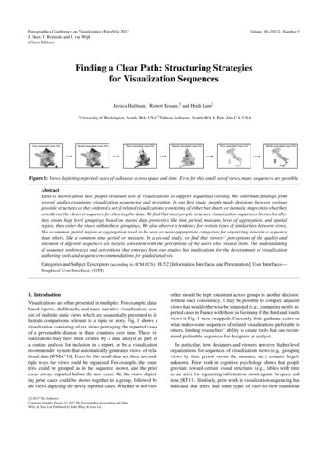
Volume 36 (2017), Number 3Eurographics Conference on Visualization (EuroVis) 2017J. Heer, T. Ropinski and J. van Wijk(Guest Editors)Finding a Clear Path: Structuring Strategiesfor Visualization SequencesJessica Hullman,1 Robert Kosara,2 and Heidi Lam21 Universityof Washington, Seattle WA, USA 2 Tableau Software, Seattle WA & Palo Alto CA, USAFigure 1: Views depicting reported cases of a disease across space and time. Even for this small set of views, many sequences are possible.AbstractLittle is known about how people structure sets of visualizations to support sequential viewing. We contribute findings fromseveral studies examining visualization sequencing and reception. In our first study, people made decisions between variouspossible structures as they ordered a set of related visualizations (consisting of either bar charts or thematic maps) into what theyconsidered the clearest sequence for showing the data. We find that most people structure visualization sequences hierarchically:they create high level groupings based on shared data properties like time period, measure, level of aggregation, and spatialregion, then order the views within these groupings. We also observe a tendency for certain types of similarities between views,like a common spatial region or aggregation level, to be seen as more appropriate categories for organizing views in a sequencethan others, like a common time period or measure. In a second study, we find that viewers’ perceptions of the quality andintention of different sequences are largely consistent with the perceptions of the users who created them. The understandingof sequence preferences and perceptions that emerges from our studies has implications for the development of visualizationauthoring tools and sequence recommendations for guided analysis.Categories and Subject Descriptors (according to ACM CCS): H.5.2 [Information Interfaces and Presentation]: User Interfaces—Graphical User Interfaces (GUI)1. IntroductionVisualizations are often presented in multiples. For example, databased reports, dashboards, and many narrative visualizations consist of multiple static views which are sequentially presented to illustrate comparisons relevant to a topic or story. Fig. 1 shows avisualization consisting of six views portraying the reported casesof a preventable disease in three countries over time. These visualizations may have been created by a data analyst as part ofa routine analysis for inclusion in a report, or by a visualizationrecommender system that automatically generates views of relational data [WMA 16]. Even for this small data set, there are multiple ways the views could be organized. For example, the countries could be grouped as in the sequence shown, and the priorcases always reported before the new cases. Or, the views depicting prior cases could be shown together in a group, followed bythe views depicting the newly reported cases. Whether or not viewc 2017 The Author(s)Computer Graphics Forum c 2017 The Eurographics Association and JohnWiley & Sons Ltd. Published by John Wiley & Sons Ltd.order should be kept consistent across groups is another decision:without such consistency, it may be possible to compare adjacentviews that would otherwise be separated (e.g., comparing newly reported cases in France with those in Germany if the third and fourthviews in Fig. 1 were swapped). Currently, little guidance exists onwhat makes some sequences of related visualizations preferable toothers, limiting researchers’ ability to create tools that can recommend preferable sequences for designers or analysts.In particular, how designers and viewers perceive higher-levelorganizations for sequences of visualization views (e.g., groupingviews by time period versus the measure, etc.) remains largelyunknown. Prior work in cognitive psychology shows that peoplegravitate toward certain visual structures (e.g., tables with timeas an axis) for organizing information about agents in space andtime [KT11]. Similarly, prior work in visualization sequencing hasindicated that users find some types of view-to-view transitions
Hullman, Kosara, Lam / Finding a Clear Path: Structuring Strategies for Visualization Sequenceseasier to comprehend than others [HDR 13]. However, how suchpreferences impact longer sequences of visualizations remains unknown. If users of visualization sets show systematic preferencesfor some sequential structures over others based on properties ofthe data that are shown (such as the measure or dependent variable,aggregation and filter level applied to data, time period, etc.), thisknowledge could pave the way for sequence recommendations.We present the results of two controlled studies to examine howpeople perceive sequential visualization structures. Our first studyasks users to play the role of designers by sequencing sets of relatedvisualizations (either bar charts or thematic maps) to clearly convey multivariate data. Our results indicate that hierarchical structure characterizes most preferred visualization sequences: participants create sequences by grouping subsets of visualizations withshared data properties, such as a common measure, time period,spatial region, or level of aggregation and filtering (Fig. 2a,b,c,d).Parallel structure – repeating a pattern of transitions two or moretimes in a sequence – and other hierarchical patterns that groupviews based on a single data factor are strongly preferred overschemes like minimizing an approximation of the cognitive cost(or perceived amount of difference) defined across adjacent views.Moreover, we find that groupings based on certain data properties,such as a shared spatial region or aggregation level, are much morelikely to be created than others, like grouping based on shared timeperiod or measure. In a second study focused on interpretation ofvisualization sequences, we investigate whether differences in preferences for sequence types among users playing the role of designers are also evident in viewers’ interpretations. We find that viewersshow the same preferences as authors when asked to rate the clarityof sequences. Viewers also perceive certain comparisons betweenviews–for example, comparing different measures or time periodsacross the same spatial region or aggregation level–as more intentional than others–like comparing the same measure across different spatial regions or aggregation levels–independent of sequence.Our results have implications for predicting effective sequences forvisualization applications like visualization recommendation tools,where more comprehensible sequences can facilitate analysis, ornarrative visualization, where a novice designer might be helpedby sequence suggestions during the design process.2. Related Work2.1. Narrative CognitionOur studies of perceived structure in sets of visualization are inspired by the structures observed in the plots of many fictional andnon-fiction stories [BB79,Gle78,MJ77,Tho77]. Mandler and Johnson [MJ77] propose that the structure of any story can be represented hierarchically, as a tree containing basic nodes: non-terminalnodes that represent groups of events. According to this model,connections between nodes on either level are causal or temporal. An alternative model posits that events in a story can be mentally indexed by various dimensions, like time, space, protagonist,causality, and intentionality. When a reader encounters discontinuities in these dimensions, more intensive cognitive processingoccurs as the reader updates the appropriate indices in her mentalrepresentation [ATT97,ZLG95]. We are interested in how commondata dimensions, like spatial region, time period, level of aggrega-tion and filtering (e.g., what unit data is reported at, such as countyversus state level, and how data is filtered, e.g, to only the U.S.), ormeasure (e.g. the dependent variable), may perform a similar “indexing” role in how people perceive structure in visualization sets.2.2. Sequence in VisualizationInitial work on narrative visualization identified expository structures like drill-down and martini glass [SH10] and described howrhetorical devices can operate procedurally as a user navigates avisualization [HD11]. More recently, Amini et al. [ARL 15] characterized data videos using the cinematic categories from Cohn’svisual narrative grammar for comics [Coh13], which analyzes hownarrative tension changes over a data story. While related to sequence, we are primarily interested in models that can be defined apriori from the state space of views of a relational data set, so as toenable sequence recommendations in visualization recommendersystems of narrative visualization authoring systems.The closest work to our framing of the problem of finding goodvisualization sequences is Hullman et al. [HDR 13]. This scenarioassumes that an analyst or designer starts with a relational data table. Possible sequences are paths through the state space of dataand view combinations generated from the table. The set of possible views V represent nodes in an undirected graph G, where edgesbetween each pair of nodes v1, v2 in G are weighted by a transitioncost measure based on the number of transformations required toconvert v1 to v2. Using controlled studies of peoples’ preferencesfor different types of single visualization-to-visualization transitions, Hullman et al. [HDR 13] proposed a transition cost modelthat approximates the cognitive cost of moving from one visualization to the next in a sequence of static views. Transition cost isdefined as the number of transformations required to convert thedata shown in the first view to the second. A single transformationis defined as a change to one of the data fields shown from the firstview to the second. For example, in Fig. 1, a transition from a viewdepicting newly reported cases of a disease in France to a view depicting prior reported cases of the disease in England would have atransition cost of 2, representing a change to the time factor and thespatial filter. The prior work also finds that when costs are equal,people are more likely to prefer certain types of transitions. Whenasked to choose which of two possible “next steps” representingchanges to the time period, measure, dimension, or level of aggregation and filtering of an initial visualization was more understandable, subjects were most likely to change the time period, followedby changing either the dimension or measure. Subjects were leastlikely to change the aggregation level.Parallel structure, also addressed by Hullman et al. [HDR 13],is a particular structure in which a visualization sequence is comprised of multiple parallel groupings in a set of views, which arepresented one after another. For example, in the parallel structuresequence shown in Fig. 2a, the four groupings are defined by different spatial regions, and the measure, or dependent variable, differsbetween the two views in each spatial region grouping. For the parallel structure sequences shown in Fig. 2b and c, the two groupingsare defined by different measures, and the spatial region differs between the views within each measure grouping. In such sequenceswhere a single data factor is used to create groupings, we refer toc 2017 The Author(s)Computer Graphics Forum c 2017 The Eurographics Association and John Wiley & Sons Ltd.
Hullman, Kosara, Lam / Finding a Clear Path: Structuring Strategies for Visualization Sequencesthe data factor used to create chunks at a high level as the “between factor” and the data factor that varies within the chunks asthe “within factor.” We extend the prior work on visualization sequence by examining whether the preferences for certain transitiontypes observed at the local (visualization-to-visualization) level canpredict the higher level structures that people prefer in visualizationsequences.More recently, Kim et al. [KWHH17] presented a cognitive costmodel that accounts for changes in both the data and encoding in apair of visualizations. Motivated by parallel structure [HDR 13],their cost model incorporates hierarchical structure by prioritizing sequences of views that use parallel transitions. However, theirmodel is agnostic as to whether certain types of transitions are morelikely to be perceived by users as appropriate “between” versus“within” factors.2.3. Sequence in Exploratory AnalysisView sequencing is implicit in some visualization recommendersystems, which aim to present a manageable number of views toanalysts exploring multidimensional data. In a grand tour, an analyst is shown a dynamic, seemingly continuous sequence of views(planes) of low dimensional projections [Asi85]. Projection pursuitpresents a set of static low dimensional projections believed to depict interesting features of the data [FS81]. Recent work exploresautomated suggestion of sets of 2D views of relational data morebroadly [WMA 16]. Suggested views vary data combinations (datavariation) but also visual encodings (design variation). Sequencingis provided only to the extent that the top ranked visual encodingsfor various combinations and transformations on a set of variablesselected by the user are presented at the top of the set of views.Suggesting effective paths through the recommended views couldease the analyst’s interpretation process, increasing their ability toexplore the search space in breadth and/or depth.Other visualization tools allow an analyst to capture the sequenceof steps they use [CFS 06, HMSA08]. However, the direct discovery sequence is not necessarily appropriate for communicating the important points in the data outside of collaborative analysis. Sequence is also implicit in interactive visualization analysis(e.g., [HS12]), but is always determined by the user’s interactions.Sequence is related to, but often not made explicit, in spatial organizations of views. Andrews et al. [AEN10] found that analystsusing large screens tended to group views based that containedsimilar items given two dimensional continuous spaces (e.g., largescreens). We investigate whether similar preferences exist given sequential presentations.3. Study 1: Structuring A Set of ViewsOur first research question asks, RQ1: To what extent are hierarchical structuring strategies preferred over non-hierarchicalstrategies? We are interested in the prevalence of hierarchicalstructures like parallel structure and reverse parallel structure.Other “non-parallel” hierarchical structures are also possible, inwhich a property like shared time period or measure is used togroup subsets of related views, but transitions are not consistentacross groups. We hypothesize:c 2017 The Author(s)Computer Graphics Forum c 2017 The Eurographics Association and John Wiley & Sons Ltd.Figure 2: Different types of sequences possible for a set of 8views including different measures (e.g., Gross Domenstic Product(GDP) and birth rate) for four different spatial regions. A viewercould group spatial regions together (a) or measures together (b);she could keep the order of transitions the same across groupings(a, b), reverse them (c), or use inconsistent ordering within groups(d, e). Or, she can simply arrange views such that a minimum oftransformations occur from one view to the next (f). H1 (Hierarchy): Strategies that use hierarchical structure willbe preferred over other strategies.– H1a. Simple hierarchical structures, defined as sequencesthat use a single shared data factor (e.g., time period,spatial region, measure, or aggregation and filter level,Fig. 2a,b,c,d) to create high level groupings will be preferredover non-hierarchical or more complex hierarchical strategies(Fig. 2e,f).– H1b. Parallel structure and reverse parallel structure(Fig. 2a,b,c) will be preferred over other simple hierarchicalstructures (Fig. 2d).– H1c. Perfect parallel structure (Fig. 2a,b) will be preferredover reverse parallel structure (Fig. 2c).Our second research question concerns how people choosebetween multiple possible global structures. If we assume thatpeople prefer parsimony, and tend toward hierarchical structureswhere variation for a single data aspect defines groupings (e.g.,Fig. 2a,b,c,d), then a question arises as to whether certain groupingsare more likely than others. Prior work suggests preferences exist
Hullman, Kosara, Lam / Finding a Clear Path: Structuring Strategies for Visualization Sequencesfor individual transitions (see summary of results from [HDR 13]above). Our second research questions asks RQ2: Can grouping structures in preferred sequences be predicted from local(visualization-to-visualization) transition preferences? Basedon the transition preferences identified in prior work [HDR 13],we hypothesize: H2: People will systematically prefer to group views based oncertain shared properties over others.– H2a. In visualization sets that vary aggregation and filter levels (the unit at which data is reported and how much of thedata are shown), people will be more likely to group by aggregation and filter level than by time period, measure, or spatialregion.– H2b. In visualization sets that vary spatial regions or measures, people will be more likely to group by spatial regionor measure than by time period.– H2c. In visualization sets that vary spatial regions and measures, people will be equally likely to group based on regionand measure.Due to the importance of visual perception in visualization interpretation, one might expect that the degree of visual difference between views would impact structures such as what factors are preferred to create groupings. Using spatial encodings to present data(e.g., showing unemployment rate as color value in a choroplethmap or radius in a graduated symbols map) for several differentspatial regions (e.g., South American versus European) countriesresults in views with different looking marks (e.g., polygons) compared to a more abstract encoding such as bar length in a bar chart.Similarly, the length of a sequence may impact the sequences thatare perceived as more understandable: a larger set of views maybe more overwhelming for a user to understand than a shorter one,requiring more careful or different sequencing decisions. Our thirdresearch question asks RQ3: Are preferred groupings affectedby visual encoding or sequence length?3.1. StimuliOur goal was to present participants with sets of visualizations thatcan be organized using high level strategies like simple hierarchical structure, parallel structure, or reverse parallel structure. Structuring the visualization sets we presented should also require participants to choose between multiple groupings that differ only inthe nature of the shared data property (e.g., time, spatial region,etc.). To achieve these goals, we created sets of visualizations thatare analogous to “crosstabs”, a common analysis for two dimensional data where the levels of two variables are crossed with oneanother. Each visualization set included views that varied along twoof the data factors representing transition types from Hullman etal. [HDR 13]: Time period: year or range (2015 vs 2016, 1960’s vs 1980’s) Spatial region (Maine vs Georgia, Germany vs France) Measure (population vs unemployment, number of incidents vscost of damage) Aggregation and filter level (data for several adjacent statesaggregated by state vs data for a specific state aggregated bycounty)For each pairing of data factors, we kept the other data factorsin the set constant. This helped ensure that a participant who choseto group by a single data factor could also keep transitions consistent across the groupings. For example, if M1 and M2 in theviews in Fig. 2 represent two measures like mean unemploymentand annual net income, the two data factors are measure and spatialregion. Time period and aggregation and filter level are kept consistent between views. If the participant chooses to group by spatialregion (Fig.2a), they can keep the measure direction consistent ifthey desire, for example, transitioning from annual net income tounemployment in each spatial region grouping.The four data factors time period, spatial region, measure, andaggregation and filter level yield six combinations of two. To investigate the impact of encoding, for each combination, we created sets that varied the visual encoding used across the set (2levels, choropleth or graduated symbols maps or bar charts). Wealso varied the length of the sets (2 levels, 4 or 8 visualizations).To further ensure that our findings were not overfit to a particular data set used to generate the views, we also varied the data set(creating two sets of views using two data sets for each combination of data factor pairing, length, and encoding combination). Datasets were taken from the U.S. Census data [Bur12a], the AmericanCommunity Survey [Bur12b], the World Bank Development Indicators [Ban16], and the Federal Aviation Administration’s (FAA)Wildlife Strike Database [Adm16]. This produced 48 stimuli sets.Each data factor in a pairing (e.g., time and measure) had two ormore levels. For example, in stimuli sets of length 4, two time periods and two measures were available. For sets of length 8, one datafactor was varied over two levels, the other over four levels. Thenumber of levels of each data factor was randomized (not counterbalanced). The specific increment of time period, measure, spatial region, or aggregation and filter level from one view to anotheracross a set of views was not held constant across all stimuli sets:for example, changes to the time period could include a single yearchange in some sets, or a change of 4 years, or a change of 10 years.However, within a stimuli set, the increment was constant. For example, in a set of 8 measure-time views where 4 views showed onemeasure and the other 4 views showed a second measure, the timesteps would not include 1990, 2000, 2010, 2014, since the increment differs across these views (10 vs 4 years).We generated all views using Tableau Desktop version. To reduce errors on how participants interpreted the data shown in eachview, views had titles that clearly stated the measure, the spatial region, and the time period (e.g., “Unemployment in 2011 for Washington”) using an identical format. To control for the influence ofvisual characteristics on sequencing choices, we kept all visual encodings (color scales, etc.) constant across views in a set, with theexception of our intentional manipulation of the encoding of measure values using bar length or a choropleth map. Bar charts werealways sorted from greatest to least values reading left to right. Asingle hue was applied within and across views in the each stimuliset, but we varied the hues across stimuli sets. All quantitative colorscales used in choropleth map stimuli were single hue sequentialscales, with the exception of two stimuli sets where the measurewas a rate that sometimes had a negative value and a two-hue dic 2017 The Author(s)Computer Graphics Forum c 2017 The Eurographics Association and John Wiley & Sons Ltd.
Hullman, Kosara, Lam / Finding a Clear Path: Structuring Strategies for Visualization SequencesFigure 4: Example 4-frame stimulus set for measure and hierarchy.Figure 3: The user interface used in the study. Users were able toreorder frames in the list on the left and flip through the set with thePrevious and Next buttons.verging color scale was used instead. All stimuli are available insupplemental material.3.2. ProcedureWe conducted the study as a repeated measures between-subjectsexperiment. Each participant saw twelve trials, including each combination of the six data factors twice, once with four and once witheight views. For each combination, each participant saw one set ofstimuli that used a map encoding and one set that used a bar encoding. Assignment of stimuli sets to participants was otherwiserandom. Trials were presented in random order.Each trial consisted of one set of visualization stimuli, whichwere vertically presented in random order on one side of the interface (Figure 3). For each trial, the participant was asked to arrangethe views so that “they give a clear idea of the data.” We avoidedthe word “story” so as to not evoke connotations commonly associated with stories (such as protagonists or setting) that might confuseparticipants. Our study prompt intentionally left the interpretationof a clear sequence to the participants in order to see whether people display systematic preferences for how to sequence certain datasets in the absence of a specific narrative or analysis goal.Participants reordered the views by dragging and dropping intoan order, clicking a button to indicate when they were satisfied withtheir ordering. After each trial, participants were asked to give abrief explanation how they picked the ordering. At the end of thestudy, participants filled out a demographic survey of ten-year agegroup, gender, highest level of education, and how often they useddata visualizations. For each trial, we recorded the initial and final orders, the time it took the participant to reorder the views, thenumber of reorderings and the explanation.We advertised the study through email and on Mechanical Turk.Emails were sent out to students and faculty via an HCI-relatedc 2017 The Author(s)Computer Graphics Forum c 2017 The Eurographics Association and John Wiley & Sons Ltd.email list at a large university and to professionals working at avisualization software company. We expected these populations tobe familiar with visualization presentations while not necessarilyrepresenting expert designers themselves. Participants were enteredinto a raffle for 100 gift cards for every 50 people who took partin the study. Workers on Mechanical Turk with an approval ratingof 95% were paid 5 to participate in the study.4. Results124 participants took part in the study. 80 participants had beenrecruited via email, and 44 via Mechanical Turk. 70 participants(56%) were female, 49 (40%) male, and 5 (4%) answered other.36 email participants (45%) had a bachelor’s degree, 37 (46%) amaster’s degree, 6 (8%) a Ph.D., and only 1 (1%) only high schooleducation. 25 Mechanical Turk participants (57%) had completedhigh school, and 19 (43%) had a bachelor’s degree. We thereforeconducted all core results analyses separately by sample to confirmthat the patterns we identify are consistent for the separate populations.We collected 1488 total sequences (12 per participant). Themean and median number of participants per stimuli set across the48 sets was 31 (minimum 19 participants, maximum 43 participants). However, we omitted 36 sequences from analysis that werecreated for two stimuli sets of length 4 that combined spatial regionand aggregation and filter level, due to a labeling issue with theviews that prevented recording the sequences that participants hadintended. Participants completed the study in just under 30 minutes(median: 19), reordering an average of 6.5 times before submitting (4 view sequences: 3.3. reorders, 8 view sequences: 9.8). Theminimum number of reorders was 1, indicating that all participantsreordered the views at least once before submitting.4.1. HierarchyH1a posits that using high level groupings based on a single datafactor will be preferred over non-hierarchical strategies or morecomplex hierarchical strategies that group based on multiple data
Hullman, Kosara, Lam / Finding a Clear Path: Structuring Strategies for Visualization Sequencesfactors. Overall, we find that 1297 of 1452 (89%) of total sequencesuse a single factor to group views (8 views: 588, 4 views: 681).We can compare these observed frequencies to the expected frequencies of such sequences assuming that sequencing choices arerandom. Due to the limited ordering possibilities with only 4 views,the majority of sequences are expected to be grouped even if we assume random sequencing: we would expect two thirds (66%, or 16out of 4!) to have a clear grouping. However, we observe a muchhigher rate than expected: 96% of the 4 view sequences createdused a single between factor to group views.We also see a relatively high frequency of 8 view sequences that use a simple hierarchical structure (79%, or 588 out of 744 total). Assuming randomsequencing, we would expect a much smaller 4% of the 8 view sequences to show grouping by a single factor (including either of thetwo possible factors).H1b states that parallel structure (e.g., 2a,b) and reverse parallelstructure (e.g., 2c) will be preferred over non parallel hierarchicalstructure (e.g., 2d). We observed 1044 total sequences (72%) thatused either form of parallel structure. Of sequences of length 4, 641used perfect parallel structure, while only 57 used reverse parallelstructure (698 or 99% of 4 view sequences). Of sequences of length8, 343 used perfect parallel structure while only 3 used reverse parallel structure (346 or 47% of 8 view sequences). These results,(presented in Table 1), strongly support H1c, which states that parallel structure will be preferred over reverse parallel structure.The predicted rate at which sequences of length 4 would use aform of parallel structure is 67%. This equates to an expected totalnumber of perfect and reverse parallel results in our results set of472, but we saw 698 (99%), for a factor of about 1.5x. If we consider only the predicted (236) and observed (641) perfect parallelsequences for 4 view sequences, we would expect 33%, but we see91%, 2.7x more than expected. However, if we consider only thepredicted (236) and observed (57) reverse parallel sequences for4 view sequences, we would again expect 33%, but we see only8.1%. Similarly, the predicted rate at which sequences of length 8would use a form of parallel structure if sequencing choices wererandom was predicted to be 0.2% (192 out of 8! 40320). If participants randomly sequenced views, we would predict seeing only0.4% (approximately 3 sequences of 744) to be perfect or reversepar
vey multivariate data. Our results indicate that hierarchical struc-ture characterizes most preferred visualization sequences: partici-pants create sequences by grouping subsets of visualizations with shared data properties, such as a common measure, time period, spatial region, or level of aggregation and filtering (Fig.2a,b,c,d).