Transcription
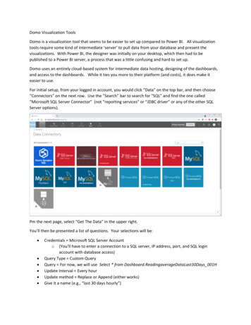
Domo Visualization ToolsDomo is a visualization tool that seems to be easier to set up compared to Power BI. All visualizationtools require some kind of intermediate ‘server’ to pull data from your database and present thevisualizations. With Power BI, the designer was initially on your desktop, which then had to bepublished to a Power BI server, a process that was a little confusing and hard to set up.Domo uses an entirely cloud-based system for intermediate data hosting, designing of the dashboards,and access to the dashboards. While it ties you more to their platform (and costs), it does make iteasier to use.For initial setup, from your logged in account, you would click “Data” on the top bar, and then choose“Connectors” on the next row. Use the “Search” bar to search for “SQL” and find the one called“Microsoft SQL Server Connector” (not “reporting services” or “JDBC driver” or any of the other SQLServer options).Pm the next page, select “Get The Data” in the upper right.You’ll then be presented a list of questions. Your selections will be: Credentials Microsoft SQL Server Accounto (You’ll have to enter a connection to a SQL server, IP address, port, and SQL loginaccount with database access)Query Type Custom QueryQuery For now, we will use Select * from Dashboard.ReadingaverageDataLast30Days 001HUpdate Interval Every hourUpdate method Replace or Append (either works)Give it a name (e.g., “last 30 days hourly”)
It should run immediately. If it has a problem connecting, try to fix the settings and wait for it to runagain. I could not find a method to force a manual ‘retry’. Here, mine has finished, and there are151,518 rows of data.Now we can choose “Create a Visualization”. That will bring you into the design of your first “card”. Acard is a single panel / component (e.g., gauge, graph, etc), several cards make up a ‘Dashboard’. ADashboard generally is looking at the same data set. We can add cards that offer some controls forfiltering the data (date range, valid vs. invalid data, etc), but the rest of the cards display data from thosefilters (e.g., the selected filters apply to the entire dashboard).
So, let’s start something simple. We want to have two “meters” that show the average temperatureand humidity across all of the sites. We will select the “Filled Gauge” on the right side. On the left side,we have data fields we can use, where “Measures” are numerical data and “Dimensions” are nonnumeric data (like our site names and parameter templates). So the first thing we want to do is justmake our gauge represent the average Ambient temperature. Drag “Parameter Template Name” justto the right into “Filters”. A pop-up will allow us to select just “AMBTEMP”Also, drag “IsValid” into another Filter just below that, and select “True”, so we know we’re only dealingwith valid averages.Drag “Final Value” from the left “Measures” to the “Gauge Values” on the top. Pull it down again toselect “Average” as the Aggregation. Also, clear out the “Target Value” and “Optional Group By”, wewon’t be using those. Your card should look like this:
All good. Now just to the upper left of the gauge, we can change the “0 Sum of Data Grade” tosomething more useful, so click on the down arrow, and let’s change that to “Final Value” andaggregation of “Maximum” and name it something more obvious to the public:That’s good enough for now, let’s save it (we can come back and tweak it later). In the far upper right,choose the drop-down next to save, choose Save As. Hit the button to create a new Dashboard andgive it a name, and name the card:
Hit the “X” in the far upper right to close the editor for this card. That will bring us to our newdashboard and its one (for now) card.So, now, press the “ ” in the upper right (next to the blue funnel), select “Create New Card”, choose“Visualization” and “Existing Data” and do the same thing for relative humidity (Note that when settingthe “Final Value”, there is a format button where you can set the number of reported digits).When we return to our Dashboard, it should look like this.Kinda clunky, so we want two smaller panels side by side. In the very top right, select the wrench icon,and choose “Edit Dashboard”. When you are in this mode, you can drag and drop panels, go direct toedit the card properties again, select backgrounds, etc. So I dragged the two side by side and set somebackground colors, and now my dashboard looks like this:
Ick, but there’s no title to tell them what each panel is, so I’m going to edit each card, select near the“Last 30 days” (the default name when you make a card name of your data set) and then re-save and“X” back into the dashboard. There’s probably places to edit the text color and chart color, too,somewhere. But we’ll get to that later. Now let’s try to show some ozone data in that bottom panel.So back to the sign, add new, select the data set, blah blah blah. So now let’s filter by ParameterTemplate OZONE (and IsValid True), and choose the Bar visualization.
Set the X-axis SiteName, and Y Axis Final Value, average, and set the format to 1 decimal point.That looks pretty good, and when we hover over it, we get some values, and it gives usmax/min/average for all the sites without having to do anything. Nice. To the left under “ChartProperties”, there’s a lot of things we can control there. On the gauges, that’s probably how we’d setthe font and gauge colors, I bet.So let’s save and add this to our dashboard.Sweet. Oh, and if you click the pull-down next to “Desktop” and change to “Mobile, you can see what itwould look like in the mobile app, and change layouts as needed!
But now, we may not always want the last 30 days. We may want to be able to select the specific days.So let’s add a new card type (using Add- New Card- visualization- same data set again). Now we’regoing to click the pulldown on the right side- “Popular Charts”Whoah! More stuff! We can play with that later. Let’s select “Filters”. Then select “Date Selector”.Where it says “0 Sum of Data Grade”, pull down and let’s just choose “No Summary Number”. Doesn’tmake sense here. Change the title from “Last 30 Days” to “Select Date Range”:
Save, add it to the dashboard, use the wrench icon in the upper right to “Edit Dashboard”, and drag it upto the top left corner. It’s not real obvious, but when you drag, if you drag to where the left side bargoes from light grey to dark grey, you can keep stacking things horizontally, so you can have morecolumns.So, hopefully now, if I exit the Edit Dashboard mode into the interactive mode, I can select dates and thedata will change.Sweet. I could create more filter selectors, checkboxes for sites to turn on/off, or anything else I have inmy SQL query or View.
Now, another thing I may want to do is change the colors of those bars when the ozone average goesabove certain values. I can do that in the designer by selecting “Colors” and putting in color rules. Here,I used lower thresholds than the AQI, so I could trigger the colors to happen.
Here, you can see the color changes at the respective levels (again, based on the selected sites anddates, so be careful how you label your charts, don’t use “All Sites” if you have a site selector.Notice my charts so far have been just hourly ozone, which really wouldn’t’ be quite right for a publicinformation dashboard- you would want to use an 8-hour rolling average for concentration. Don’tforget also you can use the Historical AQI Calculator and create a site with the parameter templateSITE AQI to have a calculated parameter for the AQI value itself to put in charts, meters, etc.
MAPSIn this case, I’m going to embed the AQI into a map. If I have lat/long data for all my site, I can get itusing the Reporting.ReadingAverageDataView full (currently lat/long is not in the “Dashboard’ views).To avoid getting too much data, my SQL connector has a date limit (and ideally I should limit by averageinterval as well,(Note: you can have more than one data source in a dashboard, technically each card has its own datasource). I’m going to add a card, choose the new Reporting.ReadingAverageDataFull data source, and inthe Chart Types, I’m going to choose “Maps” and scroll down to select “Lat/Long” map.
At the top, we will map in the Lat and Long fields from the View. I’ve made the graph value theMaximum of Final Value, and a filter for ParameterTemplateName ‘SITE AQI’Under the Chart Options, I’m going to hide the Legend (under Legend), since it doesn’t make sense. Ialso want to make those circles colored to match the AQI. But there’s no color option in the map graph.There is a “series for color”, so let’s drag Final Value into that:Well, that doesn’t look right
Well, it turns out that “Series for Colors” needs to use groupings (like “Good” and “USG”, etc). Eachindividual value for AQI gave us a unique ‘group’. The AQI level isn’t in the Reporting view, so we needto use and AQI view that has the AQI classifications as part of the data return (and then that text shouldauto-populate into the legend as well, hopefully).Reporting.AmbAqiHistory will give us what we want, and has the Lat/Long data we need. So we updateour data source to get data from this as well (and using “IndexTimeStamp” instead of “date”).It’s apparently not possible to change the data source for a card after creation, so we have to delete theold card and make a new map card again. In this case, we are now using “Maximum of IndexValue” forthe value, and “Description” for “Series for Color”. Initially, that aggregated to many AQI points, so Ichose to get the most recent hour, by sorting by “Index Time Stamp” descending, and limiting the rowsto the number of sites I had.
We’re still not able to control the circle colors, and the legend to the right gives us annoying totals of allof the “unhealthy”AQIs as a single number, etc, but we can turn that off by setting Legend- Show SeriesTotal as “None”.But, if we click on the top ribbon on ‘Color Rules’, we can create rules for the card!
Now we just need to figure out how to deal with that pesky circle size . Oh and notice we can hoverover a circle and because LabelName SiteName, we see the site name. So, experimenting around, wefind if we set:Scale: Maximum 1, Minimum 1, and set Symbol Size 5XL, we can get reasonable size dots that areall the same size.
SHARINGSo, now how do I share all this stuff? With the share button (box with up arrow) in the upper right,there are some immediate share/export options, as well as the option to create a scheduled report thatcan be shared with other Domo users in my group.For public sharing, your subscription will need to include “Domo Everywhere”. With that, you can putindividual cards into ‘iframes’ in a web site In the designer, click on the wrench icon, and choose“Domo Everywhere”
This will show a link at the bottom you can copy and put into a web page as an iframe. You will alsoneed to select “Public” for the privacy under “Embed Options”.
Domo Visualization Tools Domo is a visualization tool that seems to be easier to set up compared to Power BI. All visualization tools require some kind of intermediate server to pull data from your database and present the visualizations. With Power BI, the designer was initially on your desktop, which then had to be