Transcription
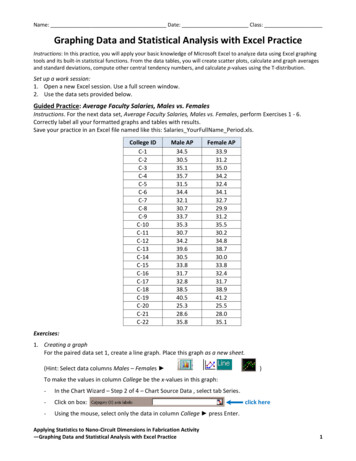
Name: Date: Class:Graphing Data and Statistical Analysis with Excel PracticeInstructions: In this practice, you will apply your basic knowledge of Microsoft Excel to analyze data using Excel graphingtools and its built-in statistical functions. From the data tables, you will create scatter plots, calculate and graph averagesand standard deviations, compute other central tendency numbers, and calculate p-values using the T-distribution.Set up a work session:1. Open a new Excel session. Use a full screen window.2. Use the data sets provided below.Guided Practice: Average Faculty Salaries, Males vs. FemalesInstructions. For the next data set, Average Faculty Salaries, Males vs. Females, perform Exercises 1 - 6.Correctly label all your formatted graphs and tables with results.Save your practice in an Excel file named like this: Salaries YourFullName Period.xls.College -15C-16C-17C-18C-19C-20C-21C-22Male 39.630.533.831.732.838.540.525.328.635.8Female 1. Creating a graphFor the paired data set 1, create a line graph. Place this graph as a new sheet.(Hint: Select data columns Males – Females )To make the values in column College be the x-values in this graph:-In the Chart Wizard – Step 2 of 4 – Chart Source Data , select tab Series.-Click on box:-Using the mouse, select only the data in column College press Enter.Applying Statistics to Nano-Circuit Dimensions in Fabrication Activity—Graphing Data and Statistical Analysis with Excel Practiceclick here1
Name: Date: Class:Example Exercise 1 graphExample Exercise 2 graph2. Formatting a grapha. Place the graph legend at the bottom of the graph.b. Eliminate the plot area default gray color. (Hint: Click on Plot Area Format Select Plot Area ordouble click on Plot Area.)c. Change the major gridlines to a broken line. (Hint: Double click in one of the gridlines.)d. Insert the next labels. For x-axis: College ID; for y-axis: Average Salary (x1,000/year)(Hint: Chart Chart Options Titles)e. Include in the graph title: College Assistant Professor Salaries. Males vs. Females3. Calculating statisticsa. Compute the data differences.b. Compute samples/differences means.[Hint: use function average()]c. Compute sample/differences standard deviations.[Hint: use function stdev()]d. Find the sample/differences maximum values.[Hint: use function max()]e. Find the sample/differences minimum values.[Hint: use function min()]f. Find the sample/differences ranges.g. Find the sample/differences medians.[Hint: use function median()]Example Exercise 3 resultsApplying Statistics to Nano-Circuit Dimensions in Fabrication Activity—Graphing Data and Statistical Analysis with Excel Practice2
Name: Date: Class:4. Graphing data differencesRepeat Exercises 1 and 2 for the data differencesobtained in Exercise 3, with the next changes:a. Delete the graph legend.b. Add a y-axis label: Average Differences (x 1,000/year)c. Title the graph: College Assistant ProfessorSalary Differences: Males vs. FemalesExample Exercise 4 results5. Graphing mean and standard deviation for the differencesa. Include in the graph a horizontal line representing the sample mean.(Hint: Create a list with mean values, then Chart Source Data Add [Select created data].)b. Include in the graph horizontal lines representing mean 1 standard deviation.(Hint: Create list with SD, then Source Data Add [Select created data].)c. Include in the graph a horizontal linerepresenting mean 2 standarddeviations.d. Format the sample mean line: Changethe color to red and select the nextthicker line. (Hint: Double click on line.)e. Format the standard deviation lines:Change the color to red and select abroken thicker line (Hint: Double click online.)Example Exercise 5 graphApplying Statistics to Nano-Circuit Dimensions in Fabrication Activity—Graphing Data and Statistical Analysis with Excel Practice3
Name: Date: Class:6. Compute the sample differences t-value, p-value and sampling standard deviationa. Compute the sample associated t-value or sample test statistic.Use equation: t d n / sd , where d is difference mean, n issample size, and Sd is difference standard deviation. Using thevalues in the table:0.23182 22𝑡 1.285350.84594b. Compute p-value using T-distribution.Use function ttest() with the values in table shown in step 2 ttest(B8:B30,C8:C30,1,1)where the first “1” indicates one-tail test, and the second “1”indicates a paired test.c. Compute the sampling standard deviation for this difference.Use equation: sd sd / n :𝑆𝑑̅ 0.84594 22 0.18035d. Do your results support the claim that no significant salarydifference exists between male and female college professors at the 5% level of significance?Example Exercise 6 results at the 10% level of significance?(Write your conclusions in a textbox on the results spreadsheet. Include an explanation. Example:)Because p-value 0.10633 is greater than 0.05 or 0.10, we have no evidence at the 5% or10% level of significance to reject the original assumption (H0) that female assistantprofessors receive, on average, the same salary as the male assistant professors.Applying Statistics to Nano-Circuit Dimensions in Fabrication Activity—Graphing Data and Statistical Analysis with Excel Practice4
Name: Date: Class:Exercises:1. Create a graph2. Format a graph (a-e)3. Calculate statistics (a-g)4. Graph data differences (a-c)5. Graph mean and standard deviation for the differences (a-e)6. Compute the sample differences t-value, p-value and sampling standard deviation (a-d)Independent Practice: Unemployment: College vs. High School GraduatesInstructions: For the next data set, Unemployment: College vs. High School Graduates, perform Exercises 1 - 6.Correctly label all your formatted graphs and tables with results.Save your practice in an Excel file named like this: Unemployment YourFullName 92.5High dent Practice: Birth Rates vs. Death RatesInstructions. For the data set, Birth Rates vs. Death Rates, perform Exercises 1 - 6.Correctly label all your formatted graphs and tables with results.Save your practice in an Excel file named like this: BDRates YourFullName Period.xls.County 114.212.512.313.115.810.312.711.1Applying Statistics to Nano-Circuit Dimensions in Fabrication Activity—Graphing Data and Statistical Analysis with Excel 110.217.911.87.05
—Graphing Data and Statistical Analysis with Excel Practice 3 4. Graphing data differences Repeat Exercises 1 and 2 for the data differences obtained in Exercise 3, with the next changes: a. Delete the graph legend. b. Add a y-axis label: Average Differences (x 1,