Transcription
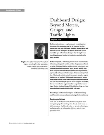
DASHBOARD DESIGNDashboard Design:Beyond Meters,Gauges, andTraffic LightsStephen FewDashboards have become a popular means to present importantinformation. Everybody wants one, but not always for the rightreasons, and often with little clue as to what is needed. Like all newmeans of business intelligence (BI) delivery, dashboards are surrounded by hype and confusion. Once you clear the fog, however,something substantial remains that can deliver genuine benefitsworth pursuing.Stephen Few is the Principal of PerceptualEdge, a consulting firm that specializesin data analysis and presentation.sfew@perceptualedge.comDashboards provide a distinct and powerful means to communicateinformation, with specific benefits, but they also pose a specific setof design challenges. Very few dashboards today come close to realizing their potential achievements. This is because very few dashboard designers (or even dashboard vendors) have fully understood,appreciated, and responded to the unique challenges and opportunities of dashboards. In their rush to bring products to market, eager tocapitalize on the popularity of dashboards, many software vendorshave cobbled together pieces of existing products with bailing wireand loads of spackle. Caught up in the race to out-gizmo one another,few have taken the time to gain more than a superficial understanding of effective dashboard design. Without this knowledge as a foundation, dashboards are destined for the BI trash heap.If something is worth communicating, it is worth communicatingwell. This article introduces keys to designing effective dashboards.Dashboards DefinedNew fads in the BI space are often nothing more thannew packaging of something that already exists under adifferent name. Dashboards relate to several technologiesand approaches to information delivery and use thatpreceded them.18BUSINESS INTELLIGENCE JOURNAL WINTER 2005
DASHBOARD DESIGNRemember the Executive Information Systems (EIS) thatemerged in the 1970s? Their intent was to provide executives and managers with an integrated view of the information needed to manage the business. Despite a greatdeal of interest in the concept, it was just too hard inthose early days of computing to build effective solutionswithout the advances in processing power, database technology, and data warehousing methodology that arrivedin later years.Some people currently use the terms EIS and dashboardsynonymously, but this is misleading. Dashboards can beused to achieve the promises of EIS, and in this respectthey are related, but they are not the same.Another term that is often used synonymously with dashboard is portal, but once again there are significant differences. A portal, as the name suggests, functions in BI as asingle point of access to information. Dashboards canserve quite nicely as points of access to further information, but nothing in their definition demands that they doso. Dashboards are not a specific type of information for aspecific audience, unlike EIS, nor must they necessarilyserve as portals to additional information, nor do theyrequire a specific technology—they are a specific type ofdisplay, a prescribed means to present information.So what is a dashboard? If you search the Internet for examples, you’ll find a mix of phenomena that is too eclectic tofit a single definition. If you search through BI literature fora definition of the term, you’ll discover that, while much issaid about dashboards, few people define them. Those whodo define the term do so differently, generally in ways thatconveniently fit the software they’re promoting.I’ve been working with dashboards for years, but have noties to any particular product, so I can suggest a definitionthat is relatively unbiased, practical, and rooted in realworld experience. Here’s my definition:A dashboard is a visual display of the most importantinformation needed to achieve one or more objectives,consolidated and arranged on a single screen so theinformation can be monitored at a glance.The information is presented visually as a combinationof text and graphics. As such, the design challenges arelargely challenges of visual design. The process of actuallyimplementing a dashboard may involve any number oftechnical challenges associated with your software, data,and computing environment, but the fundamental designchallenges are visual in nature. How can you best presentthe information so that human eyes can take it in quicklyand human brains can derive the correct and most important meanings from it easily? To design dashboards effectively, you must understand a bit about visualperception—what works, what doesn’t, and why.Dashboards include the most important information onemust know to achieve specific objectives. To achieve evena single objective often requires a collection of information that is not otherwise related—information thatcomes from diverse sources and is related to differentbusiness functions. The information is of whatever typeneeded to do a job. Dashboard displays are not just forexecutives and managers—they’re for anyone who hasobjectives to meet. The information can be (and often is)a set of key performance indicators (KPIs), but othertypes of information can also be needed.The information fits on a single screen, entirely availablewithin eyespan so it can all be seen at once and at aglance. If you must scroll around to see it all, it isn’t adashboard. If you must shift from screen to screen to seeit all, you’ve crossed the boundaries of a single dashboard.The objective is to have the most important informationreadily, effortlessly, and immediately available so you canabsorb what you need to know very quickly.Must the information be displayed in a Web browser?That might be the best medium for most dashboardstoday, but it isn’t the only acceptable medium, and probably won’t be the best medium 10 years from now.Must the information constantly be refreshed in real time?Only if the objectives it serves require real-time information. If you are monitoring air traffic using a dashboard,then you must be informed immediately when somethingis wrong. On the other hand, if you are making strategicBUSINESS INTELLIGENCE JOURNAL WINTER 200519
DASHBOARD DESIGNdecisions about how to boost sales, a snapshot of information as of last night or perhaps even as of the end of lastmonth would work fine.Although information about almost anything may be displayed appropriately in a dashboard, there is one characteristic that describes almost all of the information foundin dashboards: it is abbreviated in the form of summariesor exceptions. You cannot monitor in a single view all thedetails needed to achieve your objectives. A dashboardneeds to point out quickly that something deserves yourattention, that something might require action. It needn’tprovide all the details necessary to take action, but if itdoesn’t, it ought to make it easy and as seamless as possible to get to that information. Getting there mightinvolve shifting to a different display beyond the dashboard, using navigational methods such as “drill-down.”The dashboard does its primary job if it tells you with nomore than a glance that you should act. It serves yousuperbly if it directly opens the door to any additionalinformation that you need to act fully.The Fundamental Challenge of Dashboard DesignGiven our definition of a dashboard, ask yourself:“What aspect of dashboard design presents the greatest,most fundamental challenge?” You will certainly face avariety of challenges during a dashboard implementationproject. One of the earliest and most critical is determining the right information to include on the dashboard.In this document, however, we’re focusing exclusivelyon visual design.The fundamental challenge of dashboard design is todisplay all the required information on a single screen,clearly and without distraction, in a manner that can beassimilated quickly.If this objective is hard to meet in practice, it is becausedashboards often require a dense display of information.You must pack a lot of information into a very limitedspace, and the entire display must fit on a single screen,without clutter. This is a tall order that requires a specificset of design principles.20BUSINESS INTELLIGENCE JOURNAL WINTER 2005Among the characteristics required for dashboards to meetthis fundamental design challenge: Exceptional organization Concise, clear, and often small display widgets Emphasis on summaries and exceptions Information that is finely customized for the taskHeed the wise words of Henry David Thoreau: “Simplify,simplify, simplify!” To achieve design elegance in a dashboard, you must strive for simplicity.Common Types of Dashboard InformationDashboards are useful for many kinds of work in manykinds of organizations. Whether you are a meteorologistmonitoring the weather, an intelligence analyst monitoring potential terrorist chatter, a CEO monitoring thehealth and opportunities of a multi-billion dollar corporation, or a financial analyst monitoring the stock market, aproperly designed dashboard will serve you well. Inalmost all cases, dashboards primarily display quantitativemeasures of what’s going on (in the business, in themarket, in the project, on the shop floor, and so on).These measures are displayed either by themselves or incombination with related measures that enhance theirmeaning, mostly by providing evaluative context—someway to determine if what’s happening is good or bad.Measures of what’s happening come in different formsdepending on what they measure (sales, productivity, customer satisfaction) and how they measure it (sales indollars, sales in units, average delivery time). Measures ofwhat’s happening are often compared to related measuresto enhance their meaning with evaluative context. Hereare the most common comparative measures and anexample of each: The same measure at the same point in time in thepast (the same day last year) The same measure at some other point in time in thepast (the end of last year)
DASHBOARD DESIGN The current target for the measure (a budget for thecurrent period) Relationship to a future target (we’re at 75 percent ofthis year’s budget) A prior prediction of the measure (a forecast of wherewe expected to be today) Relationship to a future prediction of the measure(we’re already at 90% of this quarter’s forecast) A measure of the norm for this measure (monthlyaverage or normal range) An extrapolation of the current measure in the formof a probable future, either at a specific point in thefuture or as a time series (forecast as of the comingyear end) Competitors’ versions of the same measure (eitherindividual or multiple measures in a time series)(our top competitors’ year-to-date revenues) A separate but related measure (revenue comparedto profit)designed properly, simple visual indicators can clearly alertusers to the state of particular measures without alteringthe overall design of the dashboard. Evaluative indicatorsneed not be limited to binary distinctions between goodand bad, but if they exceed the limit of five distinct states(for example, very bad, bad, acceptable, good, and verygood) they run the risk of too much complexity for efficient perception.Effective Dashboard Display WidgetsMany people, including dashboard vendors, believe theessence of dashboards is the presence of meters, gauges,and traffic lights. These display widgets are logical extensions of the automobile dashboard metaphor, but theycarry the metaphor too far, using widgets that are muchcuter than they are functional. Figure 1 shows dashboardgauges from Infommersion, Inc. that are rendered morebeautifully than any others I’ve seen, but are neverthelessa sub-optimal means to display this sales information.Measures of what’s currently going on may be displayedeither as a single measure combined with one or morecomparative measures, as in the examples above, or as: Multiple instances of a measure, each representing asubdivision of the measure into separate categories(for example, sales subdivided into regions or a countof sales subdivided into numeric ranges in the formof a frequency distribution)Temporal instances of a measure (that is, a timeseries, such as monthly versions of the measure)Time series in particular provide context for a richerunderstanding of what’s going on and how well it’s going.Because a dashboard of data must be evaluated quickly, it isoften useful to directly declare whether something is goodor bad. Evaluative information like this may be encoded ina dashboard as special visual objects (for example, trafficlights) or visual attributes (for example, displaying themeasure in red to indicate a serious condition). WhenFigure 1. Typical example of gauges used in dashboardsOnly a few widgets are required to display the types ofinformation that typically populate business dashboards.Two fundamental principles guide the selection of idealdashboard widgets: The widget must be the best way to display a particular type of information that is commonly found indashboards The widget must be able to serve its purpose evenwhen sized to fit into a small spaceSeveral of the familiar tables, graphs, and icons work wellin the context of dashboards, but I will focus on two newBUSINESS INTELLIGENCE JOURNAL WINTER 200521
DASHBOARD DESIGNforms of data display ideally suited to dashboards: performance bars and sparklines.Performance BarsPerformance bars are my answer to the meters and gaugesthat have become synonymous with dashboards. Metersand gauges typically display a single key measure, sometimes in the context of a comparative measure (such as atarget), and sometimes in the evaluative context of quantitative ranges with qualitative labels (such as good andbad). Although Figure 2 is rendered in grayscale here,both examples use varying colors to provide evaluativecontext for the key measures (green for good, red for bad,yellow for the range between good and bad).Both examples also display the key measure in comparison to a target, which is represented by zero in the gaugeon the right and presumably by the top of the thermometer on the left. Can you make sense of the thermometeron the left? Do sales increase as they rise or as they fall onthe thermometer? Given the fact that actual sales are75.93% of target and the mercury in the thermometerextends about 75% of the way to the top of the thermometer, we must assume that sales rise as the mercuryrises, but then why is the red range at the top, assumingthat red means bad?The question you should ask when considering typicalexamples of gauges and meters like these is: “Do theyprovide the clearest, most meaningful presentation of thedata in the least amount of space?” In my opinion they donot. Radial gauges like the example on the right waste agreat deal of space due to their circular shape. Thisproblem is magnified when you have many such displayson a single dashboard, for radial gauges cannot bearranged closely together in a compact manner. The linearnature of the thermometer style of display potentiallyavoids this problem, but these are generally designed tolook so much like a real thermometer that space is wastedon meaningless realism. If dashboard display widgets weredesigned by expert communicators, rather than by graphicartists who clearly haven’t studied the communicationneeds, they would look much different.The performance bar is my attempt to design a widgetcapable of displaying a key measure along with a comparative measure (for example, a target) and a qualitativescale to instantly declare whether the measure is good,bad, or in some state in between. Figure 3 provides asimple example of a performance bar.Figure 3. Example of a performance barPerformance bars may be arranged horizontally, as shownin Figure 3, or vertically, depending on which arrangement fits best on the dashboard. Performance bars consistof the following components: Text label to identify the measure (positioned eitherleft, right, above, or below the bar) Bar to encode the value of the key measure (inFigure 3, the bar is black and runs horizontally) One or more short lines running perpendicular to thebar to encode comparative measures, such as a target(in Figure 3, this is the short vertical line that intersects the bar at around 237 on the quantitative scale)Figure 2. Typical examples of meters and gauges with contextualdata. The meter on the left came from Corporate Radar’s Web site(www.corporateradar.com) and the gauge on the right fromPrincipa’s Web site (www.principa.net).22BUSINESS INTELLIGENCE JOURNAL WINTER 2005
DASHBOARD DESIGN Quantitative scale to place measures in the contextof a range of potential values Background fill colors to assign qualitative ranges tothe quantitative scale to communicate an immediateevaluation of the measure. In Figure 3, three distinctshades of gray are used to represent bad (dark gray),satisfactory (medium gray), and good (light gray)In contrast to the performance bar in Figure 3, assumingthat the revenue amount was expressed in units of thousands of dollars, it could be expressed as simply as:Revenue 2004 YTD 275,000Sometimes this is all you need, but more often you mustprovide context to assist the decision-making process.People need more than a number; they need a numberthat has been enriched with meaningful context to tell acompelling story and suggest appropriate action.I know that performance bars work well because I’vetested them with a variety of people. Although I haven’tconducted the kind of rigorous experimental research thatwould pass peer review for a scientific journal, my testscompared the speed and accuracy of viewing and interpreting performance bars versus radial gauges in a mannerthat was carefully designed to eliminate any bias.Conservatively stated, my findings show that performancebars work at least as well as radial gauges, and probablysignificantly better. Even if the speed and accuracy of performance bars merely equal that of radial gauges, it iscertain that they take up less space, which makes themsuperior in the context of dashboards. Unlike typicalgauges and meters, it is easy to see that many performancebars could be arranged to fit neatly next to one anotheron a dashboard. Performance bars can be squeezed downinto a small space without losing clarity. This is becausetheir visual design is simple, consistingentirely of straight lines, and can bereduced to a few pixels wide and stillremain readable.The qualitative ranges of bad, satisfactory, and good in Figure 3 are repre-sented by shades of gray rather than red, yellow, andgreen, which is typical in dashboards. Rather than usingdistinct hues, I’ve intentionally opted for distinct intensities of a single hue. Any hue could be used, such as threeshades of red. I choose this approach to avoid problemsassociated with color blindness. The most common formof color blindness, which affects roughly 10 percent ofmales and one percent of females, disables the ability todistinguish between red and green. This problem can beavoided entirely by varying the intensities of a single huefrom dark to light or fully-saturated to partially-saturated.These are the kinds of concerns that dashboard designersneed to address and dashboard vendors need to support.I encourage dashboard vendors to make use of my simpleinvention, the performance bar.SparklinesSparklines are the brainchild of Edward R. Tufte, a truemaster of data display. Tufte has dedicated a full chapterto their introduction in the book Beautiful Evidence, dueout in 2005 from Graphics Press. Many of us who closelyfollow Tufte’s work have previewed the chapter onsparklines, which has created quite a buzz in the information design community. Please don’t consider my brieftreatment of the subject in this article as definitive in anyway. My purpose here is to describe them only to thedegree necessary to demonstrate their valuable applicationto dashboards.Figure 4 provides an example of a simple sparkline.Tufte invented the sparkline to provide bare-bones andspace-efficient time-series context for measures. Assumingthat the sparkline in Figure 4 encodes a rolling 12-monthhistory of an account balance, the ups and downs are presented in an instant for those who wish to consider histor-Figure 4. Example of a sparkline, based on the work of Edward R. TufteBUSINESS INTELLIGENCE JOURNAL WINTER 200523
DASHBOARD DESIGNical context to better understand the meaning of thecurrent balance.Tufte describes sparklines as “data-intense, design-simple,word-size graphics.” (Tufte, 2005) As such, they are idealfor dashboards and anything else that requires highly condensed forms of data display, such as medical diagnosticreports that include patient histories.You may be wondering: Where’s the quantitative scale? It’snowhere to be seen, and that’s intentional. Sparklines arenot meant to provide the quantitative precision of anormal graph. Their whole purpose is to provide a quicksense of historical context to enrich the meaning of themeasure. This is exactly what you generally want to do ina dashboard—instead of providing details, display a quickview that can be assimilated in a glance. The details cancome later, if needed, in the form of supplemental graphsand reports.Putting It All TogetherFigure 5 combines the two widgets that we’ve just examined—performance bars and sparklines—to better illustrate how well they can work together on a dashboard.Think of what you’re seeing in Figure 5 as a section of alarger sales dashboard.Each of the key measures (a.k.a. metrics) in Figure 5 areenhanced by the following comparisons: Percentage of its target (encoded as horizontal bars) Direct evaluation of performance (encoded as varyingshades of gray behind the bars) Even more direct alerts (encoded as simple circles,similar to traffic lights, with varying shades of red oranother color [although it can’t be displayed here] toindicate degrees of urgency) Historical context (encoded as simple line graphs ofthe past 12 months)This figure illustrates how effectively you can display arich set of information in a small amount of space on adashboard if you pick the right data and display it usingappropriate visualizations.Concluding ThoughtsThis is by no means an exhaustive treatment of visualdashboard design. It is but an introduction to the uniquecharacteristics of dashboards and to a few of the designprinciples and practices that are tailored to the uniquechallenges and opportunities of dashboards. Other topicsthat deserve attention include the arrangement of data onthe screen to promote clarity and an ideal readingsequence, and visual techniques for highlighting the mostimportant data—both topics worthy of their own articles.Always remember that when you are presenting data,whether in a dashboard or any other medium of display,the bottom line is communication. As Tufteexhorts: “Above all else show the data.”(Tufte, 1983)REFERENCESTufte, Edward R. The Visual Displayof Quantitative Information, Cheshire,CT: Graphics Press, 1983.Tufte, Edward R. Beautiful Evidence,Cheshire, CT: Graphics Press, 2005.Figure 5. Example of a rich display of information in a small space, without waste.24BUSINESS INTELLIGENCE JOURNAL WINTER 2005
DASHBOARD DESIGN Dashboard Design: Beyond Meters, Gauges, and Traffic Lights Stephen Fewis the Principal of Perceptual Edge, a consulting firm that specializes in data analysis and presentation. sfew@perceptualedge.com 18 BUSINESS INTELLIGENCEJOURNAL WINTER 2005 Stephen Few Dashboards have become a popular means to present