Transcription
Business Intelligence Best Practices forDashboard DesignKeys to Effective Dashboards: Data, Data, DataA White Paperby Dan Carotenuto
Dan CarotenutoDan Carotenuto is a technical director in Corporate Marketing at InformationBuilders. He is a driving force behind Information Builders’ businessintelligence and integration technical marketing materials. His team createsproduct demonstrations, educational materials, and Flash-based marketingsolutions; conducts public relations, press, and analyst product reviews; andresearches new and emerging business intelligence technologies.Dan has been with Information Builders since 1989. He often speaks aboutbusiness intelligence and integration at industry conferences and seminars.
Table of Contents1Overview2Visual Design2A “Few”Words on Visual Design3Visual Design in Action3Word-Sized Graphics5Dashboard Data Integration5Show Me the Data7Integration Styles11Integration and Information Builders12Conclusion
OverviewThe real estate axiom “location, location, location” makes it apparent that the most important attributefor a piece of property is where it is located. For dashboards, think, “data, data, data.” An oftenoverlooked aspect, data is one of the most important things to consider in designing dashboards.Even if a dashboard’s appearance looks professional, is aesthetically pleasing, and includes graphsand tables created according to accepted visual design standards, other issues come into playwhen assessing the true success of the application. Remember, appearances can be deceiving. It isalso important to ask yourself: Is the data reliable? Is it timely? Is any data missing? Is it consistentacross all dashboards?Although visual design is important, sometimes the biggest challenge is getting the right datainto the right dashboard in the most efficient way. This paper offers an overview of best practicebusiness intelligence (BI) dashboard design principles and discusses data integration options forgetting data into a dashboard.1Information Builders
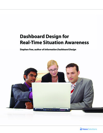
Visual DesignFirst, let’s make sure we are using the same language with regards to dashboards. In 2004 StephenFew, a data visualization expert, wrote an article for Intelligent Enterprise magazine that defined adashboard as “a visual display of the most important information needed to achieve one or moreobjectives consolidated and arranged on a single screen so the information can be monitored at aglance.”1 In 2007 Gartner expanded the definition to: “ a reporting mechanism that aggregatesand displays metrics and key performance indicators (KPIs), enabling them to be examined at aglance before further exploration via additional BI tools. Dashboards are useful KPI and metricreporting mechanisms that enable users to quickly monitor and track performance via an aestheticuser interface. They employ visualization components, such as gauges, thermometers, dials, andtraffic lights.”2From these definitions we can make several agreed upon assumptions about dashboards: A usershould be able to look at a dashboard and quickly make observations without scrolling, drilling, orclicking off the initial screen. Minimal user interaction can be included to enhance understandingand clarify observations, but too much interaction defeats the purpose of a dashboard and crossesover into the realm of analysis. And that dashboards also: Provide a way to monitor and track performance Should be able to convey what is going on rather quickly Typically contain key performance indicators and use several types of data visualizationA “Few” Words on Visual DesignSince dashboards serve as a way to monitor performance at a glance, graphs, icons, and tabularreports should not be put together in an uncoordinated, unplanned manner. Dashboards must bebuilt methodically, strategically, and with attention to detail. The size, color, and style of a font –such as whether it’s bold or italics – matter more in a dashboard than anywhere else in a businessintelligence solution.“Two of the greatest challenges in dashboard design,” says Stephen Few in his book, InformationDashboard Design,“ are to make the most important data stand out from the rest, and to arrangewhat is often a great deal of disparate information in a way that makes sense, gives it meaning, andsupports its efficient perception. An understanding of the preattentive attributes of visual perception and the Gestalt principles provides a useful conceptual foundation for facing these challenges.”3Achieving at-a-glance observations means making data pop. Designers must manipulate thegraphs and tabular reports common to dashboards so the data reflects problems or opportunities– depending on which is important to the user – and stands apart from the rest of the information.This can be done through the use of icons, colors (hues), shapes, and sizes of objects andproperties in a graph or tabular report.41 Few, Stephen. “Dashboard Confusion.” Intelligent Enterprise, March 20, 2004.2 Gartner. “Q&A: Important Integration Considerations for Scorecards, Dashboards and Portals.” July 9, 2007.3 Few, Stephen, Information Dashboard Design: The Effective Visual Communication of Data. O’Reilly Media, Inc.January 2006.4 Few, Stephen. IBID2Business Intelligence Best Practices for Dashboard Design
Visual Design in ActionGraphs, tabular reports, and text can be manipulated to make important information stand out.Figure 1 shows a dashboard created with Information Builders WebFOCUS business intelligenceplatform. Note that all the text is gray except for the problems, which are black and slightly larger.Even the axes values and borders are displayed in gray, which makes the text in black moreapparent. Icons further draw the user’s eye to the data that needs attention so that observationscan be made.Figure 1: Sample dashboard created with WebFOCUS from Information Builders that makes use ofvisual perception and design standards and principles.Word-Sized GraphicsA common problem in dashboard design is how to deal with the limited amount of real estate.Among others, two solutions that Few advocates are sparklines and bullet graphs.5 These are graphsthat can be displayed in an area no larger than a word. Edward Tufte, the creator of the sparklinedescribes them as “ small, high-resolution graphics usually embedded in a full context of words,numbers, images. Sparklines are data words: data-intense, design-simple, word-size graphics.”6Figure 2: An example of a sparkline graph.Bullet graphs are Few’s “answer to the problems exhibited by most of the gauges and meters thathave become synonymous with dashboards.” Radial gauges waste a great deal of space. Thisproblem is magnified when you have many displayed in a single dashboard. Few describes bullet5 Few, Stephen. IBID.6 Tufte, Edward R. Beautiful Evidence, Graphics Press LLC. January 2006.3Information Builders
graphs as “ designed to display a key measure, along with a comparative measure and qualitativeranges to instantly declare if the measure is good, bad, or in some other state.”7 Bullet graphsreinforce the notion that a picture is worth a thousand words. They help the viewer quicklyunderstand comparisons made to targets via a graphical representation.Figure 3: An example of a bullet graph.Sparklines and bullet graphs both convey considerable meaning on their own, but whencombined along with text-based data in a tabular report, they can convey much more information.Figure 4: This mobile dashboard createdwith WebFOCUS from Information Buildersshows how sparklines, bullet graphs, andother data elements tell more about thedata when used together than when usedon their own.WebFOCUS generates these word-sized graphics as well as other display mediums ideal fordashboards. It provides the ability to manipulate the elements of graphs and tabular reports inaccordance to dashboard visual design standards and principles.By their very nature, word-sized graphics demand serious data integration considerations.Sparklines are typically rendered from detailed data and can have thousands of data points, whilebullet graphs typically use aggregated data. Generating a tabular report containing these graphscan be difficult, and some common challenges include: Coordinating the detail-data display containing potentially thousands of data values representedby sparklines and the aggregate data display containing a handful of values represented bybullet graphs into a single row Incorporating these graphs and reports along with others so that they can display data frommany different areas of the organization all on a single screenThe way to address these challenges is through data integration.7 Few, Stephen. IBID.4Business Intelligence Best Practices for Dashboard Design
Dashboard Data IntegrationThe challenges of designing dashboards does not end with knowing which hues to use and howto make information pop. The data in dashboards is used as the basis for making critical businessdecisions. Designers must consider what data to use and how to make it available and integrate itinto a dashboard solution.The answers to the following questions help determine which data integration style shouldbe implemented: What is the quality of the data targeted? How accurate is it? Should it be real time? Where is it coming from? Does information from systems outside the enterprise need to be included?Before reviewing the integration styles that can address these concerns, some common elementsof data integration – including data access, data quality, and consistency – must be addressed.Show Me the DataThe following aspects of data integration are paramount to the effectiveness of dashboards and arecommon to all styles of integration: Data access Data quality and consistency Data consolidation Data latency Impact on operational systems Implementation time and costData AccessData access is the most fundamental property of dashboard data integration. It is not just aboutgetting access to data wherever it is; but also involves accessing the data in the most efficient waypossible without sacrificing data quality and consistency. Also along for the ride is the ability to jointhe data across disparate sources and platforms. Software systems such as Web services have openednew doors for data access by allowing applications to tap into previously unavailable informationsystems. Business intelligence applications can be made available via Web services, effectively turningthem into data sources that can be combined, joined, and reconciled with other enterprise data.Data Quality and ConsistencyThe accuracy of information in dashboards affects business decisions. The Data Warehouse Institute(TDWI) reports that, “ data quality problems cost U.S. businesses more than 600 billion a year. Yet,most executives are oblivious to the data quality lacerations that are slowly bleeding their companies to death. More injurious than the unnecessary printing, postage, and staffing costs is the slow5Information Builders
but steady erosion of an organization’s credibility among customers and suppliers, as well as itsinability to make sound decisions based on accurate information.”8Ensuring data quality and consistency provides a single version of the truth throughout the enterprise and needs to be seriously considered when designing dashboards.Data ConsolidationData consolidation involves combining data from multiple sources into a central system such as adata warehouse. Consolidating data includes many challenges, such as where the data resides, whichdata to combine, how often it should be combined, and whether or not it should be transformed.Since dashboards often have an amalgamation of information from across the enterprise, dataconsolidation is fundamental to making data available for a dashboard.Data LatencyThe dashboard’s primary purpose determines how current its data must be. For example, a strategicdashboard used to help understand long-term business plans may not be concerned with the dayto-day transactions. Data for this dashboard can be current up to the week, month, quarter, or year.Operational dashboards, on the other hand, require real-time or near real-time data to make immediate decisions and solve problems or address opportunities as they arise. It is important that thesedashboards experience little or no data latency.Impact on Operational SystemsBusiness intelligence solutions strive to minimize their impact on operational systems. Dashboardsused for strategic purposes typically do not require access to operational systems. Though it may seemthat operational dashboards absolutely need access to operational systems, it is not always required.Operational dashboards can be fed data from a data warehouse instead of an operational system.The process is a variation of the traditional data warehouse style of integration known as the realtime data warehouse. There can also be hybrid approaches where parts of the dashboard use areal-time data warehouse and others pull data directly from the operational systems. Which approachis best depends on the dashboard requirements. The bottom line is that dashboards – as part of aBI solution – should minimize their impact on operational systems.Implementation Time and CostThere are many ways to make data available to a dashboard. Some are faster than others, and costsvary. Which approach is best is driven by business demands, but should not be determined at theexpense of data quality and consistency because it can lead to bad decisions. An ideal approach todata integration might be compromised by making dashboards functional sooner rather than later.Keep in mind that different integration styles demand different implementation times, whichimpact how fast a dashboard solution can be made available. Operational data access requiresconsiderably less time to implement than a traditional data warehousing style. The trade off isimpact on operational systems.8 Eckerson, Wayne W. “Data Quality and the B
3 Few, Stephen, Information Dashboard Design: The Effective Visual Communication of Data. O’Reilly Media, Inc. January 2006. 4 Few, Stephen. IBID. 3 Information Builders Visual Design in Action Graphs, tabular reports, and text can be manipulated to make important information stand out. Figure 1 shows a dashboard created with Information Builders WebFOCUS business intelligence platform. Note .