Transcription
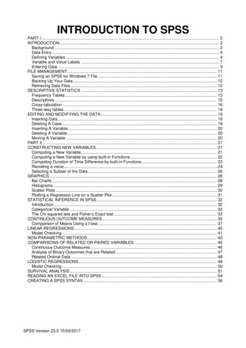
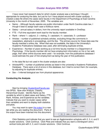
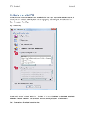
SPSS HandbookSession 1Getting to grips with SPSSWhen you open SPSS it will ask what you want to do first (see Fig 1). If you have been working on anexisting file you can open it directly from here by highlighting and clicking OK. To start a new database simply close this dialog.Fig 1: SPSS dialogWhen you first open SPSS you will notice 2 different forms of the data base Variable View where youname the variables within the data base and Data View where you type in all the numbers.Fig 2 shows a blank data base in variable view.
SPSS HandbookSession 1Fig 2: Variable viewFig 3: Data view blankYou need to be in variable view to type up what variables you have in your data set.You will need to know whether you have Within Subjects data or Between Subjects. Your data willbe entered very differently for the different designs.Additionally you will need to know whether your variables are categorical or continuous. Categoricalvariables require an additional step.
SPSS HandbookSession 1Fig 4: Variable view with two variables inserted. “Levels” is categorical (note the ‘nominal’ under‘Measure)’. “Recall” is continuous (note the ‘scale’ under ‘Measure’.You can label your variable if you would like. Forexample if the name is too long you may want tohave an abbreviated word in ‘Name’ but have thelonger version in ‘Label’For categorical data you will need to value thecategories.Click on the box in the Values column.Within this box you needto state the value youwould like to give foreach level of thevariable.Don’t forget to press addafter each value.Once this is complete you can return to data view and start inserting your raw data (see Fig ?)
SPSS HandbookSession 1Once this is complete you canreturn to data view and startinserting your raw data (see Fig ?)This is how a data set looks forBetween subjects dataEach row equates to 1 participant.In this case one row is for the IVThe second row is the DVFig ?:Data view for within participants effects. In this case each level of the variable is a column.
SPSS HandbookGraphical displays of Data.Categorical data: Pie ChartsGraphs Chart Builder Ignore the dialog box (press OK)Highlight Pie and then drag the pie diagram into the Gallery Chart (Fig ?)Session 1
SPSS HandbookSession 1Select the variable you are interested in looking at and drag to ‘slice by’. You can change themeasure from count to percentages using the element properties option. Once you have finishedselect OK.
SPSS HandbookSession 1After you have completed this youcan change aspects of your graphsuch as colours used, shading, aswell as adding titles etc. Simplydouble click on the graph in outputto enter Chart Editor and playaround. You can do this with allgraph types.Categorical Data : Bar ChartGraphs: Chart Builder Select Bar Chart drag across the variable of interest decide if you wouldlike percentages or counts and press OK.
SPSS HandbookSession 1Using the Bar chart for more than just counts: (categorical IV and Continuous DV)Between Subjects design example: assessing the difference between peer mentored and non peermentored individuals on adjustment to university.Graphs: Chart Builder select bar drag across your categorical IV onto the x axis box (in this casementored/ not mentored). Finally drag your continuous DV (in this case adjustment) into the y axis.
SPSS HandbookSession 1You will need to go into element properties andselect MeanAdditionally you can see the distribution ofscores by selecting ‘Display Error Bars’ which Iwould recommend within reports.Within subjects design example: assessing the change over time for social support amongstuniversity students.Graphs: Chart builder select bar drag both time points across. Leave the x axis blank. Rememberto go to element properties and change this to mean.
SPSS HandbookSession 1Continuous variables:Histogram. This type of graph is most often used to check the assumptions of parametric testing. INparametric tests we argue that the data must be normally distributed. A normally distributed datahas 3 properties .To complete a histogram Graphs Chart Builder Highlight histogram drag simple histogram intothe box select the continuous variable of interest across. Because you are interested in testingyour parametric assumptions you will need to check @display normal curve’ in the ‘elementproperties’
SPSS HandbookSession 1If you want to assess the distribution of your data according to a categorical data (forexample wellbeing according to gender) you can select the split histogram.Chart editor will ask for a split variable (Gender) and a distribution variable (wellbeing)Two continuous variables: assessing the relationship in graphical formatGraphs Chart Builder Scatter/ dot. Select the simple scatter drag up select the two variablesof interest placing one in the x axis and one in the y axis. I would suggest that if you argue that onevariable predicts the other have the predictor in the x and the predicted in the y. This is essentialwhen graphing regression analysis although isn’t important in correlation (because we cannot implycausality in correlation). Thus I assume that well being will predict how well adjusted you are touniversity. When you have created a graph I would suggest ‘fitting a line’.Line of best fit in correlation graphs:Double click on your graph in output to bring up the chart editor. Within chart editor click thediagram corresponding to line of best fit to fit the line.
SPSS HandbookSession 1You can also produce scatter plots split by a categorical variable. For example I couldassess the relationship between wellbeing and adjustment depending upon gender. Inorder to do this select the grouped scatter/ dot and enter your categorical variable intothe ‘set colour by’ box that appears in the top right hand corner.I have set color by whether or not the participants had a peer mentor.
SPSS HandbookDescriptive StatisticsTo get all the descriptive statistics you need: Analyze Descriptive Statistics Explore.Enter the IV into the Factor list and the DV intothe Dependent list.Select plots and tick Histogram and NormalityplotsSession 1
SPSS HandbookSession 1This table can be used to find the mean, 95% CI around the mean, and SD. Additionally you can findinformation on the distribution of data: skewness and kurtosis.Tests of *.93812.467No Noise.16412.200*.96312.825a. Lilliefors Significance Correction*. This is a lower bound of the true significance.These are statistical tests for normality of data. I read the Shapiro -Wilk and if this is significant thenwe have a problem with our distribution. However, in large sample sizes these become overlysensitive when small deviations produce significant results, therefore you should also visually inspectthe histograms.
SPSS HandbookSession 1Because the above test is unreliable in larger sample sizes I often assess for normality using a z scorecalculation instead. This is based on figures found in the explore table – the skewness and kurtosisand their respective standard error terms. To test for normality using this you calculate: z s/se (i.e.skew / standard error of skew). In the above example this would be: - 0.003 / 0.343 0.0175; thus z 0.0175. The general rules are: for small sample size (which is what you will be dealing with) a scoreof z 1.96 or above indicates a problem.In Psychology you rarely get a perfectly normal distribution. I would be happy with the abovehistogram. Further investigation can be made from the normality plots: see Figure 2.The Q-Q plots the observed valuesagainst those that are predicted ifyour data were normal (a bit like ascatterplot). Therefore your line ofbest fit indicates a perfect fit withnormality. Any deviations from thatline indicate some form ofabnormality. Your aim is to have ano deviation (rarely happens) or agentle s shape around the linewithout too greater deviation.
SPSS Handbook Session 1 Fig 2: Variable view Fig 3: Data view blank You need to be in variable view to type up what variables you have in your data set. You will need to know whether you have Within Subjects data or Between Subjects. Your data wi