Transcription
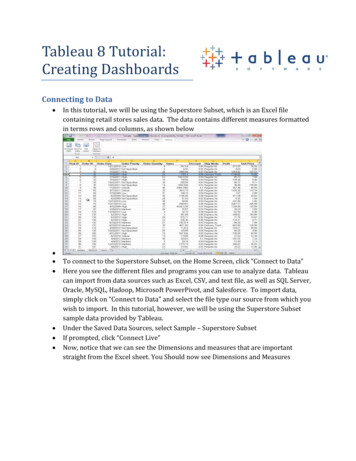
Creating a Tableau Data Visualization on Cincinnati CrimeBy Jeffrey A. ShafferStep 1 – Gather and Compile the Data:This data was compiled using weekly files provided by the Cincinnati Police. Each file includes 26 fields,including these important fields; incident number, date & time reported, date & time from/to, offense,address and neighborhood.The data visualization shows all crimes reported in the Cincinnati area for 2013. Since the data isreported weekly it was necessary to compile 25 weekly spreadsheets into a single spreadsheet. It’scertainly possible to combine these manually, but there are a number of tools available that will do thisin a more automated fashion. One useful tool is an Excel Macro written by Chris Kent that makescombining multiple Excel files really easy (http://tinyurl.com/MergeExcelFiles). Creating and using aquick keyboard shortcut to the macro it took no time at all to combine these files. Also, it would fairlyeasy to customize this code if there were a need to combine hundreds or even thousands of Excel files.Step 2 – Geocode the AddressesThe next step is to geocode the addresses. This is the process of converting an address into latitude andlongitude. In this case there are 16,612 addresses that need to be geocoded. There are a number offree batch geocoding tools available, each with different daily limits. Here are a three recommendedtools for geocoding.http://www.findlatitudeandlongitude.com/ - this is an excellent tool that offers many options,including geocoding a single address, locating a point on a map, reverse geocoding (i.e.converting a latitude and longitude to an address) and batch geocoding (click on Batch Geocodefrom the Menu options box near the bottom of the home page) .http://geoservices.tamu.edu/Services/Geocode/ - another excellent tool that allows for 2,500free searches at a time and allows registered partners to search more. This tool also allows theuser to upload a file, monitor progress and then download the finished results. They also offercheap prices for very large geocoding jobs.http://www.juiceanalytics.com/tags/geocoding/ - Juice Analytics has created a terrific tool forgeocoding that works directly from MS Excel using a Yahoo API. It is necessary to have a Yahooaccount (which is easy to do and free) and then obtain a Yahoo Search ID. There is also a nicefeature allowing the user to download the KML file.In order to geocode and address these tools require the full address, city and state. In the CincinnatiCrime dataset there is only address so it was necessary to append this to the address. This is simple todo right from excel using the concatenate() function or simply combining the strings using the & symbol.
Example:After appending a new column for address with city and state it is best to copy the entire column andreplace with values so that there are no formulas in the spreadsheet. It’s always best to import truevalues and not formulas into Tableau.Note: zip code is also necessary for geocoding with the Texas A&M tool, however, the zip code does notneed to accurate to get the results. For example, choosing a central zip code for Cincinnati would allowthe tool to properly geocode.There are other fields that are appended to the Cincinnati Crime dataset for the visualization, but theseare the essential fields that are necessary in order to create the base data visualization in Tableau. Sothe next step is loading the Excel file into Tableau.Step 3 – Load the data into Tableau and prepare it for analysisLoading an Excel file into Tableau is very simple. First open Tableau 8 and then select Connect to Dataand choose Microsoft Excel. After choosing the Excel file click import all data so that Tableau creates afull data extract. Tableau will then load all of the data.The next step is to verify that the fields imported correctly into Tableau. Typically it’s necessary toreview the dimensions and measures to make sure that Tableau organized them correctly, however, inthis case the only measures that are in the dataset are latitude and longitude which Tableau handledcorrectly on import. It’s easy to check this. From the Measures pane, drag Longitude to the Columnsshelf and Latitude to the Rows shelf.It’s always important to question the data. Never assume that the data is correct or imports correctly.In this dataset there were a few addresses that did not geocode correctly and this is immediateapparent when mapping the points. There are 2 addresses in the dataset that did not geocode correctlyusing one of the geocoding tools and they ended up with a latitude and longitude in South Americainstead of Cincinnati, Ohio where they should be.Examples:2700 CENTRAL PY and 2020 CENTRAL PYUsing PARKWAY or PKWY worked in the original tool, but the other tools accepted the PY in theaddress for Parkway.
One option is to drop these records from the dataset or filter them out in Tableau, but these are simpleto correct and update. After correcting these 2 addresses in the original Excel file it is necessary torefresh the dataset in Tableau (Data - Refresh All Extracts). Once this is done then all of the pointscorrectly show in the Cincinnati area (there were also 56 NULL values which will be excluded later).After changing the size of points to make them smaller, change the color of the points to orange(instead of the default blue) and adjust some of the features of the base map, the map should looksomething like this.By adding a data layer that is built into Tableau we can add another dimension to the analysis. In thiscase add Household Income from the Data Layer dropdown menu and select by Block Group. Thedefault color scheme will work well in this case. Now the map will look something like this.
The next to do is to create some custom groupings. The crimes in this data set occur at all hours of theevenings. For analysis purposes it will be necessary to group them into some sort of subgrouping andwhen examining crime data it’s fairly common to use an increment between 4 to 8 hour (see DataMining and Predictive Analysis: Intelligence Gathering and Crime Analysis by Collen McCue, page 94 onTime Groupings for more information).Tableau has a custom calculation that can be used for custom time groupings. First right-click on thedate field, in this case “Date From”, and select Create Custom Date. This will bring up a dialog box tochoose options. The goal in this case is to create a custom field on hour, so the options are Hours underthe detail dropdown menu and data part. The next step is to group them by right-clicking the newlycreated field, in this case “Date From (Hours)”, and selecting Create Group. Select each group of hoursthat need to be grouped and group them together. The final result will look something like this.
After creating the new grouping rename it to something appropriate and easy to understand, forexample “Time Slots”. This will be a field that is crucial for the visualizations that follow.Step 4 – Create some visualizationsBefore creating any of the visualizations, put the data in a simple crosstab format. From the Dimensionspane, drag DAYOFWEEK to the Column Shelf, Time Slot to the Row Shelf and from the Measures pane,drag Number of Records to the Text shelf (or to the body of the cross tab). This will create the followingcrosstab with the total number of crimes by day of week and by hour in a layout that is similar to acalendar format (in this case moving Sunday to the end of the week for the weekend).
Creating the “Droplet Chart” is a little tricky at first, but it’s easy once you get the hang of it. First, chose“Line” in the dropdown options on the Marks card. Next, from the Dimensions pane, drag Time Slot tothe Path option on the marks card. From the Marks card, drag the Sum(Number of Records) up to Color.Edit the color and choose the orange palette. Next, from the Dimensions pane bring Offense to the Sizeshelf on the Marks card. The goal here is to count the offense and since Offense is a dimension click onOffense in the Marks card and select Measure and Count. After following these steps the droplet chartshould look something like this.The next step is to add Neighborhood to the Filers and then click on Neighborhood on the Filters cardand select Show Quick Filter. On the quick filter select Multiple Values (Dropdown). For this analysisthe selected neighborhoods are “Hyde Park”, “East Walnut Hills”, “Walnut Hills” and “Evanston”. Oncethese are selected in the dropdown box then add Neighborhood to the Rows shelf in front of Time Slot.
After renaming a few things and moving the legend around, the visual will look something like this:The next step is to create a Dashboard. After creating a Dashboard page, drag the Droplet Chart on thedashboard. Format the title by double clicking on it. The title in this visualization uses a dynamic titlebased on the Neighborhood selected in the quick filter. The title is formatted in the following manner.Cincinnati Crime Visualization Neighborhood by Time(choose neighborhoods to view)
By using floating tiles the dropdown quick filter and the legend can be placed next to the title. Also, byusing a floating tile on the map legend it can be placed directly on the map for efficient use ofdashboard space. The dashboard now looks like this (note – there is a Blank placeholder here for thenext part).The next step is to embed a Google Map which will be linked via a URL Action. The first step is to drag aWeb Page onto the blank area of the Dashboard (in this case the bottom right hand corner). A dialogbox will appear asking to set the URL. You will want to use the URL that you want as the default. In thiscase I want to Google map to mimic the Tableau map in location and size. The following URL will embedthat map.http://maps.google.com/maps?q Cincinnati, OH&hl en&ll 39.1281,-84.4766&z 12&iwloc near&output embedThe term &iwloc near is used to remove the bubble pop up in the Google window and z 12 is the zoomlevel which is set to match the Tableau map. The parameter &ll is the latitude and the longitude which isset at the center of the Tableau map, again, this is so the default location and size will look like theTableau map.On the Interactive Map worksheet, from the Measures pane, drag Latitude and Longitude to the Detailsshelf. They will appear as AVG(Latitude) and AVG(Longitude). Right-click each one of them and selectDimension to convert them to dimensions. After this is complete they should show up in the Marks paneas Latitude and Longitude and these will be used as a parameter in the Google map.The next step is to create a URL Action. Click Dashboards on the top menu and select Actions. Click AddActions and choose URL. Select the Droplet Chart and the Map from the list of Tableau Sheets. Click theSelect button on the right hand side. Now enter the following website address into line marked URL:
http://maps.google.com/maps?q @ Latitude , Longitude &ll Latitude , Longitude &spn .0005,.0005&t h&hl en&output embedThis link will embed an overhead view from Google maps for the point selected on the Tableau map. TheDashboard should look like this and when a point is selected on the Tableau map the Google map shouldimmediately update to an overhead view of the selected address. The visualization should look like this:The next step is to make the map selection also filter the droplet chart. This is very easy in Tableau.Simply selecting the dropdown from the top right corner window of the Interactive Map window andselecting Use as Filter and the droplet chart will immediately filter. However, when doing this thecalendar days will be messed up, only showing the one individual point in the first column, regardless ofthe day of the week and this also affects the other formatting. For example:
Don’t despair, Tableau has unlimited undo available, so just click the undo button twice, once to removethe filter on the point and once more to remove the filter. Instead of filtering we will use theHighlighting feature and this will solve our problem and provide more features. To do this select theInteractive Map sheet and from the Dimensions pane, drag the Day of the Week, Time Slot andNeighborhood to the Details shelf. Return to the Dashboard. Select Dashboards on the top menu andselect Actions. Click Add Actions and this time choose Highlight. Select Selected Fields under TargetHighlighting and check the three dimensions that were just added to the Details shelf on the InteractiveMap and click OK.
Now when a point is selected on the Interactive Map the droplet chart remains intact, but with the dayof the week, time slot and neighborhood highlighted. In addition, the other points in that group areselected on the Interactive Map which gives additional context around the other crimes that happenedin the same neighborhood, on the same day and during the same time slot. The visualization shouldnow look like this:
Embedding Streetview will add yet another feature to the visualization. Currently Tableau does nothave the capability to dynamically embed two different URL’s on the same Dashboard. In this case thereisn’t much room left anyway, so we will add this feature to the tooltip of the Interactive Map.Click Dashboards on the top menu and select Actions. Click Add Actions and choose URL. Enter“Streetview” as the Name. Select the Interactive Map from the list of Tableau Sheets. Click the Menubutton on the right hand side. Now enter the following website address into line marked URL:https://maps.google.com/maps?q Latitude , Longitude &layer c&z 17&sll Latitude , Longitude &cbp 13,276.3,0,0,0&cbll Latitude , Longitude &hl en&ved 0CAoQ2wU&sa X&output svembed&layer cClick OK. Click Add Actions again and choose URL. Enter “Reset Map” as the Name. Select theInteractive Map from the list of Tableau Sheets. Click the Menu button on the right hand side. Nowenter the following website address into line marked URL:http://maps.google.com/maps?q Cincinnati, OH&hl en&ll 39.1281,-84.4766&z 12&iwloc near&output embedClick OK and OK again. Now the Tooltip on the Interactive Map should look like this:
Clicking “Reset Map” will reset the Google Map back to the original default and clicking “Streetview” willnow change the embedded Google map to a Streetview version that gives the user complete control tonavigate around the address.There is a parameter &iwloc A that was removed from the Streetview URL which embeds a popupbubble on the map with an address. cbp is used in the URL for the Street View window and accepts 5parameters.Example:cbp 11,180,0,0,51. Street View/map arrangementa. 11 upper half Street View and lower half mapb. 12 mostly Street View with corner map2. Rotation angle/bearing (in degrees: 0-360)3. Tilt angle, -90 (straight up) to 90 (straight down)4. Zoom level (0-2)5. Pitch (in degrees) -90 (straight up) to 90 (straight down), default 5
After some formatting adjustments to the tooltips, the dashboard looks like this.
Creating a Tableau Data Visualization on Cincinnati Crime By Jeffrey A. Shaffer . including geocoding a single address, locating a point on a map, reverse geocoding (i.e. converting a latitude and longitude to an address) and batch geocoding (click on Batch Geocode
