Transcription
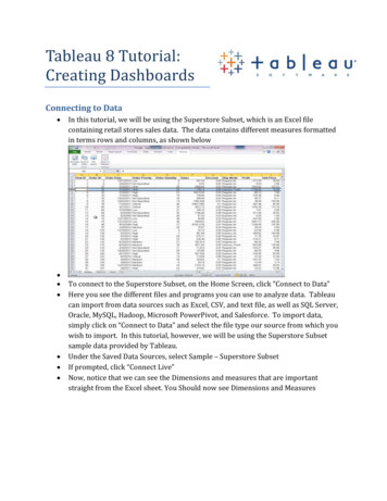
Tableau 8 Tutorial:Creating DashboardsConnecting to Data In this tutorial, we will be using the Superstore Subset, which is an Excel filecontaining retail stores sales data. The data contains different measures formattedin terms rows and columns, as shown belowTo connect to the Superstore Subset, on the Home Screen, click “Connect to Data”Here you see the different files and programs you can use to analyze data. Tableaucan import from data sources such as Excel, CSV, and text file, as well as SQL Server,Oracle, MySQL, Hadoop, Microsoft PowerPivot, and Salesforce. To import data,simply click on “Connect to Data” and select the file type our source from which youwish to import. In this tutorial, however, we will be using the Superstore Subsetsample data provided by Tableau.Under the Saved Data Sources, select Sample – Superstore SubsetIf prompted, click “Connect Live”Now, notice that we can see the Dimensions and measures that are importantstraight from the Excel sheet. You Should now see Dimensions and Measures
o Dimensions are the categories that we will use to slice our datao Measures are the numbers we want to view, or measureCreating a Bar Chart Drag the “Sales” measure into the bottom left hand field box that says “Drop FieldHere”Your screen should now look like this:Tableau gives us the aggregate sales in our data set. Now that we have a measure,we can now slice this measure by a Dimension. Let’s start with Product Category.Drag Departments into the box above the Sales graph.
Our Sales data is now broken up by three Departments: Furniture, Office Supplies,TechnologyWhen you hover over the bars, you can plainly see the Department and the exactsales figure corresponding to it.Now, let’s break down this even further by dragging Product Category overNow our data is sliced not only by Department, but by product categoryNow replace Category with the Region Dimension. Notice how easy it is to slice thedata many different ways.
Also notice that you can click the back button, and switch back and forth.Now, drag Department down to Rows. Notice that you again have a different view ofthe data. Your screen should look like this:Let’s save this WorksheetAt the bottom of the page, Right click on “Sheet 1” and Rename it to “Bar Charts”Now right click on the Sheet Tab again and click “Duplicate Worksheet.” This createsanother Sheet that we can use the data we’ve already created to create anothergraphIterating Worksheets: Using “Show Me” We will now use the Show Me feature of Tableau. Show Me is an easy way to change the chart types using just a single click.Using Sheet 2, let’s play around with the Show Me feature
Let’s first change our bar chart to a highlight table. Simply select the Highlight Table option, and there you have it!Let’s quickly change this to some bubbles (yay, bubbles!). Simply click on the PackedBubbles option of Show Me, and Tableau is bursting with bubbles. Or maybe you want a Tree Map. Now, click Tree Map.
Let’s take a minute to notice how Tableau is breaking down the Tree Map, and all ofthe other visualizations for that matter.To do so, take a look at the “Marks Card” which tells us exactly howTableau is plotting each dimension and measure. Look at the iconsat the bottom of the Marks Card with the dimensions and measuresnecessary to build the chart. We have the SUM(Sales) measure,which is breaking out the tree map by size. The Color button is alsoby SUM(Sales). Further notice that the color scale goes from a lightgreen shade to dark green based on an increase in sales. TheABC123 portion of the Marks Card denotes the labels on the TreeMap (e.g., by Department and by Region). This is the actual textdisplayed on the Tree Map.Now, let’s manipulate our Tree Map by allowing it to visualize another Measure bycolor. Let’s make the Tree Map show the SUM of Profit by Color, instead of the Sumof Sales. To do so, drag the Profit Measure into the Color button.Notice in the Marks Card that the Tree Map now shows the colors by the SUM(Profit)Now let’s cuztomize how the Tree Map is colored. To do this, click on the Color ButtonClick on Edit Colors. Play around with the colors you want to use. I still think theAutomatic Green colors do the best job portraying the sum of profit, but it’s up toyou.Now let’s change the labels so that our Profit and Sales numbers are included, alongwith the existing Department and Region.To change the labels, drag the Sales and Profit measures onto thelabel button. Notice the change again to the Marks CardBut, if you look at the Tree Map, notice that there are onlynumbers, without any indication of what the numbers mean. Let’sedit the Labels so that we have a better idea of which number represents profit.Click on the label button and click on the button next to textA window pops-up that allows us to edit the text. Edit your textso that it looks like this:Your Tree Map should look like this:
Save this Tree Map by renaming the Worksheet to Tree MapNow let’s create a MapCreating a Filled Map Open a New Worksheet and Name it Sheet 3In Show Me, notice that there are two different types of Maps: Field Maps andSymbol MapsNotice when you hover over the maps that Show Me gives you the minimumrequirements needs to make one of these maps.So, we need some dimensions and measures.Let’s make a Profit by State map.First, Select the State Dimension (under the Mappings Tree). Hold the CTRL key andSelect Profit as well. Both options should be selected.Once the State Dimension and Profit Measure is selected,notice that the Maps now illuminate. Let’s select a FilledMap to gain a better understanding about how eachstate’s profit is doing.Now you have a view of profit by state.Notice that you can hover over each state to see the exactprofit.Now that we have seen each state in terms of overall profit, let’s filter the profit by adimension. In this case, let’s try DepartmentTo do this, right click on the Department dimension and select “Show Quick Filter”,noticing that the filter shows up on the right hand side of the screen. You can alsoaccomplish this by dragging the Department Dimension into the Filters box, rightclicking that, and selecting “Show Quick Filter”Now we can filter this easily by Department. We can change the book of the filter byhovering over the list and clicking the down arrow. Change it to Single Value List.Let’s add the State Name to the Labels, along with the Profit Numbers by draggingthe Profit and State into the labels box.
Wow! This graph looks pretty good. Let’s name it “State Profit Map” and createanother graph.Creating a Scatter Plot Create another WorksheetLet’s make a Scatterplot.Drag “Profit” to Rows and “Sales” to Columns; Drag Region to the ColorButton; Drag Department to the Shape ButtonNotice in the Marks Card that we now have different shapes forDepartment, and different colors for RegionLet’s change the Shape by clicking on the Shape buttonTableau has many different shapes. Select the shapes you want. Don’t forget toAssign the Palette to the Department categories. I chose filled shapes because theylook BOLD. Click Apply and click OKLet’s make the filled shapes a bit bigger. Click the Size button and make the shapesthe size you wish. Not too big now!Now let’s use the Detail button to add some detail to this scatterplot. Let’s view thescatterplot by customer names so that we can get a nice view of our customers.Drag the Customer Name dimension into the Detail button. Splat! This should giveyou a seemingly messy, but useful view of customers by name, and show you wheremost of them lie in terms of sales and profit. You may need to resize your shapesagain.Now, let’s make the scatterplot a little bit cleaner by adding Profit to the Labels. Sodrag the Profit Measure into the Labels button.Let’s go a little further by adding trend lines to our view. To do this,right click on the plot itself, select trend lines, and select add trendlines.Now we have a really easy way to highlight each different regionand tell exactly how Sales and Profit are trending. Notice that youcan filer the scatterplot by simply clicking on the Dimensions in theMarks Card. Click on the East region, just to try it out.Your graph should now look like this:
Rename this sheet “Scatter Plot”Now we will use the 4 graphs to create a DashboardCreating a Dashboard It’s time to combine the previous charts into a DashboardIn the Area where you create a new sheet, right click and select New DashboardAt the top left hand corner of the screen, you will notice the labels for the graphs wejust made.Now we just have to drag the graphs into the new sheet. One-by-one, drag the mapsonto the sheets so that they look presentable.Notice that the filters we created are displayed at the right hand of the screen, Youcan use these filters to filter the data by those dimensions by just clicking on one.Rename the Dashboard “Final Report”Save your fileOther Tableau ResourcesTo access web resources and to learn more about Tableau Software, visit the links below: x
Tableau 8 Tutorial: Creating Dashboards Connecting to Data In this tutorial, we will be using the Superstore Subset, which is an Excel file containing retail stores sales data. The data contains different measures formatted in terms rows and columns, as shown below To connect to the Superstore Subset, on the Home Screen, click “Connect to Data” Here you see the different files and programs .File Size: 904KBPage Count: 9