Transcription
Creating Tableau Dashboards withIPEDS Data: How To, Tips, and Tricks2016 Association for Institutional Research Annual ForumSean V. Hoffman, Institutional Research AnalystOffice of Institutional Research, Planning & EffectivenessStony Brook University
GOALSGoals To learn what data are available in the IPEDS data center, and how toretrieve them. To be able to use these data to create a basic benchmarking dashboardwith Tableau. To review some advanced techniques for creating more useful andinformative visualizations in Tableau. To gain an understanding of how these dashboards can be used to aid ininstitutional research and planning.
AGENDAAgendaTableau basicsThe IPEDS Data CenterBuilding a dashboard – Admissions Data Basic – Filters and calculated fields Intermediate – Parameters and more calculated fieldsAdvanced techniques Comparison charts Chart switching on a dashboard Dashboard actionsUses for Institutional ResearchQuestions
TABLEAU BASICSTableau Desktop Create, manage, edit, and update workbooks locally. Can be deployed to a server(campus, public or online). Personal vs Professional – Need professional for DB connectionsTableau Server View and edit published workbooks in a secure environmentTableau OnlineTableau Public Free, but not secureTableau Reader View and interact with dashboardsBackwards compatibility issues
IPEDS DATA CENTER: WHAT’S AVAILABLEFind Your College-College navigator-College scorecardUse the Data-IPEDS Data Center-Customizable,downloadable dataReport Your Data-Log in to completesurveys-Collection Level DataCenter (Most recent dataavailable)All data reported to IPEDS is available, as well as copies ofthe actual surveys submittedJoin In-Training-Resources
IPEDS DATA CENTER: WHAT’S AVAILABLE For this exercise wewill use “CompareInstitutions”
IPEDS DATA CENTER: WHAT’S AVAILABLE Data from all surveys are available (final or provisional) Collection level data center allows access to current year (Go back to main page Click Report Your Data “Answer The Current Survey” Log In Click “Tools” Click “Go to Collection Level Data Center) Select institutions: can create groups, use groups, or download all (By groups EZGroup “All Institutions”)
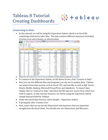
IPEDS DATA CENTER: EXPORTING DATA-Select the variables you wouldlike (up to 250 for “CompareInstitutions”)-Click continue-Download a CSV file-You can create derivedvariables if you desire
IPEDS DATA CENTER: EXPORTING DATACSV from IPEDSStacked Panel-Each element is downloaded as a separate column. This file can be quickly chopped up towork well in Tableau.-For this example, we can stack the panel based on year and gender, leaving only 8columns. This will allow for a better layout in Tableau.
BASIC DASHBOARD: IMPORTING DATAConnect to a file -You can edit the file and refreshonce you’ve started.Connect to a server -Need Tableau DesktopProfessional-Can create an extract
BASIC DASHBOARD Let’s begin with:– Filters» Filters are based off of certain fields (columns)» Because of the way we stacked the example panel, we canfilter, gender, year and school» To create, drag the item to the filter shelf. To show, right clickand choose “Show Quick Filter”– Calculated fields» Calculated fields are similar to excel formulas» We can create fields to calculate admit rate and yield» To create, right click in the data tab and select “CreateCalculated Field” Now let’s create two charts based on the items wehave:– A column chart to display Applications, Admissions andEnrollments– A table to display Admit rate and yield
BASIC DASHBOARD Now, we can create anew dashboard and addthe two charts to it Drag the sheets fromthe dashboard shelf tothe dashboard page All charts and filtersfrom the sheets will bebrought to thedashboard We can select eachobject, and use thedropdown menu tochoose to make theobject floating (freeplacement)
SOME REFERENCE NOTESNotes about filters:1)2)3)A filter can be set to apply to a sheet, or all sheets usingthe same source. This allows for you to only need one filterwith multiple chartsA filter can be set to only show relevant values. This ishelpful with long lists of related items. Example:Colleges/Schools and MajorsFilters can be set to include an “All” option. In thisexample, it has been deactivated, as the data set alreadyhas an all optionAll options can be accessed from the drop down menuon the quick filterNotes about the charts:1)To add multiple measures to the measure shelf, start byadding two measures to the row shelf. Then drag one fromthe row shelf into the axis of the other. This will bring themeasures shelf up, and allow you to add more measuresdirectly to it.
INTERMEDIATE DASHBOARD Here is another step to add some functionality to our dashboard. We will use aparameter and calculated field to select one metric to display at a time.– Parameter» Parameters allow you to create more complex filters» Let’s create a parameter to choose what specific metric we want to look at in a chart» Create a parameter that allows you to choose from the strings: “Applications”, “Admissions”,“Enrollments”, “Admit Rate” or “Yield Rate”» To create, right click in the data tab and select “Create Parameter”– Calculated field» We can now create a calculated field that uses theparameter to select the item. For example, this fieldwill show Admissions if parameter selected is Admissions.» This will be a multiple IF statement. In Tableau you mustend an IF statement with “END” Now let’s update our dashboard!
INTERMEDIATE DASHBOARD Observe that wedo not need tostore multiplemetrics in multipletables (or onetable with multiplecolumns) This can helpwhen space islimited This allows foreasybenchmarking onone metric
LIMITATIONSLimitations of the dashboard1. Benchmarking: What if we want to focus on our institution, or anotherselected institution?2. Data types: Our graphs and labels will not work for multiple data types3. Size and content: How much is too much for one dashboard?Advanced techniques to address the limitations1. Comparison Charts – Create a benchmarking chart2. Chart Switching – Select a chart based on the data you wish to display3. Dashboard Actions – Switch between dashboards (or other links) and createfilters that pass between charts
ADVANCED: COMPARISON CHARTSolution – Create a comparison chart Step 1 – Add a parameter using theinstitution names fieldStep 1Goal – Highlight a selected institution andcompare to the average (quartiles alsopossible) Step 3 – Set this field to be equal to thenumber of applications when the InstitutionName field is equal to the parameter, andnull otherwise. This will make sure this fieldonly displays data for the institution you areinterested inStep 2/3 Step 2 – Create a calculated field that setsits value based on the parameter. Forexample, create a parameter called:“Selected Institution Applications”
ADVANCED: COMPARISON CHARTLet’s examine how to merge this with the chart we created in the intermediate dashboard In that chart, we created a calculated field to display our metric of choice. Now, we will create another calculated field to display our metric of choice for our focus institution.For example, call the calculated field: “Selected Institution Metric” We can then add both metrics to a chart, and create a dual axis chart. To merge both axis, ensure both calculated fields are the same data type, by adding the float functionto your calculated field: ( FLOAT(calculation) ) Not applicable for this data set.
ADVANCED: COMPARISON CHARTS Gray Averageselected measure forall institutions – thisis determined by themetric parameter Red Selectedmeasure for ourfocus institution –determined by themetric and focusinstitutionparameters
COMPARISON CHARTSAlternate Comparison ChartHighlighting the selected institution Create a calculated field called“Is Selected”. This will bebinary ( 1 or 0 ) Drag the field over to thecolor shelf, change it todiscrete, and assign ahighlight color to 1 andstandard color to 0.123
ADVANCED: CHART SWITCHINGGoal – Display all metrics in one chart area This is made challenging by different data types, and different trend representations (we would liketo trend admit rate along a reversed axis and yield along a regular axis).Solution – Place multiple charts in the same location on the dashboard, and display only one at a time This is will be done through the use of a parameter, a calculated field, and custom list filters. For this dashboard, there will be three charts1.2.3.Admissions, Applications, and Enrollments displayed as numbers, trended along a regular axisAdmit Rate displayed as a percentage, trended along a reversed axisYield displayed as a percentage, trended along a normal axis123
ADVANCED: CHART SWITCHINGStep 1 – Create all charts needed for the dashboard Three, as mentioned previouslyStep 2 – We will need a parameter that has the values we want to switch between Use the parameter created in the intermediate dashboardStep 3 – Create a calculated field that is equal to the parameter This will help to switch between charts
ADVANCED: CHART SWITCHINGStep 4 – On each chart, add the calculated field as a filter,using a custom list. Set the custom list to the appropriatemetrics for the chart For example, the Admit Rate chart should have thecalculated field filtered only on “Admit Rate”. When theparameter is switched to “Admit Rate”, it will trigger thecalculated field filter and display any chart with “AdmitRate” filteredStep 5 – Apply filters to all charts, and stack them on thedashboard As long as each value in the parameter is included inonly ONE of the stacked charts, then only one chart ata time will be visibleNote: if chart titles are different, hide the titles, and use aseparate sheet to create a universal titleTo stack, set all charts to “floating” and place them atthe same coordinate location, using the manualcoordinate entry section of the dashboard (bottom left)Filter for the Applications,Admissions, and Enrollments chart.The Admit Rate and Yield chartswill only have one element each.
ADVANCED: DASHBOARD ACTIONSDashboard Actions Actions allow for dynamic interaction between objects on dashboards These actions can be used to communicate between sheets, dashboards,and external objects as well To add a dashboard action go to “Dashboard” “Actions” “Add Action” All actions offer the choice to run on: Hover, Select, or Menu Hover – When the mouse hovers over the target, the action will triggerSelect – When the target is selected, the action will trigger (the target will have to be unselectedand then selected again to re-trigger)Menu – When the target is selected, a menu will display, giving you the option to trigger the action
ADVANCED: DASHBOARD ACTIONSDashboard Action – FilterFor passing filters between sheets Choose a source and a target. The source is the object being clicked, andthe target is what will be filtered. For example, if there is a table showing all institutions, we can use a filteraction to display institution detail when the name is clicked. If the target sheet is on another dashboard, this will switch to that dashboard.For switching between dashboards Using the above knowledge, we can use the filter actions to navigatebetween sheets without passing filters as well. Simply choose all items astargets on the dashboard you wish to navigate to Instead of using a chart as a source, a navigation button can be created byadding a calculated field with the value of “image”, and setting the mark typeto Shape (see example Tableau workbook)
ADVANCED: DASHBOARD ACTIONSDashboard Action – Filter “Show all values” will pass thefilter when selected, but remove itwhen the source is unselected(Exclude all will pass the filter asan exclusion filter) “Leave the filter” will leave thefilter until a different element ofthe source is selected This filter will show the detail forinstitution name that is clicked onthe “Detail All Inst” chart (Source).It will be displayed on the “Detailby Year” chart (Target).
ADVANCED: DASHBOARD ACTIONSDashboard Action – URL URL actions all for navigation to external addresses, such as a webpage or afile on a file share When adding the action, choose the target on the dashboard that will activatethe action, then input the URL.Dashboard Action – Highlight Highlight actions allow for focusing on subsets of the dashboards. You canpass the action between sheets to filter a graph based on something clickedin a table We will not add a highlight action to this visualization, but their uses are welldocumented in the Tableau forums
USES FOR INSTITUTIONAL RESEARCHPlanning Examining position Trends and projectionsResearch Highlights areas of interestBenefits Quick, relatively simple, and publicly available Well populated Customizable peer groupsGoing further Adding institutional data (dashboard example on next slides)
USES FOR INSTITUTIONAL RESEARCH
Questions or comments?Feel free to contact me:Sean HoffmanStony Brook UniversityOffice of Institutional Research, Planning & ml (Main IRPE s/ com/2014/10/a-rough-guide-to-tableaudashboard.html (Dashboard rums (Tableau Community Forums)
Creating Tableau Dashboards with IPEDS Data: How To, Tips, and Tricks 2016 Association for Institutional Research Annual Forum Sean V. Hoffman, Institutional Research Analyst Office of Institutional Research, Planning & Effectiveness Stony Brook University. Goals To learn what data are available in the IPEDS data center, and how to retrieve them. To be able to use these data to create .