Transcription
1GUIDE TO USING PIVOT TABLES and PIVOT CHARTS in EXCEL 2016(BUSINESS AND ECON APPLICATIONS)Please refer to the “Business and Econ Data Sheet” Excel file. You will see a “SBA Disaster Loan” sheet,as well as a “Sales” Data sheet for a small fictious office supply company. Use this data to practicecreating Pivot Tables and Pivot Charts.Session Goal: To orient users on how to use: 1) Pivot Tables to analyze worksheet data, and 2) Pivot Chartto create visualization of complex data sets.About Pivot Table: Pivot tables are used to summarize, sort, reorganize, group, count, total or averagedata stored in a database. Users can transform columns into rows and rows into columns (hence the term“pivot table”). Users can query large amounts of data in user-friendly ways, subtotal and aggregatenumerical data, and summarize data by categories and subcategories. (Users can also filter, sort, group andconditionally format useful and interesting subsets of data.) So, with Pivot Table, you are able to “slice anddice data” to present it in a meaningful way.About Pivot Chart: Pivot charts complement PivotTables by adding visualizations to the summary datacreated in a PivotTable. Bar graphs, histograms, line charts allow you to easily see comparisons, patterns,and trends. Pivot Charts can be used to produce “dashboard” summaries for reports.(Note: there are many ways to use Pivot Table and Pivot Chart in Excel to analyze data. Users areencouraged to practice in “playing with” Excel to find alternate, perhaps more efficient ways to get to thedesired output.SETTING UP YOUR DATA IN EXCEL1.2.3.Provide named headers for your columns (and indicate units of measure).Insure no duplicate rows.Insure no blank cells.
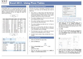
2TERMINOLOGY TO KNOWCREATING A PIVOT TABLE1. Select/highlight the cells from your data sheet (including the field names) you want to create aPivotTable from. To highlight all of the cells in a data set quickly you can click on upper left cellhold down CTRL and SHIFT, and press and then .)2.Select Insert PivotTable.
33.Under Choose the data that you want to analyze, select Select a table or range.4.In Table/Range, verify the cell range.5.Under Choose where you want the PivotTable report to be placed, select New worksheet toplace the PivotTable in a new worksheet or Existing worksheet and then select the location youwant the PivotTable to appear.6.Select OK.7.To build out your PivotTable, select name of the field you want from the PivotTables Fields paneby checking the box. Some fields are added to their default areas. Generally, non-numeric fieldsare added to Rows, numeric fields are added to Values. You can direct how you set up your tableby dragging the name of the field to Rows, Columns, or Σ Values.a.To move a field from one area to another, drag the field to the target area.
4b.If you drag a quantitative variable into Σ Values area you will default to SUM; if you drag aqualitative variable into Σ Values area you will default to COUNT (i.e., frequency data).Note that you can change how this data is handled by going to the field area for “Σ VALUES”and click on the drop down menu to open up window to select the last entry -- “Value FieldSettings” to then select the value you want (e.g., count, average, min, max, etc.).c. To set up multiple subcategories in your table rows by dragging the name of the fields intoRows, and then you can order the subcategories in one of two ways: 1) you can click on thedrop down menu to the right of the field you have placed in the Row area and move it up ordown, or 2) you can click and drag that field up or down relative to other fields you have inthe Row area.Below is shown the general set ---------------------------------------Now let’s try some Examples using the “Business and Econ Data Set” (start with the “SBA DisasterLoan sheet)A. To view total approved loan amount, move it to the Σ values area.
5B. To view the total approved loan amount by month of claim, move claim date to the Rows area.Here, and for more sophisticated analyses where you might want to display data in bar graph orhistogram, think of your y-axis (dependent-variable) data going into Values area and x-axis(independent variable) data going to Rows area. (Notice that when you click on “claim data” thedefault is to show in Row area with “months” and “claim date” automatically appearing. Thetable you created is now interactive, in that if you click on the to the left of any month to seedata for every day of the month for which there is data. If you only want information for themonths, you can now right click on that claim date and delete that from the Row area, which nowleaves your claims data summarized by month.
6C. If you now want to show this data by state (i.e., adding an additional field to your interactivetable), you can add the Damaged Property State Code to Column.etc D. Now assume you only want to look at the total approved loan amount by month for just the statesof Florida and California. You can move the Damaged Property State Code to Filter. You nowwill see a drop down menu that you can use to filter this data to only include the state(s) you areinterested in.Total Approved Loan Amountfor states of FL and CA
7More Examples, this time using the “Sales” sheetE. Notice that the sales data is for 2019 and 2020. Assume you are interested in sales data for eachrepresentative only for 2020. Set up as shown below.F.Practice setting up subcategories of rows. View which office products (and how many, and totalrevenues from each) sold in each of the regions of the country. Simply check the 4 relevant boxesand see default for set up as shown below. (Notice that default was “sum of units” rather than“count” in Values area for Units. There were 7 desks sold in the Central region, but there wereonly 2 order dates. So, always check that your output is displaying what you want.)
8How to clean up your generated Pivot Tables.Notice the unaltered Pivot Table below.For example, if you have financial data and you want to indicate in units of :-right click on any of the cells in the column you want to show in -go to “value field settings”-click on the “number” button-select “currency” and select the # of decimal places-click OKFor example if you have empty cells in your table and you want them to indicate “0”, can click on anycell in the body of the table, then:-right click to then select “pivot table options”-select to fill empty cells with value of 0You can highlight your table and select the DESIGN tab in the ribbon tab at the top of the page.You can SORT data in a column, for example to show highest to lowest values by right clicking on the cellat the top of the column and selecting SORT.KS did not have any disasterloans.
9CREATING A PIVOT CHART:1.2.3.4.5.Select any cell in your PivotTable.From the Insert tab, click the PivotChart command.The Insert Chart dialog box will appear. Select the desired chart type and layout, then click OK. .The PivotChart will appear.Clean up and customize your ------------Good Videos (length) to Take You to the Next Level:Using slicers to filter data (:36) 29dHow to build interactive Excel Dashboards (52:25) https://www.youtube.com/watch?v K74 FNnlIF8(show min 48:45 as an example)Excel 2016 PivotTables in Depth (3:42:27) ( ) -tablesin-depth/welcome?autoplay true&trk course preview&upsellOrderOrigin sem src.go-pa c.lil-sem-prsb2c-gbl-eng-txt-bizexcel pkw.excel%20pivot%20table%20tutorial pmt.e pcrid.262661450863 pdv.c plc. trg. net.g learning
3 3. Under Choose the data that you want to analyze, select Select a table or range. 4. In Table/Range, verify the cell range. 5. Under Choose where you want the PivotTable report to be placed, select New worksheet to place the PivotTable in a new worksheet or Existing worksheet and then select the location you want the PivotTable to appear. 6. Sele