Transcription
Quantum GIS Tutorial for Science On a Sphere Written by Audrey RandallSummer 2014Quantum GIS (or QGIS, or Quantum Geographic Information System) is a “free,open source geographic information system.” It provides a way for non-programmers tocreate maps using GIS information.This tutorial will walk you through the basics of using QGIS to create SOSformatted maps, by going through the creation of the Earthquakes and Nuclear PowerPlants dataset, the Marine Life dataset, the Global Statistics dataset, and a few maps thatare not currently part of the SOS collection.Further resources: An excellent set of general tutorials can be found here:http://www.qgistutorials.com/en/. Thank you to Ujaval Gandhi for providing these toQGIS users free of charge. Additionally, SOS’s Content Creation guide may be foundhere: http://sos.noaa.gov/ . Makesure you read it BEFORE creating your map. There is a lot of information in there thatcan save you from having to redo an entire project.A couple of notes for users: First, QGIS can be finicky. Please SAVE YOURPROJECT OFTEN. Second, QGIS often has trouble exporting very high resolutionimages. The SOS team recommends that users use the lowest resolution images that stilllook good on the sphere— in most cases, that means a resolution of 2048x1024 pixelsfor simple maps and 4096x2048 pixels for maps with intricate details.Links for all the data used in this tutorial are provided. In cases where the linksare no longer valid, a copy of all the files used is available here:http://sos.noaa.gov/Docs/qgis tutorial files.zip1
Table of ContentsOverview .4Requirements of the SOS format 5Some background information before you startVector vs. Raster DataDownloading QGIS 6Making a Base Map with Vector Data 6Making a Base Map with Raster Data 6Downloading Correctly Formatted ImagesWorld FilesImporting Raster DataRe-ordering Layers*Example used: SOS’s Blue Marble imageFinding/Manipulating Point Data 11Splitting a Column: A common format issue*Example Used: WNO’s map of nuclear reactor locationsFormatting Point Data .14Tab-delimited files in QGISAttribute tables (tables of data associated with layers)Null values in attribute tablesColoring points based on associated dataChanging point color, shape, transparency, and border*Example used: NOAA’s database of significant earthquakesMaking a Map with Regions Colored by Data 20Option One: Shapefiles on the Web .20Example Used: Life Expectancy from Atlas of the BiosphereOption Two: Shapefiles from Spreadsheets .25*Example Used: ITU’s database of landlines per country*Software Used: CartoDB.comOption Three: Adding Attribute Data to Existing Shapefiles 33*Example Used: Life Expectancy from Atlas of the Biosphere,Language Spreadsheet from Brown UniversityExporting Maps as Images 37*Example used: Reactor Sites and Earthquakes MapLegends, Color Bars, and Scales .40Exporting Maps as Layers .41Creating layers based on data in the attribute tableCopying layer styles*Example used: Reactor Sites and Earthquakes Map2
Making Image Backgrounds Transparent .44Batch-editing images*Software used: GIMP, free image-editing software for all platformsConnecting Dots using the Points to Paths Plugin .48This is a useful tool for converting locations of something over time into a path.For example, use this plugin to convert an animal’s location over time into anapproximation of the path the animal followed.3
An Overview of QGISQGIS, according to its website, is “a user friendly Open Source GeographicInformation System (GIS) licensed under the GNU General Public License.” To draw ananalogy, it is to making maps what Adobe Photoshop is to editing images. It gives youthe ability to create maps from scratch or from imported data, or modify and add toexisting maps. The software is set up so that each imported map or map feature is a“layer.” Layers can be made of point locations, background images, polygons such ascountry borders, or more complex types of vector data, like WMS maps or ESRIshapefiles. While QGIS can manipulate maps, it cannot create data. Users must do thatthemselves, by manually creating a table of information or (more commonly) importingdata from the Web or other sources. The two main categories of maps that QGIS canassemble, along with the type of data required to make them, are below: Maps of event locations, such as lightning strikes, earthquakes, tornados, or thelocations of tagged animals. These maps require importing a Comma SeparatedVariable (.csv) file or a text (.txt) file. CSV files are simply spreadsheets that havebeen saved in a form a computer can easily understand. Contrary to the name,they can be saved with tabs, spaces, or other characters separating theinformation, not just commas. If you are unsure how your CSV file is organized,simply open it in a text editor such as Notepad to determine what charactersseparate rows and columns. The information in a CSV file that could be used tocreate these maps would have to include separated latitude and longitudecolumns. If the coordinates are in the same column, see the section labeled“Finding/Manipulating Point Data.” Maps of regions colored according to data, such as a map of countries shaded bypopulation. To create this map, you’ll need an ESRI shapefile that includescountry borders and names or IDs, as well as a CSV file that has countrypopulation by country name or country ID.Usually, maps are made up of a base map (the world map, either an image or a vectormap made of polygons such as continents) and overlaying layers of interesting data,such as locations of phenomena. Base maps can be created with vector or raster data.Vector layers can be scaled indefinitely, because they are made up of mathematicalalgorithms that tell the computer where to draw lines and shapes. Every time you zoomin, the shape just gets redrawn. Raster layers are images. They are composed of pixels,so will lose quality the more they are stretched or zoomed in on.4
The SOS Format's RequirementsBecause of SOS’s high resolution requirements, it is generally easier to have abase map of vector data, which can be scaled indefinitely. Raster, or image, data works ifit is high enough resolution, but images of sufficiently high resolution are uncommon.Additionally, SOS's software needs to be given a specific map projection in orderto render the map correctly on the sphere. In QGIS, this is the default projection: theEquatorial Cylindrical Equidistant projection, also known as WGS 84 or EPSG:4326.While this is a relatively common map projection, it is NOT the one used by anythingthat Google Maps has made, or anything with Google Maps as a background. There area lot of tutorials for QGIS that assume a Google Map will be a fine base map, so theytell users how to import that and skip over the instructions for importing anything else.Because of this limitation, the underlying map layer is a little more complicatedwhen making an SOS map than it is when making a normal map. Keep a few tips inmind: It is certainly possible to import a vector map in the correct projection. They'rejust not very easy to find. A good place to go is www.naturalearthdata.com. Clickon the green “Get the Data” button near the top of the page. From that page, youcan download the “Natural Earth quick start kit” or browse the availableresources. If you choose to download the quick start kit, you will get a zip filethat contains a folder called “packages”. Inside is a .qgs file called“Natural Earth quick start for QGIS.” To get started, it's a fun one to play with. If you want to find a vector map from another source, QGIS accepts the followingforms of vector data:o KMLo SVGo GeoTIFFo GeoJSONo PostGISo SpatiaLiteo MSSQLo WMS/WMTSo WCSo WFSStart by trying to find data in one of these formats. Websites from NASA, NOAA,and other government agencies will occasionally have mapping data available tothe public.5
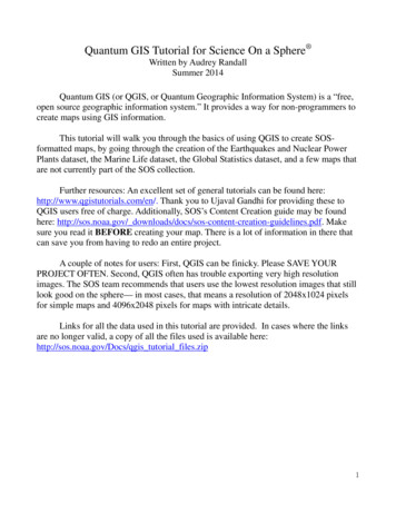
It is also possible to put an image as the base of your map, provided the image isof high enough resolution (2048x1024 or 4096x2048 pixels for SOS). SOS's FTPserver (ftp://public.sos.noaa.gov/) is a good place to find high resolution imagesthat are already in the right format.Downloading QGISQGIS releases new versions often. The version this tutorial is written for is QGIS2.2, which is no longer the current version. The SOS team recommends that youdownload QGIS 2.2, which is available at http://www.qgis.org/downloads/. Find thedownload link that works for your operating system.Once you’ve clicked the link, the QGIS Setup Wizard should appear. Follow itsinstructions to download QGIS 2.2. When you click “Finish,” several icons should haveappeared on your desktop with a yellow Q on them. You want to click on the one called“QGIS Desktop” to open the most sophisticated version of QGIS. QGIS Browser issimply a less versatile version of QGIS Desktop. If these icons do not appear, search for“QGIS Desktop” in the search bar in the Start menu.Making a Base Map with Vector DataTo insert a vector layer and style it, please see this highly helpful c vector styling.html.Making a Base Map with an ImageLet's assume you want to use SOS's “earth vegetation” image as your base map. Thatimage can be accessed from SOS's FTP server:1. Go to ftp://public.sos.noaa.gov/. Note that this is SOS’s FTP server, where all oftheir datasets are available for download, not its website. Go directly to that URL.2. Click on “land,” then “blue marble,” then “earth vegetation,” then click on2048.jpg.3. Right-click and select “Save image as.” It doesn't matter where, but make sureyou save it as a .tif image- we'll need it in that format. Save the image in a folderyou can find again. When the dialogue box appears to save your image inWindows, there will be a field labeled “Save as type.” Click on “All file formats.”Next, add the extension “.tif” to the name of your image. On a Linux machine,you’ll have to delete the original file extension first: for example, replace .jpgwith .tif.6
Windows screenshot:Linux screenshot:7
Next, we need to create a way for QGIS to interpret this image; the software can’ttell that it’s actually a map until we create something called a “world file.” A world fileis an extra file that QGIS knows to associate with an image file, which gives QGIS a setof “coordinates” to put the image at. It tells QGIS how big the image is supposed to be,how to rotate it if at all, and where to place the corners. A world file must have the samename as the .tif image, but its extension is .tfw, for Tiff World File. This is so that QGISknows which image to associate with which world file.Open up a text editor (such as Notepad for Windows or Text Editor for Linuxmachines) and create a blank file. Its name must be the same as your image; only the fileextension should be different. For example, if you have an image named 2048.tif, itsworld file should be called 2048.tfw. Also, please note that even though the fileextension is supposed to stand for “TIFF World File”, it’s “.tfw,” not “.twf.” Save itusing the “Save as” feature in the same folder as your image. If the world file is not inthe same folder as its image, QGIS won’t be able to find it.Now, to create the world file, you have to type in information in a way thecomputer expects it to appear. World files have six lines, which each contain onenumber:Line 1: Pixel size in X direction (aka image width)Line 2: Y-axis rotationLine 3: X-axis rotationLine 4: Negative of the pixel size in Y direction (aka image height, with a negative sign)Line 5: X coordinate of the CENTER of upper-left most pixelLine 6: Y coordinate of the CENTER of upper-left most pixelTo find this information, we have to know something about our map. First, withthe projection we're in (and with most world maps), there are 360 degrees in the Xdirection (the map spans the circumference of Earth) and 180 degrees in the Y direction(the map only goes from the North to the South Pole, not around the other side). We alsoknow that our image is 2048x1024 pixels. Knowing this, we can use the followingequations:Line 1: Pixel size in X direction 360 degrees / 2048 pixels 0.17578125 degrees per pixelLine 2: Y-axis rotation 08
Line 3: X-axis rotation 0Line 4: Negative of the pixel size in Y direction 180 degrees / 1024 pixels -0.17578125 degrees per pixelPlease note that lines 5 and 6 require the position of the CENTER of the pixel. Since wealready know how many degrees make up a pixel (0.17578125), we divide that numberby two to find the distance from the edge to the center of the pixel.Line 5: X coordinate of center of upper-left pixel -180 degrees ( 0.17578125 / 2) -179.9Line 6: Y coordinate of center of upper-left pixel 90 degrees - (0.17578125/ 2) 89.9Our final text file, 2048.tfw, looks like this:0.175781250.00.0-0.17578125-179.989.9Type these numbers into your world file, or copy and paste, and save the file. Notethat this world file will only work for an image that is 2048 by 1024 pixels. If yourimage has different dimensions, your world file will look different.Now go back to QGIS and go to Layer - Add Raster Layer.9
Select your image (2048.tif), not the world file. Click OK. A box will appear asking youwhich CRS (Coordinate Reference System) the data is in. Select WGS 84 and click OK.Once the image is open, QGIS will know to overlay any other data you might want toinsert in the right place on the map. Your map should now look like this:10
Once you have more layers, you can reorder layers by clicking and dragging thelayer names in the layer bar to the left of the viewing window, to make one appear ontop of or below another.Finding/Manipulating Point DataFor the purpose of this tutorial, I will create a map with the locations of nuclearreactors plotted against earthquake danger zones.I’m using a map with a transparent ocean as a base map, so that it’s easy to seewhat I’m doing during this tutorial. To insert it, see the “Base Maps with Raster Data”section of this tutorial on page 6. I found my reactor data in spreadsheet form #data. To download it, click on the link right under the title thatsays “Get the data.” This takes you further down the website to a link that says “DATA:Download the full spreadsheet.” Click on that link and save it in a place you’llremember.Once you've downloaded the spreadsheet, you'll notice that while it does includecoordinates, they have both latitude and longitude in the same column. QGIS won't beable to plot the data unless latitude and longitude are separate. This is frequently the casewith online databases, so I'm going to document the trick I use to separate the columninto two. If you are using a spreadsheet that already has latitude and longitude inseparate columns, skip down a page to the words “Skip to this point if your data does notrequire reformatting.”To split one column into two, follow these instructions:1)Open a new Google Spreadsheet. (If you prefer using Microsoft Excel, theirtutorial is here: -text-into-differentcells-HA102809804.aspx. Skip down to the “Skip to this point” message if you do.)2)Copy and paste your data into the sheet.11
3)Insert two extra rows next to the coordinates’ column, in the same spreadsheet. Dothis by right-clicking on the column head, circled in green, and selecting “Insert 1 right.”Do this twice.4)Click on cell C2. Go to the formula bar located directly above the column headers,boxed in blue. Type in the formula SPLIT(B2, “,”). This will split cell B2 where thecomma appears, putting the split halves into cells C2 and D2. It will also make sure thecomma isn't copied into the new cells.5)Right-click to copy cell C2. Select the remainder of column C, down to whereyour data ends. Right-click to paste the formula in C2 into the rest of your selection.6)Label your new columns “latitude” first and “longitude” second.Now go to File Download As Comma Separated Values (.csv) to save yourspreadsheet.Skip to this point if your data does not require reformatting, or if you are using Excelto reformat.In QGIS, click the “add delimited text layer” button or go to Layer Add DelimitedText Layer. Select the file you want to upload (that'll be our nuclear data file).12
For the X field, pick “Longitude” or whatever column contains longitude coordinates;for the Y, choose the latitude column. Click OK.A dialog box will come up prompting you to choose your projection. Pick WGS84 and hit OK. Huzzah, we have a map of reactor locations! For information about howto change the color and style of the points, see the next section.Formatting Point Data13
For the earthquake layer of this map, I'm going to want something more than justlocations of earthquakes- I want to somehow add information like earthquake intensity.The tab delimited variable file I've downloaded from NOAA has all that information; wejust need to show it.Start by downloading NOAA's significant earthquake database (which contains“information on destructive earthquakes from 2150 B.C. to the present that meet at leastone of the following criteria: Moderate damage (approximately 1 million or more), 10or more deaths, Magnitude 7.5 or greater, Modified Mercalli Intensity X or greater, orthe earthquake generated a tsunami”) fromhttp://www.ngdc.noaa.gov/nndc/struts/form?t 101650&s 1&d 1. Click the link labeled“Download entire significant earthquake database in tab delimited format.” Once it’sdownloaded, open the significant earthquake database and save it in a place you’llremember it.Import it into QGIS the same way we imported the nuclear reactor dataset, butwhen the dialog box that asks you to choose the file comes up, look at the field calledFile format. It has three choices: “CSV (comma separated values),” “Customdelimiters,” and “Regular expression delimiter.” Choose “Custom delimiters.” Check thetab box if it isn't checked already.LONGITUDE and LATITUDE should be in the X and Y fields already. Hit Ok. A list oferrors may pop up. These are usually due to a missing set of coordinates. You can ignorethem for now. Another window will pop up prompting you to choose a CRS: pick WGS14
84 and click OK. Your map should now look something like this:Now, right click on the layer of earthquake data you just imported and select“Properties.”15
You can format your data to make it show attributes. In this case, I want to showthe intensity of each earthquake via a color scale. Since my data includes a columnlabeled INTENSITY, I can tell QGIS to assign a color to each point based on what’s inthat column. However, if you were to try doing so now, you would notice that a bunch ofyour data vanishes, because if a point has a null value in INTENSITY, QGIS can’tassign it a color, so it gets removed. We can fix this by filtering out everything with anintensity of NULL (which QGIS interprets as having no intensity at all) and making it itsown layer.Right-click on the layer name of your earthquake data in the layer menu and select“Open the attribute table.” Click “Select using equation,” which is the button in the topleft corner with an epsilon on it.In the “Expression” box, type the phrase INTENSITY IS NULL to select thepoints with null intensities. Then click Select. Some points will now be highlighted inthe attribute table, and some points on the map will be a different color (yellow insteadof blue, in this example).16
Now right click on your earthquake data layer and select “Save selection as.”You’ll want to click “Browse” and choose where to save your file- you’ll get an errormessage if you try to save in the default directory. Check the box that says “Add savedfile to map,” and hit OK. Your selection is now a separate layer that we can formatindependently, for example, by assigning it a color value that matches the color barwe’re using for the rest of the earthquake points.17
Now we can reformat our data to give it a color scheme. To do this, go into the“Style” tab of the Properties window. (Remember that to get to Properties, you rightclick on the layer name and select “Properties.”) First change the bar that says “Singlesymbol” to “Graduated.” Next, pick the column you want to be color scaled, which forme is “INTENSITY.” Pick your color ramp and then click “Classify.” If you want morethan the default five classes, you can adjust the Classes setting found to the right of theSymbol field. A color scale will appear. Click “Apply.” If you like it, keep it! If not, foolaround some more.18
Your map now looks like this:I assigned the null values a light yellow color in the previous step, which isn’tvisible at the moment. Those values don’t show up very well on a white background, soI’m now switching back to an image with a blue ocean. I’m going to change the colorscheme, and I think I’d like to make the earthquake locations look more blendedtogether, so that they look more like danger zones than individual locations. So I’mgoing to click on the “Change ” button, in the Style tab under Properties. (To get toProperties, remember that you right-click on the layer name and select “Properties”).Here you can change the marker transparency, shape, and size. You can click on“Change ” and select the “simple marker” icon, then set the outline style to “no pen” toget rid of the outline around the shapes. You can make all sorts of changes here, so Iwon’t go into detail. The only thing to remember is that you want your map to be easilyread. For example, you can change the shape of the nuclear power plant layer points todifferentiate them from the earthquake locations. My results are below. (To export thisimage, see the “Exporting Maps as Images” section of this tutorial.)19
Making a map with Regions Colored by DataSo far, this tutorial has only dealt with one type of data: a spreadsheet, which weuse in .csv (comma separated variable) file format. This format is suitable for plottingdata in the form of points or locations, but if you want to show data on a per-region basis(such as life expectancy per country), the easiest way to do so is to use an ESRIshapefile. A shapefile is actually a group of several files that must be kept in the samefolder to work. There are a few ways to get them. The first is to simply download ashapefile from one of any number of websites (a list of suggestions is provided below, inOption One). The second is to create a new shapefile from a spreadsheet or .csv data,which is primarily useful if you can’t find a pre-existing shapefile with the rightelements. The easiest way to create your own shapefile is to use CartoDB.com, amapmaking website- see Option Two. And finally, you can add new data to a preexisting shapefile by adding columns in the layer’s attribute table (see Option Three).Option One: Getting a Shapefile from the WebStart by searching for whatever dataset you like as an ESRI shapefile. Some good places20
to start looking are: The Natural Earth datasets: http://www.naturalearthdata.com/downloads/. Thesedatasets are good as base maps, but probably won’t contain data that can be usedto color-code regions— these maps are usually just borders. However, if youwant a base map composed of vector data, this is a good place to start. Geocommons: http://geocommons.com/. User-submitted maps containing all sortsof data. Search for any kind of map, then click on the "shapefile" button to theright of the map (if available) to download the shapefiles. MapCruzin: efiles.htm. Aluck-of-the-draw eclectic collection of maps and shapefiles. Some shapefiles contain data that can color-code countries, such as historical earthquake occurrencesper country.For the purposes of this example, I’m going to use the Life Expectancy shapefilefrom Atlas of the Biosphere, which is available d 12&includerelatedlinks 1&dataset 12. Although this dataset is labeled “Life Expectancy,” it actually has numerous otherstatistics included in it, such as infant mortality rates, access to safe water per country,etc. You can click on the link that says “Download a GIS grid of this data (ESRI ArcGISformat). This will open up a new page, with a button that says “Download Now.” Clickon it.It will download a zipped file. At the bottom of your screen, a Downloads bar should21
appear with an icon that says “lifeexpectancy.zip.” We need to unzip it, so double clickthe icon to open the zipped folder. Once the folder opens, you should see all the filesinside it. Go up a folder in your file tree so you can see the folder the files are stored in,lifeexpectancy.zip. Right-click it and select “Extract all.” Make sure you extract thefiles into a location where you’ll be able to find them again.Now, go into QGIS and start a new project by going to Project - New. Click the“Add vector layer” button. You can also click on the Layers menu at the top of the pageand select Add Vector Layer.Click the Browse button next to the Dataset field and navigate to your extracted files.You want to upload the one that has the .shp extension— that’s the actual shapefile.Click Open.A window will appear asking you to specify the CRS— that’s the Coordinate ReferenceSystem. SOS uses WGS 84, also known as EPSG:4326. Select this if it isn’t alreadyselected and click OK.22
Your map should now look like this:To style this shapefile, you’ll want to choose a column of data such as Life23
Expectancy and tell QGIS to color countries based on the values in that column. In theinterest of not reinventing the wheel, please see Ujaval Gandhi’s tutorial on the subject,which may be found here: www.qgistutorials.com/en/docs/basic vector styling.html.Some points to be aware of: Assuming you’ve followed the steps above, you can skip to step 4 of Ujaval’s tutorial. Steps 1-3 are instructions on how to get the data into QGIS. When you color countries according to values in a column, countries with no values in that column will get grouped with the countries that have the smallest values. QGIS assigns those countries the value “-99” for some reason. If you only get two colors in your map after assigning it a color scheme, trychanging the mode or adding more classes.Once you have styled your map to your satisfaction, please skip to the “ExportingMaps as Images” section of this tutorial. You’ll also add legends, colorbars, and othermap features in that step.Example of Styled Map: Access to Contraception per CountryI used the graduated symbols option with seven equal-interval classes and the“Blues” color ramp to make this map.24
Option Two: Creating a Shapefile Using CartoDBCartoDB is a website that allows users to upload spreadsheets of geographicinformation and plot them on a map of the world. Unfortunately, the map CartoDB usesis in the wrong projection to work with SOS (see the write-up on CartoDB for moreinformation), but it’s still a useful tool for converting CSV files to shapefiles. Theprocess of converting text or image information to information that is associated withlocation coordinates is called georeferencing. CartoDB can do that for us.Getting CartoDBIn this case, getting the mapmaking software is very simple: go towww.cartodb.com and create an account. CartoDB designs plans based on storage space.If you’re importing a lot of data for individual maps, or creating a lot of maps, you’llneed to get one of the paid versions. If not, scroll down past the descriptions of the paidversions and click on “free version.”Importing the DataFor this tutorial I will be using the International Telecommunications Union’sdatabase of landlines and mobile phones registered throughout the world. These filesweren’t quite in the format CartoDB can use, so I had to mess with them in Excel first.This is frequently the case with databases on the web, and since this particularspreadsheet’s issues were very specific, I won’t go into how I solved them. If you wouldlike to recreate this dataset, please see the collection of datasets provided along with thistutorial. The file is called Fixed tel 2000-2012.csv.A note about CartoDB’s preferred formats: Please see the developer help website g-cartodb.html for specifics onformatting.25
To start, go to the green Dashboard button in the top-right corner of the page. Thiswill get you to your dashboard page, where your datasets are stored in table format.Click on the large “ ” button labeled New Table.Select “Select a file,” and find the spreadsheet you need. CartoDB can take Excel,CSV, TSV, ESRI Shapefiles, KMLs and KMZs, GeoJSON, GPS eXchange (GPX), OSMand BZ2, OpenDocument Spreadsheets (ODS), and SQL. ng-cartodb.html for more information.Click Open. Your table will appear.At the top of the screen, just above your table in the left hand corner, will be thewords “Table view” and “Map view.” Click on “Map view.” This window will appear. Ifit does not, click on the Options button in the top right corner of the screen and select the“Georeference” option.26
Table View and Map ViewClick “Georeference.”On the next window that appears, you’ll want to click “You have a columnidentifying administrative regions” since our data is referenced by country, not latitudeand longitude coordinates. In the “In your table the polygons are identified by ” field,select “field 1.” This means that the countries ar
Quantum GIS (or QGIS, or Quantum Geographic Information System) is a "free, open source geographic information system." It provides a way for non-programmers to . Windows, there will be a field labeled "Save as type." Click on "All file formats." Next, add the extension ".tif" to the name of your image. On a Linux machine,