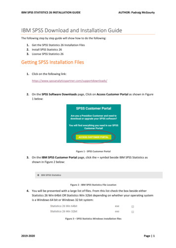
Transcription
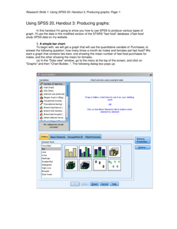
Research Skills 1: Using SPSS 20: Handout 3, Producing graphs: Page 1:Using SPSS 20, Handout 3: Producing graphs:In this handout I'm going to show you how to use SPSS to produce various types ofgraph. I'll use the data in the modified version of the STARS "fast food" database (Fast-foodstudy SPSS data on my website.1. A simple bar chart:To begin with, we will get a graph that will use the quantitative variable of Purchases, toanswer the following question: how many times a month do males and females eat fast food? Wewant a graph that contains two bars: one showing the mean number of fast-food purchases formales, and the other showing the mean for females.(a) In the "Data view" window, go to the menu at the top of the screen, and click on"Graphs" and then "Chart Builder.". The following dialog box pops up:
Research Skills 1: Using SPSS 20: Handout 3, Producing graphs: Page 2:(b) In the "Gallery", click on the graph entitled "simple bar" (top left in the array of littlegraphs), and drag it into the Chart Preview window above it:(c) Click on "Number of fast food purchases" in the "Variables" window on the left side ofthe dialog box, and drag it into the "Y-axis?" box on the preview graph. Likewise drag "sex" intothe "X-axis?" box. The default graph will change to two bars, giving some idea of how it will lookeventually.
Research Skills 1: Using SPSS 20: Handout 3, Producing graphs: Page 3:Add a title by highlighting "Titles/Footnotes", putting a tick in the box next to "Title 1", andthen clicking on "Element Properties". Type the title that you want in the box labelled "Content",and then click on "Apply" at the bottom. The "Element Properties" box is very useful, as it enablesyou to change all sorts of things, including what the bars represent: SPSS assumes you wantmeans, but you can change the graph to showing medians, modes and all sorts of other things.(d) Lastly, put a tick in the box that says "Display error bars". You have various optionsthat you can pick for the error bars. The most common would be to display the means plus orminus one standard deviation, or plus and minus one standard error. Click on "standard error",and then change the number in "multiplier" to 1. Then click on "Apply" at the bottom of the"Element Properties" box; and lastly, click on "OK" in the "Chart Builder" dialog box.
Research Skills 1: Using SPSS 20: Handout 3, Producing graphs: Page 4:You should have a graph that looks like this:The vertical and horizontal labels are supplied automatically by SPSS from the variablelabels (so this is a good reason for making sure that you label the variables appropriately). It alsohelpfully adds a label that tells the reader whether the error bars represent standard deviations orstandard errors.If you want to alter any aspect of a graph in SPSS, all you have to do is to double click onit, and it will open in a new window called the "Chart Editor". Using the menus at the top of this,you can change the widths and colours of the bars; convert the graph from bars to lines or viceversa; alter the font size of the labels; alter the labels themselves; and so on. Have a play withthese features. When you are happy with the graph, click on the "close" button in the top rightcorner and you will be returned to the output window. Here's my attempt:
Research Skills 1: Using SPSS 20: Handout 3, Producing graphs: Page 5:By default, SPSS graphs often use too small a font, so that they look terrible when imported into aWord document. In the above example, I've changed the font to size 18 throughout. I've alsochanged the vertical scale, the format of the numbers on the vertical scale (from two significantdigits to one) and the number of ticks on the vertical scale that are labelled.2. A clustered bar chart:Now let's produce a chart of fast food purchases broken down by two independentvariables - age and sex.(a) In the "Data view" window, go to the menu at the top of the screen, and click on"Graphs" and then "Chart Builder.". This time, click on the graph labelled "Clustered Bar", anddrag it into the Chart Preview" window. (You might want to click on "Reset" at the bottom first, toget rid of the earlier graph):Everything is entered as in the previous example, except now you put one of yourindependent variables into "X axis?" box, and the other into the box entitled "Cluster on X, setcolour". Here, I've got Sex in "Category" and Age in "Cluster on X, set colour". Don't forget to setall the various options in the "Element Properties" box, such as error bars.Click on "Apply" and then "OK" in the "Chart Builder" box, and you should get a graph likethe following:
Research Skills 1: Using SPSS 20: Handout 3, Producing graphs: Page 6:The following graph is the other way round, so to speak, with Age in "Category" and Sexin "Cluster on X, set colour":
Research Skills 1: Using SPSS 20: Handout 3, Producing graphs: Page 7:Often you will find that the data make more sense plotted one way round than the other,depending on the questions that you want to answer. Here, I think the first graph makes the agepattern more obvious, whereas the second graph makes it a little easier to compare males andfemales within each age-category.3. Line graphs:Line graphs are just as easy to produce. Click on "Graphs." then "Line." and then on thepicture for "Simple Line" if you want a graph with one line on it, or "Multiple Line" if you want morethan one line. Then follow the same procedures as in the bar chart examples earlier. Here's aone-line line graph with error bars, with error bars representing one standard error. I've alteredthe font for the axes, so that they remain legible when the graph is reduced in size:Try to get the same graph as I produced, and play around with the options.Here's how to produce a "multiple" line version, showing age and gender differences inpurchasing behaviour. Click on "Graphs.", then "Chart Builder", then "Line.". Then click on thelittle graph next to "Multiple " and drag it into the chart preview area. Put the dependent variable(Purchases) into the "Y axis?" box. Put "age" into the "X axis?" box. Lastly, put into "Set color:"the IV for which you want separate lines on the graph (in this case, Sex).
Research Skills 1: Using SPSS 20: Handout 3, Producing graphs: Page 8:.Put a tick next to "Display error bars", and then click on the button next to "Standarderror". Change the "multiplier" to 1, so that the error bars will be each mean plus and minus onestandard error of the mean. Then click on "Apply" and "OK" to get your graph. It should look likethis. (I've altered the font size, and added value markers (little round circles) on the two lines thatdisplay the data).
Research Skills 1: Using SPSS 20: Handout 3, Producing graphs: Page 9:Bar charts of frequency data:The previous graphs have all been concerned with Purchases, which are measured on aratio scale, and for which we have graphed averages of one kind or another. Many of thevariables in the fast food spreadsheet can best be described in terms of how often they occur. Forexample, how many people think the brand of fast food is important? These data are given in theBrand importance variable. People could respond by giving one of four answers: "not", "quite","very" or "don't know". These are categorical (nominal) data, so it makes no sense to averagethem! We can only plot the frequency with which each of these responses occurred.First, let's produce a simple bar chart of the frequency with which each of theseresponses occurred. Here are the frequencies, in table form (obtained by clicking on "Analyze",then "Descriptives" and then "Frequencies"). "9" represents "don't know".Brand 71400Percent38.327.334.3.3100.0Valid 599.8100.0To present these frequencies graphically, click on "Graphs", "Chart Builder", "Bar" andthen choose "Simple Bar" as before. When you put "Brand Importance" into the "X axis?" box inthe Chart Preview box. SPSS automatically changes the "Y axis?" box to "count", sensing that
Research Skills 1: Using SPSS 20: Handout 3, Producing graphs: Page 10:this is a categorical variable. So, in contrast to the previous graphs, you don't have to putanything into the Y-axis box.Click on "OK" and you should get a graph like the following. I'll leave you to tidy it up: puta title on it, give the vertical axis a more meaningful label, change the colour of the bars andenlarge the font. (If you were going to include the graph in a lab-report, you might want to import itinto Word first (see below) and then give it a title within Word. There are conventions on figuretitles that you should adhere to. (See the handout on writing lab-reports, or Field and Hole 2003).Essentially, all graphs and tables are numbered consecutively - e.g. "Fig.1. Gender differences inratings of brand importance". However, if you are saving the SPSS output as a file in its ownright, it's a good idea to give the graphs titles within SPSS so that when you return to the output,you can remember what they are graphs of!).Next, we'll produce a frequency chart of brand importance broken down according to gender ofrespondent. First, here are the relevant frequencies (obtained by clicking on "Analyse","descriptive statistics", and then "Crosstabs" command).Brand importance * Sex 1400
Research Skills 1: Using SPSS 20: Handout 3, Producing graphs: Page 11:To graph these data, click on "graphs", "Chart Builder.", and drag the "clustered bar" image intothe "Chart Preview" box.Put Brand importance into "X axis?" and Sex into "Cluster on X: set colour". Here's thegraph:Again, it could do with some tidying up. You could produce the same graph, but withrelative frequencies instead of raw frequencies (i.e. with each column showing the percentage ofmales and females who fell into each of these categories of brand importance). To do that, simplyclick on "count" in the "Element Properties" box, and change it to "Percentage". Click on "SetParameters" and change it to "Grand Total".Finally, here's the same two variables, but displayed differently. This time I put Sex into"category axis" and Brand importance into " Cluster on x: set colour ".
Research Skills 1: Using SPSS 20: Handout 3, Producing graphs: Page 12:Importing graphs into Word:Most of the time, you will want to embed an SPSS graph into a Word document, such as a labreport. To do this, click once on the graph in SPSS to highlight it. Then go to the menu at the topof the screen, pick "Edit" and then click on "copy". Switch to your Word document and place thegraph in it by clicking on "Edit" , then "Paste Special" and then "Bitmap". If you click and drag onthe little black dots around the box that contains the graph, you can resize it. It's best to do this byclicking on a corner dot and holding down the shift key, so that the aspect ratio of the graph ispreserved. Otherwise, the text can get distorted and hard to read. You will have to do all of theediting of the graph (colours, labels, font size, etc.) before you import it into Word -once it's inWord, it will be a picture, an image rather than a graph as such, and you won't be able to edit it.Be prepared - Word doesn't handle pictures particularly well, and you may find odd thingshappening as you resize it, such as the graph suddenly jumping from one page to another oroccasionally disappearing altogether!Graham Hole, University of Sussex, September 2012.
Research Skills 1: Using SPSS 20: Handout 3, Producing graphs: Page 1: Using SPSS 20, Handout 3: Producing graphs: In this handout I'm going to show you how to use SPSS to produce various types of graph. I'll use the data in the modified version of the STARS "fast food" database (Fast-food study SPSS data on my website. 1. A simple bar chart: