Transcription
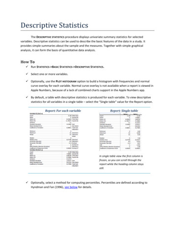
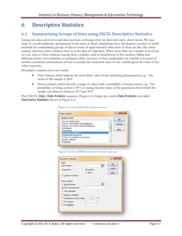
Statistics in Business, Finance, Management & Information Technology6Descriptive Statistics6.1Summarizing Groups of Data using EXCEL Descriptive StatisticsListing raw data and even sorted data becomes confusing when we deal with many observations. We losetrack of overall tendencies and patterns in the mass of detail. Statisticians have developed a number of usefulmethods for summarizing groups of data in terms of approximately what most of them are like (the centraltendency) and how much variation there is in the data set (dispersion). When more than one variable is involved,we may want to show relations among those variables such as breakdowns in the numbers falling intodifferent classes (cross-tabulations or contingency tables), measures of how predictable one variable is in terms ofanother (correlation) and measures of how to predict the numerical value of one variable given the value of theother (regression).Descriptive statistics have two forms: Point estimates, which indicate the most likely value of the underlying phenomenon; e.g., “themean of this sample is 28.4” Interval estimates, which provide a range of values with a probability of being correct; e.g., “theprobability of being correct is 95% in stating that the mean of the population from which thissample was drawn is between 25.9 and 30.9”The EXCEL Data Data Analysis sequence (Figure 6-1) brings up a useful Data Analysis tool calledDescriptive Statistics shown in Figure 6-2.Figure 6-1. Excel 2010 Data Analysis menu.Figure 6-2. Excel 2010 Descriptive Statistics pop-up.Copyright 2021 M. E. Kabay. All rights reserved. statistics text.docx Page 6-1
Statistics in Business, Finance, Management & Information TechnologyFor example, a series of intrusion-detection-system log files from a network documents the numbers ofnetwork-penetration attempts (Network Attacks) per day for a year. Figure 6-3 shows the DescriptiveStatistics data analysis tool filled out to accept columnar data with the first line as a heading or label; it is alsoset to locate the 5th largest and the 5th smallest entries as an illustration.61 The 95% Confidence Level forMean setting generates the amount that must be subtracted and added to the mean to compute the 95%confidence limits for the mean., discussed in detail later in the course.Figure 6-3. Descriptive Statistics tool in Excel 2010.Applying the Descriptive Statisticsanalysis tool with these settingsproduces the summary shown inFigure 6-4. In the sections following,we’ll discuss each of these results.The results of the DescriptiveStatistics tool do not change dynamically:if the data are modified, you have toapply the tool again to the new data.Unlike functions, which instantlyshow the new results if the input dataare changed, the results produced byany of the Data Analysis tools arestatic and must be recalculatedexplicitly to conform to the new data.Figure 6-4. Descriptive Statisticsresults.INSTANT TEST P 6-2Generate some Normally distributed random datausing int(norm.inv(rand(),mean,std-dev)). Explainexactly what each part of this function does byshowing it to a buddy who doesn’t know Excel.Practice using the Descriptive Statistics tool on yourdata.Notice that the data change constantly. Applythe Descriptive Statistics tool again and place theresults below the original output so you cancompare them.Observe that the values are different (exceptthe Count).For example, in exploratory data analysis, one might want to examine the most extreme five data on each side of the median to see if they wereoutliers to be excluded from further analysis.61Copyright 2021 M. E. Kabay. All rights reserved. statistics text.docx Page 6-2
Statistics in Business, Finance, Management & Information Technology6.2Computing Descriptive Statistics using Functions in EXCELIn the next section, we’ll examine a number of descriptive statistics, including the ones listed in Figure 6-4.Before that, though, it’s useful to know that EXCEL can also compute individual descriptive statistics usingfunctions. For example, Figure 6-5 shows all the individual statistical functions available in EXCEL 2010through the Formulas More Functions Statistical sequence.As always, every function is fully described in the EXCEL HELP facility. The functions with periods in theirname are defined in EXCEL 2010 and, for the most part, correspond to the equivalent functions in earlierversions of EXCEL.Figure 6-5. Statistical functions in Excel 2010.INSTANT TEST P 6-3To ensure that you remember how to access these functions quickly any time you needthem, practice bringing up the function lists for all the different functional areasavailable in the Function Library portion of the Formulas menu.For a few functions that you recognize and for some you don’t, bring up the Help facilityto see the style of documentation available that way.Copyright 2021 M. E. Kabay. All rights reserved. statistics text.docx Page 6-3
Statistics in Business, Finance, Management & Information Technology6.3Statistics of LocationAt an intuitive level, we routinely express our impressions about representative values of observations. Evenwithout calculations, we might say, “I usually score around 85% on these exams” or “Most of the surveyrespondents were around 50 years of age” or “The stock seems to be selling for around 1200 these days.”There are three important measures of what statisticians call the central tendency: an average (the arithmeticmean is one of several types of averages), the middle of a ranked list of observations (the median), and themost frequent class or classes of a frequency distribution (the mode or modes). In addition, we often refer togroups within a distribution by a variety of quantiles such as quartiles (quarters of the distribution), quintiles(fifths), deciles (tenths) and percentiles (hundredths).62 These latter statistics include attributes of statistics ofdisperson as well as of central tendency.6.4Arithmetic Mean (“Average”)The most common measure of central tendency is the arithmetic mean, or just mean or average.63 We add up thenumerical values of the observations (Y) and divide by the number of observations (n):or more simplyIn EXCEL, we use the AVERAGE(data) function where data is the set of cells containing the observations,expressed either as a comma-delimited list of cell addresses or as a range of addresses. Figure 6-7 shows anaverage of three values computed with the AVERAGE(data) function.Figure 6-7. Excel AVERAGE function.Figure 6-6. Drop-downmenu in Excel 2010.For convenience, several frequently used functions are accessible in a drop-downmenu on the main EXCEL bar, as shown in Figure 6-6. The functions areaccessible when a range of data has been selected.The percentile is occasionally called a centile.The arithmetic mean is distinguished from the geometric mean, which is used in special circumstances such as phenomena that become morevariable the larger they get. The geometric mean is the nth root of the product of all the data. E.g., for data 3, 4, 5, the geometric mean is (3*4*5) (1/3) 60(1/3) 3.915. In Excel the geomean() function computes the geometric mean of a range.6263Copyright 2021 M. E. Kabay. All rights reserved. statistics text.docx Page 6-4
Statistics in Business, Finance, Management & Information Technology6.5Calculating an Arithmetic Mean from a Frequency DistributionSometimes we are given a summary table showing means for several groups; for example, suppose threedifferent soap brands have been tested in a particular market. Cruddo was introduced first, then Gloppu andfinally Flushy. Figure 6-8 shows the average sales figures for each of three brands of soap along with the totalnumber of months of observations available.Figure 6-8. Monthly sales figures and weighted average.It wouldn’t make sense just to add up the average monthly sales and divide by three; that number ( 34,506)doesn’t take into account the different number of months available for each soap. We simply multiply theaverage monthly sales by the number of months (the weight) to compute the total sales for each soap (theweighted totals) and divide the sum of the weighted totals by the total number of months (the total of theweights) to compute the weighted average as shown in Figure 6-8. The weighted average, 34,586, accuratelyreflects the central tendency of the combined data.Figure 6-9 shows the formulas used to compute the weighted average in this example.Figure 6-9. Formulas used in previous figure.INSTANT TEST P 6-5Duplicate the example yourself in Excel. Compute the erroneous average of the AverageMonthly Sales using the appropriate Excel function to see for yourself that it’s wrong.Copyright 2021 M. E. Kabay. All rights reserved. statistics text.docx Page 6-5
Statistics in Business, Finance, Management & Information Technology6.6Effect of Outliers on Arithmetic MeanThe arithmetic mean has a serious problem, though: it is greatly influenced by exceptionally large values –what we call outliers.Here’s an imaginary list of five household annual incomes (Figure 6-10).Figure 6-10. Household incomes showing a wealthy outlier.The mean income for these five households is 1,692,699. Does that value seem representative to you? Theaverage for the four non-wealthy incomes is 29,976: about 2% of the computed (distorted) average includingthe outlier. Another way of looking at the problem is that the distorted mean is 56 times larger than the meanof the lower four incomes.If you think about how the average is computed, it makes sense that unusually large outliers can grosslydistort the meaning of the arithmetic mean. One way of reducing such an effect is to exclude the outliersfrom the computation of the average. For example, one can set an exclusion rule in advance that leaves outthe largest and the smallest value in a data collection before performing statistical analysis on the data.However, these rules can be problematic and should be carefully discussed and thought through beforeapplying them to any scientific or professional study.Do unusually small values also distort the arithmetic mean? In Figure 6-11 we see another made-up sample,this time with mostly millionaires and one poor family.The average of the five household incomes is 6,308,938. Does the poor family unduly influence theFigure 6-11. Four wealthy families & one poor outlier.calculation of the average? The average of the four wealthy households is 7,881,612; thus the average thatincludes the tiny-income outlier is 80% of the average for the wealthy households. There is an effect, butbecause of the way the arithmetic mean is computed, very small outliers have less effect on the average thanvery large outliers.INSTANT TEST P 6-6Create a list of incomes yourself in Excel. Play around with outliers to see for yourselfwhat kind of effects they can have on the arithmetic average. Try outliers on the smallside and on the large size.Copyright 2021 M. E. Kabay. All rights reserved. statistics text.docx Page 6-6
Statistics in Business, Finance, Management & Information TechnologySometimes wildly deviant outliers are the result of errors in recording data or errors in transcription.However, sometimes wildly different outliers are actually rooted in reality: income inequality is observed togreater or lesser extents all over the world. For example, Figure 6-12 shows the average US pre-tax incomereceived by the top top 1% of the US population vs the quintiles (blocks of 20%) between 1979 and 2007along with a graph showing changes in the proportion (share) of total US incomes in that period.64 These aresituations in which a geometrical mean or simply a frequency distribution may be better communicators ofcentral tendency than a simple arithmetic mean.Figure 6-12. Income inequality in the USA.As with most (not all) statistics, there is a different symbol for the arithmetic mean in a sample comparedwith the mean of a population. The population mean (parametric mean) is generally symbolized by the Greek letter lower-case mu: μ.The sample mean is often indicated by a bar on top of whatever letter is being used to indicate theparticular variable; thus the mean of Y is often indicated as .65(Gilson and Perot 2011)To learn how to use shortcuts to insert mathematical symbols in Word 2003, Word 2007 and Word 2010, see (Bost 2003). With these functionsenabled, creating X̅ is accomplished by typing X followed by \bar. A curious bug is that not all fonts seem to accept the special element; for example,the Times Roman font works well, but the Garamond font (in which this textbook is mostly set) does not – the bar ends up displaced sideways overthe letter. The workaround is simply to force the symbol back into a compliant font as an individual element of the text.6465Copyright 2021 M. E. Kabay. All rights reserved. statistics text.docx Page 6-7
Statistics in Business, Finance, Management & Information Technology6.7MedianOne way to reduce the effect of outliers is to use the middle of a sorted list: the median. When there is an oddnumber of observations, there is one value in the middle where an equal number of values occur before andafter that value. For the sorted list24, 26, 26, 29, 33, 36, 37the median is 29 because there are seven values; 7/2 3.5 and so the fourth observation is the middle (threesmaller and three larger). The median is thus 29 in this example.When there is an even number of observations, there are two values in the middle of the list, so we averagethem to compute the median. For the list24, 26, 26, 29, 33, 36, 37, 45the sequence number of the first middle value is 8/2 4 and so the two middle values are in the fourth andfifth positions: 29 and 33. The median is (29 33)/2 62/2 31.Computing the median by sorting and counting can become prohibitively time-consuming for large datasets;today, such computations are always carried out using computer programs such as EXCEL.In EXCEL, the MEDIAN(data) function computes the median for the data included in the cells defined bythe parameter data, which can be individual cell addresses separated by commas or a range of cells, as shownin Figure 6-13.Figure 6-13. MEDIAN function in Excel.INSTANT TEST P 6-8Create a list of values in Excel. Play around with outliers to see for yourself what kindof effects they can have on the median. Compare with the effects on the average,which you can also compute automatically. Try outliers on the small side and on the largesize and note the difference in behavior of the mean and the median.Copyright 2021 M. E. Kabay. All rights reserved. statistics text.docx Page 6-8
Statistics in Business, Finance, Management & Information Technology6.8QuantilesSeveral measures are related to sorted lists of data. The median is an example of a quantile: just as the mediandivides a sorted sequence into two equal parts, these quantiles divide the distribution into four, five, ten or 100parts: Quartiles divide the range into four parts; the 1st quartile includes first 25% of the distribution; thesecond quartile is the same as the median, defining the midpoint; the third quartile demarcates 75%of the distribution below it and 25% above; the fourth quartile is the maximum of the range. Quintiles are similar to quartiles but involve five divisions. Deciles demarcate the 1st tenth of the values, the 2nd tenth and so on; the median is the 5th decile. Percentiles (sometimes called centiles) demarcate each percentage of the distribution; thus the medianis the 50th percentile, the 1st quartile is the 25th percentile, the 3rd quintile is the 60th percentile and the4th decile is the 80th percentile.EXCEL 2010 offers several functions to locate the boundaries of the portions of a distribution in ascendingrank order; however, there are subtleties in the definitions and algorithms used. Figure 6-14 lists the PERCENTILE, PERCENTRANK, and QUARTILE functions. By default, we should use the .EXCversions, which are viewed as better estimators than the older versions of the functions, as discussed in §6.9.Figure 6-14. Quantile functions in Excel 2010.Copyright 2021 M. E. Kabay. All rights reserved. statistics text.docx Page 6-9
Statistics in Business, Finance, Management & Information Technology6.9EXCEL 2010 .INC and .EXC FunctionsIn all the EXCEL 2010 quantile functions, the suffix .INC stands for inclusive and .EXC stands for exclusive.The calculations for .INC functions are the same as for the quantile functions in EXCEL 2007 for those thatexist. Functions with .INC calculations weight the positions of the estimated quantiles closer towards themedian than those with the .EXC suffix, as shown in Figure 6-15 using quartiles.The larger the sample, the smaller the difference between the two forms of computations. In general, the.EXC versions are preferred.Figure 6-15. Comparing .INC and .EXC quantiles in Excel 2010.Copyright 2021 M. E. Kabay. All rights reserved. statistics text.docx Page 6-10
Statistics in Business, Finance, Management & Information Technology6.10 Quartiles in EXCELThere are three quartile functions in EXCEL 2010, one of which (QUARTILE) matches the EXCELQUARTILE.INC function (Figure 6-17).The EXCEL 2010 QUARTILE and QUARTILE.INC functions are identical to the EXCEL 2007, 2013 and2016 QUARTILE function. Figure 6-18 shows the comparison of results of these types of quartiles for asample dataset.Figure 6-17. Excel 2010 quartile functions.Figure 6-18. Results of Excel 2010 quartile functions.Figure 6-16. Formulas for comparison of Excel 2010 quartile functions.Copyright 2021 M. E. Kabay. All rights reserved. statistics text.docx Page 6-11
Statistics in Business, Finance, Management & Information Technology6.11 QUARTILE.EXC vs QUARTILE.INCThe following information is provided for students who are curious about the different calculation methods used for n-tiles inEXCEL. The details are unnecessary if the advice “use the .EXC versions” is acceptable at face value.Depending on the number of data points in a sample, it may be necessary to estimate ("interpolate") betweenexisting values when computing quartiles. For example, if we have exactly 10 values in the sample, we haveto compute the second quartile (Q2, which is the median) as being half way between the observed value s#5 and #6 in the ranked list if we label the minimum as #1. If we label the minimum as #0, Q2 is half waybetween the values called #4 and #5. The calculations of Q1 and Q3 depend on whether we start countingthe minimum as #0 or as #1.Newer versions of EXCEL include a function called QUARTILE.EXC where EXC stands for exclusive. Inthis method, the minimum is ranked as #1 and the maximum in our sample of 10 sorted values is called #10.The median (Q2) is half way between value #5 and value #6. The value of Q1 is computed as if it were the0.25*(N 1)th value (remembering that the minimum is labeled #1); in our example, that would be theobservation ranked as #2.75 – that is, 3/4 of the distance between observation #2 and observation #3.Similarly, Q3 is computed as the 0.75*(N 1)th 0.75*11 which would be rank #8.25, 1/4 of the waybetween observation #8 and observation #9. There are 2 values below Q1 in our sample of 10 values and 2values above Q3. There are 3 values between Q1 and Q2 and 2 value between Q2 and Q3.The older versions of EXCEL use the QUARTILE function which is exactly the same as the modern QUARTILE.INC function. The INC stands for inclusive and the minimum is labeled as #0. This method isthe commonly used version of the calculations for quartiles. In this method, for the list of 10 values (#0through #9), the median (Q2) is halfway between the values ranked as #4 and #5. Q2 is calculated as if itwere rank #(0.25*(N-1)) #2.25 – that is, 25% of the distance between value ranked #2 and the one that is#3. Similarly, Q3 is the value corresponding to rank #(0.75*(N-1) #6.75 – 75% of the distance betweenvalues #6 and #7. Thus in our example there are 3 values below Q1 in our sample of 10 values and 3 valuesabove Q3. There are 2 values between Q1 and Q2 and 2 values between Q2 and Q3.The QUARTILE.EXC function is theoretically a better representation of the values of Q2 and of Q3. Youcan simply ignore the QUARTILE.INC and QUARTILE functions in most applications, but they areavailable if you are ordered to use it.66For detailed explanation of the differences between these functions, see (Alexander 2013) -packages/ or http://tinyurl.com/kcrxlfn .66Copyright 2021 M. E. Kabay. All rights reserved. statistics text.docx Page 6-12
Statistics in Business, Finance, Management & Information Technology6.12 Box PlotsA common graphical representation of data distributions is the box plot, also called a box-and-whisker diagram,shown for three datasets (Figure 6-19) in the diagram (Figure 6-20).Figure 6-19. Sample data for box-and-whisker 2Denmartox4235302617Figure 6-20. Box-and-whisker plots for sampledata.Ephrumia161412108As you can see, the top “whisker” (vertical line) runsfrom the maximum to the third quartile; the bottomwhisker runs from the first quartile to the minimum.The box runs from the third quartile through themedian (horizontal line insider the box) down to thefirst quartile.Unfortunately, no version of EXCEL yet provides anautomatic method for drawing box-and-whisker plots.However, if one has a small number of categories,highlighting the individual cells to draw borders (forlines) and boxes is not difficult. 67.67(Peltier 2011)Copyright 2021 M. E. Kabay. All rights reserved. statistics text.docx Page 6-13
Statistics in Business, Finance, Management & Information Technology6.13 Percentiles in EXCELThe same principles apply to percentiles as to quartiles.Figure 6-14 lists the PERCENTILE.EXC and the PERCENTILE.INC functions. Both produce an estimateof the value in an input array that corresponds to any given percentile. The .EXC functions arerecommended.The HELP facility provides ample information to understand and apply the PERCENTILE functions.6.14 Rank Functions in EXCELYou can produce a ranked list (ascending or descending) easily in EXCEL 2010. Using a RANK, RANK.AVG, or RANK.EQ function (Figure 6-21), you can compute a rank for a given datum in relationto its dataset.For example, Figure 6-22 shows information from the quality-control section of GalaxyFleet for its 17 classesFigure 6-21. Rank functions in Excel 2010.of starships (Andromeda Class, Betelgeuse Class,etc.). RANK.EQ is the EXCEL 2010 version of theolder EXCEL versions’ RANK function. The datadon’t have to be sorted to be able to compute ranks.In this case, the data are simply orderedalphabetically by class.Figure 6-22. Accident data sorted by starship class.INSTANT TEST P 6-14Create some data using one of therandom-number generator functions { RAND(), RANDBETWEEN(bottom, top)}.Use the RANK.EQ and RANK.AVGfunctions and compare the results.Explain these results as if to someonewho has never heard of the functions.Copyright 2021 M. E. Kabay. All rights reserved. statistics text.docx Page 6-14
Statistics in Business, Finance, Management & Information TechnologyIn case of ties, the RANK and RANK.EQ functions both choose the higher rank whereas the RANK.AVGfunction computes the average of the tied ranks. Figure 6-23 shows the results of the three rank functionsstarting rank #1 at the lowest value. Notice that Hamal Class and Lesuth Class starships had the same valueand therefore could be ranks 6 and 7. The RANK.EQ and RANK functions list them as rank 6 (and thusrank 7 is not listed) whereas the RANK.AVG function averages the ranks [(6 7)/2 6.5] and shows thatvalue (6.5) for both entries.Figure 6-23. Rank functions in Excel 2010.Each rank function in EXCEL 2010 requires the specific datum to be evaluated (number), the referencedataset (ref) and an optional order parameter, as shown in Figure 6-24.Figure 6-24. Excel 2020 rank functions showingoptional order parameter.Copyright 2021 M. E. Kabay. All rights reserved. statistics text.docx Page 6-15
Statistics in Business, Finance, Management & Information TechnologyBy default, the order parameter (Figure 6-26) is zero and therefore, if it is not entered, the valuecorresponding to rank #1 is the maximum value in the reference list. Figure 6-25 shows the results of adefault-order sort and the formulas used to generate the ranks in EXCEL 2010.Figure 6-26. Optional order parameter in Excel 2010 rank functions.Figure 6-25. Rank functions (values in top table and formulas in bottom table) using default sort order.Copyright 2021 M. E. Kabay. All rights reserved. statistics text.docx Page 6-16
Statistics in Business, Finance, Management & Information Technology6.15 Mode(s)Frequency distributions often show a single peak, called the mode, that corresponds in some sense to the mostpopular or otherwise most frequent class of observations. However, it is also possible to have more than onemode.Figure 6-27 shows a typical unimodal frequency distribution – one with a single class that is the mostfrequent.Figure 6-27. Unimodal frequency distribution.Finding such a class by inspection is easy: just look at the table of frequencies or examine the graph of thefrequency distribution.Figure 6-28 shows a more difficult problem: a distribution with more than one local maximum. The peaklabeled A is definitely a mode but peak B can justifiably be called a secondary mode as well for this bimodaldistribution. B marks a region that is more frequent than several adjacent regions, so it may be important inunderstanding the phenomenon under study.Figure 6-28. Bimodal frequency distribution.Copyright 2021 M. E. Kabay. All rights reserved. statistics text.docx Page 6-17
Statistics in Business, Finance, Management & Information TechnologySometimes a bimodal distribution is actually the combination of two different distributions, as shown by thedashed lines in Figure 6-29. For example, perhaps a financial analyst has been combining performance datafor stocks without realizing that they represent two radically different industries, resulting in a frequencydistribution that mixes the data into a bimodal distribution.Figure 6-29. Bimodal distribution resulting fromcombination of two underlying distributions.Generalizing about data that mix different underlying populations can cause errors, misleading users intoaccepting grossly distorted descriptions, and obscuring the phenomena leading to the differences. One of thesituations in which such errors are common are political discussions of income inequality, where statementsabout overall average changes in income are largely meaningless. Only when specific demographic groupswhich have very different patterns of change are examined can the discussion be statistically sound. Similarly,some diseases have radically different properties in children and adults or in men and women; ignoring thesedifferences may generate odd-looking frequency distributions that do not fit the assumptions behind generaldescriptions of central tendency and of dispersion.As you continue your study of statistics in this and later courses, you will see that many techniques have beendeveloped precisely to test samples for the possibility that there are useful, consistent reasons for studyingdifferent groups separately. Examples include multiway analysis of variance (ANOVA) to test for systematicinfluences from different classifications of the data (men, women; youngsters, adults; people with differentblood types; companies with different management structures; buildings with different architecture) on theobservations.INSTANT TEST P 6-18Create a column of 100 rows of data using function INT(NORM.INV(RAND(),100,10))and then add the same number of entries using INT(NORM.INV(RAND(),150,10)).Construct a frequency distribution of the combined data and explain the results.Copyright 2021 M. E. Kabay. All rights reserved. statistics text.docx Page 6-18
Statistics in Business, Finance, Management & Information Technology6.16 Statistics of DispersionObservations may have the same arithmetic mean yetobviously be different in how widely the data vary.Figure 6-30 shows three frequency distributions withthe same mean and sample sizes but differentdistribution (dispersion) patterns.The common ways of describing the extent ofdispersion are the range, the variance, the standarddeviation, and the interquartile range.Figure 6-30. Three different frequency distributionswith same mean but different dispersion.6.17 RangeAs you’ve seen in several discussions before this, therange is simply the difference between the maximumvalue and the minimum value in a data set. Thus if arank-ordered data set consists of {3, 4 , 4, 8, , 22,24}68 then its range is 24 – 3 21.As discussed in §6.169 (Summarizing Groups of Datausing EXCEL Descriptive Statistics), the Data DataAnalysis Descriptive Statistics tool generates a list ofdescriptive statistics that includes the range. EXCELhas no explicit function for the range, but it’s easysimply to compute the maximum minus the minimum,as shown in Figure 6-31.Figure 6-31. Computing the range in Excel.calculate the range.The descriptive statistics discussed in section 6.1 automaticallyINSTANT TEST P 6-19Using data similar to those you created in the test on the previous page, calculate therange of your data.By convention a set (group) is enclosed in braces { } in text; commas separate individual elements and colons indicate a range (e.g., 4:8). Similarconventions apply to Excel, except that arguments of functions are in parentheses ( ).69 The symbol § means :section” and is used for references to numbered section headings in this t
Descriptive Statistics tool in Excel 2010. Figure 6-4. Descriptive Statistics results. INSTANT TEST P 6-2 Generate some Normally distributed random data using int(norm.inv(rand(),mean,std-dev)). Explain exactly what each part of this function does by showing it to a buddy who doesn't know Excel. Practice using the Descriptive Statistics tool .