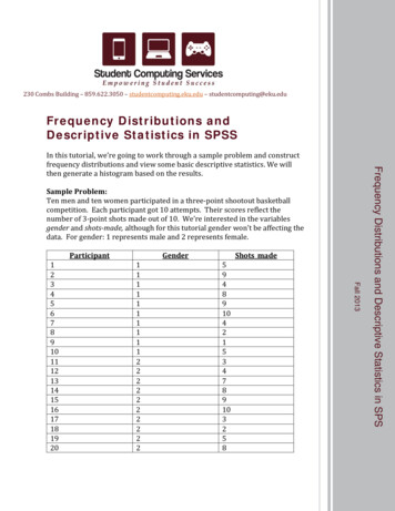
Transcription
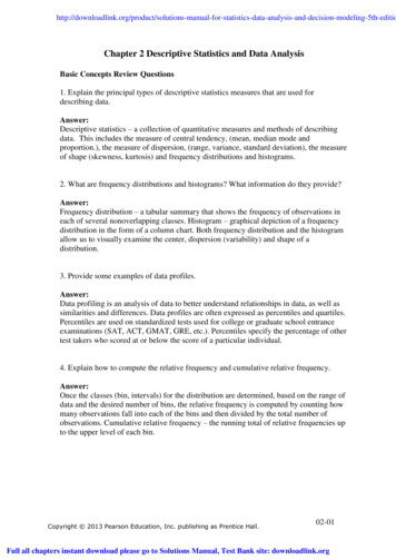
Solutions Manual for Statistics Data Analysis and Decision Modeling 5th Edition by EvansFull Download: 5th-editioChapter 2 Descriptive Statistics and Data AnalysisBasic Concepts Review Questions1. Explain the principal types of descriptive statistics measures that are used fordescribing data.Answer:Descriptive statistics – a collection of quantitative measures and methods of describingdata. This includes the measure of central tendency, (mean, median mode andproportion.), the measure of dispersion, (range, variance, standard deviation), the measureof shape (skewness, kurtosis) and frequency distributions and histograms.2. What are frequency distributions and histograms? What information do they provide?Answer:Frequency distribution – a tabular summary that shows the frequency of observations ineach of several nonoverlapping classes. Histogram – graphical depiction of a frequencydistribution in the form of a column chart. Both frequency distribution and the histogramallow us to visually examine the center, dispersion (variability) and shape of adistribution.3. Provide some examples of data profiles.Answer:Data profiling is an analysis of data to better understand relationships in data, as well assimilarities and differences. Data profiles are often expressed as percentiles and quartiles.Percentiles are used on standardized tests used for college or graduate school entranceexaminations (SAT, ACT, GMAT, GRE, etc.). Percentiles specify the percentage of othertest takers who scored at or below the score of a particular individual.4. Explain how to compute the relative frequency and cumulative relative frequency.Answer:Once the classes (bin, intervals) for the distribution are determined, based on the range ofdata and the desired number of bins, the relative frequency is computed by counting howmany observations fall into each of the bins and then divided by the total number ofobservations. Cumulative relative frequency – the running total of relative frequencies upto the upper level of each bin.Copyright 2013 Pearson Education, Inc. publishing as Prentice Hall.02-01Full all chapters instant download please go to Solutions Manual, Test Bank site: downloadlink.org
5. Explain the difference between the mean, median, mode, and midrange. In whatsituations might one be more useful than the others?Answer:Mean – an arithmetic average of a set of observations and is the most appropriate tool forinterval and ratio data without significant outliers. Median – the middle point of a sortedset of observations, and is the most appropriate tool for ordinal, interval and ratio data andis not affected by outliers. Mode – the most frequent data point in a set of observations,and is appropriate only for nominal and ordinal data with few frequently occurringobservations. Midrange – the average of the largest and smallest observations, and isappropriate when the number of observations is relatively small and is adversely impactedby the presence of outliers.6. What statistical measures are used for describing dispersion in data? How do theydiffer from one another?Answer:Range – the difference between the largest and the smallest observation, and is extremelysensitive to outliers. Variance – the average of squared deviations for the mean and is alsoaffected by outliers, but not to the same extent as the range. It is expressed in squaredunits. Standard deviation – the square root of the variance, and represents and averagedeviation from the mean.7. Explain the importance of the standard deviation in interpreting and drawingconclusions about risk.Answer:When comparing financial investments such as stocks, investors compare average returns,but also risks. If 2 stocks have average returns, and the standard deviation is much higherthan the other, than we may conclude that the stock with the higher standard deviation isriskier or more volatile.8. What does Chebyshev’s theorem state and how can it be used in practice?Answer:Chebyshev’s Theorem – for any set of data, the proportion of values that lie within kstandard deviations of the mean is at least 1 – 1/k2. In practice, this tells us that for k 2at least 75% of the observations lie within 2 standard deviations of the mean, and for k 3 at least 89% of the observations lie within 3 standard deviations of the mean.Copyright 2013 Pearson Education, Inc. publishing as Prentice Hall.02-02
9. Explain the coefficient of variation and how it can be used.Answer:Coefficient of variation – provides a relative measure of the dispersion in data relative tothe mean. This allows a researcher to compare 2 stocks that have different means andstandard deviations. For the stock with the larger coefficient of variation, we could saythat it took more risk per unit of return than the other stock did.10. Explain the concepts of skewness and kurtosis and what they tell about thedistribution of data.Answer:Skewness – represents the degree of asymmetry of a distribution around its mean. Thecloser skewness gets to zero, the closer the distribution is to a perfectly symmetrical one.Positive numbers represent right-skewed distributions, and negative numbers represent adistribution that is left skewed. Kurtosis refers to the peakedness (high and narrow) orflatness of a distribution. The higher the kurtosis, the more area the distribution has in itstails rather than in the middle.11. Explain the concept of correlation and how to interpret correlation coefficients of 0.3,0, and –0.95.Answer:Correlation – a measure of the strength of a linear relationship between 2 variables. Thecorrelation of 0 implies lack of relationship, correlation of 0.3 represents a weak positiverelationship, and a correlation of -0.95 represents a strong negative relationship.12. What is a proportion? Provide some practical examples where proportions are used inbusiness.Answer:Proportion – the fraction of data that have a certain characteristic. It is used mostly withcategorical data, such as marketing survey responses. A typical business example mightbe, “What proportion of school aged children buy a school lunch every day.”Copyright 2013 Pearson Education, Inc. publishing as Prentice Hall.02-03
13. What is a cross‐tabulation? How can it be used by managers to provide insight about data,particularly for marketing purposes?Answer:Cross-tabulation – is a tabular method that displays the number of observations in a data setfor different subcategories of two categorical variables, resulting in a contingency table.Managers might look at a contingency table showing total sales by gender and productcategory, in order to determine which market segment better responds to which product groupand adjust their marketing efforts accordingly.14. Explain the information contained in box plots and dot-scale diagrams.Answer:Box plots – graphically display five key statistics of a data set, the minimum, firstquartile, median, third quartile, and maximum, and are very useful in identifying theshape of a distribution and outliers in the data. Dot-scale diagrams – shows a histogram ofdata values as dots corresponding to individual data points, along with the mean, median,first and third quartiles, and 1, 2, and 3 standard deviation ranges from the mean. Themean acts as a fulcrum as if the data were balanced along an axis.15. What is a PivotTable? Describe some of the key features that PivotTables have.Answer:PivotTables allows you to create custom summaries and charts of key information inthe data. PivotTables also provide an easy method of constructing cross‐tabulationsfor categorical data. The beauty of PivotTables is that if you wish to change theanalysis, you can simply uncheck the boxes in the PivotTable Field List or drag thevariable names to different field areas. You may easily add multiple variables in thefields to create different views of the data.02-04Copyright 2013 Pearson Education, Inc. publishing as Prentice Hall.
16. Explain how to compute the mean and variance of a sample and a population. Howwould you explain the formulas in simple English?Answer:If a population consists of N observations x1, . . . , xN, population mean, µ is calculated asthe ratio of sum of the observations x1, . . . , xN to the total number of observations, N. Themean of a sample of n observations, x1, . . . , xn, denoted by “x‐bar” is calculated as theratio of sum of the observations, x1, . . . , xn to the total number of observations, n.Variance of a population is the sum of the squared deviations of the observations x1, . . . ,xN from its mean ,µ divided by the total number of observations, NVariance of a population is the sum of the squared deviations of the observations x1, . . . ,xn from its mean ,x bar divided by the total number of observations minus one.17. How can one estimate the mean and variance of data that are summarized in agrouped frequency distribution? Why are these only estimates?Answer:When data are summarized in a grouped frequency distribution the mean of the data isestimated as Variance of data is given as .They are only estimates since they are calculated using the sample data.18. Explain the concept of covariance. How is covariance used in computing thecorrelation coefficient?Answer:Covariance – Covariance between two (linearly) related variables is the average of theproducts of deviations of each variable's observation from its respective mean. If, formost of the observations, both variables are either above or below their means at the sametime, the covariance will be positive. On the other hand, if for most of the observations,when one variable is above its mean and the other is below its mean, and vice versa, thecovariance will be negative. Correlation between the two (linearly) related variables is thecovariance, adjusted (divided) by the standard deviations of each of the two variables.Copyright 2013 Pearson Education, Inc. publishing as Prentice Hall.02-05
Problems and Applications1. A community health status survey obtained the following demographic informationfrom the respondents:Age18-2930-4546-6465 Frequency297661634369Compute the relative frequency and cumulative relative frequency of the age groups.Also, estimate the average age of the sample of respondents. What assumptions do youhave to make to do this?Answer:Age18-2930-4546-6465 34%32%19%100%Cumulative Relative Frequency15%49%81%100%100%Assumptions:1. Assume the distribution within each age category is uniform, so median is theappropriate methodology2. Use average life expectancy of age 78* for maximum age in 65 categoryRelativeMedian age/Midpoint Frequency FrequencyWeighted 563432%17.7817440171.536919%13.45410505Average age in study1961100%47.43523712Link used: en.wikipedia.org/wiki/List of countries by life expectancyCopyright 2013 Pearson Education, Inc. publishing as Prentice Hall.02-06
2. The Excel file Insurance Survey provides demographic data and responses tosatisfaction with current health insurance and willingness to pay higher premiums for alower deductible for a sample of employees at a company. Construct frequencydistributions and compute the relative frequencies for the categorical variables of gender,education, and marital status. What conclusions can you draw?Answer:***SatisfactionGender Frequency Relative Frequency Cumulative Relative FrequencyF964%64%M536%100%Total14100%100%*** assumes a satisfaction score of 4 or 5 means satisfiedConclusion, 64% of the satisfied respondents with current insurance are female and 36%of the satisfied insured are male.RelativeCumulative RelativeGenderFrequency onclusion, 50% of the respondents who are favorable to new premiums insurance arefemale and 50% of the respondents who are favorable to new premiums are male.RelativeCumulative RelativeGenderFrequency 0%58% of the respondents are female and 42% are maleCumulative RelativeEducational Level Frequency Relative Frequency FrequencyCollege graduate938%38%Graduate degree833%71%Some college729%100%Total24100%100%38% of respondents are college graduates, 33% have a graduate degree and 29% havesome college.Marital 71124RelativeFrequencyCumulative % of the respondents are married, 21% are divorced, 4% are single and 4% arewidowed.Copyright 2013 Pearson Education, Inc. publishing as Prentice Hall.02-07
3. Construct a frequency distribution and histogram for the taxi‐in time in the Excel fileAtlanta Airline Data using the Excel Histogram tool. Use bin ranges from 0 to 50 withwidths of 10. Find the relative frequencies and cumulative relative frequencies for eachbin, and estimate the average time using the frequency TORDScheduled 2Copyright 2013 Pearson Education, Inc. publishing as Prentice 7231221979118611671723711191061502-0702-0102-01
013989136139699829121091510133902-07Copyright 2013 Pearson Education, Inc. publishing as Prentice Hall.
0:0417:5711:17Copyright 2013 Pearson Education, Inc. publishing as Prentice 714147813168810151415971099716816788141211
8:2714:1819:28Copyright 2013 Pearson Education, Inc. publishing as Prentice 4141512711911915914171010712101118
1:1312:0013:48Copyright 2013 Pearson Education, Inc. publishing as Prentice 911151311991071198281510991079102014859
1413-22-98Copyright 2013 Pearson Education, Inc. publishing as Prentice 51089141112111688111113811
1-15-91-25-2012-4-13-23Copyright 2013 Pearson Education, Inc. publishing as Prentice 10696810132075189131210291078798
2,0882,0922,0942,0962,0972,098Bins for lative ght 2013 Pearson Education, Inc. publishing as Prentice Hall.
4. Construct frequency distributions and histograms using the Excel Histogram tool forthe Gross Sales and Gross Profit data in the Excel file Sales Data. Define appropriate binranges for each variable.Answer:Bins for mulative 8.33%98.33%98.33%100.00%100.00%Copyright 2013 Pearson Education, Inc. publishing as Prentice Hall.02-16
5. Find the 10th and 90th percentiles of home prices in the Excel file Home Market Value.Answer:Home market value Prices90th percentile 108,090.0010th percentile 81,320.006. Find the first, second, and third quartiles for each of the performance statistics in theExcel file Ohio Education Performance. What is the interquartile range for each of these?Answer:WritingFirst QuartileSecondQuartileThird p ScienceAll68.562.57. Find the 10th and 90th percentiles and the first and third quartiles for the timedifference between the scheduled and actual arrival times in the Atlanta Airline DataExcel file.Answer:First QuartileThird Quartile10th Percentile90th PercentileTime difference between scheduled and actual-128a negative value indicates early arrival-2023minminminminCopyright 2013 Pearson Education, Inc. publishing as Prentice Hall.02-1740
8. Compute the mean, median, variance, and standard deviation using the appropriateExcel functions for all the variables in the Excel file National Football League. Note thatthe data represent a population. Apply the Descriptive Statistics tool to these data, whatdifferences do you observe? Why did this ePassingYards/GameOpponentYards/GameOpponent RushingYards/GameOpponent PassingYards/GamePenaltiesPenalty YardsInterceptionsFumblesPasses InterceptedFumbles 325.218751218.714648110.9125SamplePop StdSample 5.23125706.1390234 984 2.3692187 olute DifferenceSample - PopSample - PopSample - Pop rds/Game12.3344909312.334490930.312888082Rushing Yards/Game41.1115999941.111599990.571229458Passing 2Yards/GameOpponent Opponent 837668.90108372.304142615Penalty 0.6238659270.070367811Passes s RecoveredCopyright 2013 Pearson Education, Inc. publishing as Prentice Hall.02-18
Relative DifferenceSample/Pop Variance Sample/Pop Std 16Penalties1.0322580651.016001016Penalty erceptedFumbles1.0322580651.016001016RecoveredFrom the above table we can observe that the sample variance is about 3% higher than thepopulation variance. Sample standard deviation is about 2% higher than the populationstandard deviation. The difference occurs due to the different denominators used to averagethe squared deviations from the mean for populations and samples.9. Data obtained from a county auditor in the Excel file Home Market Value providesinformation about the age, square footage, and current market value of houses along onestreet in a particular subdivision.a. Considering these data as a sample of homeowners on this street, compute the mean,variance, and standard deviation for each of these variables using the formulas (2A.2),(2A.5), and (2A.7).b. Compute the coefficient of variation for each variable. Which has the least and greatestrelative dispersion?Copyright 2013 Pearson Education, Inc. publishing as Prentice Hall.02-19
Answer:a.MeanMedianVarianceStandard DeviationCoefficient of VariationHouseSquareAgeFeetMarket Value29.831695.26 92,069.05281666 88,500.005.7647357.96 108715946.712.40217.62 10,426.690.080.130.11b. Higher the Coefficients of variation higher greatest is the relative dispersion and viceversaCoefficients of variation indicate that square footage has the highest dispersion and age thelowest dispersion around the respective means.10. The Excel file Seattle Weather contains weather data for Seattle, Oregon. Apply theDescriptive Statistics tool to these data. Show that Chebyshev’s theorem holds for theaverage temperature and rainfall.Answer:TemperatureMeanStandard ErrorMedianModeStandardDeviationSample tRainfall52.775 MeanStandard2.594257207 Error51.95 Median#N/AModeStandard8.98677058 DeviationSample80.76204545 Variance-1.529095045 opyright 2013 Pearson Education, Inc. publishing as Prentice Hall.02-20
Partly CloudyCloudyMeanStandard ErrorMedianModeStandardDeviationSample t7.750.53830588Chebyshev Standard ErrorMedianModeStandardDeviationSample 79– 3s /k 23.6175%5.4289%– 2s 2sActualobservationswithin 2 swithin 3 ight 2013 Pearson Education, Inc. publishing as Prentice Hall.02-21
11. The Excel file Baseball Attendance shows the attendance in thousands at SanFrancisco Giants baseball games for the 10 years before the Oakland A’s moved to theBay Area in 1968, as well as the combined attendance for both teams for the next 11years. What is the mean and standard deviation of the number of baseball fans attendingbefore and after the A’s move to the San Francisco area? What conclusions might youdraw?Answer:San FranciscoGiants (19581967 seasons)AttendanceAverageStdDeviationGiants Oakland A's after moveto Oakland (1968-1978 )1499.41646.2171.12304.0The average attendance only increased by about 150 fans after the move to Oakland. Thevariability, however, nearly doubled. The primary reason was the higher attendance in1971 and 1978.12. For the Excel file University Grant Proposals, compute descriptive statistics for allproposals and also for the proposals that were funded and those that were rejected. Areany differences apparent?Answer:FundedProject All Projects 2782E mSumCountRejectedProject 681E 462.62026E 8561010Copyright 2013 Pearson Education, Inc. publishing as Prentice Hall.02-22
Rejection46% rateAcceptance rateDifference between funded and rejectedprojects, based on meansDifference between funded and rejectedprojects, based on mediansDifference between funded and rejectedprojects, based on modes54% 487,687 13,411 239,242Measures of shapeBoth the reject and funded projects had distributions than were skewed strongly to theright. Funded projects were skewed more to the right. This means that most of the fundedprojects were requesting a
Chapter 2 Descriptive Statistics and Data Analysis Basic Concepts Review Questions 1. Explain the principal types of descriptive statistics measures that are used for describing data. Answer: Descriptive statistics - a collection of quantitative measures and methods of describing data.


