Transcription
CIVL 3103Introduction to DescriptiveStatisticsLearning ObjectivesTo understand the goal of statisticalmethods of data analysis To apply multiple techniques (summarystatistics, tables, graphics) to describedata, and to understand the benefits ofeach. Introduction to Descriptive Statistics The purpose of probability and statistics is to dealwith uncertainty.Descriptive vs. Inferential StatisticsDEFINITIONS Population – all members of a class or category ofinterestParameter – a summary measure of the population(e.g. average)Sample – a portion or subset of the population collectedas dataObservation – an individual member of the sample(i.e., a data point)Statistic – a summary measure of the observations in asample1
Populations and rsSummary Statistics Measures of Central Tendency Arithmetic meanMedianModeMeasures of Dispersion VarianceStandard deviationCoefficient of variation (COV)Measures of Central Tendency8641038485The sample mean is given by:nx xi 1ni 8 6 4 10 3 8 4 8 5 6.229The sample median is given by:34456888102
Measures of Central TendencyThe mode of the sample is the value that occurs most frequently.34456888103444688810BimodalMeasures of DispersionThe most common measure of dispersion is the sample variance:ns 2 (xi 1i x)2n 1The sample standard deviation is the square root of sample variance:s s2Measures of DispersionCoefficient of variation (COV):COV s8.04 kph 100% 100% 13.44%x59.8 kphThis is a good way to compare measures of dispersion between differentsamples whose values don’t necessarily have the same magnitude(or, for that matter, the same units!).3
Frequency DistributionVehicle Speeds on Central AvenueSpeeds (mph)Vehicles 5–705 Class Intervals 70–753TOTAL50 Class Frequencies A frequency distribution is a tabular summary of sample data organized into categories or classesHistogramFrequency1510500 30-3535-40 4040-45 4545-50 5050-55 5555-60 6060-65 6565-70 7070-75 7575-80Speeds (mph)A histogram is a graphical representation of a frequency distribution. Eachclass includes those observations who’s value is greater than the lower boundand less than or equal to the upper bound of the class.HistogramRange10500 Speeds (mph)15Class markFrequencyFrequency1510500 32.537.542.547.552.557.562.567.572.577.5Speeds (mph)4
Symmetry and SkewnessRelative Frequency DistributionVehicle Speeds on Poplar AvenueSpeeds (kph)Vehicles CountedPecentage of ��6571465–7051070–7536TOTAL50100Relative Frequency HistogramRelative Frequency30%20%10%0%0 30-3535-40 4040-45 4545-50 5050-555555-606060-656565-707070-757575-80Speeds (mph)5
Cumulative Frequency DistributionsVehicle Speeds on Poplar AvenueSpeeds (mph)Vehicles CountedPercentage of SampleCumulative 0100Cumulative Frequency DiagramCumulative Frequency100%75%50%25%0%0 30-3535-40 4040-45 4545-50 5050-55 5555-60 6060-65 6565-70 7070-75 7575-80Speeds (mph)A good rule of thumb is that the number of classes should be approximately equal to thesquare root of the number of observations.Cumulative Frequency DistributionsCumulative Frequency100%75%50%50% of all vehicles on Centralare traveling at 55 mph or less.25%0%300354045505560657075Speeds (mph)6
Boxplots A boxplot is a graphic that presents the median, the firstand third quartiles, and any outliers present in the sample.The interquartile range (IQR) is the difference betweenthe third and first quartile. This is the distance needed tospan the middle half of the data.Steps in the Construction of a Boxplot¾¾¾Compute the median and the first and third quartiles of thesample. Indicate these with horizontal lines. Draw verticallines to complete the box.Find the largest sample value that is no more than 1.5 IQRabove the third quartile, and the smallest sample value that isnot more than 1.5 IQR below the first quartile. Extend verticallines (whiskers) from the quartile lines to these points.Points more than 1.5 IQR above the third quartile, or morethan 1.5 IQR below the first quartile are designated asoutliers. Plot each outlier individually.BoxplotsBoxplots – ExampleNotice there are no outliers in thesedata. Looking at the four pieces of theboxplot, we can tell that the samplevalues are comparatively denselypacked between the median and thethird quartile. The lower whisker is a bit longer thanthe upper one, indicating that the datahas a slightly longer lower tail than anupper tail. The distance between the first quartileand the median is greater than thedistance between the median and thethird quartile. 9080duration 70605040This boxplot suggests that the dataare skewed to the left.7
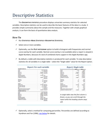
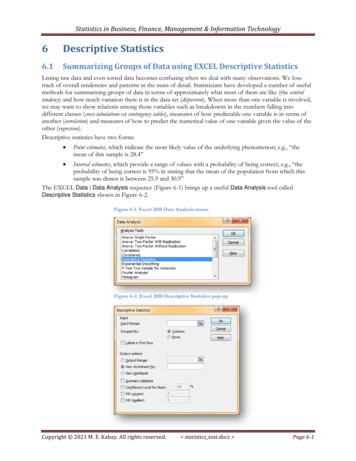
Excel ToolsAnalysis Toolpack in Excel8
Introduction to Descriptive Statistics Learning Objectives To understand the goal of statistical methods of data analysis To apply multiple techniques (summary statistics, tables, graphics) to describe data, and to understand the benefits of each. Introduction to Descriptive Statistics The purpose of probability and statistics is to deal