Transcription
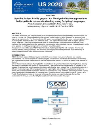
Paper DV04Spotfire Patient Profile graphs: An Abridged effective approach tobetter patients data understanding using Scripting LanguagesAnish Kuriachen, Syneos Health, New Jersey, USAHrideep Antony, Syneos Health, North Carolina, USAABSTRACTThe patient profile plots play a significant role in the monitoring and reporting of subject safety information from theonset of a clinical trial. Traditional patient profile plots are created based on safety data such as lab results, vitalsigns, drug exposure, etc. The classic patient profile graphs are usually plotted on the same x-axis using the durationof the subject in the study as the x-axis reference range. This approach occasionally leads to illegible graphicsoutput, especially if the study has several time points or visits that collect safety information. In addition to thischallenge, the traditional patient profile requires the corresponding listing outputs to interpret the subject safety profile,since graphics by itself may not express the whole story about the subject.This paper will present the use of TIBCO Spotfire to build the best patient profile with examples. This not onlyprovides the best quality graphics but also a dynamic reporting system that helps with the cross-referencing ofsubject's data without the need of flipping through the listings.INTRODUCTIONTIBCO Spotfire is a powerful data analytics tool that lets users create smart, secure, flexible, and scalableVisualizations. The SDTM datasets are created using the SAS software. SDTM data standards have several flagsand variables that facilitate the formation of effective patient profile graphics in Spotfire as shown in the flowchart infigure 1.One of the several advantages of using Spotfire visualization is its dynamic and scalable reporting feature, allowingthe users to choose their own criteria for the visualization. The criteria can be changed based on the need of thereviewer. In a clinical trial reporting setting, this feature will allow the users to easily filter for desired information (e.g.different treatment groups, different populations) while exploring the data in Spotfire visualizations. Spotfire, bydefault, has several options to explore the data but the prominence of using Spotfire is in its ability to further expandthese customization features based on the users' ability to develop scripts in languages such as R, Python, or SPLUS. This feature contributes to the overall efficiency of reviewing and exploring the data. Some of thecustomization techniques using R and Python scripts are further discussed in this paper.Figure1: Process flow chart-1-
CREATING VISUALISATION PACKAGESThe first step in creating Spotfire Visualization packages is to load the SDTM datasets to Spotfire by selecting the“File-Add Data Tables” on the menu and navigating to the corresponding folders. Spotfire allows users to process thedatabase by allowing the uses to add new variables defined from the existing data column, transpose the data,combine multiple datasets, etc. Using the loaded and processed data the user can generate listings, tables, andgraphs according to the requirements.Some of the techniques to create effective patient profile plots are further discussed in the examples below.EXAMPLE 1In the first example, a profile plot for LAB data of maximum ALT (Alanine Aminotransferase) value vs. maximumBilirubin value for each subject is created. The x-axis and the y-axis parameters are selected using the script asshown in figure 2 below. The output plot generated is shown in figure 3 below. Note that each subject's information iscolor-coded and it is easy to analyze the overall trend of the subjects ALT/Bilirubin LAB profile. The individualsubject's information and outliers can be conveniently identified and filtered using the filter panel. Further informationon the subject can be obtained by merely moving the mouse pointer towards the panel as shown in the example.Figure 2: Script to get Maximum ALT value for each subjectFigure 3: Color-coded visualization of each subject.2
EXAMPLE 2In this example, we are creating a profile plot for maximum ALT/AST value (shown in figure 4) vs. maximum bilirubinvalue. In this example, we used the same script as in example 1, but with the addition of allowing the user todynamically choose the x-axis variable. The parameter name is replaced with “ {altast}” which will accept values fromthe dropdown menu as shown in figure 5 below.Figure 4: Script to get maximum ALT/AST value for each subjectFigure 5: Dropdown menu to choose user-defined x-axis.The drop-down menu is created using by choosing the “Control type” in the text area menu and by adding “altast” asthe new property control as shown in figure 6 below.3
Figure 6: Control type selection windowThe Output visualization example using the parameter selection can be seen in figure 7 below. Note that in thisexample AST parameter has been selected for x-axis to compare with the Bilirubin values.Figure 7: Plot generated using user-defined x-axis4
Using a similar methodology user can choose to add any number of parameters such as treatment, race, sex, etc. tothe drop-down menu, to compare the results. This parameter addition technique will facilitate reviewers to instantlycreate their own customized plots and review the results without need for any programming.EXAMPLE 3In this example, we are creating a zoom slider in the Spotfire visualization. Zoom sliders are used to get a closer lookat details in your visualization by providing the ability to adjust the axis scales. An example of output with zoom sliderscan be found in figure 8 below.Figure 8: Option to choose zoom slider on/offThe typical way to enable zoom sliders is by clicking on the small arrow icon in the title bar of visualization as shownin figure 9 below. The icons in the title bar are only shown when hovering with the mouse pointer over the title bararea.5
Figure 9: Option to choose zoom slider on/offIf there are numerous visualizations in the package, it may be tedious to add the zoom sliders to each of the plots. Insuch a situation, another practical way to add the zoom slider is by adding a button that allows the users to enable azoom slider on/off for the visualization in a page with the use of a python script.The following steps may be followed to add a zoom slider button with the Python script.Step 1: Insert a text area by selecting the “insert” menu and choosing the “text area” option.Step 2: Add the “Action Control” item from the text area menu as highlighted in yellow in figure 10 below.Step 3: Select “Scripts” from the left tab and choose Control Type as “Button”. Now select the “New” button to addnew script for the zoom sider on/off.Figure 10: Inserting a Button in a pageStep 4: Clicking on the “New” button will prompt a pop-up window that allows users to add a script. In this example,the script name is “zoomonoff’. The Python script for adding the zoom slider can be found in figure 11 below.The active scripts that can be used across all the plots in the package are displayed in the window in figure 12 below.6
Figure 11: Script for enabling zoom slider in graphs.Figure 12: Scripts available in the visualization packageExample 4All the variables of the data table in the Spotfire can be associated with a filter that can be found on the filter panel.These filters are used to limit the data based on the subset of interest. Depending on the type of data, the filterstypes will also vary. The Spotfire filter panel and the different types of filters can be found in figure 13 below.7
Figure 13: Filter Pannel and Filter TypeWhen several filters are active, the user may find it difficult to revert back to the original data view especially when thedata tables consist of numerous variables. In this example, we will provide an option for resetting all filters in theSpotfire package using a simple Python script as shown in figure 14 below. Using the steps explained in example 3above, a “Reset button” is created which activates the script and resets all the filters in the panel.Figure 14: Script for resetting all filtersExample 5In this example, we are creating an x-axis range limiter option that allows the user to choose a dynamic axis range.Two text input fields such as minimum and maximum range values are added for the x-axis. The following steps canbe followed to add this feature to the visualization.Step1: Add two text boxes in the text area by selecting “Input Field” from the text in menu and create correspondingtwo new variables to store the text area value as shown in figure 15 below.8
Figure 15: Property control windowStep2: In this step, the x-axis range script is added by first defining the variable names such as “Viz1” and thendefining the “Start” and the “End” range values as shown in the figure 16 below.Figure 16: Script Parameter WindowStep4: Figure 17 shows the script to add the dynamic range for x-axis.9
Figure 17: Adding new script for setting x-axis rangeExample 6In this example, we are creating a customized function for computing average to draw a line based on the racecategory using R as shown in figure 18 below. The user could choose a value from the drop-down list in the racecategory.10
Figure 18: Output panel with dynamic average optionThe following steps may be followed to add a customized function using the R script.Step 1: Insert a text area by selecting the “insert” menu and choosing “text area” option and then add a dropdownfield with values from RACE.Step 2: Create a document property “avgcount” and assign a value 0.Step 3: Add a data function using menu option Tools Register Data FunctionStep 4: Add below code to scrip areacount -c(Fcnt,Mcnt)avgcount -mean(count)Step 5: Define input parameters “Fcnt and Mcnt” as “Single, Real, and Single Real”.Step 6: Define output parameter “avgcount” as Real.Step 7: Run the Script from the top menu, which will enable you to enter the custom expression for each parameter.Step 8: Give theName as “CalAvg” (You could give your own name here)Enable the “Refresh function Automatically” option.Define input parameter as “Expression and add below script for each input parameter:Fcnt: sum(if(([Sex] "F") and ([Race] Documentproperty("racedropdown")),1,0))Mcnt: sum(if(([Sex] "M") and ([Race] Documentproperty("racedropdown")),1,0))Define Output parameter as “Document Property avgcount”.Step 9: Click ok and save the new function. You could check the data functions from the menuEdit Data Function PropertiesStep 10: Add a line to the graph by following steps.Choose “Properties Lines and Curves”Add a New “Straight Horizontal Line” and choose “Custom Expression” and add below expressionDocumentProperty("avgcount")11
CONCLUSIONSpotfire is rich in graphs and three-dimensional charts that provide the graphical representation of your data. The tooloffers an all-inclusive platform for visualization, interaction and sharing of data. The option that allows users to usescripting languages to customize the graphs makes Spotfire highly valuable especially in the clinical trial process.The scripts written in Python, R and other languages allows users to incorporate very beneficial tools into theanalysis.REFERENCESWhat is the Filters Panel?, Available at html/filter/filter what is the filters panel.htmACKNOWLEDGMENTSSincere thanks to Steve Benjamin, Director Statistical Programming, Biostatistics and Global Contracts and AmanBahl, Associate Director, Statistical Programming, Clinical Division for their vision, great leadership, persistentsupport, and encouragement throughout and for their valuable assistance in reviewing this paper.CONTACT INFORMATIONYour comments and questions are valued and encouraged. Contact the authors at:Anish KuriachenPrincipal Statistical Programmer, Clinical Division, Syneos HealthPhone: 1-732-567 5975E-mail: anish.kuriachen@syneoshealth.comWeb: http://www.syneoshealth.comHrideep AntonyPrincipal Statistical Programmer, Clinical Division, Syneos HealthWork Phone: 1- 984 459 4785Email: hrideep.antony@syneoshealth.comWeb: http://www.syneoshealth.comBrand and product names are trademarks of their respective companies.12
The first step in creating Spotfire Visualization packages is to load the SDTM datasets to Spotfire by selecting the "File-Add Data Tables" on the menu and navigating to the corresponding folders. Spotfire allows users to process the database by allowing the uses to add new variables defined from the existing data column, transpose the data,