Transcription
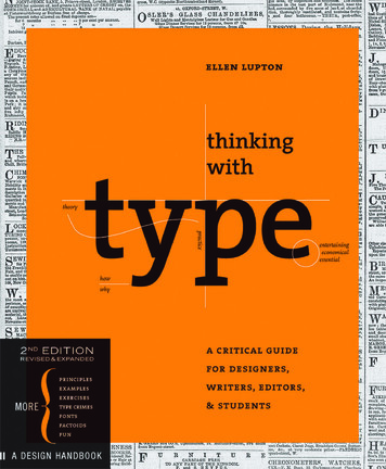
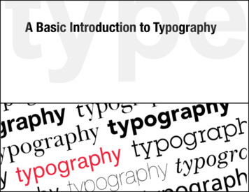
A Basic Introduction to Typography
What is Typography?Typography is an art form that has been around for hundreds of years.Words and text are all around us every day in almost everything we do.In every piece of type you see, somebody has considered how theletters, sentences and paragraphs will look in order for it to be read byus, or make us feel a certain way when we look at it.Sometimes this is done well, sometimes not. Often it is graphicdesigners who are the ones deciding how it will look; in brochures,logos, websites and so on. The better we are at this, the more effectiveour designs will be.Good typography comes from paying attention to tiny details. Thiscan make the difference between work that is average or work that isreally good.
Typographic Basics. typeface or font?Designers are often unsure of the difference between these two, asthey are often confused for being the same thing.typefacefonta set of fonts in thesame style. a font family.a single weight or stylewithin a typeface family.ArialArial NarrowArial Rounded BoldArial BlackTimes New RomanTimes New Roman RegularTimes New Roman ItalicTimes New Roman Semi BoldCentury GothicCentury GothicCentury Gothic Bold
Typographic Basics.classificationThere are many different classifications of typefaces, but the mostcommon two types are:Serif – these typefaces are the more traditional ones. “Serifs” arethe little feet or arms that hang off the end of letter strokes, and typicallyadd a thick/thin look to the letter. Serif fonts are considered the easiestfonts to read so they are most often used as text or “body” copy.Sans-serif – as the name suggests, sans saerif fonts are“without serifs” and usually have an overall even stroke weight.Sans serif fonts can evoke a more modern look because they werenot created until the 19th century. While they can also be harder toread, they are often used only for small amounts of copy, subheadings,or large headlines. Helvetica is the most universal sans serif font asit is used around the world.
Typographic Basics. serif vs. sans-serifNow, how do you decide which one to work with for your project?serif or anArialFuturaImpactMyriadTahoma
Typographic Basics. serif vs. sans-serifStart out by considering Serif fonts as "fancy" fonts. Those littleembellishments on every letter are just that – embellishments.Serif fonts can be associated with words like classy, refined, expensive.If those words also describe who your target audience is, then this isthe type of font you should choose.Serif fonts are: refined?didyoufancyelegentclassyexpensiveknowTimes New Roman: is the standard for all written articlesbecause it the most common font found in newspapers.News is associated with importance and seriousness –so the font Times New Roman became associated withintelligence and seriousness, and conveys the feeling thatthe news or article you are reading is important!
Typographic Basics. serif vs. sans-serifSans-Serif fonts come without these embellishments so they tend toget associated with words like clean, modern, straightforward,and sometimes (although not always) inexpensive – If you want a fontthat is going to speak to the subconscious of the general public andmake them feel comfortable instantly, than use a sans-serif font.Sans-serif fonts are:?didyouknowcleanmodernstraightforwardMasthead: The title going across the front ofa magazine is called a masthead. The next timeyou are standing in front of a magazine rack, takea look at the fonts used for the covers on display.You can usually tell the target audience just bylooking at the font used for the masthead.Magazines that use a sans-serif font are clear,inviting and universal to the general public.However, ones that are more news-oriented,sophisticated or political will most likely use aserif font for the masthead.minimalistfresh
Typographic Basics. other styles of fontsdecorativeDecorative fonts are designed to be used for attention-getting headlines.They should rarely be used as body copy fonts. When designing, it isbest to limit your use to only one decorative font.BWi L[]Wi9WijWmWoMesquiteLiving Hell JetSet portocallkiddiezFiestarosewood
Typographic Basics. other styles of fontsscriptScript fonts are designed to mimic handwriting, therefore the lettersoften touch one another. There is both traditional and modern stylesof script. Script fonts should never be used in all capital tRocket
Typographic Basics. other styles of fontshandwritingHandwriting fonts are designed to look like they were hand written.These can range from a fancy adult script, to a child’s scribble.AngelinaScribblepeasStreet SOUlchildrenBaby Facecomic sanscartoons
Typographic Basics. other styles of fontsdingbatsDingbats are symbols that are small pieces of art used to enhancethe design of the text or page. While Zapf Dingbats and Wingdingsare the most common dingbats, there are hundreds, if not thousands,of different designs available. They are usually packaged with a specificfont, and tend to mimic their style. " StreetSOchildrenBab Facec640csa
Typographic Basics.font sizessizesFonts come in many different sizes, and use a system of measurementcalled points. Computers use 72 points to equal one inch. Two differentfont designs at the same point size may actually have different physicalsizes. The correct size for a font depends on how it’s being used. Thebody copy is generally 9-12 points depending on the font used, theaudience, and the size of the material. A printed letter page may usea 12 pt, but a presentation on screen may need a larger size like 24 pt.67891011 121418 212484 9636486072200
It’s the little things that matter most.The difference between “just okay” typography and professionallevel typography is usually in the details. Many times, simply typingin the text and formatting the font, size and line spacing is enough.However, depending on the design, some extra attention may beneeded. Larger type sizes may need adjustments to the spacebetween the characters, and paragraphs need to be adjusted toeliminate “widows” and “orphans.”Character & word spacingkerningtrackingLine spacingleadingParagraph spacingalignmentline breaks & raghyphenswidows & orphans
Typographic Basics. character spacingkerningKerning is the space between each character or letter. Sometimesthis space needs to be adjusted in order to create a more pleasinglook to the text. Most programs apply kerning automatically, but thereare certain letter combinations that may require manual kerning.type looks better with kerning!
Typographic Basics. word spacingtrackingThe adjustment of word spacing is called tracking. It is similar tokerning but refers to the space between words instead of characters.It’s main purpose is to make type fit a required space without alteringthe type size or line spacing. Tracking can be either negative (makingthe words closer together) or positive (making the words farther apart)Tracking at 400T R A C K I N GTracking at 100TRACKING IS A DESIGN TOOLTracking at 0Tracking at -50Tracking at -100I SATRACKING IS A DESIGN TOOLTRACKING IS A DESIGN TOOLTRACKING ISA DESIGNTOOLD E S I G NT O O L
Typographic Basics. line spacingleadingLeading, or line spacing, refers to the amount of space between linesof type. The amount of leading you use will be determined based onthe font used, the line length, and the size of the type. The larger thetype, the more leading you will need.24 / 24this is an example ofsize 24 type with aleading of 24 pt.36 / 24this is an example ofsize 36 type with aleading of 24 pt.24 / 36this is an example ofsize 24 type with aleading of 36 pt.24 / 24this is an example ofsize 36 type with aleading of 36 pt.
Typographic Basics. paragraph spacingalignmentAlignment refers to the way the lines of text flow on a page. Mosttext is aligned left, as this is how we are used to reading it. In somecases, we may want to used other alignments in order to add to thedesign quality of a project.align centeralign leftThis text is aligned leftso that the sentencesalways line up on theleft sidealign rightThis text is aligned rightso that the sentencesalways line up on theright sideThis text is centeredso that the sentencesalways line up ontop of one anotherjustifiedThis text is justifiedso that there is astraight edge onboth sides. In orderto do this you willhave to use tracking
Typographic Basics. paragraph spacingline breaks & ragIn typography, “rag” refers to the irregular or uneven vertical marginof a block of type. Usually it’s the right margin that’s ragged but eitheror both margins can be ragged. Pay attention to the shape that theragged line endings make. A good rag goes in and out from line to linein small increments. A poor rag creates distracting shapes of white spacein the margin. Don’t rely on the line breaks generated by your softwareapplication; get in the habit of spotting and correcting poor rags bymaking manual line breaks or by editing your copy.bad raggood ragbad raggood rag
Typographic Basics. paragraph spacinghyphensHyphenated words are sometimes considered a necessary evil intypography, but proper hyphenation allows for a better-looking,tighter rag – or, in the case of justified type, a more natural, eventext color. Hyphenation also allows more words to fit in a line,which saves space. Don’t have more than two hyphenations in a row. Don’t have too many hyphenated line endings in a single paragraph Check the “rag” (the right edge of the text) for any glaring holes, or words that “stick out” In justified text, check that the text looks natural, with an even, readable color and texture.Avoid spacing that looks squeezed or stretched.
Typographic Basics. paragraph spacingwidows & orphansIf a single word or very short line is left at the end of a column it iscalled a Widow. If the same is left at the top of the following columnthis is called an Orphan. Both of these are considered bad typographyas they cause distracting shapes in a block of type. They can usuallybe fixed easily in the same way as the rag, by reworking the line breaksin the column or by editing the copy.
Typographic Basics.is that it?You will find that you will be able to communicate your message moreeffectively when you take the time to select the right typeface, andmake all the small adjustments needed.typography humor
Typographic Basics. Dingbats are symbols that are small pieces of art used to enhance the design of the text or page. While Zapf Dingbats and Wingdings are the most common dingbats, there are hundreds, if not thousands, of different designs available. They are usually packaged with