Transcription
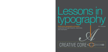
Must-know typographic principlespresented through lessons, exercises,and examples.Jim KrauseBOOK03
Lessons in TypographyMust-know typographic principles presented through lessons, exercises, and examplesJim KrauseNew RidersFind us on the Web at www.newriders.comTo report errors, please send a note to errata@peachpit.comThis book is part of the New Riders Creative Core series on design fundamentals. New Riders is an imprint of Peachpit,a division of Pearson Education.Copyright 2016 by Jim KrauseAcquisitions Editor: Nikki Echler McDonaldProduction Editor: Tracey CroomProofreader: Jan SeymourIndexer: James MinkinCover Design and Illustrations: Jim KrauseInterior Design and Illustrations: Jim KrauseNotice of RightsAll rights reserved. No part of this book may be reproduced or transmitted in any form by any means, electronic,mechanical, photocopying, recording, or otherwise, without the prior written permission of the publisher. For informationon getting permission for reprints and excerpts, contact permissions@peachpit.com.Notice of LiabilityThe information in this book is distributed on an “As Is” basis without warranty. While every precaution has been takenin the preparation of the book, neither the author nor Peachpit shall have any liability to any person or entity with respectto any loss or damage caused or alleged to be caused directly or indirectly by the instructions contained in this book orby the computer software and hardware products described in it.TrademarksMany of the designations used by manufacturers and sellers to distinguish their products are claimed as trademarks.Where those designations appear in this book, and Peachpit was aware of a trademark claim, the designations appearas requested by the owner of the trademark. All other product names and services identified throughout this book areused in editorial fashion only and for the benefit of such companies with no intention of infringement of the trademark.No such use, or the use of any trade name, is intended to convey endorsement or other affiliation with this book.ISBN 13: 978-0133-99355-4ISBN 10: 0-133-99355-8987654321Printed and bound in the United States of America
Must-know typographic principlespresented through lessons, exercises,and examplesJim Krause
LESSONS IN TYPOGRAPHYTABLE OF CONTENTS4PageNumberChapter/Topic6Introduction101. The Terminology of Type12Appreciation14Typographic Terms15 Types of type16 Forms and placement17 More typographic anatomy18 Heights Measuring type Upright, leaning19 Typographic optics20Your Turn To: Check Your Type Vocabulary22Kinds of Type23 Serif typefaces24 Serifs and change Significant details25 Ampersands Culture and flair Good for text26 Classic sans serif Comparing sans serif fonts27 Contemporary sans serif Variety is good28 Script and related typefaces29 Smart scripts Feigned legitimacy30 Blackletter typefaces Practicality32 Monospace typefaces Bitmap and dot matrix33 Display and novelty34 Families of dingbats, ornaments, and images35 Ornaments as add-ons and backdrops36 One typeface, many fonts37 Alternate and hidden characters Case38 One typeface, many flavors39Your Turn To: Boost Your Awareness of Type40Typographic numerals41 Lining and non-lining Number options42 The beauty of punctuation43 Hanging, or not Punctuational correctness44Your Turn To: Explore Typographic History462. The Art of the Letter48Typographic Voice50 Expressive range52 Artistic expression54Letter Modifications55 Cutting and modifying Additions and effects56 Ready-to-go modified fonts57 Decorative additions Thematic relations58Focusing on: Letter Modifications60Building CharactersPageNumberChapter/Topic61 Creating within shapes62 Form-defining details63 Gridded letterforms64Focusing On: Pathfinder Operations66Your Turn To: Create Letters68Adding Imagery69 Borrowed decor Added imagery Interiors70 Imagery inside72 The illustrated letter The letter as illustration74Monograms and Letter Sets75 Monograms76 Pairs and sets77 Ways of saying and79 Thinking collaterally80Your Turn To: Make Monograms and More823. Working with Words84Word Fundamentals85 Font, case, and space86 Mixed specifications87 Font ligatures Custom ligatures88 Letterspacing strategies89Focusing On: Evaluating Letterspacing90Presenting Words91 Word legibility Text legibility92 Font persona94 Simple word treatments97 Using interiors98 Dimension99Focusing On: Digital Effects100Your Turn To: Work with Words102Adding Decor and Imagery103 Simple extensions and replacements104 Backdrops Enclosures105 Ornamental add-ons Correlation106 Dominant backdrops108Focusing On: Developing Ideas110 Adding imagery112 Ideas from others113 Boiling it down114 The advantageous O115 Words as images116 Wrapping tightly Enclosure as starring element118Your Turn To: Create Your Own Word Graphics
PageNumberChapter/Topic120Making Fonts121 Modifying existing fonts122 Custom-built typefaces123 Linework options124 Hand-lettering based on existing fonts125 Lettering analog126Focusing on: Assembling Hand-Lettered Words128 The illustrated word130Your Turn To: Make Letters and Words1324. Multi-Word Presentations134Logo, Headline, and Word Graphic Fundamentals135 Simple and effective136 Font choices, font voices138 Combining fonts139 Multi-font failings140 Breaking lines141 Nontraditional line breaks142 Baseline considerations Getting lucky143 Your Turn To: Create Typographic Logos144Emphasis Strategies145 Directing the eye146 Size considerations147 Weight and color148Focusing On: Exploring Fonts150 Color for emphasis152Type Against Backdrop153 The legibility factor154 Solid backdrops156 Type over imagery158Focusing On: Altering Photos to Assist Legibility160Your Turn To: Mix Type and Background Imagery162Logos That Integrate Type and Icon163 Basic associations164 Considering options166Layouts and Graphics167 Questions and answers168 Establishing pecking order169 Sameness170Your Turn To: Incorporate Icons or Images172 All type176Enclosures and Assemblages177 Simple enclosing strategies178 Going furtherPageNumberChapter/Topic179 Purely typographic solutions180 Your Turn To: Create a Personal Emblem181 Focusing on: Investigating Different Endings1825. Text and Layouts184Helping the Reader Read185 Text font considerations186 Tracking187 Leading188 Column width versus type size189 Justification190 Wrapping text191 Best to avoid192Paragraphs193 Opening lines194 Denoting new paragraphs195 Solving the argument196 Alternative paragraph indicators198Focusing on: Making It Work200Self-Contained Messages201 Callouts202 Captions203 Excerpts204 Highlighting text205Your Turn To: Present a Quotation206Laying It Out207 Levels of hierarchy208 Columns209 Flexibility210 Grids211 Adhering Overruling212 Assistance from lines213 Panels, too214 The spaces around216 Full page, purely typographic visuals218 On the fly220Your Turn To: Never Stop Learning About Type222 Appreciation224 Glossary234 Index5
LESSONS IN TYPOGRAPHYINTRODUCTIONhen I was in high school there wereonly two things I wanted to be when Igrew up—a pilot or a painter. I spent prettyartist who actually created these alphabet designs—and another that put them to use in all kinds oflogos and layouts. It blew my mind, and the moremuch all my time either reading about airplanes orI looked into all the different styles and varieties ofdrawing and painting pictures of them. And thentypefaces, and applied them to the posters, programs,something unexpected came up and changedand business cards I was working on in class, theeverything. I met typefaces.more interested I became in both typography and6graphic design.It’s true. I signed up for a graphic arts class withthe idea of learning how to print the things I wasSo yes, it was an infatuation with typefaces that drewdrawing and painting, and then one day the instructorme into the only career I’ve had as an adult, andintroduced the class to typefaces. And that was it.typefaces are still one of the main things that keepI was completely smitten and awed. I mean, to thinkme as eager and interested as ever to keep goingthat typefaces didn’t just happen, that someonein my work as a designer.actually designed the things, that there were somany different kinds, and that such intricate andLessons In Typography is my sixteenth book on sometiny works of art had always been sitting there insideaspect of design and creativity, and it’s one that I’veevery book I’d ever read and within just about everybeen wanting to do for a long, long time. I decidedadvertisement and movie title I’d ever looked at. Andto open this book with a spread that talks about whatnot only that, but that there was a certain species ofI consider one of the most important thing designers
can cultivate to deepen and expand their typographicsuch), paragraphs, and page layouts. Notes towardsavvy: appreciation.the finer points of typographic appreciation threadtheir way through each of these topics, as does anWhy appreciation? It’s because appreciation makesemphasis on practical real-world uses of typographyus look closer at things, and looking closer leadsas it can be applied to things like logos, wordto greater appreciation, which makes us look evengraphics, and layouts.closer and on and on and on. This is true whetheryou’re talking about chocolate, music, cinema, fineWhat sort of designer is Lessons In Typographyart, or any other truly appreciation-worthy subject—aimed at? All sorts, really. This book is for newtypography included.designers who want to begin their study of thegraphic arts with a good foundation of this all-From there, Lessons In Typography gives readersimportant aspect of design, mid-level designersa quick rundown of the terminology used to talklooking to bring their knowledge of typographytypefaces (you’ve got to speak the language of typeto a higher and more focused level, and experi-if you’re going to learn about it—just as you’d needenced professionals who are interested in refresh-to learn the language of chocolate, music, cinema, oring and rebuilding their typographic awarenessfine art if you were going to learn deeply about anyand competency.of those things). After that, the book takes the readerthrough subjects involving individual letters, completeThumb through this book and one thing you’ll noticewords, multi-word graphics (logos, headlines, andright away is that there are a whole lot of visuals:7
letterforms, word treatments, typographically inclinedlevel of experience and expertise, I urge you tologos, page layout examples, and much more. I thinktry out these exercises (and I encourage teachingmost designers will enjoy this sort of presentation—asprofessionals to consider them as classroomopposed to one that’s overly text-heavy—since mostprojects). Each of the exercises builds on topicspeople who make their living in the commercial artsand ideas presented in the book and each isseem to be visual learners.designed with real-world applications in mind. Feelfree to follow the exercises’ instructions verbatim or8And speaking of the book’s many visuals, everyto reinterpret them to fit project ideas of your own.one of them was created specifically for Lessons InEntirely up to you.Typography. This is an uncommon approach fora design-related book (given that nearly all booksAnd finally, a couple notes on certain softwareon design are compilations of preexisting logos,programs that are mentioned throughout Lessonsgraphics, and layouts) but I prefer it and have usedIn Typography. It should come as little surprisethis method in all my books since it’s allowed me tothat Adobe InDesign, Illustrator, and Photoshopuse imagery and examples that speak very directlycome up often in the pages ahead. It’s not thatto the topics I’ve covered and the points I’ve madeAdobe has sponsored this book, or that I’m gettingthrough my books’ text.a commission every time I mention one of theirproducts—it’s just that these three programs areLessons In Typography also has a number of exer-unquestionably the tools of the design trade thesecises scattered throughout its pages. Whatever yourdays and it seems clear that they’ll remain so for
some time. It’s assumed, then, that most readers willbe familiar and functional with some or all of theseproducts—at least those readers who are either astudent or a professional of graphic design. Very fewspecific how-to tips about these programs are offeredhere, so if you’re new to these programs, know thatnone of the uses for them mentioned in this bookBOOK03Lessons In Typography is the third book inthe New Riders Creative Core series.9require much knowledge about them, and with a littlehelp from a tutorial and/or a Help menu you shouldbe able to follow along.The first book in the series, Visual Design,deals thoroughly with principles of aesthetics,composition, style, color, typography,Thank you for picking up a copy of Lessons Inand production.Typography. I hope you enjoy this book and that itscontent not only makes you more appreciative oftypefaces and the way they’re used in works ofdesign, but also makes you better at what you doas a designer.Jim Krausejimkrausedesign.comThe series’ second title, Color for Designers,teaches designers to confidently select andapply colors to layouts, illustrations,graphics, and more.
132CHAPTER 4
Multi-WordPresentations133
MULTI-WORD PRESENTATIONSLOGO, HEADLINE, AND WORD GRAPHIC FUNDAMENTALSTypography as it applies to solitary letters andthey apply to both single and multiple lines of type,individual words was the focus of this book’ssize relationships between words that appear together,earlier chapters.and strategies involving using different fonts withinmulti-word designs.Here, the topic is words
125 Lettering analog 126Focusing on: Assembling Hand-Lettered Words 128 The illustrated word 130Your Turn To: Make Letters and Words 132 4. Multi-Word Presentations 134 Logo, Headline, and Word Graphic Fundamentals 135 Simple and effective 136 Font choices, font voices 138 Combining fonts 139 Multi-font failings 140 Breaking lines 141 Nontraditional line breaks 142 Baseline considerations .