Transcription
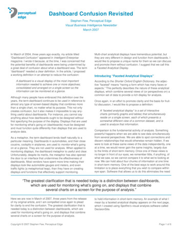
perceptualedgeDashboard Confusion RevisitedStephen Few, Perceptual EdgeVisual Business Intelligence NewsletterMarch 2007In March of 2004, three years ago exactly, my article titled“Dashboard Confusion” appeared in Intelligent Enterprisemagazine. I wrote it because, at the time, I was concerned thatthe potential benefits of dashboards were being undermined bya great deal of confusion about what a dashboard was. The term“dashboard” needed a clear definition. In the article, I proposeda working definition in an attempt to reduce the confusion:A dashboard is a visual display of the most importantinformation needed to achieve one or more objectives;consolidated and arranged on a single screen so theinformation can be monitored at a glance.Although many people have embraced this definition over theyears, the term dashboard continues to be used in reference toalmost any type of screen-based display that combines morethan a single chart, no matter what its purpose. This not onlycreates confusion, but it also makes it impossible to say anything useful about dashboards. For instance, you cannot sayanything about how dashboards ought to be designed withoutfirst specifying the purpose of the display. Displays that are usedfor monitoring what’s going on (dashboards) must be designedand must function quite differently than displays that are used toanalyze data.As a metaphor, the term dashboard lends itself naturally to aparticular meaning. Dashboards in automobiles, and their closecousins, cockpits in airplanes, are used to monitor what’s goingon at a glance. They are not used for analysis. When applied tomonitoring displays, the dashboard metaphor is useful and clear.Unfortunately, despite its merits, the metaphor has also openedthe door to an interface that undermines the effectiveness ofdashboards. Most vendors have spent more time making theirdisplays look like automobile gauges and meters, and eventraffic lights (a metaphorical leap), than they have on creatingdisplays and functions that effectively support monitoring.Multi-chart analytical displays have tremendous potential, butthey are very different in design and function from dashboards. Iwould like to propose a unique name for them so we can discussand promote them without confusion. I suggest that we call thisa Faceted Analytical Display.Introducing “Faceted Analytical Displays”According to the Shorter Oxford English Dictionary, the adjective “faceted” means “having a form which has many faces oraspects.” This perfectly describes the nature of these analyticaldisplays, which combine several views of (or perspectives on) acommon set of data to provide a rich display for analysis.Once again, in an effort to promote clarity and the basis for fruitful discussion, I would like to propose a definition:A “faceted analytical display” is a set of interactivecharts (primarily graphs and tables) that simultaneouslyreside on a single screen, each of which presents asomewhat different view of a common dataset, and isused to analyze that information.Comparison is the fundamental activity of analysis. Somethingpowerful happens when we are able to see data simultaneouslyfrom several perspectives. We are able to spot connections anddiscern relationships that would otherwise remain hidden. If wewere to look at these same views of the data independently, oneat a time, we would never gain the same insights, largely dueto the limits of short-term memory. Once one of these views isno longer in front of our eyes, we remember little, if anything, ofwhat we saw, so we cannot compare it to what we’re looking atnow. We can hold about four chunks of information at one timein short-term memory. One of the best ways to work around thislimitation is to place everything that you wish to compare withineye span. Software that allows us to do this eliminates the need“The greatest clarification that is needed today is a distinction between dashboards,which are used for monitoring what’s going on, and displays that combineseveral charts on a screen for the purpose of analysis.”Here we are now in March of 2007, three years from the releaseof my original article, and I am compelled once again to pleadfor clarity to end the confusion. The greatest clarification that isneeded today is a distinction between dashboards, which areused for monitoring what’s going on, and displays that combineseveral charts on a screen for the purpose of analysis.Copyright 2007 Stephen Few, Perceptual Edgeto hold information in short-term memory. An example of what Imean by a faceted analytical display appears on the next page,which I created using Spotfire’s visual analysis software calledDecisionSite.Page 1 of 6
Figure 1: Example of a faceted analytical display created using Spotfire DecisionSite.Each graph in this collection of nine reveals a different aspectof wine sales, based on a common set of data. Starting withthe graph in the upper left-hand corner and working down eachcolumn before moving right to the next, here’s what they display:Column 1: Total wines sales (black bars) compared to Merlot sales(gray bars) in U.S. dollars for this year per region. Percentage change in sales between last year and thisyear—total (black bars) and Merlot (gray bars)—perregion. Merlot’s percentage of total wine sales per region. Change in Merlot’s percentage of total sales from last yearto this year per region.Column 2: Total wines sales this year per customer size (darkestblue represents big customers, medium blue representsmedium-sized customers, and light blue represents smallcustomers) by region. Merlot sales this year per customer size by region. Total wines sales this year by state.Column 3: Frequency distribution of sales based on the number ofsales visits that led to each sale (0-3, 4-7, 8-11, etc.). Scatterplot showing the correlation of the percentageCopyright 2007 Stephen Few, Perceptual Edgechange in total wine sales from last year to this year(vertical axis) to the percentage change in Merlot winesales from last year to this year (horizontal axis). Eachdata point represents a particular customer.Seen together, these graphs help us see connections (interesting interactions) between various aspects of sales. Here are afew features that caught my attention: Merlot sales in the west region represent around 55% oftotal sales, the greatest share of any region, but this ismostly due to a dramatic increase in Merlot sales in thewest. Despite this strong showing in the west, Merlot salesdecreased from the first year to the next more than totalwine sales in all regions except the west. Even though the west came in last in overall wine salesthis year, they came in second in Merlot sales. Most sales resulted from between four and seven visitsto a customer and the number of visits that seems to berequired for sales is fairly consistent between big, medium,and small customers. While there is a positive correlation between changes intotal wines sales vs. Merlot sales from last year to thisyear (that is, as total wines sales increased or decreased,Merlot sales tended to do the same), there are a numberof exceptions to this pattern, especially in the lower rightcorner where a disproportionate number of Merlot salesincreases appear relative to decreases in overall sales.Page 2 of 6
Many of these observations might have remained invisible usingmore traditional business intelligence methods of analysis, andcertainly would have been much more difficult and time-consuming to uncover.Important Faceted Analysis Functionalityincreased, as shown in the upper left quadrant of the scatter plotin Figure 3 at the bottom of this page. We don’t want to filter outeverything else from the display, because we want to comparethis subset of data to the data as a whole. We could brush thissubset of data, which involves highlighting these values througha simple action such as drawing a rectangle around them.The power of these rich analytical displays is dramatically extended when software provides two specific ways to interact withthe data: Global filters BrushingGlobal filters provide the means to remove unwanted data fromthe entire display. The wine sales data in the example abovesegments customers into “big,” “medium,” and “small” customers. An example of a filtering activity would be to removemedium and small customers from the display so you can focuswithout distraction on the big customers only (illustrated in Figure 2). Another example could involve removing all wine ordersthat were for less than 500. Filters in some analysis tools canonly be used to affect individual charts. Global filters, however,work across the entire collection of charts, keeping the data insync across the entire display. When we examine data frommultiple perspectives simultaneously, we almost always want tofilter the data in a consistent manner across all of the charts. Theeasier the filter controls are to use and the faster they can beset, the more powerfully they support the free flow of analysis.One powerful means of interacting with the data, called “brushing,” extends our ability to see connections in the data byhighlighting selected items across all of the views. Imagine thatwhile examining the wine sales data, we become interestedin a particular subset of the data, such as those Merlot salesthat decreased since last year even though overall wines salesFigure 2: Example of global filters, which use simplemechanisms such as checkboxes and sliders.Figure 3: All values above zero on the Y-axis and below zero on the X-axis have been highlighted.Copyright 2007 Stephen Few, Perceptual EdgePage 3 of 6
Figure 4: Brushing caused a subset of data that was highlighted in one chart to automatically appear highlighted in all charts. This example was createdusing Spotfire DecisionSite.This action isn’t very useful when viewing the scatterplot alone,but look what happened throughout the display when thesevalues were brushed, shown above in Figure 4.One of the first things that I discovered by brushing the datain this way was that these decreases in Merlot sales that wereout of sync with corresponding increases in overall wine salesoccurred to a slightly less degree in the west (especially seenin upper graph in the left column and the middle graph in thecenter column). By looking at each of the bars in the “Total WineSales this Year by State graph” (bottom middle) that lack redright), where the ratio of the red section of the bar to its overallheight indicates that at least 40% of wine orders in Vermont fellinto this category.Best Practices of Faceted Visual AnalysisJust placing multiple charts on a screen alone does not produceanalytical discoveries such as those we’ve just seen. In otherwords, it is possible to produce a faceted analytical display thatdoesn’t work very well. One typical problem that plagues otherforms of data visualization as well, such as dashboards, is that“The effectiveness of faceted analytical displays can be undermined by gratuitousvisual effects, decorative display media, and poor use of colors.”highlights altogether, I quickly learned that this situation did notoccur at all in Delaware (the state with the greatest wine sales),Maine, Montana, New Mexico, and Washington D.C. I could alsoeasily see states in which this occurred to a disproportionatelyhigh level, such as in Vermont (represented by the last bar to theCopyright 2007 Stephen Few, Perceptual Edgethe effectiveness of faceted analytical displays can be undermined by gratuitous visual effects, decorative display media, andpoor use of colors. On the next page, Figure 5 exhibits some ofthese problems.Page 4 of 6
Figure 5: Poorly designed display media and distracting visual effects undermine the effectivenessof this display.In this example, the gauges on the left use a great deal of spaceto provide far too little information. The graphs on the right arecluttered with large, flashy data points to mark the values alongthe lines, which make it difficult to see the shape of changethrough time. The bottom right graph is completely indecipherable. Which represents the site visits: the line or the bars? Whatdoes it mean that revenue is “not to scale”? Also, the fact thatthe two graphs on the right are not aligned so that the samepoints in time match up with one another makes is almost impossible to compare clicks (above) to site visits (below).Perhaps the greatest problem in this example, however, is thefact that it restricts filtering to one choice only—the selection ofmarketing campaigns—which is controlled by using the list ofcampaigns that appears in the upper left corner. (By the way,don’t you just love the “Remo” button?) Data analysis requiresflexibility to filter the data in a variety of ways. For instance, itwould be useful to filter out all but those campaign responsesthat generated leads.Also, this example severely restricts the comparisons that canbe made to one measure at a time in each of the two graphs.For instance, we could compare leads to clicks, or impressionsto site visits, but we could never compare leads, clicks, impressions, and site visits, except as separate steps limited to onepair of measures at a time.This same theme of hobbled analysis is repeated in the nextexample also (see Figure 6).Figure 6: This display restricts what we can see at one time too severely, and also combines charts that arenot synchronized.Copyright 2007 Stephen Few, Perceptual EdgePage 5 of 6
The ability to only see one sales representative at a time, whichentirely eliminates the ability to compare them, hardly lendsitself to analysis. This display also suffers in another significantway, which is worth mentioning. Two of the charts—the bargraph on the left and the combination bar and line graph on theright—share a common period of time (November of one yearthrough April of the next), but this synchronization is not obviousand the graphs are not arranged in a way that makes it possibleto view deviation from budget (the graph on the left) in relation tothe actual and budget values that appear in the other graph. TheActual vs. Budget graph displays the months in a horizontal arrangement from bottom to top, which is not intuitive. Time shouldalmost always be arranged from left to right in chronological order. Also, the fact that some data sets are encoded as bars andsome as lines is completely arbitrary. It would be much easier tocompare the shape of change through time formed by each ofthese measures if lines were used to encode them all.With the exception of silly display media (such as the gauges)and annoying visual effects, which come standard with thisparticular product, the problems that I’ve highlighted in theseexamples are problems of design. These displays were simplynot designed effectively for analysis.Data analysis—except for routine analytical procedures that arealways done in the same exact manner—requires the ability toadd, remove, and change views of the data on the fly, following the trail of analytical pursuit as quickly as questions arise.Any software tools that requires more than a few seconds forthe analyst to add another chart to the screen or to modify anexisting chart will not work for ad-hoc analysis. One of the waysthat a tool such as Crystal Xcelsius from Business Objects failsto qualify as a serious analytical tool is the excessive work thatis involved in creating the displays. For this reason, it functionsmore like a developer’s tool for building analytical applications,rather than one that’s designed for ad-hoc, free-flowing analysis.I only know of a few visual analysis products that effectivelysupport faceted analytical displays. In addition to Spotfire, whichI used to create the good examples in this article, Advizor AnalystX does this well, and various SAS products also do the jobbut require extra skill and effort. Beginning in April with the nextrelease of its visual analysis software, Tableau will complementCopyright 2007 Stephen Few, Perceptual Edgeits existing visual crosstab displays, which support rich multidimensional views of data, with the addition of faceted analyticaldisplays. This will extend the power of this already fine productin ways that take it to the next logical level of its evolution.Final WordThe primary points I hope you take from this article are the following four: Dashboards and multi-chart displays that are used foranalysis are quite different. Faceted analytical displays provide a powerful means tosee relationships in data. Global filters and brushing are powerful features thatshould be supported by any good faceted analytical display. No matter how great your tool, faceted analytical displaysonly work if you design them properly.If you’re an analyst and you don’t already have a tool that allowsyou to prepare a rich visual feast from your data in the form offaceted analytical displays, I suggest that you find one and makeit a part of your business intelligence toolset. It’s time to movebeyond the days when we were satisfied with a pivot table.About the AuthorStephen Few has worked for over 20 years as an IT innovator,consultant, and teacher. Today, as Principal of the consultancyPerceptual Edge, Stephen focuses on data visualization foranalyzing and communicating quantitative business information.He provides training and consulting services, writes the monthlyVisual Business Intelligence Newsletter, speaks frequently atconferences, and teaches in the MBA program at the Universityof California, Berkeley. He is the author of two books: Show Methe Numbers: Designing Tables and Graphs to Enlighten andInformation Dashboard Design: The Effective Visual Communication of Data. You can learn more about Stephen’s workand access an entire library of articles at www.perceptualedge.com. Between articles, you can read Stephen’s thoughts on theindustry in his blog.Page 6 of 6
Dashboard Confusion Revisited Stephen Few, Perceptual Edge Visual Business Intelligence Newsletter March 2007 perceptual edge In March of 2004, three years ago exactly, my article titled “Dashboard Confusion” appeared in Intelligent Enterprise magazine. I wrote it because, at the