Transcription
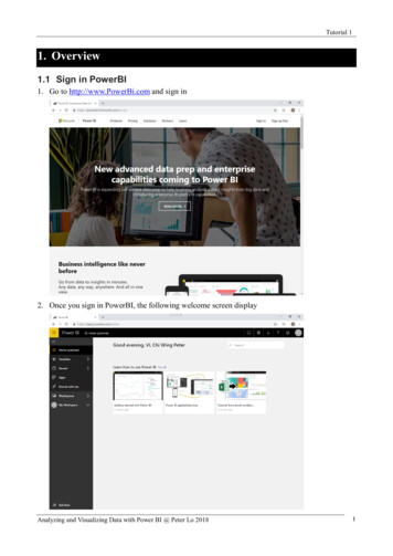
Tutorial 1Overview1.1 Sign in PowerBI1. Go to http://www.PowerBi.com and sign in2. Once you sign in PowerBI, the following welcome screen displayAnalyzing and Visualizing Data with Power BI @ Peter Lo 20181
Tutorial 11.2 Open Power BI Service and Get Data1. We'll grab some sample data to use for our tour of Power BI service. There are all types ofsample data we provide for you to explore, and this time we'll use the data about retail stores.Press [Get Data] and then select “Sample”.2. Select the “Retail Analysis Sample” and click [Connect].Analyzing and Visualizing Data with Power BI @ Peter Lo 20182
Tutorial 13. Power BI imports the sample, adding a new dashboard, report, and dataset to your MyWorkspace.4. Power BI service imports the sample and displays the dashboard. Dashboards are something thatdifferentiates Power BI service from Power BI Desktop. The sample also includes a report and adataset, which we'll visit later.Analyzing and Visualizing Data with Power BI @ Peter Lo 20183
Tutorial 11.3 View Content1. Let's start by looking at how the basic content (dashboards, reports, datasets, workbooks) isorganized. Content is displayed within the context of a workspace. My Workspace stores all thecontent that you own. My workspace is where the Retail Analysis sample you just downloadedis saved. Within My Workspace, your content is organized into 4 tabs: Dashboards, Reports,Workbooks, and Datasets.2. Within those tabs (aka content views), you'll see information about the content as well as actionsyou can take with that content. For example, from the Dashboards tab you can open a dashboard,search, sort, and much mores3. Open the dashboard by selecting the dashboard namesAnalyzing and Visualizing Data with Power BI @ Peter Lo 20184
Tutorial 11.4 Favorite Dashboard and Report1. Favorites lets you quickly access content that is most important to you. With the dashboard open,select Favorite from the upper right corner.2. Favorite changes to Unfavorite and the star icon become yellow.3. To display a list of all the content that you have added as favorites, in the left navpane, select thearrow to the right of Favorites. Because the left navpane is a permanent feature of Power BIservice, you have access to this list from anywhere in Power BI service.4. Another way to mark either a dashboard or report as a favorite is from the Dashboards orReports content view tab. Open the Reports tab, and select the star icon to the left of the reportname.Analyzing and Visualizing Data with Power BI @ Peter Lo 20185
Tutorial 15. Open the Favorites pane, by selecting Favorites from the left navpane or by selecting the staricon.6. You now have two favorites, one a dashboard and one a report. From here you can open, search,unfavorite, or share content with colleagues. Select the report name to open it in the reporteditor.Analyzing and Visualizing Data with Power BI @ Peter Lo 20186
Tutorial 11.5 Locate your Most Recent Content1. Similar to Favorites, quickly see your most recently accessed content from anywhere in PowerBI service by selecting the arrow next to Recent in the left navpane.2. Sometimes you don't want to simply open recent content, but want to view information or takeother action, such as view Insights, or export to Excel. In cases like these, open the Recentspane by selecting Recent or its icon from the left navpane. If you had more than one workspace,this list would include content from all of your workspaces.Analyzing and Visualizing Data with Power BI @ Peter Lo 20187
Tutorial 11.6 Search and Sort Content1. The content view makes it easier to search, filter and sort your content. To search for adashboard, report or workbook, type in the search area. Power BI filters to only the content thathas your search string as part of the name. Since you only have one sample, searching andsorting isn't necessary. But when you have long lists of dashboards, reports, workbooks, anddatasets, you'll find searching and sorting extremely helpful.2. You can also sort the content by name or owner. Notice the up arrow to the right of Name. We'recurrently sorting 83 items alphabetically by name, ascending. To change the sort order todescending, select Name. The up arrow changes to a down arrow. Not all columns can be sorted.Hover over the column headings to discover which are able to be sorted.Analyzing and Visualizing Data with Power BI @ Peter Lo 20188
Tutorial 11.7 Q&A for Power BIYou'll find Q&A on dashboards in Power BI service, at the bottom of the dashboard in Power BImobile, and above the visualization in Power BI Embedded. Unless the designer has given you editpermissions, you'll be able to use Q&A to explore data but won't be able to save any visualizationscreated with Q&A.Q&A looks for answers in all of the datasets associated with the dashboard. If a dataset has a tile onthe dashboard, then Q&A will look in that dataset for answers1.7.1 How many Store?1.7.2 What is last year sales?Analyzing and Visualizing Data with Power BI @ Peter Lo 20189
Tutorial 11.7.3 Compare last year sales and this year sales1.7.4 Show buyer in mapAnalyzing and Visualizing Data with Power BI @ Peter Lo 201810
Tutorial 1Power BI Mobile2.1 Download Power BI Mobile1. Download and install Microsoft Power BI Mobile from App Store or Google Play2.2 Explore Dashboards and Reports2.2.1 Install Retail Analysis Sample1. The first step in the quickstart is to download the Retail Analysis sample in the Power BI service.Open the Power BI service in your browser (app.powerbi.com) and sign in. Select the globalnavigation icon to open the left navigation. In the lower-left corner select “Get data” and the“Samples” icon.Analyzing and Visualizing Data with Power BI @ Peter Lo 201811
Tutorial 12. Select the Retail Analysis sample and click Connect.3. Power BI imports the sample, adding a new dashboard, report, and dataset to your MyWorkspace.Analyzing and Visualizing Data with Power BI @ Peter Lo 201812
Tutorial 12.2.2 View Dashboard on Mobile Device1. Open the Power BI app and sign in with your Power BI account credentials, the same ones youused in the Power BI service in the browser. Tap the global navigation button Global navigationbutton. Tap Workspaces My Workspace2. Tap the Retail Analysis Sample dashboard to open it.Analyzing and Visualizing Data with Power BI @ Peter Lo 201813
Tutorial 13. Tap thestar icon Favorite star icon in the title bar to make this a favorite dashboard. Whenyou make a favorite in the mobile app, it's a favorite in the Power BI service, and vice versa.4. Scroll down and tap the "This Year's Sales, Last Year's Sales" filled line chart. Tap a tile to go tofocus mode5. In focus mode, tap Apr in the chart. You see the values for April displayed at the top of the chart.Analyzing and Visualizing Data with Power BI @ Peter Lo 201814
Tutorial 16. Tap theReport icon Report icon in the upper-right corner. The report related to this tileopens in landscape mode.7. Tap the yellow "040 - Juniors" bubble in the bubble chart. See how it highlights related valuesin the other charts?s8. Swipe up to see toolbar across the bottom, and tap the pencil icon.sAnalyzing and Visualizing Data with Power BI @ Peter Lo 201815
Tutorial 19. Tap the smiley-face icon in the Annotate toolbar, and add some smiley faces to your report page.10. Tap Share in the upper-right corner. Fill in their email addresses and add a message, if you sodesire.sAnalyzing and Visualizing Data with Power BI @ Peter Lo 201816
Tutorial 12.3 Q&A Virtual Analyst2.3.1 Install Opportunity Analysis Sample1. Open the Power BI service in your browser and select the global navigation icon to open the leftnavigation. Then press “Get Data” and “Samples”2. Select the “Opportunity Analysis sample” and click [Connect].Analyzing and Visualizing Data with Power BI @ Peter Lo 201817
Tutorial 13. Power BI imports the sample, adding a new dashboard, report, and dataset to your MyWorkspace2.3.2 Try Featured Insights in Mobile1. On your iPhone or iPad, open the Power BI app and sign in with your Power BI accountcredentials, the same ones you used in the Power BI service in the browser. Tap the globalnavigation button Global navigation button Workspaces My Workspace, and open theOpportunity Analysis Sample dashboard. Tap the Q&A virtual analyst icon Q&A virtual analysticon from the action menu at the bottom of the page (at the top of the page on an iPad).Analyzing and Visualizing Data with Power BI @ Peter Lo 201818
Tutorial 12. The Power BI Q&A virtual analyst offers some suggestions to get started. Click the “featuredinsights” button3. The Q&A virtual analyst suggests some insights. Scroll to the right and tap “Insight 2”.Analyzing and Visualizing Data with Power BI @ Peter Lo 201819
Tutorial 14. The Q&A virtual analyst displays Insight 2.5. Tap the chart to open it in focus mode. Tap the arrow in the upper-left corner to go back to theQ&A virtual analyst experienceAnalyzing and Visualizing Data with Power BI @ Peter Lo 201820
Tutorial 1Get Data from Excel Workbook Files3.1 Upload your Excel file into Power BI1.At the bottom of the left navigation pane, select [Get Data]. On the Get Data page, underImport or Connect to Data, in the Files box, select Get. On the Files page, select Local File.Navigate to the Excel workbook file on your computer and select it to load into Power BI.2.Click [Get] in “File”.Analyzing and Visualizing Data with Power BI @ Peter Lo 201821
Tutorial 13.On the Files page, select Local File. Navigate to the Excel workbook file on your computerand select it to load into Power BI.4.Click [Import] button to “Import Excel data into Power BI”.Analyzing and Visualizing Data with Power BI @ Peter Lo 201822
Tutorial 15.Power BI imports the sample, adding a new dashboard, report, and dataset to your MyWorkspace.3.2 Build your Report1.After Power BI imports your Excel file, start building your report. When the dataset is readymessage appears, select View dataset. Power BI opens in Editing view and displays the reportcanvas. On the right side are the Visualizations, Filters, and Fields panes. Notice that yourExcel workbook table data appears in the Fields pane. Under the name of the table, Power BIlists the column headings as individual fields.Analyzing and Visualizing Data with Power BI @ Peter Lo 201823
Tutorial 13.2.1 Create Bar Chart1.Now you can begin to create visualizations. Your manager wants to see profit over time. Inthe Fields pane, drag Profit to the report canvas. Power BI displays a bar chart by default. Next,drag Date to the report canvas. Power BI updates the bar chart to show profit by date.3.2.2 Create Map1.Your manager wants to know which countries are the most profitable. Impress her with amap visualization. Press [ ] to create a new page, and then create a “Map”, and from the Fieldspane, simply drag over the Country and then Profit fields. Power BI creates a map visual withbubbles representing the relative profit of each location.Analyzing and Visualizing Data with Power BI @ Peter Lo 201824
Tutorial 13.2.3 Create Stacked Bat Chart1.What about displaying a visual showing sales by product and market segment? In the Fieldspane, select the checkboxes next to the Sales, Product and Segment fields. Power BI creates achart instantly. Change the type of chart by choosing one of the icons in the Visualizationsmenu. For instance, change it to a Stacked Bar chart. To sort the chart by Product, select theellipses (.) Sort by.3.3 Create Dashboard1.Pin all of your visuals to your Dashboard. You’re ready to share it with your colleagues.Analyzing and Visualizing Data with Power BI @ Peter Lo 201825
Tutorial 13.4 Switch between Web / Mobile View3.5 Create QR Code for Report1.Open a report in the Power BI service. Select the ellipsis (.) in the top-right corner and selectGenerate QR code.2.A dialog box with the QR code appears.3.From here you can scan the QR code or download and save it so you can: Add it to an email or other document, orPrint it and place it in a specific location.Analyzing and Visualizing Data with Power BI @ Peter Lo 201826
Tutorial 1Connecting to CSV File4.1 Read Text/CSV File1. Select Get Data to load the “0388.HK.csv” file, double cli k to create the report.4.2 Creating Report4.2.1 Create Line Chart1. Select Line and Stacked Column Chart. Put Date in Shared Axis, Volume in Column values,and Close in Line values.Analyzing and Visualizing Data with Power BI @ Peter Lo 201827
Tutorial 1Quick Insight5.1 OverviewHave a new dataset and not quite sure where to start? Need to build a dashboard quickly? Want tolook for insights you may have missed?Run quick insights to generate interesting interactive visualizations based on your data. Quickinsights can be run on an entire dataset (quick insights) or on a specific dashboard tile (scopedinsights). You can even run insights on an insight!5.2 Create Insight1.Explore insights using the Supplier Quality Analysis sample. From the Datasets tab, selectthe ellipses (.) and choose Get insights.2.Power BI uses various algorithms to search for trends in your dataset.3.Within seconds, your insights are ready. Select View insights to display visualizations.Analyzing and Visualizing Data with Power BI @ Peter Lo 201828
Tutorial 14.The visualizations display in a special Quick Insights canvas with up to 32 separate insightcards. Each card has a chart or graph plus a short description.5.3 Interact with Insight Cards1.Hover over a card and select the pin icon to add the visualization to a dashboard. Hover over acard, select the ellipses (.) and choose View insights. This opens the insight fullscreen.Analyzing and Visualizing Data with Power BI @ Peter Lo 201829
Tutorial 12.In Focus mode you can: Filter the visualizations. To display the filters, in the top right corner, select the arrow toexpand the Filters pane. insight an Filters menu expanded Pin the insight card to a dashboard by selecting the pin icon Run insights on the card itself. This is often referred to as scoped insights. In the top-rightcorner, select the lightbulb icon or Get insights.or Pin visual.The insight displays on the left and new cards, based solely on the data in that singleinsight, display along the right.3.To return to the original insights canvas, in the top-left corner, select Exit Focus mode.Analyzing and Visualizing Data with Power BI @ Peter Lo 201830
Tutorial 15.4 Run Insights on a Dashboard TileInstead of searching for insights against an entire dataset, narrow your search to the data used tocreate a single dashboard tile. This too is often referred to as scoped insights.1. Open a dashboard. Hover over a tile. Select the ellipses (.), and choose View insights.2.The tile opens in Focus mode with the insights cards displayed along the right.3.Does one insight pique your interest? Select that insight card to dig further. The selectedinsight appears on the left and new insight cards, based solely on the data in that single insight,display along the right.Continue digging into your data, and when you find an interesting insight, pin it to yourdashboard by selecting Pin visual from the top-right corner.4.Analyzing and Visualizing Data with Power BI @ Peter Lo 201831
Tutorial 1Data Alert6.1 Creating AlertSet alerts to notify you when data in your dashboards changes beyond limits you set. This exampleuses a card tile from the Retail Analysis sample dashboard.1. Start on a dashboard. From a dashboard gauge, KPI, or card tile, select the ellipses.2. Select the bell iconto add one or more alerts for Total stores. To start, select Add alertrule, ensure the slider is set to On, and give your alert a title. Titles help you easily recognizeyour alerts.3. Scroll down and enter the alert details. In this example we'll create an alert that notifies us oncea day if the number of total stores goes above 100. Alerts will appear in our Notification center.And we'll have Power BI send us an email as well.sAnalyzing and Visualizing Data with Power BI @ Peter Lo 201832
Tutorial 16.2 Receiving AlertsWhen the data being tracked reaches one of the thresholds you've set, several things will happen.First, Power BI checks to see if it's been more than an hour or more than 24 hours (depending on theoption you selected) since the last alert was sent. As long as the data is past the threshold, you'll getan alert. Next, Power BI sends an alert to your notification center and, optionally, in email. Eachalert contains a direct link to your data. Select the link to see the relevant tile where you can explore,share, and learn more.1. If you've set the alert to send you an email, you'll find something like this in your Inbox.2. Power BI adds a message to your Notification center and adds a new alert icon to the applicabletile.3. Open your Notification center to see the alert details.Analyzing and Visualizing Data with Power BI @ Peter Lo 201833
Tutorial 16.3 Managing AlertsThere are many ways to manage your alerts: From the dashboard tile itself, from the Power BISettings menu, on an individual tile in the Power BI mobile app on the iPhone or in the Power BImobile app for Windows 10.6.3.1 From the Tile Itself1. If you need to change or remove an alert for a tile, re-open the Manage alerts window byselecting the bell icon Alert icon. All the alerts that you've set for that tile are displayed.2. To modify an alert, select the arrow to the left of the alert name.s3. To delete an alert, select the trashcan to the right of the alert name.6.3.2 From the Power BI Settings Menu1. Select the gear icon from the Power BI menubar.2. Under Settings select Alerts. From here you can turn alerts on and off, open the Manage alertswindow to make changes, or delete the alert.Analyzing and Visualizing Data with Power BI @ Peter Lo 201834
Tutorial 1Visualization7.1 Waterfall Charts7.1.1 OverviewA waterfall chart shows a running total as values are added or subtracted. It's useful forunderstanding how an initial value (for example, net income) is affected by a series of positive andnegative changes.The columns are color coded so you can quickly tell increases and decreases. The initial and thefinal value columns often start on the horizontal axis, while the intermediate values are floatingcolumns. Because of this "look", waterfall charts are also called bridge charts7.1.2 When to use a Waterfall ChartWaterfall charts are a great choice: when you have changes for the measure across time series or different categories to audit the major changes contributing to the total value to plot your company's annual profit by showing various sources of revenue and arrive at thetotal profit (or loss). to illustrate the beginning and the ending headcount for your company in a year to visualize how much money you make and spend each month, and the running balance foryour account.7.1.3 Create a Waterfall Chart1.We'll create a waterfall chart that displays sales variance (estimated sales versus actual sales)by month. Select the Datasets tab and scroll to the new "Retail Analysis Sample" dataset.Select the Create report icon to open the dataset in report editing view.2.From the Fields pane, select Sales Total Sales Variance. Convert the chart to a Waterfall. IfTotal Sales Variance isn't in the Y Axis area, drag it there.Analyzing and Visualizing Data with Power BI @ Peter Lo 201835
Tutorial 13.Select Time FiscalMonth to add it to the Category well.4.Sort the waterfall chart chronologically. From the top-right corner of the chart, select theellipses (.) and choose FiscalMonth.Analyzing and Visualizing Data with Power BI @ Peter Lo 201836
Tutorial 15.Dig in a little more to see what's contributing most to the changes month to month. Drag Store Territory to the Breakdown bucket.6.By default, Power BI adds the top 5 contributors to increases or decreases by month. But we'reonly interested in the top 2 contributors. In the Formatting pane, select Breakdown and setMaximum to 2.7.A quick review reveals that the territories of Ohio and Pennsylvania are the biggestcontributors to movement, negative and positive, in our waterfall chart.Analyzing and Visualizing Data with Power BI @ Peter Lo 201837
Tutorial 18.This is an interesting finding. Do Ohio and Pennsylvania have such a significant impactbecause sales in these 2 territories are much higher than the other territories? We can checkthat. Create a map that looks at this year sales value and last year sales by territory. Our mapsupports our theory. It shows that these 2 territories had the highest value of sales last year(bubble size) and this year (bubble shading).7.2 Treemaps7.2.1 OverviewTreemaps display hierarchical data as a set of nested rectangles. Each level of the hierarchy isrepresented by a colored rectangle (often called a "branch") containing other rectangles ("leaves").The space inside each rectangle is allocated based on the value being measured. And the rectanglesare arranged in size from top left (largest) to bottom right (smallest).For example, if I'm analyzing my sales, I might have top-level rectangles, also called branches, forthe clothing categories: Urban, Rural, Youth, and Mix. My category rectangles would be split intosmaller rectangles, also called leaves, for the clothing manufacturers within that category. And thesesmaller rectangles would be sized and shaded based on the number sold.7.2.1.1 ExampleAnalyzing and Visualizing Data with Power BI @ Peter Lo 201838
Tutorial 1In the Urban branch above, lots of Maximus clothing was sold, less Natura and Fama, and few Leo.So, the Urban branch of my Treemap would have: the largest rectangle for Maximus in the top left corner slightly smaller rectangles for Natura and Fama lots of other rectangles for all the other clothing sold, and a tiny rectangle for Leo.And I could compare the number of items sold across the other clothing categories by comparingthe size and shading of each leaf node; larger and darker rectangles mean higher value.7.2.2 When to use a TreemapTreemaps are a great choice: to display large amounts of hierarchical data.when a bar chart can't effectively handle the large number of values.to show the proportions between each part and the whole.to show the pattern of the distribution of the measure across each level of categories in thehierarchy.to show attributes using size and color coding.to spot patterns, outliers, most-important contributors, and exceptions.7.2.3 Create a Basic Treemap1.In “Retail Analysis Sample”, creating visualizations in a report requires edit permissions tothe dataset and report. Select the Total stores tile to open the Retail Analysis sample report.Open Editing View and select the Sales Last Years Sales measure.Analyzing and Visualizing Data with Power BI @ Peter Lo 201839
Tutorial 12.Convert the Chart to a Treemap.3.Drag Item Category to the Group well. Power BI creates a treemap where the size of therectangles is based on total sales and the color represents the category. In essence you'vecreated a hierarchy that visually describes the relative size of total sales by category. The Men'scategory has the highest sales and the Hosiery category has the lowest.Analyzing and Visualizing Data with Power BI @ Peter Lo 201840
Tutorial 14.Drag Store Chain to the Details well to complete your treemap. You can now compare lastyear's sales by category and chain.5.Hover over a Chain area to reveal the tooltip for that portion of the Category. For example,hovering over Fashions Direct in the 090-Home rectangle reveals the tooltip for FashionDirect's portion of the Home category.7.3 Report Filter7.3.1 Editing View vs. Reading ViewThere are two modes for interacting with reports: Reading View and Editing View. And the filteringcapabilities available to you depend on which mode you're in. In Editing View, you can add report, page, and visual filters. When you save the report, thefilters are saved with it. People looking at the report in Reading View can interact with thefilters you've added. In Reading View, you can interact with any report, drillthrough, page, and visual filters thatalready exist in the report, but you cannot add new filters. However, the changes you make inthe Filters pane are saved with the report -- even if you view the report in a mobile app andeven if you leave the report and return to it later.Analyzing and Visualizing Data with Power BI @ Peter Lo 201841
Tutorial 17.3.2 Available Filters in Power BI Filters PaneWhether you're using Desktop or Power BI service, the Filters pane displays along the right side ofthe report canvas. If you don't see the Filters pane, select the " " icon from the upper-right corner toexpand it. There are four types of filters. page filter applies to all the visuals on the report page visual filter applies to a single visual on a report page drillthrough filter applies to a single entity in a report report filter applies to all pages in the reportAnalyzing and Visualizing Data with Power BI @ Peter Lo 201842
Tutorial 1 Analyzing and Visualizing Data with Power BI @ Peter Lo 2018 17 2.3 Q&A Virtual Analyst 2.3.1 Install Opportunity Analysis Sample 1. Open the Power BI service in your browser