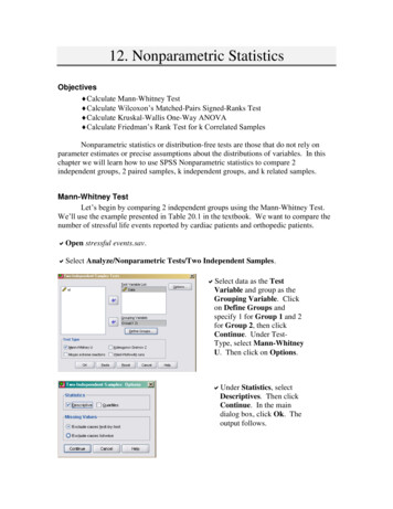
Transcription
AP Statistics:Study GuideAP is a registered trademark of College Board, which was not involved in the production of, and does not endorse, thisproduct.
Key Exam DetailsThe AP Statistics course is equivalent to a first-semester, college-level class in statistics. The 3hour, end-of-course exam is comprised of 46 questions, including 40 multiple-choice questions(50% of the exam) and 6 free-response questions (50% of the exam).The exam covers the following course content categories: Exploring One-Variable Data: 15%‒23% of test questionsExploring Two-Variable Data: 5%‒7% of test questionsCollecting Data: 12%‒15% of test questionsProbability, Random Variables, and Probability Distributions: 10%‒20% of test questionsSampling Distributions: 7%‒12% of test questionsInference for Categorical Data: Proportions: 12%‒15% of test questionsInference for Quantitative Data: Means: 10%‒18% of test questionsInference for Categorical Data: Chi-Square: 2%‒5% of test questionsInference for Quantitative Data: Slopes: 2%‒5% of test questionsThis guide will offer an overview of the main tested subjects, along with sample AP multiplechoice questions that look like the questions you’ll see on test day.Exploring One-Variable DataOn your AP exam, 15‒23% of questions will fall under the topic of Exploring One-Variable Data.Variables and Frequency TablesA variable is a characteristic or quantity that potentially differs between individuals in a group.A categorical variable is one that that classifies an individual by group or category, while aquantitative variable takes on a numerical value that can be measured.1
Examples of VariablesCategorical variablesQuantitative variablesThe country in which a product is manufacturedThe political party with which a person is affiliatedThe color of a carThe height, in inches, of a personThe number of red cars that pass through an intersection in a dayIt is important to recognize that it is possible for a categorical variable to look,superficially, like a number. For example, despite being composed of numbers, a zip code iscategorical data. It does not represent any quantity or count; rather, it’s simply a label for alocation.Quantitative variables can be further classified as discrete or continuous. A discretevariable can take on only countably many values. The number of possible values is either finiteor countably infinite. In contrast, a continuous variable can take on uncountably many values.An important characteristic of a continuous variable is that between any two possible valuesanother value can be found.Graphs for Categorical VariablesA categorical variable can be represented in a frequency table, which shows how manyindividual items in a population fall into each category. For example, suppose a student wasinterested in which color of car is most popular. He collects data from the parking lot at school,and his results are shown in the following frequency table:Color 51163142
A relative frequency table gives the proportion of the total that is accounted for by eachcategory. For example, in the previous data, 14 of the 50 cars, or 28%, were black. The fullrelative frequency table is as follows:ColorRelative 12%10%22%12%6%2%8%Note that the percentages add up to 100%, since all of the cars were of one of the colorsrepresented in the table.A bar chart is a graph that represents the frequencies, or relative frequencies, of acategorical variable. The categories are organized along a horizontal axis, with a bar risingabove each category. The height of the bar corresponds to the number of observations of thatcategory. The vertical axis may be labeled with frequencies or with relative frequencies, as inthe following examples.A bar chart representing data from more than one set is useful for comparing thefrequencies across the sets. For example, suppose that the day after collecting the initial dataon car colors, the student collected the same information from a parking lot at a nearby school.The results can be compared using the following bar chart, which shows the relativefrequencies for each color, separated by school:3
Graphs for Quantitative VariablesA histogram is related to a bar chart but is used for quantitative data. The data is split intointervals, or bins, and the number of data points in each interval is counted. The horizontal axiscontains the different intervals, which are adjacent to each other, as they form a number line.The vertical axis shows the count for each interval. The following histogram represents thescores that 50 students received on a test:How the data is split into intervals can have a big impact on the appearance of thehistogram. Two histograms that represent the same data can show different characteristics,depending on the choice of interval width.4
A stem-and-leaf plot is another graphical representation of a quantitative variable. Eachdata value is split into a stem (one or more digits) and a leaf (the last digit). The stems arearranged in a column, and the leaves are listed alongside the stem to which they belong. Thetest score data is shown in the following stem-and-leaf plot:4 95 1 3 5 5 6 9 9 06 0 1 3 3 3 4 4 5 6 8 8 8 97 1 1 2 2 4 5 5 5 6 6 7 7 8 98 0 0 2 2 3 3 3 5 5 6 7 7 7 8In a dotplot, each data value is represented by a dot placed above a horizontal axis. Theheight of a column of dots shows how many repetitions there are of that value. The following isa subset of the test score data:The Distribution of a Quantitative VariableThe distribution of quantitative data is described by reference to shape, center, variability, andunusual features such as outliers, clusters, and gaps.When a distribution has a longer tail on either the right or left, the distribution is said tobe skewed in that direction. If the right and left sides are approximately mirror images, thedistribution is symmetric. A distribution with a single peak is unimodal; if it has two distinctpeaks, it is bimodal. A distribution without any noticeable peaks is uniform.An outlier is a value that is unusually large or small. A gap is a significant interval thatcontains no data points, and a cluster is an interval that contains a high concentration of datapoints. In many cases, a cluster will be surrounded by gaps.5
Free Response TipIf you are asked to compare two distributions, be sure toaddress both their similarities and differences. For example,perhaps they are both unimodal, but one is skewed while theother is symmetric. Perhaps one has an outlier while theother does not. In particular, be sure to note if one hasgreater variability than the other, even if you cannotquantify the difference.Summary Statistics and OutliersA statistic is a value that summarizes and is derived from a sample. Measures of center andposition include the mean, median, quartiles, and percentiles. The commonly used measures ofvariability are variance, standard deviation, range, and IQR.The mean of a sample is denoted x , and is defined as the sum of the values divided by1 nthe number of values. That is, x xi . The median is the value in the center when the datan i 1points are in order. In case the number of values is even, the median is usually taken to be themean of the two middle values. The first quartile, Q1 , and the third quartile, Q3 , are themedians of the lower and upper halves of the data set.The ideas behind the first and third quartiles can be generalized to the notion ofpercentiles. The pth percentile is the data point that has p% of the data less than or equal to it.With this terminology, the first and third quartiles are the 25 th and 75th percentiles,respectively.The range of a data set is the difference between the maximum and minimum values,and the interquartile range, or IQR, is the difference between the first and third quartiles. Thatis, IQR Q3 Q1 .Variance is defined in terms of the squares of the differences between the data points1 n222 sand the mean. More precisely, the variance s is given by the formula( xi x ) . The n 1 i 1standard deviation is then simply the square root of the variance: s 61 n2( xi x ) . n 1 i 1
When units of measurement are changed, summary statistics behave in predictableways that depend on the type of operation IQRVarianceStandard deviationOriginalvalueValue aftermultiplying alldata points by aconstant cxcxmcmcrrs22 2sValue afteradding aconstant c to alldata pointsx cm crcss2cssThere are many possible ways to define an outlier. There are two methods commonlyused in AP Statistics, depending on what statistic is being used to describe the spread of thedistribution.When the IQR is used to describe the spread, the 1.5IQR rule is used to define outliers.Under this rule, a value is considered an outlier if it lies more than 1.5 IQR away from one ofthe quartiles. Specifically, an outlier is a value that is either less than Q1 1.5 IQR or greaterthan Q3 1.5 IQR .On the other hand, if the standard deviation is being used to describe the variation ofthe distribution, then any value that is more than 2 standard deviations away from the mean isconsidered an outlier. In other words, a value is an outlier if it is less than x 2s or greaterthan x 2s .If the existence of an outlier does not have a significant effect on the value of a certainstatistic, we say that statistic is resistant (or robust). The median and IQR are examples ofresistant statistics. On the other hand, some statistics, including mean, standard deviation, andrange, are changed significantly by an outlier. These statistics are called nonresistant (or nonrobust).Related to the idea of robustness is the relationship between mean and median inskewed distributions. If a distribution is close to symmetric, the mean and median will beapproximately equal to each other. On the other hand, in a skewed distribution the mean willusually be pulled in the direction of the skew. That is, if the distribution is skewed right, themean will usually be greater than the median, while if the distribution is skewed left, the meanwill usually be less than the median.7
Graphs of Summary StatisticsThe five-number summary of a data set is composed of the following five values, in order:minimum, first quartile, median, third quartile, and maximum. A boxplot is a graphicalrepresentation of the five-number summary that can be drawn vertically or horizontally along anumber line. In a boxplot, a box is constructed that spans the distance between the quartiles. Aline, representing the median, cuts the box in two.Lines, often called whiskers, connect the ends of the box with the maximum andminimum points. If the set contains one or more outliers, the whiskers end at the most extremevalues that are not outliers, and the outliers themselves are indicated by stars or dots.Note that the two sections of the box, along with the two whiskers, each represent asection of the number line that contains approximately 25% of the values.Boxplots can be used to compare two or more distributions to each other. The relativepositions and sizes of the sections of the box and the whiskers can demonstrate differences inthe center and spread of the distributions.The Normal DistributionA normal distribution is unimodal and symmetric. It is often described as a bell curve. In fact,there are infinitely many normal distributions. Any single one is described by two parameters:the mean, , and the standard deviation, . The mean is the center of the distribution, andthe standard deviation determines whether the peak is relatively tall and narrow or short andwide.8
The empirical rule gives guidelines for how much of a normally distributed data set islocated within certain distances from the center. In particular, approximately 68% of the datapoints are within 1 standard deviation of the mean, approximately 95% are within 2 standarddeviations of the mean, and approximately 99.7% are within 3 standard deviations of the mean.In practice, many sets of data that arise in statistics can be described as approximatelynormal: they are well modeled by a normal distribution, although it is rarely perfect.The standardized score, or z-score, of a data point is the number of standard deviationsx above or below the mean at which it lies. The formula is z . It is analogous to a percentile in the sense that it describes the relative position of a point within a data set. If thez-score is positive, the value is greater than the mean, while if it is negative, the value is lessthan the mean. In either case, the absolute value of the z-score describes how far away thevalue is from the center of the distribution.Suggested Reading Starnes & Tabor. The Practice of Statistics. 6th edition.Chapters 1 and 2. New York, NY: Macmillan.Larson & Farber. Elementary Statistics: Picturing the World.7th edition. Chapter 2. New York, NY: Pearson.Bock, Velleman, De Veaux, & Bullard. Stats: Modeling theWorld. 5th edition. Chapters 1‒5. New York, NY: Pearson.Sullivan. Statistics: Informed Decisions Using Data. 5thedition. Chapters 2 and 3. New York, NY: Pearson.Peck, Short, & Olsen. Introduction to Statistics and DataAnalysis. 6th edition. Chapters 3 and 4. Boston, MA:Cengage Learning.9
Sample Exploring One-Variable Data QuestionsConsider the following output obtained when analyzing the percent nitrogen composition ofsoil collected in neighborhoods near a water treatment facility in 2019.NumCases 55Mean 23.01Median 24.26StdDev 4.131Min 12.05Max 31.4975th %ile 30.12A. The 25th percentile must be about 18.4.B. Some outliers appear to be present.C. The IQR is 19.44D. About 10% of the values are in the range 30.12 to 31.49.E. Soil levels at 11% exist in the sample, but are not prevalent.Explanation:The correct answer is B. An outlier is typically taken to be a data point that is more than twostandard deviations from the mean. If you compute mean 2(standard deviation), you get31.272. Since the maximum is larger than this value, and 25% of the values are larger than30.12, there must be some outliers in the data. Choice A is incorrect because the data need notbe uniformly spaced and so, the manner in which the data is dispersed to the left of the medianmay not be the same as how it is dispersed to the right. Choice C is incorrect because 19.44 isthe range, not the IQR. Choice D is incorrect because about 25% values are within this range.Choice E is incorrect because the minimum value in this data set is 12.05.10
A researcher is interested in the age at which adolescents get their first paying job. Shesurveyed a simple random sample of 150 adolescents who have had at least one paying jobbefore the age of 19. The distribution of the ages was found to be approximately normal with amean of 15.2 years and a standard deviation of 1.6 years. According to the empirical rule,between which two ages do approximately 95% of the adolescents get their first paying job?A. 13.2 years and 17.2 yearsB. 15.2 years and 18.4 yearsC. 12 years and 15.2 yearsD. 12 years and 18.4 yearsE. 13.6 years and 16.8 yearsExplanation:The correct answer is D. Let X be the age at which an adolescent gets his or her first paying job.Since X is assumed to be normal with mean 15.2 and standard deviation 1.6, the empirical rulestates that about 95% of data will be within 2 st.dev of the mean and 15.2 2(1.6) 12, 15.2 2(1.6) 18.4. So, 95% of adolescents get their first paying job between the ages of 12 years and18.4 years. Choice A is incorrect because you used 2 instead of 2 times the standard deviation1.6 when computing the margin of error. Choice B is incorrect because you forgot to subtractthe margin of error 2(1.6) from the left endpoint. Choice C is incorrect because you forgot toadd the margin of error 2(1.6) to the right endpoint. Choice E is incorrect because because youused 1(1.6) as the margin of error instead of 2(1.6). As such, this is the range for whenapproximately 68% of adolescents get their first paying job.11
Thirty-six students completed an algebra exam consisting of 40 questions. The scoredistribution is described by the following stem-and-leaf plot:0 01161 223578882 188889993 1222466666884 0000The first quartile of the score distribution is equal to which of the following?A. 17B. 7C. 36D. 17.5E. 29Explanation:The correct answer is A. Since there are 36 scores in the stem-and-leaf plot, the position of the0.25(36) 9th score, measured starting from the lowest score, is the 25th percentile, or firstquartile. The score in the 9th position is 17. Choice B is incorrect because is incorrect becauseyou likely forgot to include the stem “1” when reporting the score. Choice C is incorrectbecause this is the third quartile, not the first. Remember, the first quartile is the 25 th percentileand the third quartile is the 75th percentile. Choice D is incorrect because you averaged the9th and 10th scores. But, the position of the first quartile, or 25th percentile, is 0.25(36) 9, aninteger, so there is no need to average two scores. Choice E is incorrect because it is the medianscore, or second quartile.12
Exploring Two-Variable DataOn your AP exam, 5‒7% of questions will fall under the topic of Exploring Two-Variable Data.Two Categorical VariablesWhen a data set involves two categorical variables, a contingency table can show how the datapoints are distributed categories. For example, suppose 600 high school students were askedwhether or not they enjoy school. The students could be separated by grade level and by theiranswer to the question. The data might be organized as follows:GradethDo 5030100180360Total90110120280600Totals can be calculated for the rows and columns, along with a grand total for theentire table. The entries can be given as relative frequencies by representing the value in eachcell as a percentage of either the row or column total. For example, the preceding data isshown below as relative frequencies based on the column totals:GradethDo h36%64%Total40%60%Total100%100%100%100%100%Note that since the percentages are relative to the row column totals, each column nowhas a total of 100%. The row totals are shown as a percentage of the table total and arereferred to as a marginal distribution. If the entries are given as relative frequencies by dividingthe total for the entire table, rather than by the row or column totals, the table is referred to asa joint relative frequency.13
Two Quantitative VariablesWhen data consists of two quantitative variables, it can be represented as a scatterplot, whichshows the relationship between the two variables. The variables are assigned to the x- and yaxes, and then each point can be represented by a point on the xy-plane. The variable that ischosen for the x-axis is often referred to as the explanatory variable, while the variablerepresented on the y-axis is the response variable.A scatterplot shows what kind of association, if any, exists between the two variables.The direction of the association can be described as positive or negative; positive means that asone variable increases, the other increases as well, while negative means that as one variableincreases, the other decreases.The form of an association describes the shape that the points make. In particular, weare generally most interested in whether or not the association is linear. When it is non -linear,it may also be described as having another form, such as exponential or quadratic.14
The strength of an association is determined by how closely the points in the scatterplotfollow a pattern (whether the pattern is linear or not). In the previous two examples, the nonlinear plot shows a much stronger association than the linear plot, since the points more closelyfollow a particular curve.Finally, a scatterplot might have some unusual features. Just as with data involving asingle variable, these features include clusters and outliers.CorrelationThe correlation between two variables is a single number, r, that quantifies the direction andstrength of a linear association:r 1 xi x yi y n 1 sx s y In this formula, sx and s y denote the sample standard deviations of the x and yvariables, respectively. Although it is possible to calculate by hand, it is implausible for all butthe smallest data sets.The correlation is always between –1 and 1. The sign of r indicates the direction of theassociation, and the absolute value is a measure of its strength: values close to 0 indicate aweak association, and the strength increases as the values move toward –1 or 1. If r is 0, thereis absolutely no linear relationship between the variables, whereas an r of –1 or 1 indicates aperfect linear relationship.It is important to note that a value close to –1 or 1 does not, by itself, imply that a linearmodel is appropriate for the data set. On the other hand, a value close to 0 does indicate that alinear model is probably not appropriate.Regression and ResidualsA linear regression model is a linear equation that relates the explanatory and responsevariables of a data set. The model is given by ŷ a bx , where a is the y-intercept, b is theslope, x is the value of the explanatory variable, and ŷ is the predicted value of the responsevariable.15
The purpose of the linear regression model is to predict a y given an x that does notappear within the data set used to construct the model. If the x used is outside of the range ofx-values of the original data set, using the model for prediction is called extrapolation. Thistends to yield less reliable predictions than interpolation, which is the process of predicting yvalues for x-values that are within the range of the original data set.Since regression models are rarely perfect, we need methods to analyze the predictionerrors that occur. The difference between an actual y and the predicted y, y yˆ , is called aresidual. When the residuals for every data point are calculated and plotted versus theexplanatory variable, x, the resulting scatterplot is called a residual plot.A residual plot gives useful information about the appropriateness of a linear model. Inparticular, any obvious pattern or trend in the residuals indicates that a linear model is probablyinappropriate. When a linear model is appropriate, the points on the residual plot shouldappear random.The most common method for creating a linear regression model is called least-squaresregression. The least squares model is defined by two features: it minimizes the sum of thesquares of the residuals, and it passes through the point ( x , y ) .The slope b of the least-squares regression line is given by the formula b r sx. Thesyslope of the line is best interpreted as the predicted amount of change in y for every unitincrease in x.Once the slope is known, the y-intercept, a, can be determined by ensuring that the linecontains the point ( x , y ) : a y bx .The y-intercept represents the predicted value of y when x is 0. Depending on the typeof data under consideration, however, this may or may not have a reasonable interpretation. Italways helps to define the line, but it does not necessarily have contextual significance.The square of the correlation r, or r 2 , is also called the coefficient of determination. Itsinterpretation is difficult, but is usually explained as the proportion of the variation in y that isexplained by its relationship to x as given in the linear model.There are three ways to classify unusual points in the context of linear regression: A point that has a particularly large residual is called an outlier.A point that has a relatively large or small x-value than the other points is called a highleverage point.An influential point is any point that, if removed, would cause a significant change inthe regression model.16
Outliers and high-leverage points are usually also influential.There are situations in which transforming one of the variables results in a linear model ofincreased strength compared to the original data. For example, consider the followingscatterplot, associated least-squares line, and residual plot:Although the coefficient of determination is high, the residual plot shows a clear lack ofrandomness. This indicates that a linear model is not appropriate, despite the relatively highcorrelation. Here are the results of performing the same analysis on the data after taking thelogarithm of all the y-values:Not only is the correlation even higher now, the residual plot does not show any obviouspatterns. This means that the data were successfully transformed for the pu rposes of fitting alinear model.There are many other transformations that can be tried, including squaring or taking thesquare root of one of the variables.17
Free Response TipIf a free response question asks you to justify theuse of a linear model for relating two variables,you can mention a correlation near -1 or 1.However, that is not a full justification on its own.You must also analyze the residuals as describedin this section.Suggested Reading Starnes & Tabor. The Practice of Statistics. 6th edition. Chapter 3. NewYork, NY: Macmillan.Essentials of Statistics 6e, Triola. Chapter 9.Bock, Velleman, De Veaux, & Bullard. Stats: Modeling the World. 5thedition. Chapters 6‒9. New York, NY: Pearson.Sullivan. Statistics: Informed Decisions Using Data. 5th edition. Chapter 4.New York, NY: Pearson.Peck, Short, & Olsen. Introduction to Statistics and Data Analysis. 6thedition. Chapter 5. Boston, MA: Cengage Learning.18
Sample Exploring Two-Variable Data QuestionsFor new trees of a certain variety between the ages of 6 months and 30 months, there isapproximately a linear relationship between height and age. This relationship can bedescribed by y 15.4 0.35x, where y represents the height (in inches) and x represents theage (in months). The tree you planted in the front yard is 16.4 months old and is 23 inches tall.What is its residual according to this model?A. 5.7400B. 44.1435C. 1.8565D. 1.8565E. 21.1435Explanation:The correct answer is D. The residual is the actual value minus the predicted value given by thelinear model at the age of 16.4 months. This yields:23 (15.4 0.35(16.4)) 1.8565Choice A is the amount of growth experienced by the tree at an age of 16.4 months. Choice B isincorrect because you should have subtracted the actual height and the predicted height at anage of 16.4 months given by the linear model. Choice C is incorrect because this is the negati veof the correct value, so you subtracted in the wrong order. Choice E is the predicted height forthe age of 16.4 months provided by the linear model. You must subtract this from the actualheight of the tree to get the residual.19
The effects of a nutritional supplement on hamsters were examined by feeding hamstersvarious concentrations of the supplement in their daily water supply (measured in mg per liter).The time (in days) until the hamsters exhibited an increase in activity was recorded. A tota l of21 different experiments were performed. A preliminary plot of the data showed that therelationship of time versus concentration was approximately linear. The output appears below:ParameterEstimate Test Statistic T Prob T Standard Error of n0.360.840.0410.028Which of the following is the best fit regression line?A. y 0.36 3.415xB. y 3.415 3.6xC. y 3.415 0.36xD. y 4.932 0.84xE. y 0.36xExplanation:The correct answer is C. This choice is the result of correctly extracting the slope and interceptfrom the table, and inserting them in the model y β0 β1x. Choice A is the result of switchingthe slope and intercept. Choice B is incorrect because the slope is off by a factor of 10. Choice Dis incorrect because you used the test statistics instead of the actual estimates of the slope andintercept provided. Choice E is incorrect because you neglected to include the intercept.20
Consider the following three scatterplots:Which of the following statements, if any, are true?I.II.III.The intercept for the line of best fit for the data in scatterplot A will be positive.The slope for the line of best fit for the data in scatterplot B will be negative.There is no discernible relationship between the variables x and y in scatterplot C.A. I onlyB. II onlyC. III onlyD. II and III onlyE. I and II onlyExplanation:The correct answer is E. Statement I is true because the best fit line is a horizontal line abovethe x-axis, so that its y-intercept will intersect the y-axis in a positive number. Statement II istrue because the best fit line is a line whose slope is the same as the parallel lines along whichthe data in the scatterplot conform. Since these lines fall from left to right, the slope isnegative. Statement III is false because there is a discernible relationship between x and y inscatterplot C, it is simply nonlinear.21
Collecting DataAbout 12‒15% of the questions on your AP Statistics exam will cover the category of CollectingData.Planning a StudyThe entire set of people, items, or subjects of interest to us is called a population. Because it isoften not feasible to collect data from a population, a sample, or smaller subset, is selectedfrom the population. One of the goals of statistics is to use sample data to make reliableinferences about populations.Once a sample is selected, data collection must take place. In an experiment, theparticipants or subjects are explicitly assigned to two or more different conditions, ortreatments. For example, a medical study investigating a new cold medication might assign halfof the people in the study to a group that receives the medication, and the other half to a groupthat recei
The five-number summary of a data set is composed of the following five values, in order: minimum, first quartile, median, third quartile, and maximum. A boxplot is a graphical representation of the five-number summa