Transcription
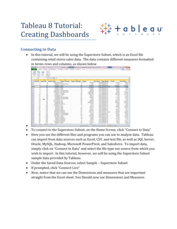
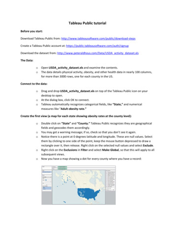
Tableau Public tutorialBefore you start:Download Tableau Public from: psCreate a Tableau Public account at: load the dataset from: http://www.peteraldhous.com/Data/USDA activity dataset.xlsThe Data:ooOpen USDA activity dataset.xls and examine the contents.The data details physical activity, obesity, and other health data in nearly 100 columns,for more than 3000 rows, one for each county in the US.Connect to the data:oooDrag and drop USDA activity dataset.xls on top of the Tableau Public icon on yourdesktop to open.At the dialog box, click OK to connect.Tableau automatically recognizes categorical fields, like “State,” and numericalmeasures like “Adult obesity rate.”Create the first view (a map for each state showing obesity rates at the county level):oooooDouble click on “State” and “County.” Tableau Public recognizes they are geographicalfields and geocodes them accordingly.You may get a warning message; if so, check so that you don’t see it again.Notice there is a point at 0 degrees latitude and longitude. These are null values. Selectthem by clicking to one side of the point, keep the mouse button depressed to draw arectangle over it, then release. Right click on the selected null values and select Exclude.Right click on the Exclusions in Filter and select Make Global, so that this will apply to allsubsequent views.Now you have a map showing a dot for every county where you have a record:
ooooooDrag “Adult obesity rate” from the Measures panel into Color, and copy it into Sizeshelf to encode counties by those values.Change the Color to Red–White-Green Diverging, and reverse it:Now add a filter to enable the selection of individual states. Click and drag “State” intothe Filters shelf, click OK at the dialog box.Right click on “State” in the Filters shelf and select Show Quick Filter. Deselect All andthen select Alabama.Rename the worksheet “Map View” by right clicking on the tab at the bottom.Finished state of first view:
Add a second view (scatter plots showing the relationship between obesity and health-relatedbehaviors at the county level):oAdd new worksheet:oDrag “Adult obesity rate” onto Rows and “% smokers,” “% eating few fruits andvegetables” and “% who do not exercise” into Columns.Drag “County” and “State” into Level of Detail. Without this step, Tableau’s defaultbehavior is to sum the values across all the counties and states, which will give you asingle data point for each graph, and not the desired scatter plots.The view should now look like this:ooooooChange Color to purple, open the Drop down menu next to “Automatic” and selectCircle, then move the slider below to the left to increase transparency of the points.Select Analysis in the top menu and check Trend Lines.Rename the worksheet “Scatterplot View” by right clicking on the tab at the bottom.Finished state of second view:
Create a Dashboard with both views:oAdd dashboard:oDouble click on each view to bring both out onto the dashboard. Right click on the Statefilter, select Compact list.Right click on this filter again, and select Make Global. This will ensure that selecting astate alters both views simultaneously.Right click on this filter for a third time, select Customize and uncheck Show “All” Value.This prevents users from seeing the entire data for all the US.Right click on the titles of each view and select Hide Title.Rename the dashboard “Obesity by state and county” by right clicking on the tab at thebottom.Double click on Title under ObjectsThe dashboard should now look like this:oooooo
Save to the web:ooUnder Size, click Edit and select the size and layout best for your website.Click File on the top menu and select Save to Web. You will be asked for your account loginat this point.Embed on your website/blog:ooooIn the Save To Web Results window that has opened up, scroll down beneath thevisualization and click on Share.Copy and paste the embed code into the html of your web page.You should now have this online visualization:http://www.peteraldhous.com/tableau demo.htmlYou can also download a PDF of this handout from:http://www.peteraldhous.com/CAR/tableau demo.pdf
o Tableau automatically recognizes catego rical fields, like “State,” and numerical measures like “ Adult obesity rate.” Create the first view (a map for each state showing obesity rates at the county level) : o Double click on “State” and “County.” Tableau Public recognizes they are geographical fields and geocodes them accordingly . o You may get a warning message; if so .File Size: 399KBPage Count: 5