Transcription
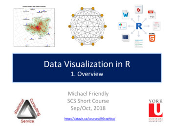
Data Visualization in R1. OverviewMichael FriendlySCS Short CourseSep/Oct, 2018http://datavis.ca/courses/RGraphics/
Course outline1.2.3.4.Overview of R graphicsStandard graphics in RGrid & lattice graphicsggplot2
Outline: Session 1 Session 1: Overview of R graphics, the big picture Getting started: R, R Studio, R package tools Roles of graphics in data analysis Exploration, analysis, presentation What can I do with R graphics? Anything you can think of! Standard data graphs, maps, dynamic, interactive graphics –we’ll see a sampler of these R packages: many application-specific graphs Reproducible analysis and reporting knitr, R markdown R Studio-#-
Outline: Session 2 Session 2: Standard graphics in R R object-oriented design Tweaking graphs: control graphic parameters Colors, point symbols, line styles Labels and titles Annotating graphs Add fitted lines, confidence envelopes
Outline: Session 3 Session 3: Grid & lattice graphics Another, more powerful “graphics engine” All standard plots, with more pleasing defaults Easily compose collections (“small multiples”)from subsets of data vcd and vcdExtra packages: mosaic plots andothers for categorical dataLecture notes for this session are available on the web page
Outline: Session 4 Session 4: ggplot2 Most powerful approach to statistical graphs,based on the “Grammar of Graphics” A graphics language, composed of layers, “geoms”(points, lines, regions), each with graphical“aesthetics” (color, size, shape) part of a workflow for “tidy” data manipulationand graphics
Resources: BooksPaul Murrell, R Graphics, 2nd Ed.Covers everything: traditional (base) graphics, lattice, ggplot2, grid graphics, maps, network diagrams, R code for all figures: https://www.stat.auckland.ac.nz/ paul/RG2e/Winston Chang, R Graphics Cookbook: Practical Recipes for Visualizing DataCookbook format, covering common graphing tasks; the main focus is on ggplot2R code from book: http://www.cookbook-r.com/Graphs/Download from: s%20Cookbook.pdfDeepayn Sarkar, Lattice: Multivariate Visualization with RR code for all figures: http://lmdvr.r-forge.r-project.org/Hadley Wickham, ggplot2: Elegant graphics for data analysis, 2nd Ed.1st Ed: Online, http://ggplot2.org/book/ggplot2 Quick Reference: plete ggplot2 documentation: http://docs.ggplot2.org/current/7
Resources: cheat sheetsR Studio provides a variety of handy cheat sheets for aspects of data analysis &graphics See: load, laminate,paste them on yourfridge8
Getting started: Tools To profit best from this course, you need to installboth R and R Studio on your computerThe basic R system: R console (GUI) & packagesDownload: http://cran.us.r-project.org/Add my recommended hics/R/install-pkgs.R”)The R Studio IDE: analyze, write, studio/download/Add: R Studio-related packages, as useful
R package toolsData prep: Tidy data makes analysis and graphingmuch easier.Packages: tidyverse, comprised of: tidyr, dplyr, lubridate, R graphics: general frameworks for making standard and custom graphicsGraphics frameworks: base graphics, lattice, ggplot2, rgl (3D)Application packages: car (linear models), vcd (categorical data analysis), heplots(multivariate linear models)Publish: A variety of R packages make it easy to write and publish research reportsand slide presentations in various formats (HTML, Word, LaTeX, ), all within RStudioWeb apps: R now has several powerful connections to preparing dynamic, webbased data display and analysis applications.10
Getting started: R Studiocommand historyworkspace: your variablesR console(just like Rterm)filesplotspackageshelp
R Studio navigationR folder navigation commands: Where am I? getwd()[1] "C:/Dropbox/Documents/6135" Go somewhere: setwd("C:/Dropbox") setwd(file.choose())R Studio GUI12
R Studio projectsR Studio projects are a handy way toorganize your work13
R Studio projectsAn R Studio project for a research paper: R files (scripts), Rmd files (text, R “chunks”)14
Organizing an R project Use a separate folder for each project Use sub-folders for various partsdata files: raw data (.csv) saved R data(.Rdata)figures: diagrams analysis plotsR files: data import analysisWrite up files willgo here (.Rmd,.docx, .pdf)15
Organizing an R project Use separate R files for different steps: Data import, data cleaning, save as an RData file Analysis: load RData, read-mydata.R# read the data; better yet: use RStudio File - Import Dataset .mydata - read.csv("data/mydata.csv")# data cleaning .# save the current statesave("data/mydata.RData")16
Organizing an R project Use separate R files for different steps: Data import, data cleaning, save as an RData file Analysis: load RData, analyse.R# analysisload("data/mydata.RData")# do the analysis – exploratory plotsplot(mydata)# fit modelsmymod.1 - lm(y X1 X2 X3, data mydata)# plot models, extract model summariesplot(mymod.1)summary(mymod.1)17
Graphics: Why plot your data? Three data sets with exactly the same bivariate summarystatistics: Same correlations, linear regression lines, etc Indistinguishable from standard printed outputStandard datar 0 but 2 outliersLurking variable?
Roles of graphics in data analysis Graphs (& tables) are forms of communication: What is the audience? What is the message?Analysis graphs: design to seepatterns, trends, aid the process ofdata description, interpretationPresentation graphs: design to attractattention, make a point, illustrate aconclusion
The 80-20 rule: Data analysis Often 80% of data analysis time is spent on data preparationand data cleaning1.2.3.data entry, importing data set to R, assigning factor labels,data screening: checking for errors, outliers, Fitting models & diagnostics: whoops! Something wrong, go back to step 1 Whatever you can do to reduce this, gives more time for: Thoughtful analysis,Comparing models,Insightful graphics,Telling the story of your results and conclusionsThis view of data analysis,statistics and data vis is nowrebranded as “data science”21
The 80-20 rule: Graphics Analysis graphs: Happily, 20% of effort can give 80% of adesired result Default settings for plots often give something reasonable 90-10 rule: Plot annotations (regression lines, smoothed curves, dataellipses, ) add additional information to help understand patterns,trends and unusual features, with only 10% more effort Presentation graphs: Sadly, 80% of total effort may berequired to give the remaining 20% of your final graph Graph title, axis and value labels: should be directly readable Grouping attributes: visually distinct, allowing for BW vs color color, shape, size of point symbols; color, line style, line width of lines Legends: Connect the data in the graph to interpretation Aspect ratio: need to consider the H x V size and shape22
What can I do with R graphics?A wide variety of standard plots (customized)line graph: plot()barchart()hist()3D plot: persp()boxplot()pie()
Bivariate plotsR base graphics provide a wide variety of different plot types for bivariate dataThe function plot(x, y) is generic. It produces different kinds of plots dependingon whether x and y are numeric or factors.Some plottingfunctions take amatrix argument &plot all columns24
Bivariate plotsA number of specialized plot types are also available in base R graphicsPlot methods for factors and tables are designed to show the association betweencategorical variablesThe vcd & vcdExtrapackages provide moreand better plots forcategorical data25
Mosaic plotsSimilar to a grouped bar chartShows a frequency table with tiles,area frequency data(HairEyeColor) HEC - margin.table(HairEyeColor, 1:2) HECEyeHairBrown Blue Hazel 1016 chisq.test(HEC)Pearson's Chi-squared testdata: HECX-squared 140, df 9, p-value 2e-16How to understand the associationbetween hair color and eye color?26
Mosaic plotsShade each tile in relation to thecontribution to the Pearson χ2statistic χ2 r 2ij(oij eij )2eij round(residuals(chisq.test(HEC)),2)EyeHairBrown Blue Hazel GreenBlack 4.40 -3.07 -0.48 -1.95Brown 1.23 -1.95 1.35 -0.35Red-0.07 -1.73 0.85 2.28Blond -5.85 7.05 -2.23 0.61Mosaic plots extend readily to 3-way tablesThey are intimately connected with loglinear modelsSee: Friendly & Meyer (2016), Discrete Data Analysis with R, http://ddar.datavis.ca/27
Follow along From the course web page, click on the /RGraphics/R/duncan-plots.R Select all (ctrl A) and copy (ctrl C) to the clipboardIn R Studio, open a new R script file (ctrl shift N)Paste the contents (ctrl V)Run the lines (ctrl Enter) along with me
Multivariate plotsThe simplest case of multivariate plotsis a scatterplot matrix – all pairs ofbivariate plotsIn R, the generic functions plot()and pairs() have specific methodsfor data framesdata(Duncan, package “car”)plot( prestige income education,data Duncan)pairs( prestige income education,data Duncan)29
Multivariate plotsThese basic plots can be enhanced inmany ways to be more informative.The function scatterplotMatrix() in thecar package provides univariate plots for each variable linear regression lines and loesssmoothed curves for each pair automatic labeling of noteworthyobservations (id.n )library(car)scatterplotMatrix( prestige income education,data Duncan, id.n 2)30
Multivariate plots: corrgramsFor larger data sets, visualsummaries are often more usefulthan direct plots of the raw dataA corrgram (“correlation diagram”)allows the data to be rendered in avariety of ways, specified by panelfunctions.Here the main goal is to see howmpg is related to the othervariablesSee: Friendly, M. Corrgrams: Exploratory displays for correlation matrices. The American Statistician, 2002, 56, 316-32431
Multivariate plots: corrgramsFor even larger data sets, moreabstract visual summaries arenecessary to see the patterns ofrelationships.This example uses schematicellipses to show the strength anddirection of correlations amongvariables on a large collection ofItalian wines.Here the main goal is to see howthe variables are related to eachother.library(corrplot)corrplot(cor(wine), tl.srt 30, method "ellipse", order "AOE")See: Friendly, M. Corrgrams: Exploratory displays for correlation matrices. The American Statistician, 2002, 56, 316-32432
Generalized pairs plotsGeneralized pairs plots from the gpairspackage handle both categorical (C) andquantitative (Q) variables in sensible waysxyplotQ Q scatterplotCQ boxplotQ rs(Arthritis[, c(5, 2:5)], )33
Models: diagnostic plotsLinear statistical models (ANOVA,regression), y X β ε, require someassumptions: ε N(0, σ2)For a fitted model object, the plot()method gives some useful diagnosticplots: residuals vs. fitted: any pattern?Normal QQ: are residuals normal?scale-location: constant variance?residual-leverage: outliers?duncan.mod - lm(prestige income education, data Duncan)plot(duncan.mod)34
Models: Added variable plotsThe car package has many more functions for plotting linear model objectsAmong these, added variable plots show the partial relations of y to each x, holding allother predictors constant.library(car)avPlots(duncan.mod, id.n 2,ellipse TRUE, )Each plot shows:partial slope, βjinfluential obs.35
Models: InterpretationFitted models are often difficult to interpret from tables of coefficients# add term for type of jobduncan.mod1 - update(duncan.mod, . . type)summary(duncan.mod1)Call:lm(formula prestige income education type, data Duncan)Coefficients:Estimate Std. Error t value Pr( t )(Intercept) -0.185033.71377 -0.050 0.96051income0.597550.089366.687 5.12e-08 ***education0.345320.113613.040 0.00416 **typeprof16.657516.993012.382 0.02206 *typewc-14.661136.10877 -2.400 0.02114 *--Signif. codes: 0 ‘***’ 0.001 ‘**’ 0.01 ‘*’ 0.05 ‘.’ 0.1 ‘ ’ 1How to understandeffect of eachpredictor?Residual standard error: 9.744 on 40 degrees of freedomMultiple R-squared: 0.9131,Adjusted R-squared: 0.9044F-statistic:105 on 4 and 40 DF, p-value: 2.2e-1636
Models: Effect plotsFitted models are more easily interpreted by plotting the predicted values.Effect plots do this nicely, making plots for each high-order term, controlling for otherslibrary(effects)duncan.eff1 - allEffects(duncan.mod1)plot(duncan.eff1)37
Models: Coefficient plotsSometimes you need to report or display the coefficients from a fitted model.A plot of coefficients with CIs is sometimes more effective than a table.library(coefplot)duncan.mod2 - lm(prestige income * education, data Duncan)coefplot(duncan.mod2, intercept FALSE, lwdInner 2, lwdOuter 1,title "Coefficient plot for duncan.mod2")38
Coefficient plots becomeincreasingly useful as:(a) models become more complex(b) we have several models tocompareThis plot compares three differentmodels for women’s labor forceparticipation fit to data from Mroz(1987) in the car packageThis makes it relatively easy to see(a) which terms are important(b) how models differfamily income - wife's incomelog wage rate for working womenhusband's college attendancewife's college attendancenumber of children 6-18number of children 5 years This example from: -of-regression-coefficients-in-r/39
3D graphicsR has a wide variety of features andpackages that support 3D graphicsThis example illustrates the conceptof an interaction between predictorsin a linear regression modelIt uses:lattice::wireframe(z x y, )The basic plot is “printed” 36 timesrotated 10o about the z axis toproduce 36 PNG images.The ImageMagick utility is used toconvert these to an animated GIFgraphicz 10 .5x .3y .2 x*y40
3D graphics: code1. Generate data for the model z 10 .5x .3y .2 x*yb0 - 10# interceptb1 - .5# x coefficientb2 - .3# y coefficientint12 - .2# x*y coefficientg - expand.grid(x 1:20, y 1:20)g z - b0 b1*g x b2*g y int12*g x*g y2. Make one 3D plotlibrary(lattice)wireframe(z x * y, data g)3. Create a set of PNG images, rotating around the z axispng(file "example%03d.png", width 480, height 480)for (i in seq(0, 350 ,10)){print(wireframe(z x * y, data g,screen list(z i, x -60), drape TRUE))}dev.off()4. Convert PNGs to GIF using ImageMagiksystem("convert -delay 40 example*.png animated 3D plot.gif")41
3D graphicsThe rgl package is the most general fordrawing 3D graphs in R.Other R packages use this for 3D statisticalgraphsThis example uses car::scatter3d() toshow the data and fitted response surfacefor the multiple regression model for theDuncan datascatter3d(prestige income education,data Duncan, id.n 2, revolutions 2)42
Statistical animationsStatistical concepts can often beillustrated in a dynamic plot of someprocess.This example illustrates the idea ofleast squares fitting of a regressionline.As the slope of the line is varied, theright panel shows the residual sumof squares.This plot was done using the animatepackage43
Data animationsTime-series data are often plottedagainst time on an X axis.Complex relations over time canoften be made simpler by animatingchange – liberating the X axis toshow something elseThis example from the tweenrpackage (using gganimate)See: https://github.com/thomasp85/tweenr for some simple examples44
Maps and spatial visualizationsSpatial visualization in R, combines map data sets, statistical models for spatial data,and a growing number of R packages for map-based displayThis example, from Paul Murrell’s RGraphics book shows a basic map ofBrazil, with provinces and their capitals,shaded by region of the country.Data-based maps can show spatialvariation of some variable of interestMurrell, Fig. 14.545
Maps and spatial visualizationsDr. John Snow’s map of cholera inLondon, 1854Enhanced in R in the HistDatapackage to make Snow’s pointPortion of Snow’s map:library(HistData)SnowMap(density TRUE,main “Snow's Cholera Map, Death Intensity”)Contours of death densities are calculated usinga 2d binned kernel density estimate, bkde2D()from the KernSmooth package46
Maps and spatial visualizationsDr. John Snow’s map of cholera inLondon, 1854Enhanced in R in the HistDatapackage to make Snow’s pointThese and other historicalexamples come from Friendly &Wainer, The Origin of GraphicalSpecies, Harvard Univ. Press, inprogress.SnowMap(density TRUE,main "Snow's Cholera Map with Pump Neighborhoods“)Neighborhoods are the Voronoi polygons of themap closest to each pump, calculated using thedeldir package.47
Diagrams: Trees & GraphsA number of R packages are specialized to draw particular types of diagrams.igraph is designed for network diagrams of nodes and edgeslibrary(igraph)tree - graph.tree(10)tree - set.edge.attribute(tree, "color", value "black")plot(treeIgraph,layout layout.reingold.tilford(tree,root 1, flip.y FALSE))full - graph.full(10)fullIgraph - set.edge.attribute(full, "color",value "black")plot(full, layout layout.circle)48
Diagrams: Network diagramsgraphvis (http://www.graphviz.org/) is a comprehensive program for drawingnetwork diagrams and abstract graphs. It uses a simple notation to describe nodesand edges.The Rgraphviz package (from Bioconductor) provides an R interfaceThis example, from Murrell’s R Graphicsbook, shows a node for each package thatdirectly depends on the main R graphicspackages.An interactive version could provide “tooltips”, allowing exploring the relationshipsamong packagesMurrell, Fig. 15.549
Diagrams: Flow chartsThe diagram package:Functions for drawing diagrams withvarious shapes, lines/arrows, textboxes, etc.Flow chart about understanding flow charts (afterhttp://xkcd.com/518 ). From: Murrell, Fig 15.1050
Path diagrams: structural equation modelsSimilar diagrams are used to display structural equation models as “path diagrams”The sem and laavan packages have pathDiagram() functions to draw a proposed orfitted model.They use the DiagrammeR package to do the drawing.library(sem)union.mod - specifyEquations(covs "x1, x2", text "y1 gam12*x2y2 beta21*y1 gam22*x2y3 beta31*y1 beta32*y2 gam31*x1")union.sem - sem(union.mod, union, N 173)pathDiagram(union.sem,edge.labels "values",file "union-sem1",min.rank c("x1", "x2"))51
Dynamically updated data visualizationsThe wind map app, http://hint.fm/wind/ is one of a growing number of R-basedapplications that harvests data from standard sources, and presents a visualization52
Web scraping: CRAN package historyR has extensive facilities for extracting and processing information obtained from webpages. The XML package is one useful tool for this purpose.This example: downloads information about all Rpackages from the CRAN web site,finds & counts all of those available foreach R version,plots the counts with ggplot2, adding asmoothed curve, and plot annotationsOn Jan. 27, 2017, the number of Rpackages on CRAN reached 10,000Code from: https://git.io/vy4wS53
shiny: Interactive R applicationsshiny, from R Studio, makes it easier to develop interactive applicationsMany examples at https://shiny.rstudio.com/gallery/54
Reproducible analysis & reportingR Studio, together with the knitrand rmarkdown packages providean easy way to combine writing,analysis, and R output intocomplete documents.Rmd files are just text files, usingrmarkdown markup and knitr torun R on “code chunks”A given document can berendered in different outputformats:56
Output formats and templatesThe integration of R, R Studio, knitr,rmarkdown and other tools is nowhighly advanced.My last book was writtenentirely in R Studio, using .Rnwsyntax LaTeX PDF camera ready copyThe ggplot2 book was writtenusing .Rmd format.The bookdown package makesit easier to manage a booklength project – TOC, fig/table#s, cross-references, etc.Templates are available for APA papers,slides, handouts, entire web sites, etc.57
Writing it up In R Studio, create a .Rmd file to use R Markdown foryour write-up lots of options: HTML, Word, PDF (needs LaTeX)58
Writing it up Use simple Markdown to write text Include code chunks for analysis & graphsmypaper.Rmd, created from a templateHelp - Markdown quick referenceyaml headerHeader 2output code chunkplot code chunk59
rmarkdown basicsrmarkdown uses simple markdown formatting for all standard document elements60
R code chunksR code chunks are run by knitr, and the results are inserted in the output documentThere are manyoptions for controllingthe details of chunkoutput – numbers,tables, graphsChoose the outputformat:An R chunk: {r name, options}# R code here 61
The R Markdown Cheat Sheet provides most of the 2016/03/rmarkdown-cheatsheet-2.0.pdf62
R notebooksOften, you just want to “compile” an R script, and get the output embedded in theresult, in HTML, Word, or PDF. Just type Ctrl-Shift-K or tap the Compile Report button63
Summary & Homework Today has been mostly about an overview of Rgraphics, but with emphasis on: R, R Studio, R package tools Roles of graphics in data analysis, A small gallery of examples of different kinds of graphic applications inR; only small samples of R code Work flow: How to use R productively in analysis & reporting Next week: start on skills with traditional graphics Homework: Install R & R Studio Find one or more examples of data graphs from your research area What are the graphic elements: points, lines, areas, regions, text, labels, ? How could they be “described” to software such as R? How could they be improved?64
Resources: Books 7 Winston Chang, R Graphics Cookbook: Practical Recipes for Visualizing Data . Cookbook format, cov