Transcription
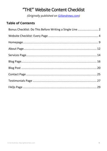
“THE” Website Content Checklist(Originally published on Gillandrews.com)Table of ContentsBonus Checklist: Do This Before Writing a Single Line . 2Website Checklist: Every Page . 4Homepage . 9About Page . 12Services Page. 14Blog Page. 16Blog Post . 20Contact Page . 25Testimonials Page . 27FAQs Page . 29 Gill Andrews, http://gillandrews.com1
BONUS CHECKLIST:DO THIS BEFORE WRITING A SINGLE LINEON YOUR WEBSITEGet clear about your product or services: What does your product do exactly? / What services do you offer? What’s the benefits? Who may need it?Zero in on your target audience:What kind of people are most likely to love your product or services? The mostbeautiful website will fail to grow your business if it’s aimed to the wrongaudience.Don’t try to appeal to everybody. Instead, zero in on those who will benefit themost from your offer. The checkpoints below will help you define your targetaudience. Demographics: Age Gender Education Family situation Occupation Income Geographical location Lifestyle: Hobbies Favorite TV shows & movies Favorite books Gill Andrews, http://gillandrews.com2
Pets Where can you meet them offline? Online behavior: Preferred social media platforms Forums Websites Preferred way to get information online (videos / podcasts / blog posts,etc.) What makes them tick? Problems Fears Dreams What’s important in life? (Values) How do they make the decision to buy? Whom do they trust?Define the purpose of your website: How will your website help your business? For example, get new clients, sellyour product, promote your brand, earn money with affiliate marketing etc. What pages would you need? Make a list. Do you need a blog? If yes, what will be your blog’s focus? Are you going to grow your email list? If yes, how? Gill Andrews, http://gillandrews.com3
WEBSITE CHECKLIST: EVERY PAGEWhether it’s your homepage or your blog post, if you want your websitevisitors to keep reading, pay attention and connect with you, make sure youhave these points covered on every page.Make It Relevant Content generally relevant to your target audience Content matches the expectations of your visitors based on a link theyclicked to get to this page Page content delivers what the title has promisedMake It Clear Clear copy: Avoid jargon Use shorter sentences Avoid meaningless words (“welcome to our website”, “nice to meet you”,etc.) Don’t try to be clever if you can’t stay clear Focus on your customers and use “you/your” more often than you use“I/my” Gill Andrews, http://gillandrews.com4
Copy Examples:Self-centered:I teach great marketingWe oversee one project at a timeThese windows are double-glazedCustomer-focused: Learn how to turn great ideas into great marketing campaigns As we oversee one project at a time, you’ll have our undivided at tention These double-glazed windows will save you heating costs in winter Clear design: What’s important is prominent Logically related elements are also visually related Clearly defined page areas Links visually stand out Text doesn’t look like clickable elementsTip: Don’t fall prey to the peer pressure of having all the modern design features.The best design isn’t the one that is most beautiful. It’s the one that converts themost visitors.Make It Valuable Put your readers’ needs first, not your business goals Solve the problems or answer the questions of your target audience Give actionable tipsMake It Trustworthy Correct grammar and spelling No superlatives (“best”, “greatest”, “awesome”, etc.) Gill Andrews, http://gillandrews.com5
No words in all capital letters (Exception: Section headings) Don’t overuse exclamation marks Support your claims with evidence: Research Examples Expert quotes Other articles on the topic written by expertsMinimize Distractions No autoplay of video / audio No elements that are moving on their own: Blog carousels Testimonial carousels Client logo carousels, etc. Reduce number of ads Use pop-ups wisely: Don’t use intrusive pop-ups on mobile Make sure you are not interrupting your visitors before they reachtheir goal If using a pop-up, make sure it can be easily closedTip: On average, small and medium business owners need 1319 people to see theiropt-in pop-up to get one engaged subscriber. If you are working with your clientsone-on-one or if your website doesn’t get much traffic yet, your interstitial maycost you more money than it brings in. Gill Andrews, http://gillandrews.com6
Minimize Friction:All the pages on your website should be: Easy to read: Unobtrusive background Readable font types and sizes High contrast between font and background Post text is well-formatted and scannable: Headings Short paragraphs Text highlights (bold, italic, etc.) Lists / bullet pointsTip: When using bullet points, make sure you leave enough white space betweenindividual points. Otherwise, you’ll end up with a long paragraph with dots on theside that is difficult to read. Easy to use:Meet your visitors’ expectations on where to find certain elements and how tointeract with them: Make clickable elements look like buttons or visually prominent links Non-clickable elements (body text or headings) shouldn’t look like buttonsor links Navigation labels and CTA copy should be clear and not cleverMake It Easy to Take ActionCalls to action aren’t only for sales page. Even if it’s just a blog post, youshould write it with that one action in mind you want your visitors to take: Forexample, to share this post, to leave a comment, or to check out your Servicespage. Gill Andrews, http://gillandrews.com7
With this in mind: Create every page with one action in mind you want your visitors to take Make it easy to take this action: Call to action visually prominent Call to action has a clear copy completing the phrase “I’d like youto ” or “I’d like to ”Call-to-Action Examples:Bad:More infoBecome a heroEvolve with itShut up and take my moneyGood: Find out more Book a free course Steal rivals’ ideas Register for this webinar Gill Andrews, http://gillandrews.com8
SMALL BUSINESS HOMEPAGE CHECKLISTIt’s tempting to put too much information on your homepage. Yet, if it fai ls toclearly communicate what you do and offer an easy way for your visitors tonavigate your website they won’t stay for long. Use the following checklist tomake sure your business homepage is as effective as possible.Business Homepage “Must-Have”s A clear website tagline and a paragraph of text (ifnecessary) that explain: Who are you? What do you do? Why should your visitors care? What’s the benefit?Tip: To make sure that your website tagline is clear, ask yourself if you would usethe same words to explain it to a stranger. Will they understand it right away orneed you to explain further?When in doubt, use this surefire tagline formula: {What you are}. I {do what} {forwhom} {with what benefit}.Recommended reading: “How to Make Sure Your Homepage Sends a ClearMessage ( 7 Great Website Tagline Examples)” Navigation: Not more than 7 navigation labels Positioned as your website visitors expect it (one row at the top of thepage) Gill Andrews, http://gillandrews.com9
Mouse pointer changes on clickable links Descriptive ClearNavigation Label Examples:Vague:Get to Know MeClear: AboutHow can I help? ServicesFees & Charges PricingRead My Columns BlogSupport yourself Books / CoursesGet in Touch ContactTip: Navigation is the last place you should try to be creative. Your visitors won’tread it. They’ll scan it for familiar labels. Anything that is unclear or requires t hemto pause and think will cause irritation or will be overlooked.Navigation mistakes:Linking to unimportant pages (Impressum, Privacy policy, etc.)Not linking to important pages (About us, Services, etc.)Placing navigation menu items in unexpected places.Using too many navigation labelsUnnecessary drop-down menusTip: Drop-down menus irritate your visitors and lose you visits to importantpages. Reorganize the information on your website to have only top-levelnavigation. Gill Andrews, http://gillandrews.com10
Business Homepage ”Must-Have”s (continued) Photo of yourself or your team A paragraph about yourself / your team Call to action Logo Search box Social proof Credible client testimonials Client logos Certifications Awards Statistics Smart footer Copyright Phone and fax numbers Navigation to main pages Social icons Privacy policy Email signup Terms of use Search box Contact Latest articles Postal address / link to a map Call to actionTip: You don’t have to include all these points in your footer, of course. Just selectthe most relevant for your business. But whatever you do, don’t leave the footerempty. Footer is a safety net of your website “catching” the visitors who haven’tfound what they were looking for on your page and were about to leave.Other things you may want to put on your homepage: Selected services Gill Andrews, http://gillandrews.com11
Freebies Books Courses Featured posts Featured videosTip: Don’t get carried away by cluttering your homepage with all possibleinformation. First, cover the “must-haves”, and only then consider adding morethingsABOUT PAGE CHECKLISTTip: Your About page isn’t a place for your ramblings about your career path, yourhobbies or your philosophy. The main question it should answer: What problemsdo you solve and how you can help your customers?A compelling About page includes: Your photo or a photo of your team: All faces clearly visible and recognizable People looking straight or towards the text of the page (not away from it) A short personal introduction that shows you as: Likable Relatable Approachable Gill Andrews, http://gillandrews.com12
Your mission: What problems do you solve? For whom? Credibility enhancers: Qualifications Awards Features in famous publications Endorsements from recognized experts Client Testimonials Statistics (for ex., books review score, copies sold) Work samples Call to action: to check out your Services page to view your work samples to check out your books to sign up for your newsletter to contact you, etc.Tip: What would you like your website visitors to do after they’ve read your Aboutpage? Don’t hope for them figure out what to do next by themselves. Include aclear call to action: A sign-up form for your newsletter, a link to your Services pageor your email address they can reach you at. Gill Andrews, http://gillandrews.com13
SERVICES PAGE CHECKLISTBefore creating your service pages, think about how you want your visitors tofind them. Do you offer many services and want to link to them from the topnavigation menu? Avoid using a drop-down menu.Reasons not to use a drop-down menu in thenavigation: Users tend to skip top-level navigation labels if there is a drop-down menu. Users find drop down menus irritating. Drop-down menus don’t work on certain devices.Creating navigation to service pages without a dropdown menu: Create a main Services page Feature your separate services on it and link to the corresponding pages Link only to your main Services page from the top navigation without adrop-down menuor If you offer only a few services, you can omit the main Services page andlink directly to the single services from your top navigation. Gill Andrews, http://gillandrews.com14
Services Page Checklist Short description of what you offer and for whom Featured services (one section for every service): Service title Brief service description Link to the corresponding page in a form of a call to action Credibility enhancers: Client logos Credible client testimonials Link to your contact pageA Service Page ChecklistTip: Create a dedicated page for each major service you provide. This will help yourank better for the relevant keywords. Plus, by sharing a page that focuses only onone service on social will bring you more targeted traffic. Unique value proposition: What is it? Service title Short summary of a service Whom is it for? What’s the benefit? Expose reader’s need Demonstrate importance Tell what’s in for them Focus on benefits, not features Tell them what makes your offer unique Gill Andrews, http://gillandrews.com15
Earning trust: Add a short description of your process Answer frequently asked questions Address and eliminate possible objections Credibility enhancers: Links to relevant case studies Expert endorsements Believable client testimonials Call to action: One per page Visually prominent Clear Compelling In a form of: Link to your Contact page, or An embedded contact form and/or your email addressTip: The main goal of your service pages is to show your prospects that you arethe right person to solve their problems. Make your prospects feel comfortable tocontact you by keeping the conversational tone and anticipating their questions.BLOG PAGE CHECKLISTYour Blog page is one of the most visited on your website. Go beyond astandard blogroll and offer your website visitors a better way t o discoverrelevant content. Gill Andrews, http://gillandrews.com16
Bl
Clear design: What’s important is prominent Logically related elements are also visually related Clearly defined page areas Links visually stand out Text doesn’t look like clickable elements Tip: Don’t fall prey to the peer pressure of having all the modern design features.