Transcription
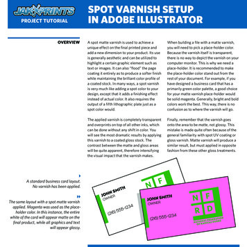
SPOT VARNISH SETUPIN ADOBE ILLUSTRATORPROJECT TUTORIALOVERVIEW A standard business card layout.No varnish has been applied. The same layout with a spot matte varnishapplied. Magenta was used as the placeholder color. In this instance, the entirewhite of the card will appear matte on thefinal product, while all graphics and textwill appear glossy.A spot matte varnish is used to achieve aunique effect on the final printed piece andadd a new dimension to your product. Its useis generally aesthetic and can be utilized tohighlight a certain graphic element such astext or images. It can also “flood” the pagecoating it entirely as to produce a softer finishwhile maintaining the brilliant color profile ofa coated stock. In many ways, a spot varnishis very much like adding a spot color to yourdesign, except that it adds a finishing effectinstead of actual color. It also requires theoutput of a fifth lithographic plate just as aspot color would.When building a file with a matte varnish,you will need to pick a place-holder color.Because the varnish itself is transparent,there is no way to depict the varnish on yourcomputer monitor. This is why we need aplace-holder. It is recommended to makethe place-holder color stand out from therest of your document. For example, if youhave designed a business card that has aprimarily green color palette, a good choicefor your matte varnish place-holder wouldbe solid magenta. Generally, bright and boldcolors work the best. This way, there is noconfusion as to where the varnish will go.The applied varnish is completely transparentand overprints on top of all other inks, whichcan be done without any shift in color. Youwill see the most dramatic results by applyingthis varnish to a coated gloss stock. Thecontrast between the matte and gloss areaswill be quite apparent, therefore intensifyingthe visual impact that the varnish makes.Finally, remember that the varnish goesonto the area to be matte, not glossy. Thismistake is made quite often because of thegeneral familiarity with spot UV coating orgloss varnish. Matte varnish will produce asimilar result, but must applied in oppositefashion from these other gloss treatments.
PROJECT TUTORIALSETUPSPOT VARNISH SETUPIN ADOBE ILLUSTRATORNow that you understand what the varnishdoes and how it is used, we can go over thesteps needed to add one to your files. Youwill first need to establish separate layersfor both your artwork and your varnish.Do this in the layers palette. You can alsoname these layers accordingly to avoid anyconfusion. This is not necessary to do beforeyou begin designing your project becauseyou can add and adjust layers at any time.The next step will be to create a specialcolor swatch that will represent the varnish.the color type to spot. Next, you will needto choose the place-holder color. Thiswill be the color in which the spot varnishis depicted on the computer monitor.Remember, this color will be swapped outwith the clear varnish when your files areprinted.To create your swatch, go to your Swatchpalette. If the palette is not open, you canfind it under Window Swatches. Enter thepalette submenu and select New Swatch.This will bring up a small window in whichyou can specify the color and swatch type.Name the swatch “VARNISH” and adjust The Swatches palette showing a spotvarnish swatch and several process colorswatches. The Swatch Options window. This is wherethe attributes of a color swatch are set. Forthe varnish swatch in this project, magentais used as the place-holder color.
PROJECT TUTORIALADDING VARNISHSPOT VARNISH SETUPIN ADOBE ILLUSTRATOROnce you have created your varnish layerand swatch, you can then add the varnishto your project. The way you implement thevarnish depends on what areas you want toappear glossy and which you want to appearmatte. You will notice the best results ifobjects that are meant to stand out are keptglossy while the negative space is appliedwith varnish. This will allow the graphicsto “pop” off the page and subdue the areaswhich are less important. A very simple wayto achieve this effect is by drawing a shapethat will encompass the entire area of theart board, including bleed.(Artwork outline added to show placement under varnish) Switch the varnish layer to be below theartwork in the stacking order. You will notice that doing this covers upall of your artwork, but you can removevarnish coverage on all graphic elementsby rearranging your layers. You can placeyour varnish layer behind the artwork layerby clicking and dragging it to the desiredlocation on the Layers palette. This layerorder will keep the artwork uncovered whilehaving the varnish on the white of the paper. All artwork is covered by the varnish layer.Bringing this layer below the artworkwill expose the artwork and removeapplication of the varnish.
SPOT VARNISH SETUPIN ADOBE ILLUSTRATORPROJECT TUTORIALADDING VARNISH, CONT. Black text on a white card. The spot varnishadds a new dimension to the design. The birdswill appear glossy on the final product. Theirshape is dictated completely by the varnish. The varnish placement, overprint preview, andunvarnished artwork compared. The arcs andbrackets around “Cerulean Industries” appearonly in the varnish layer and will be glossy onthe final product.If you decide to place varnish over anyareas with graphic elements, you willneed to make sure that the varnish is setto overprint. You can do so by selectingthe varnish shape and then accessing theAttributes palette through the Windowmenu. On the palette, there are two checkboxes. If your varnish consists of only afill color, check Overprint Fill and if only astroked object, check Overprint Stroke. Ifyour varnish has both a fill and stroke, makesure both boxes are checked. Setting yourvarnish object to overprint will make surethat your file prints correctly and everythingplaced under the varnish remains intact.To view the varnish overprint in your file,you can turn on Overprint Preview underthe View menu.The specific placement of the varnish is upto you. There are many different possibilitiesthat can be used to enhance your designs.Below are some examples of various varnishsetups. Of course, if you are unsure ofanything discussed in this tutorial or if youhave any other questions about the varnishsetup process, you can give us a call and wewill gladly help.
PROJECT TUTORIALSAVING & ORDERINGSPOT VARNISH SETUPIN ADOBE ILLUSTRATOROnce you are happy with the placement ofthe matte varnish, you can save out yourfile(s). Choose one of three file formats —EPS, PDF, or AI. Any one of these will keepyour art in vector layers, which means thefiles will not be flattened and will print atthe highest quality. Make sure that your filesare saved with a full 1/8” bleed and that allplaced images, if any, are embedded into thedocument. You will also need to outline allfonts if you do not plan to include the fontfiles separately.From here you can place your order andupload your files. When entering theproduct information, it is important tochoose 5/0 or 5/5 ink option to let usknow there will be a 5th spot plate in yourproject. In the Spot Ink field, enter “SpotMatte Varnish” so we know that is what youwould like included. It’s also recommendedthat you request a digital proof that can besent to you for your approval. This ensuresthat the varnish is placed exactly as youintended. Jakprints order form set to order a one-sided business cardwith a 5th spot ink—in this case, the spot matte varnish.
IN ADOBE ILLUSTRATOR A standard business card layout. No varnish has been applied. The same layout with a spot matte varnish applied. Magenta was used as the place-holder color. In this instance, the entire white of the card will appear matte on the final product, while all graphics and text will appear glossy.