Transcription
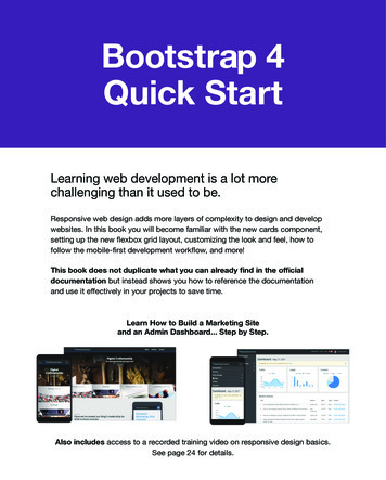
Bootstrap 4Quick StartLearning web development is a lot morechallenging than it used to be.Responsive web design adds more layers of complexity to design and developwebsites. In this book you will become familiar with the new cards component,setting up the new flexbox grid layout, customizing the look and feel, how tofollow the mobile-first development workflow, and more!This book does not duplicate what you can already find in the officialdocumentation but instead shows you how to reference the documentationand use it effectively in your projects to save time.Learn How to Build a Marketing Siteand an Admin Dashboard. Step by Step.Also includes access to a recorded training video on responsive design basics.See page 24 for details.
Want to improve the design ofyour website or web application?Learning HTML and CSS is a lotmore challenging than it used to be.Responsive web design adds morelayers of complexity to design anddevelop websites. In this book, you willbecome familiar with the new cardscomponent, using the new flexboxgrid layout, customizing the look andfeel, how to follow the mobile-firstdevelopment workflow, and more!Get Your rt/
The training documents were greatand got me started quickly. I wasable to jump into getting my websiteframework started.― Andrew Diaz, web developer new to BootstrapIt is clear and well structured. A goodstart for Bootstrap 4 beginners.― Uwe, web developer beginner
An excellent and concise introductionto Bootstrap 4. Includes completeexamples/code that is easily modifiablefor your own uses.― Pedrovski, web design beginnerThe book uses metaphors throughoutwhich helps make technical conceptsclear and easier to understand.― Max, Web developer new to Bootstrap
Bootstrap 4 Quick StartCopyright 2018 by Jacob Lett Published on June 28, 2018PublisherBootstrap Creative Sterling Heights, Michigan 48314 (586) 894-8024To report errors, please send an email to support@bootstrapcreative.comFind us on the web at: bootstrapcreative.comNotice of RightsAll rights reserved. Please do not distribute, share, or sell without the writtenpermission of the publisher. You may print pages for personal use. If you wouldlike to share this with a group, please contact support@bootstrapcreative.com.Notice of LiabilityThe information in this book is distributed on an "as is" basis without warranty.While every precaution has been made in the preparation of the book, neitherthe author nor Bootstrap Creative shall have any liability to any person or entitywith respect to any loss or damage caused or alleged to be caused directly orindirectly by the instructions contained in this book or by the computer softwareproducts described in it.TrademarksMany of the designations used by manufacturers and sellers to distinguish theirproducts are claimed as trademarks. Where those designations appear in thisbook, and Bootstrap Creative was aware of a trademark claim, the designationsappear as requested by the owner of the trademark. All other product names andservices identified throughout this book are used in editorial fashion only and forthe benefit of such companies with no intention of infringement of the trademark.No such use, or the use of any trade name, is intended to convey endorsement orother affiliation with this book. Bootstrap is released under the MIT license and iscopyright 2018 Twitter.ISBN: 978-1-7322058-1-9
ContentsINTRODUCTION1THE MOBILE WEB & BOOTSTRAP9WHAT’S NEW IN BOOTSTRAP 425THE DESIGN PROCESS47BUILD A HOMEPAGE53BUILD A DASHBOARD105RESPONSIVE LAYOUT TIPS155CONCLUSION175APPENDIX179
Dedicated to my wife Colleen.Thank you for your persistent love and encouragement.Thank you!I would like to thank the following for their advice and support with this project:Greg Vance, Dan Joseph, Max, and my encouraging parents. Marcus and Joshua thankyou for your patience as your Dad was working on this project. Also my mentors for theirwisdom and inspiration: Zig Ziglar, Dan Miller, Seth Godin, and Matthew 25:14-30.Finally, thank you reader for purchasing this book.My hope is to help you be successful in your web development projects and career.About the AuthorJacob Lett is the author of the Bootstrap 4 Quick Start, and theBootstrap Reference Guide. His books and training help web developerssave time learning how to design and build responsive websites.www.linkedin.com/in/jacoblett/
Introduction1
IntroductionDo you remember learning how towrite a research paper?Perhaps you learned how to follow the MLAor APA Style Guide. Think how different the reportswould look if each student made up their own styleand format?Using the MLA Style guaranteed consistency for anyone who followed that same formateven if they were thousands of miles away or written five years apart.I believe Bootstrap works the same way for web design. It helps developers work moreefficiently and write CSS in a clean and consistent manner regardless of where you live orwho you work for.It also ensures your website adheres to a mobile first approach and works well acrossbrowsers and devices.I am convinced Bootstrap will greatly improve how you build websites and save youcountless time. So if you’re ready, let’s get started.2 : Bootstrap 4 Quick Start
IntroductionHi.My name is Jacob Lett and it’s my missionto help you save time learning how todesign and build responsive websites.I earned a bachelors degree in graphic design around the time CSSand web standards were just starting to take hold. Out of frustrationnot knowing how to fix broken websites generated by Dreamweaver,I learned how to hand code HTML/CSS. Then in 2009 I got my first jobas a web designer writing a ton of CSS and realizing I had a long journeyof learning ahead. www.linkedin.com/in/jacoblett/BootstrapCreative : 3
IntroductionInitial SetupBefore we begin, we need to make sure you have allof the necessary software and tools installed on yourcomputer. So let’s get started.1. Install Google ChromeI recommend testing your sites in Google Chrome because of their nice set of DevTools tohelp you debug problems and inspect CSS styles and HTML elements. If you do not havethis it installed you can do so here[1].In my Bootstrap 4 Toolkit,[2] I include a tutorial video titled Inspect and Test CSS thatdemonstrates how to use Chrome DevTools.2. Install Chrome ExtensionsThese are optional but very helpful.live.js ExtensionInstall the live.js Chrome extension[3] to toggle the ability to automatically reload yourbrowser when you make code changes. Or you can manually add the script found athttp://livejs.com/.Web Developer ExtensionInstall the Web Developer Chrome extension[4] to help you test responsive breakpointsand perform other developer focused s://bootstrapcreative.com/webdevchrome4 : Bootstrap 4 Quick Start
Introduction3. Setup a Local Testing ServerIf you are new to web servers, a local server is on your desktop/laptop and a remoteserver is located someplace else accessible via SFTP. Web servers are just big computerswith software installed for the sole purpose of hosting websites and data. The benefitof having a local test server is you can eliminate the step of transferring changed filesto a remote server and avoid the public seeing your unfinished work.The easiest way to start testing sites locally is using a tool called XAMPP onwindows or MAMP on a mac. It lets you run PHP, apache, and even phpMyAdminfor MySQL database configuration. Commonly referred to as the LAMP web stack[5]of bundled software.WindowsInstall XAMPP[6] following theinstructions in this guide. It iswritten for WordPress users soyou can ignore the part of settingup a database and installingWordPress. You want the abilityto make HTTP requests (oraccess files on other servers).I created this video tutorial[7]on how to install XAMPP onWindows 10.567https://en.wikipedia.org/wiki/LAMP (software eative : 5
IntroductionMacInstall MAMP[8] following the instructions in this guide. It is written for WordPress users soyou can ignore the part of setting up a database and installing WordPress. You want theability to make HTTP requests (or access files on other servers).LinuxInstall Mongoose Binary[9]. A really light weight server ideal for web design testing.4. Install a Code Text EditorInstall a code text editor so you can benefit from code syntax coloring and other featuresthat make the job of writing code easier. There are a lot of editors available and it comesdown to your preference.I personally use Visual Studio Code because it’s free, cross platform, and works reallywell without having to add a lot of addons.Below are some other popular code editors available: Atom (free, cross platform): https://atom.io/ Brackets (free, cross platform): http://brackets.io/ Dreamweaver (paid, cross platform): http://www.adobe.com/products/dreamweaver.html Notepad (free, Windows only): https://notepad-plus-plus.org/download/v7.3.3.html TextWrangler (free, mac only): nload.html Visual Studio Code (free, cross platform): https://code.visualstudio.com/ Other editors: https://en.wikipedia.org/wiki/Source code editor#Some wellknown source code https://www.cesanta.com/products/binary6 : Bootstrap 4 Quick Start
Introduction5. Mobile First Desktop WorkspaceNext, open up your Chrome web browser then press F12 to open Chrome DevTools. Next,press CTRL SHIFT D (win) or CMD SHIFT D (mac) to move the dock to the right side ofyour browser window.Reference for all of Chrome DevTools shortcuts: tools/shortcutsThen move your text editor window to the left half of your screen and your browser to theright half of your screen using the keyboard shortcuts WIN and WIN (win) you willneed to adjust the windows manually on a mac.Start coding/testing mobile first - Your screen should now look like this.BootstrapCreative : 7
FREE Cheat Sheets BundleDo you have trouble remembering all of the Bootstrap class names?Includes the following three references:Bootstrap 4 Cheat Sheet Flexbox Cheat Sheet CSS3 Cheat Sheethttps://bootstrapcreative.com/b4bundle8 : Bootstrap 4 Quick Start
The Mobile Web & Bootstrap9
The Mobile Web and BootstrapBuilding websites today is a lot more challengingand time consuming than it used to be.Some of my first websites were first designed in Adobe Photoshop, exported to HTMLtables (yes tables) and then linked together with Adobe Dreamweaver . If your website didnot exceed the width of common monitor resolutions (1024px by 768px) everything wouldwork out fine.Web standards[1] were quickly introduced because using table markup for grid layout isjust bad practice. So HTML tables were replaced with floated divs and tag markup thathad meaning – referred to as semantics. This also shifted things away from the majorityof the visual design being baked into images and now relying on CSS3 to create borders,shadows, rounded corners, etc.The first widely used CSS grid system was the 960 grid system (Fig. 1) created by NathanSmith. This 12,16, 24 column grid system was designed to work well for a fixed desktopresolution of 1024px x 768px. This grid system was widely used and helped designersand developers work from the same grid pixel dimensions.Fig. 1: The 960 grid system helped bring consistency between grid design inPhotoshop and the signing With Web Standards10 : Bootstrap 4 Quick Start
The Mobile Web and BootstrapThen in 2007, Steve Jobs introduced the world to the iPhone with Multi-Touch gestures[2].Now people could access websites anywhere using just their fingers.Web designers and developers had to quickly develop creative solutions to work withinthe new constraints presented by smartphones and tablets.These Constraints Include: Smaller screens Increased pixel densities with retina displays Ability to switch between portrait and landscape orientation Multi-touch gestures Slower data connections Distracted user attention (one eyeball and one thumb).At the start, the concept of responsive design did not exist. And so mobile devices had toscale down websites to fit the smaller screens. For the user, in order to read the text theywould have to double tap the screen or pinch and zoom.Website owners quickly realized it was not a good experience to display their homepageat a zoomed in level. The meta tag below was introduced to remove this default scalingand give the site creator more control. When this meta tag is added to the head of apage, it instructs the web browser to scale the document 100% to prevent pinch/zoomon mobile. meta name "viewport" content "width device-width, initialscale 1" eative : 11
The Mobile Web and BootstrapDifferent Mobile StrategiesMobile ApplicationsOne approach is to build a dedicated experience as a mobile app. This gives thedeveloper the most control and could utilize the device user interface componentsand to help with navigation. Major drawbacks include: it requires an app developer,considerable amount of marketing to direct existing traffic to download the mobile app,and overcoming low rates of user adoption. Also, any links to outside pages requiredthem to open in a web browser window.Adaptive DesignAnother approach is to build multiple versions of a website and use server side detectionto then present custom code for that device or viewport size.You could decide to have your mobile site on a separate domain for example m.domain.com. The server will then automatically serve al
28.06.2018 · In my Bootstrap 4 Toolkit,[2] I include a tutorial video titled Inspect and Test CSS that demonstrates how to use Chrome DevTools. 2. Install Chrome Extensions These are optional but very helpful. live.js Extension Install the live.js Chrome extension[3] to toggle the ability to automatically reload your browser when you make code changes. Or you can manually add the script found at