Transcription
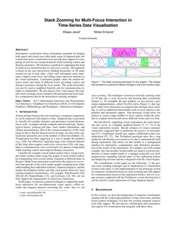
Stack Zooming for Multi-Focus Interaction inTime-Series Data VisualizationWaqas Javed Niklas Elmqvist†Purdue UniversityA BSTRACTInformation visualization shows tremendous potential for helpingboth expert and casual users alike make sense of temporal data, butcurrent time series visualization tools provide poor support for comparing several foci in a temporal dataset while retaining context anddistance awareness. We introduce a method for supporting this kindof multi-focus interaction that we call stack zooming. The approachis based on the user interactively building hierarchies of 1D stripsstacked on top of each other, where each subsequent stack represents a higher zoom level, and sibling strips represent branches inthe visual exploration. Correlation graphics show the relation between stacks and strips of different levels, providing context anddistance awareness among the focus points. The zoom hierarchiescan also be used as graphical histories and for communicating insights to stakeholders. We also discuss how visual spaces that support stack zooming can be extended with annotation and local statistics computations that fit the hierarchical stacking metaphor.Index Terms: H.5.2 [Information Interfaces and Presentation]:User Interfaces—Graphical User Interfaces (GUI); I.3.6 [ComputerGraphics]: Methodology and Techniques—Interaction techniques1 I NTRODUCTIONAlmost all data found in the real world have a temporal component,or can be analyzed with respect to time. Temporal data is prevalentin virtually all scientific domains, and permeates societal phenomena as well—examples include computer and network logs, chronological history, political poll data, stock market information, andclimate measurements. One of the common properties of this widerange of data is that the datasets tend to be large, not only in the captured time period but also in the number of observed attributes [2].Visualization has been suggested as a way to handle this problem(e.g., [18]), but effectively exploring large-scale temporal datasetsof this kind often requires multi-focus interaction [10]—the capability to simultaneously view several parts of a dataset at high detailwhile retaining context and temporal distance awareness.Consider for example a stock market analyst who is trying to predict future market trends using line graphs of stock market indicesby extrapolating from several similar situations at different times inthe past. Multi-focus interaction would allow the analyst to see several time periods of the stock market graphs simultaneously whileunderstanding their individual relations, temporal distances, and themarket developments before and after each period. However, mostexisting temporal visualizations—for example, TimeSearcher [18],ATLAS [9], PatternFinder [13], and LifeLines [24, 38]—do notfully support the requirements of multi-focus interaction.In this paper, we present a general technique to supporting multifocus interaction for one-dimensional visual spaces—which includes the temporal datasets motivating this work—that we callFigure 1: The stack zooming technique for line graphs. The analysthas focused on a period of radical changes in the main timeline (top).stack zooming. The technique is based on vertically stacking stripsof 1D data into a stack hierarchy and showing their correlations(Figure 1). To exemplify the new method, we also present a prototype implementation, called T RA X PLORER (Figure 2), that supports multi-focus interaction in temporal data through stack zooming, as well as additional functionality such as local statistics computation and annotation support. Our prototype would allow ouranalyst to create a large number of focus regions within the timeline to compare between and across different stocks and over time.Beyond directly supporting visual exploration, the stack hierarchy also serves as a tangible graphical history [7, 17, 31] of thevisual exploration session. Recent advances in visual communication have suggested that to ameliorate the process of sensemaking [27], visualization should also support collaboration and communication [35, 37]. Our TraXplorer prototype takes this a stepfurther by introducing a presentation tree that is automatically builtduring exploration, and which can then double as a managementinterface for annotations, computations, and, ultimately, presentation of the results of the exploration. To complete our stock marketexample, this functionality would enable our analyst to present predictions of future market trends to a manager using the tool itself,progressively expanding selected parts of the exploration historyand displaying relevant statistics integrated with the visual display.The contributions of this paper are the following: (i) the general stack zooming technique and its implications to visualizationof time-series data; (ii) the implementation of our prototype systemfor temporal visualization based on stack zooming and with supportfor communication based on the exploration history; and (iii) a usage scenario conducted with the TraXplorer system showing how itcan be used for visual exploration of a large financial dataset.2BACKGROUND e-mail:wjaved@purdue.edu† e-mail: elm@purdue.eduIn this section, we give the background of temporal visualization,starting with the visual representations of time-series data, and thenfocus context techniques [15] that few existing temporal analysistools fully support. We also discuss collaboration and communication aspects for visualization that integrate with these ideas.
Figure 2: Stack zooming in a stock market dataset using TraXplorer. The horizon graph segments are arranged in a stack hierarchy that wasbuilt during visual exploration. The exploration and presentation interface of the tool is also visible on the right side of the image.2.1Time-Series VisualizationIn the last two decades, a large number of research papers have beenpublished related to visualization of time-series datasets—relevantsurveys include [22, 32]. During this time, temporal visualizationhas evolved from basic timeline graphs [36] (some of these datingback hundreds of years), through becoming a novel approach forusing visualization as a problem solving technique [7], and finallyto encompass design considerations of sophisticated systems likeATLAS [9] for visualizing massive time-series datasets.Correspondingly, considerable research efforts have been directed towards developing methods for interactive visual exploration of time-series data; here follows a representative sampling.The Perspective Wall [20] presents temporal data using a 3D rendering that incorporates a natural focus context [15] perspectivedistortion. LifeLines [24] was one of the early systems that used visualization to explore discrete events in personal histories. Wang etal. [38] recently presented a follow-up to the original LifeLines system as a support for electronic health records. TimeSearcher [18]is a time-series visualization tool that uses timeboxes to generatevisual queries to explore the datasets. PatternFinder [13] providesan interface for querying temporal data of medical records. Continuum [4] is a Web 2.0 tool for faceted timeline browsing. Mostrecently, LiveRAC [21] is an interactive visual exploration environment for time-series data for system management.All of these projects concentrate mainly on interactive exploration of time-series datasets. However, beyond standard low-levelvisualization tasks [3], temporal visual exploration often require attention to the special properties of the time dimension [1, 2]. Inparticular, additional important temporal analysis tasks include [4]support for (a) dynamic temporal hierarchies, (b) across-concept relationships, and (c) large-scale overviews. Few of the above timevisualization tools, with the exception of LiveRAC [21] and Continuum [4], explicitly support all of these requirements.2.2Supporting Multi-Focus InteractionWe argue that the temporal analysis tasks discussed above can begeneralized to the concept of multi-focus interaction [11]. Multi-focus interaction is a conceptual framework that integrates multiplefocus context [15] views with guaranteed visibility to support bothfocus, context, and distance awareness. This is the approach takenby the LiveRAC system, implemented using the Accordion Drawing framework [23, 33] for guaranteed focus visibility. In this paper,we take a different approach to multi-focus interaction compared toLiveRAC: instead of using a single integrated view with visual distortion, we take advantage of the one-dimensional nature of the datato present hierarchies of undistorted visualization strips.A number of general techniques have evolved to support multifocus interaction, e.g., split-screen [30], fisheye views [15], andspace-folding [11], etc. However, none of these techniques wasoriginally developed for the exploration of time-series data. TheContinuum faceted timeline browser [4] implements the above extended temporal tasks, but provides only one level of overview ofthe timeline, meaning that detail and context awareness is limited.Two existing systems are of particular relevance to the stackzooming technique presented in this work. The multi-resolutiontime slider for multimedia data presented by Richter et al. [25] usesa hierarchical zoom stack similar to ours, but their work is primarilyan interaction technique for selecting single time periods in a hierarchical fashion and does not support multiple focus points. The ideawas also not designed for visual exploration. Second, the multipage zooming technique presented by Robert and Lecolinet [26]defines a hierarchical zooming technique similar to our stack zooming, but is defined for hypertext document graphs and has a differentpresentation approach compared to us.2.3Supporting Communication and CollaborationAdvances in visualization research have showcased the power ofcollaboration to amplify sensemaking [27] and enable distributedcognition [19] in a team of analysts, but collaboration requires astrong communication component to disseminate insights acrossparticipants [35, 37]. Communication-minded visualization [37] isalso important in its own right for ultimately disseminating the results of visual exploration to stakeholders outside the analysis team.A recent approach in human-computer interaction has been to
(a) Main strip showing the whole dataset (June (b) Creating a child strip for Black Monday (Octo- (c) Creating a second child strip for the Asian fi1986 to December 1997).ber 19, 1987).nancial crisis (starting July 1997).Figure 3: Stack zooming in the Hongkong stock market index dataset. Transitions between views are animated, and the space-filling layoutalgorithm ensures that the whole space is used optimally.utilize automatically captured interaction histories as a means offostering awareness of your own (e.g. [8]) and your team’s (e.g. [6])activities. Self and group awareness is a big research topic that isoutside the scope of this article. We concern ourselves with the specific use of visual exploration histories to support communication.Branching interaction histories for visualization that capturemultiple exploration paths were introduced as early as in the GRASPARC [7] system, and was recently utilized to great effect byShrinivasan and van Wijk [31] for a scatterplot visualization. Theirtool consists of a data view, a navigation view, and a knowledgeview. However, their history mechanism stores all interactions in avisual exploration system, which can be a large and complex datasetwith no real connection to the useful outcome from the analysis. Incontrast, Heer et al. [17] use linear (non-branching) graphical histories in the Tableau (formerly Polaris [34]) system. Their eventcompression scheme is interesting, but the mechanism focuses onindividual analysts and thus does not support using the history as astarting point for communicating analysis results to stakeholders.Color-coded frames for the child strips and correspondinglycolor-coded selection areas in the parent strips show the correlation between parents and children, as well as provide interveningcontext and distance awareness between the focus points. Dragginga selection area in a parent strip will pan the connected child strip,and children can be panned directly by using the arrow keys. In thisway, users can quickly explore the temporal dataset with a sequenceof simple zoom and pans while retaining multi-focus support.In the example in Figure 3(a), the user is studying a financialdataset of the Hong Kong stock exchange (HNGKNGI) from June1986 to December 1997. He first creates a child strip for the BlackMonday crash of October 19, 1987 by dragging on the main strip(see Figure 3(b)). Then, interested in comparing this crash to theAsian financial crisis in 1997, he creates a second child strip centered around the period July to October, 1997 (Figure 3(c)). A continued description of this usage scenario can be found in Section 5.3 S TACK Z OOMINGConsider a user trying to use line graph visualizations (Figure 4) toanalyze a large-scale temporal dataset. Because such datasets oftencontain more data points than can be fit on the screen, the user willneed to zoom and pan in the line graph to see details necessary tosolve a particular task. However, using just a sequence of zoom andpan actions to support higher-level temporal analysis tasks such ascomparison and correlation over time [2, 4], both between differenttime series and within the same time series, will quickly becometedious and ineffective [15, 16].The basic structure in stack zooming is a hierarchical zoom stack (orZ-stack)1 . The zoom stack describes the layout of the hierarchy offocus regions, orthogonal to the underlying visual representation.In other words, the zoom stack can manage any one-dimensionalvisual space. Just like any other tree, a Z-stack is defined by asingle root node r containing all of the nodes of the tree.The Z-stack structure supports all basic tree operations such asfinding the depth of individual nodes, the depth of the whole tree,the number of children, as well as all standard tree traversals.Nodes in a zoom stack are called zoom nodes (Z-nodes). A singleZ-node n captures a single strip (a focus region in the 1D visualspace) in the stack zooming technique. Thus, the node n consistsof a range [e0 , e1 ] describing the extents of the focus region in datadimension space, a alloc factor describing the layout allocation forthis particular node on the screen (width or height, depending onthe orientation of the space), a parent node p, and an ordered list ofchild nodes C. In our particular application, the data dimension istime and the visual representations are temporal visualizations, butstack zooming can be applied to any one-dimensional visual space.Screen allocations (alloc) are specified as scale-independent ratios of the full allocation of the whole zoom stack. This measure,along with the node order in the list of children for the parent, governs the actual screen location of the node when it is visualized.Note that the technique does not stipulate the layout of the zoomstacks on the screen; in our examples so far, layers are stacked ontop of each other (so the space allocation is a ratio of the horizontalspace), but we will show a horizontal layout in Section 6 (wherespace allocations accordingly are ratios of the vertical space).Figure 4: Two time-series datasets visualized as line graphs.With the stack zooming technique, the available display space issplit evenly among the currently visible line charts, or strips, thatshow subsets of the time-series dataset. When the user begins toanalyze the dataset, the whole display is taken up by the full timeseries drawn as a line visualization on a single strip. Using a mousedrag on the surface of this strip, the user can create a child stripof the main strip that displays the selected subset of the time data.Additional zoom operations on the main dataset strip will createadditional children in the zoom stack, all of them allocated an equalamount of the available display space for that particular level (spaceallocations can be changed by dragging the borders of a strip). Eachchild strip serves as a focus, and is guaranteed to always be visible.3.1Zoom Stacks1 Notethat zoom stacks are trees and not linear lists, like normal stacks.
3.2LayoutNodes in a zoom stack are laid out on the visual 2D substrate usinga space-filling layout (Figure 5) that splits the vertical space by thedepth of the tree (assigning an equal amount to each tree level), andthe horizontal space by the number of siblings for each level of thetree (assigning an equal amount to each sibling). At any point intime, the user is able to change the layout allocations by draggingthe borders of individual strips. As discussed above, the layout mayalso be reversed, using horizontal space for stacking layers in thetree and vertical space for siblings for each level.Figure 5: General layout mechanism for stack zooming. Color-codedzoom areas and corresponding colored frames show parent-child relationships, and visual arrows make the relations explicit.The ordering of child strips for each level may be significant forthe purpose of conveying the relative positions of the displayed intervals of a time series to the user. Therefore, the layout managerwill always order child strips for each level in the zoom stack to bethe same as the order of their intervals on the parent strip. Overlapping intervals, such as when moving focus points, is a specialcase—see Section 3.4.To preserve the tree structure of the zoom stack, one design alternative is to not divide space equally across siblings of each level ofthe zoom stack, but rather to assign space to whole subtrees. Thiswould mean that each child would have to stay within the extents ofits parent. This would give an explicit indication of the parent-childrelationships between strips in adjacent levels, and thus decreasethe need for explicit correlation graphics (discussed next). However, we found that because visual exploration using stack zooming often results in unbalanced zoom trees, this design would resultin suboptimal use of the available screen space. Therefore, globalspace allocation across each level is a better solution.3.3Correlation GraphicsIf we are to retain focus, context, and distance awareness for a visual space supporting stack zooming, we need to make explicit therelationship between parent strips and child strips in adjacent levelsof the zoom stack. However, as argued above, we cannot directlyshow ancestor relationships in the layout, or we may waste valuablescreen space. Therefore, we introduce correlation graphics that visually indicate the relationships between parents and children.The correlation graphics take several forms (see Figure 5): Color-coded zoom areas: Parent strips show color-coded(but semi-transparent) selection areas that indicate the position and extents of each child strip in the time series. Theseareas can also be interacted with, see the next section. Color-coded strip frames: Child strips have color-codedframes that correspond to the color of its selection area in theparent. This gives a visual link between parent and child. Correlation links: For a complex visual exploration session,the above two graphics may not be sufficient to quickly understand the correlation structure in the zoom stack. We introduce explicit correlation links drawn as arrows from zoomareas in parents to the respective children. In an effort to minimize visual clutter, an implementation may choose to exposethese arrows as a transient overlay.3.4 NavigationOne of the basic requirements of effective temporal exploration isto allow the user to navigate the focus points through the dataset.We have already described the zoom functionality, which for stackzooming—unlike traditional visualization applications—is not anavigation operation in itself, but used to create new focus regions.Therefore, the zoom operation is intrinsic to stack zooming.Instead, the main navigation operation is panning—or moving—a focus point. In our technique, moving a focus point can either bedone by dragging the zoom area selections in a parent strip, or bypanning a child strip directly, such as using the arrows keys, or bya dragging mouse gesture at the left and right border of the strip.Moving a child strip may give rise to a special layout case whenthe interval covered by one strip overlaps that of another strip. During overlap, the layout will not be changed to maintain stability ofthe display, but if the temporal order of two strips change as a result of a navigation operation (i.e. a pan), the layout will switch therelative position of the two affected strips. Overlapping has special potential for reinforcing the awareness of a user navigating inthe time series by merging adjacent child strips when their intervalsoverlap. Figure 6 gives a schematic overview in both layout andtemporal space of this operation. However, strip merging requiresthat all zoom strips in a stack level cover the same length of intervalW e1 e0 (i.e., all strips should use the same zoom factor), orvisual stability of the display will not be maintained. Therefore, itmay not be practical for all applications.4 T HE T RA X PLORER S YSTEMThe T RA X PLORER system is a time-series visualization tool supporting multi-focus interaction using the stack zooming techniqueintroduced in this paper. Time series are represented as multipletracks, hence the name of the tool. The system was designed tosupport a communication-minded [37] iterative workflow processdepicted in Figure 7 where there are three phases involved: individual exploration, collaboration within the analysis team, and dissemination to external stakeholders. For the TraXplorer tool, this isrealized in the following ways (explained in subsequent sections): Exploration: An individual analyst, or potentially a numberof analysts, use the stack zooming technique to explore complex time-series dataset in the tool and gain insights about thedata (Section 4.1). Here, the zoom stack doubles as a branching exploration history graph [7, 31]. Collaboration: The analyst uses the zoom stack as an exploration history to communicate progress and insights to othermembers of the analysis team (Section 4.2). The analysis process can now be continued, potentially by other analysts, bybacktracking to the exploration phase. We provide a methodfor pruning, annotating, and calculating local statistics for individual strips or subhierarchies in the exploration history. Dissemination: Insights gained during the internal exploration and collaboration phases are presented to externalstakeholders (Section 4.3). The TraXplorer tool has a dissemination mode using the standard visual representations wherethe branching exploration history is linearized into a sequence(akin to a slide show) to better support communicating insights to non-experts while retaining the link to earlier stages.
Figure 6: Layout and temporal view of merge operations for strips during temporal overlap. (a) Two strips, A and B, at time positions T 1 and T 2,respectively, and both of interval width W are approaching. (b) Temporal overlap between A and B, causing the layouts to merge into a singlestrip. To maintain the same combined layout size on the visual space, all temporal overlap is added to the beginning of the combined interval.(c) B has now passed A and there is no longer a temporal overlap, so the strips are separate and with correct temporal order in layout space.Figure 7: Communication-minded workflow for TraXplorer.The above workflow process gives a clear path from explorationto dissemination [35], and bridges the gap between visualizationtools and traditional presentation tools such as MS PowerPoint.4.1Visual ExplorationThe TraXplorer exploration interface (Figure 2) consists of the mainvisualization window, the data box for getting details and statisticsabout the dataset, and the layer control box for managing the visualdisplay of the time series data. TraXplorer was designed for loadingseveral tracks of time-series data (defined as comma-separated files,or similar) into the same visual space.The main visualization window is a visual space supporting stackzooming. It contains a set of visualizations of time-series data ona common time axis and potentially different value axes. The typeof visualization is independent of the layout management—our implementation currently supports basic line graphs, filled line graphs,and horizon graphs [14]. For line graphs, multiple time series willbe drawn as tracks overlaid on the same temporal axis, whereas forfilled line graphs and horizon graphs, the charts will be juxtaposed.To help manage multiple tracks, the layer control box can beused to move, to delete, and to toggle the visibility of individualtracks, as well as to change color mapping, transparency, and tracktitle. Furthermore, using the layer control, two or several tracks canbe linked to use the same scale for the value (Y) axis, thereby supporting direct comparison of values across tracks. If tracks are notlinked, they will be scaled to use the whole vertical space of eachvisualization strip, independent of other tracks (useful for comparing trends rather than absolute values). Layer control is also usedto determine which track should be used for the value axis labels.Our implementation of the stack zooming technique for the mainvisualization window allows the user to explore time series databy building zoom stacks. More specifically, the user can drag themouse on a visualization strip to define a time interval. This willcreate a child strip for that interval in the zoom stack. Colorcoded correlation graphics show the relationship between parentand child. Dragging the time window graphic in a parent will panthe corresponding child a corresponding amount. Each strip has additional decorations to allow for maximizing the size of a specificstrip on the layout space, hiding it (see below), as well as deleting it.Deleting a strip will delete all of its children. Furthermore, draggingthe border of a strip enables directly resizing its space allocation.To further support visual exploration, we also provide a data boxthat gives local statistics about the currently selected strip in thezoom stack. This provides detail-on-demand for computing measures such as minimum, maximum, average, median, and standarddeviation metrics for a particular track. The data box also doublesas a presentation tool; this is discussed more closely in the next section. In addition, users can always hover their pointer over a timeseries point to retrieve exact data about the point in a tooltip.4.2 CollaborationThe TraXplorer objective is to support an analyst communicating insights gained during an individual exploration session to thewhole team, while allowing for continuing the exploration in collaborative mode, or iterating back to individual exploration (by thesame analyst or another) after conferring with other team members.In other words, for this setting, the analyst will need support fromthe visualization tool for a semi-structured presentation, while atthe same time being able to continue visual exploration at any time.The zoom stack already captures the exploration history, and wereinforce this by providing a presentation tree (top right in Figure 2)that maintains a hierarchical representation of the zoom stack. Thisapproach is similar to the branching exploration histories of GRASPARC [7] as well as of Shrinivasan and van Wijk [31].In our work, we take the history concept a step further by utilizing the history as a starting point for creating a presentation of theexploration. The analyst can prune, move, or hide individual nodes(i.e. child strips) in the presentation tree to refine the presentation,while at the same time being able to extend the presentation by continuing exploration at any time, even during the actual presentation.This feature is important to allow transitioning between explorationand presentation. Also, by selectively hiding and showing parts ofthe zoom stack using the presentation tree interface, analysts canbetter structure their narrative while presenting their results.4.3 External DisseminationFinally, there comes a point when the results collected by an analystteam must be communicated to the external, and often non-expert,stakeholders [37]. Our aim with TraXplorer was to bridge the gapbetween the visualization tool and the presentation tool, eliminatingthe need to, for example, cut and paste visualization images intotraditional presentation applications like Microsoft PowerPoint.Instead, the analyst (or the team of analysts) can use the exploration history contained in the presentation tree to linearize thecombined exploration sessions of the data, i.e., to create a linearsequence of views similar to a slideshow presentation suitable forpresentation to the audience. Because stakeholders may not be experts in data analysis, TraXplorer allows for hiding the exploration
interface entirely, and instead just show the visualizations (standardline graphs) in fullscreen mode. The analyst can still revert back tothe whole branching exploration history, even during a presentation.Mere images may not be enough for an effective presentation,so the data box that supports details-on-demand in the explorationphase also doubles as an annotation mechanism. Checkboxes in thedata box for each computed and user-supplied metric (i.e. annotation) allows the user to toggle display of these metrics on the actualvisualization strip. In other words, this functionality can add localstatistics—such as a key, the extrema, or the average of a particulardata track—to the visual display of the track.4.4Implementation NotesThe T RA X PLORER system was implemented in Java using the Piccolo2 str
Branching interaction histories for visualization that capture multiple exploration paths were introduced as early as in the GRAS-PARC [7] system, and was recently utilized to great effect by Shrinivasan and van Wijk [31] for a scatterplot visualization. Their tool consists of a data view, a navigation view, and a knowledge view.