Transcription
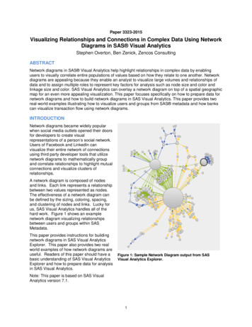
Paper 3323-2015Visualizing Relationships and Connections in Complex Data Using NetworkDiagrams in SAS Visual AnalyticsStephen Overton, Ben Zenick, Zencos ConsultingABSTRACTNetwork diagrams in SAS Visual Analytics help highlight relationships in complex data by enablingusers to visually correlate entire populations of values based on how they relate to one another. Networkdiagrams are appealing because they enable an analyst to visualize large volumes and relationships ofdata and to assign multiple roles to represent key factors for analysis such as node size and color andlinkage size and color. SAS Visual Analytics can overlay a network diagram on top of a spatial geographicmap for an even more appealing visualization. This paper focuses specifically on how to prepare data fornetwork diagrams and how to build network diagrams in SAS Visual Analytics. This paper provides tworeal-world examples illustrating how to visualize users and groups from SAS metadata and how bankscan visualize transaction flow using network diagrams.INTRODUCTIONNetwork diagrams became widely popularwhen social media outlets opened their doorsfor developers to create visualrepresentations of a person’s social network.Users of Facebook and LinkedIn canvisualize their entire network of connectionsusing third party developer tools that utilizenetwork diagrams to mathematically groupand correlate relationships to highlight mutualconnections and visualize clusters ofrelationships.A network diagram is composed of nodesand links. Each link represents a relationshipbetween two values represented as nodes.The effectiveness of a network diagram canbe defined by the sizing, coloring, spacing,and clustering of nodes and links. Lucky forus, SAS Visual Analytics handles all of thehard work. Figure 1 shows an examplenetwork diagram visualizing relationshipsbetween users and groups within SASMetadata.This paper provides instructions for buildingnetwork diagrams in SAS Visual AnalyticsExplorer. This paper also provides two realworld examples of how network diagrams areuseful. Readers of this paper should have abasic understanding of SAS Visual AnalyticsExplorer and how to prepare data for analysisin SAS Visual Analytics.Figure 1: Sample Network Diagram output from SASVisual Analytics Explorer.Note: This paper is based on SAS VisualAnalytics version 7.1.1
UNDERSTANDING DATA FOR NETWORK DIAGRAMS IN SAS VISUAL ANALYTICSIn the world of analytics, everything starts and ends with the data. Network diagrams require that thedata is structured with either hierarchical or ungrouped node-link pairs. If this requirement is met, networkdiagrams can easily be generated and designed to provide intuitive analysis.There are two types of networks in anetwork diagram: Hierarchical – uses a standardhierarchy structure of categoricalvalues. Ungrouped – uses a traditional nodelink, or source and target data values.In most cases, data structures will fall intoone network type easier than the other.Figure 2 shows how to select the networktype in SAS Visual Analytics Explorer.HIERARCHICAL NETWORKThe hierarchical network type is based on aset of categorical variables that make up aclassic hierarchy. This is the most commondata format and easiest to utilize.Traditional hierarchies follow a logical pathdown a related set of fields. For example, alocational hierarchy may contain onlygeographical attributes like country, state,city, and zip code. Due to the nature ofnetwork diagrams and visual capabilities,traditional hierarchies can expand andcombine unrelated attributes to formcomplex networks.Figure 2: Selecting Network type in SAS Visual AnalyticsExplorer.A basic hierarchical network diagram must contain, at a minimum, a 2-level hierarchy. This paperprovides a real world example, which uses a 2-level hierarchy for simplicity. The nature and complexity ofthe data will drive how deep (i.e. the number of levels) hierarchies will go. Hierarchies traditionally camefrom OLAP “drill down” functionality through a particular subject area within the data. However, networkdiagram hierarchies expand beyond drilling down or into data by adding visual context to the relationshipsbetween members of the levels within a hierarchy. Think of a hierarchical network graph as a fullyexpanded hierarchy of values showing the relationship of all possible members within a given hierarchy.Figure 3 shows an example of hierarchical data.Figure 3: Example of hierarchical data for a network diagram.2
UNGROUPED NETWORKAn ungrouped network consists of “source” and “target” values that represent the relationships orconnections between nodes. SAS Visual Analytics Explorer visualizes ungrouped networks by displayinga node for each value of a source data item, then linking another node corresponding to the target value.One way to think of the structure of ungrouped data is to consider records as conceptual objects thathave parent associations. All possible values should exist as objects, even parent nodes that do not haveany additional connections. These are referred to as terminal objects because they have no target orparent node to reference. Figure 4 shows an example of ungrouped data. Records with no parent valuesare terminal records. These are necessary to complete an ungrouped network diagram.Figure 4: Example of ungrouped data for a network diagram.HOW TO BUILD A NETWORK DIAGRAM IN SAS VISUAL ANALYTICS EXPLORERLike many visualizations in SAS Visual Analytics, it is very easy to produce a network diagram. Beforebuilding a network diagram, the data must fit into the roles required in order to produce the networkdiagram. In other words, the structure of source data must contain valid columns in order to berepresented on a network diagram.To create a network diagram, select “Network Diagram” from either of the Visualization menus shown inFigure 5 below.Figure 5: Creating a Network Diagram in SAS Visual Analytics Explorer.As described earlier, begin your analysis by understanding the source data and select the proper networktype to display using the Roles tab on the right.3
NETWORK DIAGRAM ROLESDrag and drop data items from the left into respective roles on the right. Hierarchical network types havedifferent roles than ungrouped network types. Use categorical hierarchy levels in the Levels role to buildhierarchical networks. Use source and target data items in the respective Source and Target roles tobuild ungrouped networks.In addition to building the basic network, you can also specify node size and color as well as link size andcolor. These are especially useful for highlighting key facts about nodes and relationships of nodes usingdiscrete or numerical values. Data tips are useful for reference when hovering over nodes in the networkdiagram. Node size – useful for representing differences in measures such as dollar amounts, volumes, orother numeric attributes. Node color – useful for representing differences in numeric or character-based values that representintensity or call attention to specific nodes. Link size – similar to node size, link size is useful for representing numeric measures that representdollar amounts, volumes, or any numeric measure, which represents the strength of a relationship. Link color – similar to node color, link color is useful for numeric measures or character-basedclassifications of the relationships between nodes.NETWORK DIAGRAM PROPERTIESAdjust the properties of network diagrams to customize the look and feel of the visualization. Geomapsare especially useful if the source data contains geographical values for the data items used in thenetwork diagram. To enable the geomap underlay, select the Show map option on the network diagramproperties as shown in Figure 6. Be sure to define the data items as geographical items to enable thegeomap feature.Figure 6: Enabling geo maps in network diagrams.4
Other useful properties can be adjusted such as direction of the node links, color gradients, and othertextual references in the network diagram. Refer to the SAS Visual Analytics User Guide for additionaldetails on arranging nodes on the diagram and other useful tips.EXAMPLE: VISUALIZING USERS, GROUPS, AND ROLES FROM SAS METADATAThe SAS Metadata server is a core component of the SAS platform and is used to manage user accessand functionality within a SAS environment. Users are created and managed using the User Manager ofSAS Management Console. Users can be members of groups or roles. Groups and roles can be nestedas members of other groups and roles. Groups can be used to organize access to SAS metadata folders,solution-specific functionality, or to simplify the management of users and other groups. Roles arespecifically used to manage actions or functionality a user can perform within a SAS environment.RETRIEVING IDENTITY INFORMATION USING THE %MDUEXTR MACROUsers, groups, and roles are perfect for ungrouped network diagrams. In order to extract this information,the %MDUEXTR macro is used to collect data from the SAS Metadata server. Output data from the%MDUEXTR macro must be formatted and restructured into a single dataset. The goal is to stage adataset with each record representing a metadata object (user, group, or role), as well as a target parentlink to the respective group the metadata object belongs to./* Extract all user/group/role metadata - requires administrator user */%mduextr(libref work);The %MDUEXTR macro is provided with a SAS installation and by default is available in any session as acompiled macro. It has to be run by a user authorized as an administrator of the respective environment.Output datasets of this macro provide information about users, groups, and roles as configured in theUser Manager of SAS Management Console. The GROUPMEMGROUP INFO table provides groupmemberships within other groups. The “id” columns represent the parent group, while the “mem” columnsprovide the groups, which are a member of the respective parent group. Additional attributes about thegroup and parent group are joined using the IDGRPS table.The following code stages group and role relationships, and joins additional details:proc sql;create table gginfo asselectgroupmemgroups info.memId as object id,groupmemgroups info.memName as object name,object.displayname as object P') length 20 as object type,object.description as object description,groupmemgroups info.id as parent id,groupmemgroups info.Name as parent name,parent.displayname as parent P') length 20 as parent type,parent.description as parent descriptionfrom groupmemgroups infoleft join idgrps as parent on groupmemgroups info.id parent.keyidleft join idgrps as object on groupmemgroups info.memid object.keyid;quit;The following code stages user memberships for groups and roles, and also joins in additional details:proc sql;create table gpinfo asselect5
groupmempersons info.memId as object id,groupmempersons info.memName as object name,usr.displayname as object displayname,'USER' length 20 as object type,groupmempersons info.memDesc as object description,usr.title as user title,groupmempersons info.id as parent id,groupmempersons info.name as parent name,group.displayname as parent ') length 20 as parent type,group.description as parent descriptionfrom groupmempersons infoleft join idgrps as group on groupmempersons info.id group.objidleft join person as usr on groupmempersons info.memid usr.objid;quit;After user, group, and role memberships are extracted they are appended together along with theIDGRPS source table. The IDGRPS table contains a record for every group and role. Appending theIDGRPS table ensures groups and roles can terminate properly in an ungrouped network type.The following code appends necessary data staged previously, cleans up variables, and defines arelationship type variable:data sgf2015.metadata user object rels;lengthobject id 20 object name 100 object displayname 256object type 100 object description 256 user title 200parent id 20 parent name 100 parent displayname 256parent type 100 parent description 256 relationship type 20;setgpinfo(in users)gginfo(in groups)idgrps(in terminating groups drop externalkey keyidrename (objid object idname object namedisplayname object displaynamegrpType object typedescription object description));/* Cleanup */object displayname coalesceC(object displayname,object name);parent displayname coalesceC(parent displayname,parent name);if terminating groups thenobject type coalesceC(upcase(object type),'GROUP');/* Define relationships */if users then relationship type 'GROUP-USER';else if groups thenrelationship type CATS(upcase(parent type),'-',upcase(object type));else if terminating groups thenrelationship type 'TERMINATING';run;6
The final data set contains the following columns: object id – Unique ID from SAS metadata for user, group, or role. object name – Name of object (user ID, group name, or role name). object displayname – Display name of user, group, or role. object type – Type of object (values equal USER, GROUP, or ROLE). object description – Description provided from SAS metadata. user title – User title if the object is a user. parent id – Unique ID of the parent object, either a group or role. parent name – Name of parent object (if exists). parent displayname – Display name of parent object (if exists). parent type – Type of parent object (values equal USER, GROUP, or ROLE). parent description – Description provided from SAS metadata for parent object. relationship type – Describes relationship between object and parent (ex: USER-GROUP) relationship count – Indicator to count relationships.ANALYZING USER, GROUP, ROLE RELATIONSHIPS IN SAS VISUAL ANALYTICSAfter structuring and cleaning user identityinformation from SAS metadata, data is loaded intothe SAS LASR server for analysis in SAS VisualAnalytics Explorer. A network diagram is createdwith roles defined as shown in Figure 7. Network type Ungrouped Source Object Display Name Target Parent Display Name Node size Relationship Count Node color Object Type Link color Relationship Type Data tips all other columns for referenceData tips are useful because they providereference details when hovering over nodes in thenetwork diagram.Figure 7: Metadata User Object Network DiagramRoles.7
The network diagram output is shown below in Figure 8. Blue nodes represent groups, green nodesrepresent roles, and red nodes represent users. There are clearly two groups, which contain the mostrelationship connections. The largest red node shows there is a single user, which is a member of themost groups and roles.Figure 8: Visualizing users, groups, and roles in SAS metadata.Red lines show group to group relationships. Green lines show user to group relationships. Yellow linesshow group to role relationships.Taking a closer look in Figure 9 below, the network diagram highlights what groups external users inheritand a potential hole in the security model. External users are defined in the [A] External Users group. Itappears user Ed Eng is a member of this group but also inherits a number of other groups.8
Figure 9: Highlighting specific group relationships in SAS metadata using a network diagram.Visualizing user, group, and role relationships is useful mainly for audit purposes. It can highlight pocketsof users that are managed by specific groups as well as accidental inheritance. Network diagrams arealso useful because they show the complex nature of some environments due to complex securitymodels.For additional documentation on the %MDUEXTR macro, refer to the SAS 9.4 Intelligence Platform:Security Administration Guide.EXAMPLE: VISUALIZING BANK TRANSACTION TYPE HIERARCHIESBank transactions can be categorized into classic hierarchies that describe the nature and type of atransaction. For example, credit and debit can be used to describe transactions at the highest level.Categories such as cash, check, and wire are examples of lower level values within a hierarchy.UNDERSTANDING SOURCE DATABank transactions are very granular and provide specific details such as the customer that performed thetransaction, when the transaction occurred, what location the transaction occurred at, the type oftransaction, and the amount of the transaction. This demonstration uses a three-level hierarchy todescribe the type of transaction:1) Transaction CDI – Credit, Debit, or Intermediary. Describes the general direction of thetransaction or if it is simply an event on a customer’s account.2) Primary Medium – Describes the type of transaction such as cash, check, loan payment, or wire.3) Secondary Medium – Provides a more specific description of the type of transaction such as thetype of check, type of cash, or type of loan payment.Examples of transaction types used in this demonstration are shown below in Figure 10.9
Figure 10: Example transaction type hierarchy.BUILDING A HIERARCHICAL NETWORK DIAGRAM OF TRANSACTION TYPESAfter structuring and cleansing source data transactions, data is loaded into the SAS LASR server foranalysis in SAS Visual Analytics Explorer. A network diagram is created with roles defined as shownbelow in Figure 11.Figure 11: Network diagram roles for transaction type analysis.10
The network diagram output is shown below in Figure 12. The thickness of the line represents the sum oftransaction amount while color represents the transaction volume.Figure 12: Transaction type analysis using a network diagram in SAS Visual Analytics Explorer.At a high level, this network diagram shows us that the highest volume of transactions occur within buyingand selling securities, or investments. This may be helpful in assessing a bank’s risk or exposure forcertain types of transactions. The highest magnitude of transaction dollar amounts occurs with cash asshown below in Figure 13. This provides further context to understand the behavior of customers andhow money is spent.11
Figure 13: Closer look at the highest volume of cash transactions.Drilling into particular nodes of interest allows additional analysis to be performed using othervisualizations; such as a table listing, which would be a simple approach to visualize specific transactionsat a more granular level. Right clicking on a node (or multiple nodes) and selecting “Include OnlySelection”, filters the visualization by adding the selections to the filter criteria. Once node values arefiltered, the visualization can be switched to dig deeper into the selected node values.EXAMPLE: VISUALIZING FOREIGN BANK WIRESIn the banking industry, specifically within the Anti-Money Laundering (AML) space, it is important forfinancial institutions to understand exposure and risk for sending and receiving foreign wires to and fromother countries. SAS Visual Analytics Explorer can be very useful in starting an analysis with networkdiagrams to accomplish this. In contrast with the previous two examples, the nature of source data in thisdemonstration can be more of a hybrid approach.UNDERSTANDING SOURCE DATAThe nature of bank wire transactions lends itself nicely to either ungrouped or hierarchical networkdiagrams. Bank wire transactions contain attributes which describe the originator of the transaction, thebeneficiary of the transaction, and sometimes an intermediary for the transaction. The originator is thebank which sends the funds, the beneficiary is the bank which receives the funds, and the intermediarycan sometimes be a bank which receives funds on behalf of the beneficiary bank. Ungrouped diagramstechnically work because the complexity of data is very simple and there are “source” and “target”variables. This demonstration utilizes a hierarchical approach to demonstrate the use of filtering on12
nodes, which is more straightforward using a hierarchical approach. This example also assumesadditional AML attributes are available such as risk scores for the transaction and country risk rating.To begin the analysis, source data is gathered and validated. The grain of the data is at the transactionlevel, which is the lowest level possible (also referred to as the atomic level). Key variables such ascountry, risk score, and dollar amounts are present.The final data provides comprehensive detail on columns used in this example: Beneficiary country – where the foreign wire was sent to, i.e. who “benefited” from the wire exchange. Originator country – where the foreign wire was sent from, i.e. who sent the funds. Alerted indicator – a simple indicator to show that the transaction triggered an AML alert. Country Risk – discrete risk category for the country where origination occurred. Amount – exact dollar amount of the foreign wire. Score – numeric value of the risk classification determined by an AML solution. Note, this is specificto the solution used at an individual bank.Example data is shown in Figure 14 below.Figure 14: Foreign bank wire data for network diagram analysis.VISUALIZING FOREIGN BANK WIRES IN SAS VISUAL ANALYTICS EXPLORERData is loaded into the SAS LASR server for analysis in SAS Visual Analytics Explorer. A networkdiagram is created with the following roles: Network type Hierarchical Levels Beneficiary Country and Originator Country Node Size Count of alerted indicator (measure) Node Color Country Risk Link Width Amount Link Color Median scoreThe network diagram output is shown below in Figure 15. Larger nodes indicate higher volume of alertedtransactions originating from a specific country. Lines that are redder indicate a higher threshold of riskscores for transactions flowing from the originating to beneficiary country.13
Figure 15: Foreign wire exposure by country at a global level.At a high level, this example shows the power of being able to visualize an entire population of values asthey relate to one another. Rather than having to make a guess at which country to focus on, a networkdiagram allows the analyst to visualize by using all data available first, then make appropriate decisionsbased on an overall perspective. One method to dig deeper into network diagram data is to right click anode (or nodes) and select “Include Only Selection”. This automatically selects values for the respectivenodes and includes in a visualization filter. This can be confirmed under the Filter tab of the exploration.Figure 16 shows an example of isolating the country of Ukraine using the “Include Only Selection” option.Figure 16: Isolating a specific country for wire exposure analysis.Understanding the exposure of foreign wires is important for a bank and a common task handed down byregulators. From here an analyst may dig further by switching the network diagram to another14
visualization for further analysis. A heatmap or correlation matrix may provide additional analysis ofvariables within the data; or a table listing would provide the specific transaction detail. Due to how thenetwork diagram functionality works, the “Include Only Selection” option only passes filter values to thelocal visualization and not the entire exploration. Therefore the same visualization has to be reused todrill into the data of a network diagram.CONCLUSIONSAS Visual Analytics Explorer makes it very easy to create network diagrams, assuming the source datais structured properly. A network diagram can be a great tool for finding the needle in the haystack.Conceptually speaking, rather than picking a subset of data to analyze, consider analyzing all availabledata to start using a network diagram if the source data permits, allowing you to quickly identifyrelationships in the data that can be used for further analysis through a simple click.RECOMMENDED READING SAS Visual Analytics User’s Guide SAS 9.4 Intelligence Platform: Security Administration GuideCONTACT INFORMATIONYour comments and questions are valued and encouraged. Contact the author at:Stephen OvertonDirector of Financial SolutionsZencos Consulting(919) /in/overtonhttp://www.zencos.com/Ben ZenickCOOZencos Consulting(919) S and all other SAS Institute Inc. product or service names are registered trademarks or trademarks ofSAS Institute Inc. in the USA and other countries. indicates USA registration.Other brand and product names are trademarks of their respective companies.15
Figure 3 shows an example of hierarchical data. Figure 3: Example of hierarchical data for a network diagram. 3 UNGROUPED NETWORK . To create a network diagram, select "Network Diagram" from either of the Visualization menus shown in Figure 5 below. Figure 5: Creating a Network Diagram in SAS Visual Analytics Explorer. .
