Transcription
IADIS International Journal on Computer Science and Information SystemsVol. 12, No. 2, pp. 17-31ISSN: 1646-3692RADIAL VS. RECTANGULAR: EVALUATINGVISUALIZATION LAYOUT IMPACT ON USERTASK PERFORMANCE OF HIERARCHICALDATASujay Muramalla1, Ragaad AlTarawneh2, Shah Rukh Humayoun3, Ricarda Moses1,Sven Panis4 and Achim Ebert11Computer Graphics and HCI Group, University of Kaiserslautern, GermanyInformation Technology Department, Mutah University, Jordan3Computer Graphics and HCI Group, University of Kaiserslautern, Germany4Faculty of Social Sciences, Experimental Psychology Unit, University of Kaiserslautern, Germany2ABSTRACTSpace-filling techniques have been used in the information visualization field as an alternative to theconventional node-link layouts for intuitively showing large hierarchies in less space. Different spacefilling layouts have been designed, developed and evaluated; however, much less effort have been madeto look into how layout can impact user task performance on hierarchical data structures . In this paper,we focus on the impact of layout on user task performance by conducting evaluation studies for twocommon space-filling layout structures, the Sunburst (radial) layout and the Icicle (rectangular) layout.In our studies, users performed eight search-based tasks on files and directories in the resultingvisualizations, first in a controlled environment and subsequently in an online environment. We focusedon deriving user performance metrics with regard to effectiveness, efficiency, and user acceptance.Results demonstrate a mixed view of task performance and preference with both layouts, e.g., usersperformed better with the Icicle layout while they preferred the Sunburst layout for visual aesthetics. Wefurther analyzed the impact of layout on the performance dynamics in terms of response times andaccuracy using event history analysis (EHA) in the control study setting. The EHA results revealed cleardifferences in response tendencies even though no differences existed in mean response times for most ofthe tasks. It also clearly showed that participants performed more efficiently with the directorycomparison tasks than the file comparison tasks. Overall, through these studies we were able to derivecausal relationships between the layout and the user’s task performance while interacting withhierarchical data structures.KEYWORDSUsability Evaluation, Space-Filling Techniques, Information Visualization, Hierarchical Data Structures,Sunburst Layout, Icicle Layout17
IADIS International Journal on Computer Science and Information Systems1. INTRODUCTIONIn the case of visualizing hierarchical data, one of the main concerns is to represent large treedata structures in a limited visual display area. Therefore, many techniques have beenproposed in the state-of-the-art literature to visualize this kind of data using differentrepresentation forms such as tabular, textual, node-link diagrams, or space-filling techniques[11, 12, 24, 25]. The differences in these tree visualization techniques lead to perceiving themdifferently by different viewers due to the variations in their cognitive abilities. For example,finding the root of the tree is considered as the initial task to understand this representationstructure. However, tree visual representations make this simple task quite challenging for thenon-expert viewers. For example, the root is assumed to be in the center of the radial treelayout but in the case of large tree sizes, high number of edges between the tree levels makes itdifficult to find the root for many non-expert users.Most of the tree drawing algorithms utilize edges between the nodes to show theparent-child relation. This can lead to the problem of overlapping for large tree sizes. To dealwith such a problem, different space-filling visualization techniques (e.g., the Tree-maplayout, the Sunburst layout, or the Icicle layout [12, 25]) have been proposed to producecompact representations for large tree sizes. Such techniques were designed using geometricalfeatures and solid areas to depict hierarchical structures. More specifically, these space-fillingvisualization techniques resulted in three different space-filling methods: the rectangular(TreeMap), the Icicle, and the circular (Sunburst). Nowadays, these techniques are especiallypopular for visualizing large trees to represent software systems, social networks of largecommunities, etc. Therefore, it is critical to understand how users perceive the differentspace-filling approaches in regard to accuracy, efficiency, and acceptance in order to utilizethem efficiently and effectively.Keeping this goal in mind, we performed user evaluation studies on the two selectedspace-filling visualization layouts (i.e., the Sunburst lay and the Icicle layout) to assess usertask performance while interacting with a hierarchical data structure in terms of accuracy andefficiency. Users performed eight tasks on the visualizations representing the hierarchicalstructure of a software system. The first user study was executed in a controlled laboratorysetting while the second user study was executed in an online setting. In the controlledlaboratory setting, we also collected user acceptance feedback using closed-ended andopen-ended questionnaire forms. In the online setting, we collected user rating regarding theirpreferred layout between the two visualization layouts.Results from the both studies demonstrate a mixed view of task performance andpreference with both layouts, e.g., users performed better with the Icicle layout while theypreferred the Sunburst layout for visual aesthetics. We further analyzed the impact of layouton the performance dynamics in terms of response times and accuracy using event historyanalysis (EHA) in the control study setting. The EHA results revealed clear differences inresponse tendencies even though no differences existed in mean response times for most of thetasks. It also clearly showed that participants performed more efficiently with the directorycomparison tasks than the file comparison tasks. Overall, through these studies we were ableto derive causal relationships between the layout and the user’s task performance whileinteracting with hierarchical data structures. The results of both studies would help theresearchers and practitioners in selecting one of the options of space-filling visualizationtechniques that would suit their specific needs.18
RADIAL VS. RECTANGULAR: EVALUATING VISUALIZATION LAYOUT IMPACT ON USERTASK PERFORMANCE OF HIERARCHICAL DATAThe remainder of the paper is structured as follows: In Section 2, we briefly provide therelated work. In Section 3, we highlight the software structure and explain the two researchexperiment settings. In Section 4, first we provide results of the both conducted studies in theterms of accuracy, efficiency, and user acceptance, then we explain the event history analysisresults, followed by general findings. Finally, we conclude the paper and highlight the futuredirections in Section 5.2. RELATED WORKHierarchical information structures are one of the commonly used information structures [26].Information structures such as family trees, building plans, computer directory structures,museum information, art galleries, libraries, or cataloging are normally represented ashierarchical data structures [12, 24]. The need for visualization for depicting hierarchicalinformation was motivated by early computing challenges of visualization of large scale datastructures stored in hard drives [12]. Johnson and Schneiderman [12] showed a TreeMapvisualization layout in their study that maps hierarchical information structure to a 2-D spacefilling rectangular display while utilizing 100 percent of the available area. They alsohighlighted the importance of TreeMap over traditional tree drawing techniques such as lists,outlines, and graph trees, which were suitable for small hierarchies but failed in depictinglarge scale hierarchies [12]. Turo and Johnson [26] presented TreeMap in two different ways,i.e., the Top-Down and the Slice and Dice. While the top-down TreeMap method preservedtraditional tree diagram convention fostering comparative analysis, it failed in depicting largescale hierarchical data [26]. The slice and dice TreeMap was beneficial for efficientlydisplaying large scale hierarchies; however, it recursively partitioned in both the dimensions[26]. They further performed an empirical evaluation of the TreeMap algorithm by comparingit with UNIX for carrying out directory browsing tasks [24, 26]. Results of the evaluationstudy favored UNIX; however, the authors attributed the difference due to expert UNIXparticipants. Stasko et al. [24] later conducted an evaluation study for space fillingvisualization tools for depicting hierarchical data structures by examining two methods ofspace filling, i.e., TreeMap (rectangular) and Sunburst (radial). In their evaluation study,results favored the Sunburst layout in the case of performance. While González-Torres et al.[8, 9] investigated how users perceive various visualization techniques to depict large scalehierarchical information structures by performing various tasks applicable to the evolution oflarge scale software files and directory structures. Recently, AlTarawneh and Humayoun [4]provided enhancements for the Sunburst layout in order to show the overall software systemstructure and the inside details in a compact visual form. They also provided the initialfindings of their preliminary user evaluation study. Finally, AlTarawneh et al. [5] proposedsome optimization solutions and interaction options for the Sunburst visualization layout tomake it appropriate for mobile devices. They performed a user evaluation study with 15participants to get their feedback regarding the influence of adding the colorization styles toconvey the hierarchy clearly.19
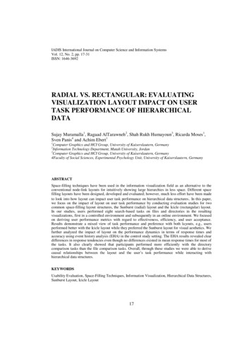
IADIS International Journal on Computer Science and Information Systems3. THE EVALUATION STUDIESIt is essential that the visual designs agree with the cognitive framework supporting UIdimensions for intuitive interaction [1, 8]. Also, it is important to understand that a cognitivestudy is necessary to reduce the gaps between the UI and the system [1]. Therefore, supportfor cognitive based design is inevitable [8]. This helps in more effortless recall, search, andbrowse functions of UI dimensions as it is easier to learn and is more satisfying [6, 13, 18]. Inour studies, we aimed at studying the impact of visual layout on user task performance interms of accuracy, efficiency and acceptance. Visual layouts are important elements of visualhierarchy and play a crucial role in task selection and execution during search and scanprocesses of interaction. In the following subsections, we explain our experimental design andsettings.3.1 The Two Experiments SettingsWe used the software structure hierarchy of the RAVON [8] robot in the visualizations centralin our studies. The RAVON software system contains four main packages (i.e., libraries,projects, tools, and others), where each package contains a group of sub-packages except the“other” package as it consists of less than 0.6% of the RAVON software system. The“libraries” package is the largest one (approximately 55.7%) in the RAVON software system,followed by the “projects” package (approximately 33.1%), and the “tools” package(approximately 10.7%). In total, RAVON has 3152 software files and are characterized bythree extensions (i.e., “.cpp”, “.h”, and “.hpp”). Each one of these files represents a leaf nodein the hierarchy. Further, the RAVON software files are divided by their levels with amaximum level is of six degrees.Figure 1 shows the resulting Sunburst and Icicle visualizations of the RAVON softwarestructure hierarchy, which were developed using the D31 library. The color scheme in bothvisualizations were inspired from the work of AlTarawneh et al. in [4, 5]. The visualizationswere positioned in the central portion of the screen, whereas the activity questionnaire forusers to solve tasks appears in the frame on the left side of the screen. Also, the labellingscheme providing contextual information to the user appears at the top of the screen.The experiment was a between-subject design, where half of the randomly selectedparticipants performed the tasks with the help of the Sunburst visualization and the other halfwith the Icicle visualization. We conducted the experiment based on two evaluation settings.The first was a controlled laboratory setting where the moderators were present to note downthe data and to answer the questions in case of any difficulties faced by the participants. Figure2 shows the controlled experiment setup in the lab environment. The second was an onlinestudy setting conducted by hosting the website online via an FTP server. The webpage linksfor both Sunburst and Icicle were shared through emails, blogs, and social media. In thisevaluation setting, the experiment was performed without any moderators.1D3 Data-Driven Documents: http://d3js.org/20
RADIAL VS. RECTANGULAR: EVALUATING VISUALIZATION LAYOUT IMPACT ON USERTASK PERFORMANCE OF HIERARCHICAL DATAFigure 1. Sunburst (left) and Icicle (right) with activity questionnaires for the participants on the leftframe in both visualization toolsFigure 2. Participants performing in the controlled experiment3.2 Tasks and HypothesesA set of 8 activity tasks were designed to extract user performance measurements from bothvisualization layouts. In both evaluation settings, participants were asked to complete thefollowing 8 tasks:1. Identify the largest directory in the hierarchy2. Identify the largest file in the libraries directory3. Identify the second largest directory in the hierarchy4. Identify the second largest file in the projects directory5. Identify the deepest subdirectory of the directory “/libraries/stereo vision”6. Compare the directories “/projects/ravon/control/” and “/projects/ravon/navigator/”.Which one is the larger one?7. Compare the directories “/projects/ravon/obstacle detection/” and“/projects/ravon/navigator/”. Which one has more files?8. Which directory has the least amount of levels?At the end of the lab study, participants were asked to give their feedback regarding theiracceptance level using a closed-ended questionnaire form using a Likert-scale and anopen-ended questionnaire form. In the case of the online study, participants were asked at theend of the test to rate their preferred visualization layout.In the study by Stasko et al. [25], the authors found a preference for and a highersubjective opinion of the Sunburst visualization layout in comparison to the TreeMapvisualization layout. In terms of perception of symmetry, we believe that the Sunburst with a21
IADIS International Journal on Computer Science and Information Systemsradial layout is more symmetric and hence visually aesthetic. However, the rectangular layoutof the Icicle layout supports the top-down viewing hierarchy; therefore, we hypothesize thatthe top-down viewing preference lets the participants execute the task more accurately.Further, since the Icicle layout follows the conventional tree structures; therefore, we assumethat the visual hierarchy and the linear navigation of the rectangular display layout (i.e., Iciclein our case) will support participants in executing tasks more quickly. Based on theseassumptions, we formulated the following set of hypotheses:1.2.3.Hypothesis 1:Accuracy (Icicle Layout) Accuracy (Sunburst Layout)Hypothesis 2:Efficiency (Icicle Layout) Efficiency (Sunburst Layout)Hypothesis 3:User Acceptance (Sunburst Layout) User Acceptance (Icicle Layout)3.3 ParticipantsParticipants were divided into two separate groups with each group performing tasks on onevisualization (either Sunburst or Icicle). Four participants performed the pilot study. In thecase of the lab experiment, 36 participants (10 females and 26 males) took part with a meanage of 27.09 years (range 24 – 32 years). Most of the participants were students with differentcultural and educational backgrounds. All the participants who performed the experiment werefamiliar with the notion of files and directories, but interaction with interactive visualizationlayouts like Sunburst and Icicle were new to them. In the online study, 59 participants(21 females and 38 males) took part. We randomly assigned the participants to one of theunderlying visualizations to avoid any influence of demographic differences. Here, theparticipants’ mean age was 27.96 years (range: 18 years – 51 years), with Sunburst having amean age of 27.54 years (range: 18 years – 51 years, SD: 6.74 years) and Icicle a mean age of28.32 years (range: 21 years – 38 years, SD: 4.50 years).4. RESULTS AND DISCUSSIONIn this section, we describe the results of the controlled lab study and the online evaluationstudy for the Sunburst layout (SB) and the Icicle layout (IC). First, we focus on thecomparison of these two layouts in terms of accuracy, efficiency, and user acceptance. Thenwe explain the Event History Analysis (EHA) results on the response times and accuracy datato study the impact of layout on the temporal dynamics of user performance for each task.Finally, we discuss our overall findings.4.1 Results of Accuracy, Efficiency, and User AcceptanceThe average accuracy obtained from the controlled, online, and combined cases arerepresented in Table 1 and Figure 3. Data for accuracy results was tested for normality usingthe Shapiro-Wilk test statistic (SB: w 0.88, IC: w 0.97) for the average task scores obtainedfrom each task when combined for both control as well as the online study. The results were22
RADIAL VS. RECTANGULAR: EVALUATING VISUALIZATION LAYOUT IMPACT ON USERTASK PERFORMANCE OF HIERARCHICAL DATAthen tested using the t-test for the reliable differences. The results show that users tend to bemore accurate with the Icicle layout (IC) than the Sunburst (SB) layout. In the controlledstudy, the difference was closely significant using the t-test (IC 87%, SB 70%, and p 0.07).In the online study, the difference was not significant (IC 79%, SB 75%, and p 0.74).Additionally, the difference was also not significant when both cases were combined foraverage accuracies (IC 83%, SB 73%, and p 0.22). Overall, although, there were nosignificant differences, there seemed to be a higher accuracy trend using the Icicle layout thanthe Sunburst layout as shown in Figure 3.Table 1. Participants’ accuracy results in both studies as well as the combined tIcicle0.880.840.550.690.960.86Tasks ID56Controlled Lab Study0.160.770.940.770.941.00Online Study0.240.760.880.700.850.96Average Results of Both Studies0.200.770.910.740.900.984Controlled Lab Study mbined Results1.228Online Study 678IcicleFigure 3. Participants’ accuracy results in both studies as well as the combined resultsThe average efficiency results from the controlled, online and combined cases weremeasured as the average time taken to correctly completing the tasks and are shown in Table 2and Figure 4. Because of varying complexity of each task, the average time of completiondiffers between the tasks. Data was tested for normality using the Shapiro-Wilk test statisticfor the controlled lab study (SB: w 0.94, IC: w 0.87) and was found to be normallydistributed. The average results were then tested using the t-test for the reliable differences.The results trend show that users tend to be quicker with the Icicle layout (IC) than theSunburst (SB) layout. All the differences in average scores were closely significant with thet-test. In the controlled study, participants on average were quicker to complete the tasks withthe Icicle layout (IC 43.67s, SB 55.17s, and p 0.11). In the online study, participants onaverage were quicker to complete all the tasks with the Icicle layout (IC 48.81s, SB 123.56s,and p 0.12). Furthermore, by combining both the results, participants on average were quickerto complete all the tasks with the Icicle Layout (IC 46.24s, SB 89.37s, and p 0.10).Although, there were no real significant differences; however, there seemed to be a higherefficiency trend using the Icicle layout than the Sunburst layout as shown in Figure 4.23
IADIS International Journal on Computer Science and Information SystemsTable 2. Participants’ efficiency in seconds in both studies as well as the combined resultTasks cicle43.5629.03168.6792.2921.2022.99456Controlled Lab Study10967.5759.886258.2334.06Online Study42088.426075.7957.3930Average Results of Both Studies264.507859.9468.9057.8132.03Contolled Lab Study 6.24Combined Results50028Online Study 678IcicleFigure 4. Participants’ efficiency results in seconds in both studies as well as the combined resultsIn the controlled study, we asked 13 questions in the closed-ended questionnaire form(see Table 3) in order to know the participants’ subjective preference for various features ofthe underlying visualizations. The table shows the frequencies with which each Likert scorewas selected by the participants. None of the differences were significant. However, there wasa marginal difference in average satisfaction rating in the controlled study in favor theSunburst layout.In the online study, only one question was used to study the participants’ acceptance. Thedifference in frequency means was found to be highly significant with a higher preference forthe Sunburst layout, with 3.8 vs 3.1 and p-value of 0.0394. Table 4 shows the results of theonline study.In both studies, the number of positive responses on the Likert scale (count of 4s and 5s)were higher with the Sunburst layout compared to the Icicle layout. Additionally, this was alsoevident from the open-ended feedback from the participants, as they provided more positivefeedback for the Sunburst layout compared to the Icicle layout.24
RADIAL VS. RECTANGULAR: EVALUATING VISUALIZATION LAYOUT IMPACT ON USERTASK PERFORMANCE OF HIERARCHICAL DATATable 3. Participants’ acceptance feedback in closed-ended questionnaire form in the controlled lab 345Don'tKnowMedian1. I was able to compare the sizes of files using the labeling system.033752. I was able to figure out the largest file using the labeling system.1143904024570404.50128603. I was able to figure out the largest file using the size of the node.124546040155704. I was able to figure out which subdirectories were inside another directoryusing Sunburst.02346704011124045. The coloring scheme was helpful while searching a particular file206. The labeling system was helpful while searching for a particular file04358042413624464040255607. The coloring scheme was helpful while searching for a particular directory042457042344503.58. The labeling system was helpful while searching for a particular directory.9. After completing the tasks, I now know how to use Sunburst well.0221040402277040228604025650410. There are definitely times that I would like to use Sunburst.21483040097203.511. I found the tool to be confusing to use.11031302355500312. Overall, I liked the tool.02311204025920413. I would like to use the tool to visualize my own hierarchical data.04482040827103Table 4. Participants’ acceptance feedback in closed-ended questionnaire form in the online studyHow was the interaction with the tool 78660MedianMean43.7933.104.2 Results of Event History AnalysisWe performed the Event History Analysis (EHA) on the response times (RT) and accuracydata in order to study the impact of layout on the temporal dynamics of user performance foreach task. Event history analysis is the standard distributional method for analyzingtime-to-event data in many scientific disciplines. It is also known as survival, hazard, duration,failure-time, or transition analysis [2, 3, 10, 16, 17, 19, 20, 22, 23].It is assumed that for each time point from the onset of the task, for each trial by eachparticipant, there is a tendency or risk for the event (here, a response) to occur. The functionrelating this likelihood of response occurrence with the passage of time is known as thecontinuous-time hazard function of the response occurrence [7, 15].In this study, we applied discrete-time (descriptive and inferential) methods [3, 20, 23, 27].We divided the first 80 seconds beginning from task-onset into 8 time bins of 10 seconds each(i.e., (0,10], (10,20], (20,30], . , (70,80] indexed by t 1, 2, 3, ., 8), and then estimated thediscrete-time hazard function of response occurrence, h(t):h(t) P(T t T t)Here, T t denotes the event that the response did not occur before the start of time bin t.Thus, this conditional probability function gives each bin t the conditional probability of aresponse occurrence sometime during bin t, given that the response has not yet occurred in any25
IADIS International Journal on Computer Science and Information Systemsprevious time bin (t-1, t-2, ., 1). The estimate is obtained by dividing the number of events bythe risk set for each bin (see Table 5).The survivor function, S(t), expresses the probability that the response has not yet occurredby the time bin t is completed. It is the joint probability that the response has not occurred inany of the bins prior to and including t:S(t) P(T t) [1 - h(t)] · [1 - h(t-1)] · [1 - h(t-2)] · . · [1 - h(1)]Finally, P(t) P(T t) indicates the unconditional probability that the response occurs intime bin t. Plotting P(t) over time t gives the (sub)probability mass function of responseoccurrence. The estimate of P(t) is obtained by dividing the number of events in each bin bythe maximal risk set (i.e., 18; see Table 5). In Table 5 we illustrate the calculation of thesefunctions for one condition (i.e.: Sunburst, Task 1).Table 5. Life table for the condition of the Sunburst layout in Task 1 in the control study sk A1.000.75In the study we have two event types of interest: correct and incorrect responses. Wecannot simply estimate the hazard functions for correct and incorrect responses separately,because these two events cannot be assumed to be independent of each other [19]. Therefore,we take the conditional-processes approach by extending the h(t) analysis of responseoccurrence with the analysis of conditional accuracy [3]. By combining the hazard functionwith a conditional accuracy function, we can provide an unbiased, time-varying, andprobabilistic description of the latency and accuracy of responses. First, we estimate h(t) ofresponse occurrence regardless of response accuracy, to study whether and when responsesoccur. For each time bin t, the sample-based estimate of h(t) is obtained by dividing the totalnumber of observed responses in bin t by the risk set for bin t. The risk set equals the totalnumber of trials that are response-free in all time bins earlier than t and are thus still eligible toexperience the response. Second, once we know probabilistically whether and when responsesoccur, we estimate the conditional accuracy function of observed responses, ca(t):ca(t) P(response correct T t)Here, ca(t) provides the conditional probability that a response is correct given that itoccurs sometime during bin t. The conditional accuracy, ca(t), is obtained by dividing thenumber of correct responses observed during bin t by the total number of observed responsesin bin t. In conclusion, we took the following metrics into account for analyzing our time-toevent data:1. Hazard function2. Survival function3. (Sub) probability mass function4. Conditional accuracy26
RADIAL VS. RECTANGULAR: EVALUATING VISUALIZATION LAYOUT IMPACT ON USERTASK PERFORMANCE OF HIERARCHICAL DATAIn Figures 5 and 6, we plot these sample-based functions for each task in the control study.For example, given that no response has occurred during the first 10 seconds in the Iciclelayout of Task 1, there is a hazard probability of about 0.5 that the response is going to occurin bin (10, 20] (see Figure 5, upper left plot, bin endpoint 20); and given that a response occursin this condition in bin (10, 20] it is estimated to be correct 100 percent of the time (see Figure5, lower left plot, bin endpoint 20).Figure 5. Sample-based descriptive statistics for Tasks 1 to 4 in the control study setting. Hazardestimates h(t), survival estimates S(t), (sub)probability mass estimates P(t), and conditional accuracyestimates ca(t) for the both layouts are presented in rows 1, 2, 3, and 4 respectivelyMore generally, the hazard and conditional accuracy functions show that for Tasks 1, 4, 5,6, 7 and 8, there are more early responses for the Icicle layout compared to the Sunburstlayout, and that when such an early response occurs, it tends to be more often correct for theIcicle layout compared to the Sunburst layout.For Task 2 we observe a positive hazard for the Sunburst layout in bin (20, 30] but when aresponse occurs in bin (20, 30] it is estimated to be correct only 20 percent of the time. Forlater bins, hazard is higher for the Icicle layout and these later responses are more often correctfor the Icicle layout compared to the Sunburst layou
The need for visualization for depicting hierarchical information was motivated by early computing challenges of visualization of large scale data structures stored in hard drives [12]. Johnson and Schneiderman [12] showed a TreeMap visualization layout in their study that maps hierarchical information structure to a 2-D space